AppCode
This article demonstrates how to create CSS emoji icons using HTML and CSS. Included in this example are a live demo and usable code.
This article was first seen on and republished from csstutorial.io
HTML
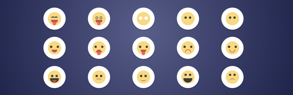
Down below we have included the code for the HTML skeleton framework of this example. As you see below we use HTML div elements with class names called “.icon-container”. This class functions as a flex item for its parent element it is nested in. The parent element should not get confused with the class name “.parent-container”. In fact, the parent element is actually named with a class called “.super-container” and is directly nested within “.parent-container”. This element has a CSS style that converts the nested children into a flex display using the CSS display flex property. Each nested element within “.super-container” contains the HTML structure for each individual emoji Icon. To demonstrate, the first emoji icon contains a left-eye, a right-eye, a mouth, and a tongue. As a result, this creates the first CSS Emoji icon you see in the flex grid.
<div class="parent-container">
  <div class="super-container">
    <div class="icon-container">
      <div class="icon">
        <div class="emoji emoji-1">
          <div class="left-eye"></div>
          <div class="right-eye"></div>
          <div class="mouth">
            <div class="tongue"></div>
          </div>
        </div>
      </div>
    </div>

    <div class="icon-container">
      <div class="icon">
        <div class="emoji emoji-2">
          <div class="left-eye"></div>
          <div class="right-eye"></div>
          <div class="mouth">
            <div class="tongue"></div>
          </div>
        </div>
      </div>
    </div>

    <div class="icon-container">
      <div class="icon">
        <div class="emoji emoji-3">
          <div class="left-eye"></div>
          <div class="right-eye"></div>
        </div>
      </div>
    </div>

    <div class="icon-container">
      <div class="icon">
        <div class="emoji emoji-4">
          <div class="left-eye"></div>
          <div class="right-eye"></div>
          <div class="mouth">
            <i class="fas fa-times"></i>
          </div>
        </div>
      </div>
    </div>

    <div class="icon-container">
      <div class="icon">
        <div class="emoji emoji-5">
          <div class="left-eye"></div>
          <div class="right-eye"></div>
          <div class="mouth">
            <i class="fas fa-minus"></i>
          </div>
        </div>
      </div>
    </div>

    <div class="icon-container">
      <div class="icon">
        <div class="emoji emoji-6">
          <div class="left-eye"></div>
          <div class="right-eye"></div>
          <div class="mouth"></div>
        </div>
      </div>
    </div>

    <div class="icon-container">
      <div class="icon">
        <div class="emoji emoji-7">
          <div class="left-eye"></div>
          <div class="right-eye"></div>
          <div class="mouth">
            <div class="tongue"></div>
          </div>
        </div>
      </div>
    </div>

    <div class="icon-container">
      <div class="icon">
        <div class="emoji emoji-8">
          <div class="left-eye"></div>
          <div class="right-eye"></div>
          <div class="mouth">
            <div class="tongue"></div>
          </div>
        </div>
      </div>
    </div>

    <div class="icon-container">
      <div class="icon">
        <div class="emoji emoji-9">
          <div class="left-eye"></div>
          <div class="right-eye"></div>
          <div class="mouth"></div>
        </div>
      </div>
    </div>

    <div class="icon-container">
      <div class="icon">
        <div class="emoji emoji-10">
          <div class="left-eye"></div>
          <div class="right-eye"></div>
          <div class="mouth"></div>
        </div>
      </div>
    </div>

    <div class="icon-container">
      <div class="icon">
        <div class="emoji emoji-11">
          <div class="left-eye"></div>
          <div class="right-eye"></div>
          <div class="mouth">
            <div class="tongue"></div>
          </div>
        </div>
      </div>
    </div>

    <div class="icon-container">
      <div class="icon">
        <div class="emoji emoji-12">
          <div class="left-eye"></div>
          <div class="right-eye"></div>
          <div class="mouth"></div>
        </div>
      </div>
    </div>

    <div class="icon-container">
      <div class="icon">
        <div class="emoji emoji-13">
          <div class="left-eye"></div>
          <div class="right-eye"></div>
          <div class="mouth"></div>
        </div>
      </div>
    </div>

    <div class="icon-container">
      <div class="icon">
        <div class="emoji emoji-14">
          <div class="left-eye"></div>
          <div class="right-eye"></div>
          <div class="mouth"></div>
        </div>
      </div>
    </div>

    <div class="icon-container">
      <div class="icon">
        <div class="emoji emoji-15">
          <div class="left-eye"></div>
          <div class="right-eye"></div>
          <div class="mouth"></div>
        </div>
      </div>
    </div>
  </div>
</div>
CSS
The CSS code below is actually compiled from SCSS that is included in the live demo below. Each emoji icon has its parts defined as a CSS class you see below. For example, the first part defined below is “.emoji.emoji-1 .left-eye”. This class creates the left eye for the first icon. The left eye uses the CSS border-radius, CSS absolute positioning, border color, and a few other properties to create the eye. Additionally, an important CSS class listed below is the root “.emoji” class. This class defines relative positioning for the element, a default CSS background color of #fada7e, width, and height.
Whenever the user hovers over an emoji icon there is a box-shadow effect. This is created with a “:hover” pseudo-class. This class is a special state that is triggered whenever a CSS selector that includes “:hover” is hovered over with a cursor. You can see this hover effect by clicking on the live demo link below.
body {
  background: #595e8b;
  background: radial-gradient(circle, #595e8b 0%, #161a42 100%);
  margin: 50px auto;
  max-width: 1000px;
}

.parent-container {
  -webkit-box-align: center !important;
  -ms-flex-align: center !important;
  align-items: center !important;
  -webkit-box-pack: center !important;
  -ms-flex-pack: center !important;
  justify-content: center !important;
  display: -webkit-box !important;
  display: -ms-flexbox !important;
  display: flex !important;
  height: 100%;
}

.super-container {
  display: flex;
  flex-wrap: wrap;
}

.icon-container {
  flex: 1 0 19%;
}

.icon {
  width: 100px;
  height: 100px;
  margin: 8% auto;
  background: #fff;
  border-radius: 50%;
  display: flex;
  box-shadow: 0 2px 4px rgba(0, 0, 0, 0.5);
  justify-content: center;
  align-items: center;
  transition: 300ms cubic-bezier(0.19, 0.38, 0.85, 0.65);
}

.icon:hover {
  box-shadow: 0 4px 8px rgba(31, 31, 31, 0.73);
}

.emoji {
  position: relative;
  background: #fada7e;
  width: 60px;
  height: 60px;
  border-radius: 50%;
}
.emoji.emoji-1 .left-eye {
  position: absolute;
  left: 15px;
  top: 20px;
  border-radius: 50%;
  border-width: 6px 0px 0px 0px;
  border-style: solid;
  border-color: #4d4d4d;
  padding: 3px;
  width: 10px;
}
.emoji.emoji-1 .right-eye {
  position: absolute;
  right: 15px;
  top: 20px;
  border-radius: 50%;
  border-width: 6px 0px 0px 0px;
  border-style: solid;
  border-color: #4d4d4d;
  padding: 3px;
  width: 10px;
}
.emoji.emoji-1 .mouth {
  position: absolute;
  bottom: 10px;
  left: 15px;
  border-bottom-left-radius: 90px;
  border-bottom-right-radius: 90px;
  height: 15px;
  width: 30px;
  background: #bc554f;
}
.emoji.emoji-1 .tongue {
  background: #fa645a;
  width: 15px;
  height: 15px;
  border-bottom-left-radius: 50%;
  border-bottom-right-radius: 50%;
  margin-left: auto;
  margin-right: auto;
  margin-top: 10px;
}
.emoji.emoji-2 .left-eye {
  position: absolute;
  left: 15px;
  top: 20px;
  border-radius: 50%;
  border-width: 3px;
  border-style: solid;
  border-color: #4d4d4d;
  padding: 3px;
}
.emoji.emoji-2 .right-eye {
  position: absolute;
  right: 15px;
  top: 20px;
  border-radius: 50%;
  border-width: 3px;
  border-style: solid;
  border-color: #4d4d4d;
  padding: 3px;
}
.emoji.emoji-2 .mouth {
  position: absolute;
  bottom: 10px;
  left: 15px;
  border-bottom-left-radius: 90px;
  border-bottom-right-radius: 90px;
  height: 15px;
  width: 30px;
  background: #bc554f;
}
.emoji.emoji-2 .tongue {
  background: #fa645a;
  width: 15px;
  height: 15px;
  border-bottom-left-radius: 50%;
  border-bottom-right-radius: 50%;
  margin-left: auto;
  margin-right: auto;
  margin-top: 10px;
}
.emoji.emoji-3 .left-eye {
  border-radius: 50%;
  background: #fff;
  width: 15px;
  height: 15px;
  position: absolute;
  left: 10px;
  top: 20px;
  display: flex;
  justify-content: center;
  align-items: center;
}
.emoji.emoji-3 .left-eye :after {
  content: "";
  position: absolute;
  width: 50%;
  height: 50%;
  border-radius: 50%;
  background: #3a3a3a;
}
.emoji.emoji-3 .right-eye {
  border-radius: 50%;
  background: #fff;
  width: 15px;
  height: 15px;
  position: absolute;
  right: 10px;
  top: 20px;
  display: flex;
  justify-content: center;
  align-items: center;
}
.emoji.emoji-3 .right-eye :after {
  content: "";
  position: absolute;
  width: 50%;
  height: 50%;
  border-radius: 50%;
  background: #3a3a3a;
}
.emoji.emoji-4 .left-eye {
  border-radius: 50%;
  background: #3a3a3a;
  width: 10px;
  height: 10px;
  position: absolute;
  left: 15px;
  top: 20px;
  display: flex;
  justify-content: center;
  align-items: center;
}
.emoji.emoji-4 .right-eye {
  border-radius: 50%;
  background: #3a3a3a;
  width: 10px;
  height: 10px;
  position: absolute;
  right: 15px;
  top: 20px;
}
.emoji.emoji-4 .mouth {
  position: absolute;
  bottom: 5px;
  left: 50%;
  transform: translateX(-50%);
  font-weight: bold;
  color: #3a3a3a;
}
.emoji.emoji-5 .left-eye {
  border-radius: 50%;
  background: #3a3a3a;
  width: 10px;
  height: 10px;
  position: absolute;
  left: 15px;
  top: 20px;
}
.emoji.emoji-5 .right-eye {
  border-radius: 50%;
  background: #3a3a3a;
  width: 10px;
  height: 10px;
  position: absolute;
  right: 15px;
  top: 20px;
}
.emoji.emoji-5 .mouth {
  position: absolute;
  bottom: 5px;
  left: 50%;
  transform: translateX(-50%);
  color: #3a3a3a;
}
.emoji.emoji-6 .left-eye {
  border-radius: 50%;
  background: #3a3a3a;
  width: 10px;
  height: 10px;
  position: absolute;
  left: 10px;
  top: 20px;
}
.emoji.emoji-6 .right-eye {
  border-radius: 50%;
  background: #3a3a3a;
  width: 10px;
  height: 10px;
  position: absolute;
  right: 10px;
  top: 20px;
}
.emoji.emoji-6 .mouth {
  position: absolute;
  bottom: 10px;
  left: 50%;
  transform: translateX(-50%);
  background: #bc554f;
  border-bottom-left-radius: 90px;
  border-bottom-right-radius: 90px;
  height: 12px;
  width: 25px;
}
.emoji.emoji-7 .left-eye {
  border-radius: 50%;
  background: #3a3a3a;
  width: 10px;
  height: 10px;
  position: absolute;
  left: 10px;
  top: 20px;
}
.emoji.emoji-7 .right-eye {
  border-radius: 50%;
  background: #3a3a3a;
  width: 10px;
  height: 10px;
  position: absolute;
  right: 10px;
  top: 20px;
}
.emoji.emoji-7 .mouth {
  position: absolute;
  bottom: 10px;
  left: 50%;
  transform: translateX(-50%);
  background: #bc554f;
  border-top-left-radius: 90px;
  border-top-right-radius: 90px;
  height: 12px;
  width: 25px;
}
.emoji.emoji-7 .tongue {
  background: #fa645a;
  width: 15px;
  height: 15px;
  border-bottom-left-radius: 50%;
  border-bottom-right-radius: 50%;
  margin-left: auto;
  margin-right: auto;
  margin-top: 10px;
}
.emoji.emoji-8 .left-eye {
  border-radius: 50%;
  background: #3a3a3a;
  width: 10px;
  height: 10px;
  position: absolute;
  left: 10px;
  top: 20px;
}
.emoji.emoji-8 .right-eye {
  border-radius: 50%;
  background: #3a3a3a;
  width: 10px;
  height: 10px;
  position: absolute;
  right: 10px;
  top: 20px;
}
.emoji.emoji-8 .mouth {
  position: absolute;
  bottom: 10px;
  left: 50%;
  transform: translateX(-50%);
  background: #bc554f;
  border-bottom-left-radius: 90px;
  border-bottom-right-radius: 90px;
  height: 12px;
  width: 25px;
}
.emoji.emoji-8 .tongue {
  background: #fa645a;
  width: 15px;
  height: 15px;
  border-bottom-left-radius: 50%;
  border-bottom-right-radius: 50%;
  margin-left: auto;
  margin-right: auto;
  margin-top: 10px;
}
.emoji.emoji-9 .left-eye {
  border-radius: 50%;
  background: #3a3a3a;
  width: 10px;
  height: 10px;
  position: absolute;
  left: 10px;
  top: 20px;
}
.emoji.emoji-9 .right-eye {
  border-radius: 50%;
  background: #3a3a3a;
  width: 10px;
  height: 10px;
  position: absolute;
  right: 10px;
  top: 20px;
}
.emoji.emoji-9 .mouth {
  position: absolute;
  bottom: 10px;
  left: 50%;
  transform: translateX(-50%);
  width: 20px;
  height: 10px;
  background-color: transparent;
  border-top-left-radius: 110px;
  border-top-right-radius: 110px;
  border: 3px solid #bc554f;
  border-bottom: 0;
}
.emoji.emoji-10 .left-eye {
  border-radius: 50%;
  background: #3a3a3a;
  width: 10px;
  height: 10px;
  position: absolute;
  left: 10px;
  top: 20px;
}
.emoji.emoji-10 .right-eye {
  border-radius: 50%;
  background: #3a3a3a;
  width: 10px;
  height: 10px;
  position: absolute;
  right: 10px;
  top: 20px;
}
.emoji.emoji-10 .mouth {
  position: absolute;
  bottom: 10px;
  left: 50%;
  transform: translateX(-50%);
  width: 20px;
  height: 10px;
  background-color: transparent;
  border-bottom-left-radius: 110px;
  border-bottom-right-radius: 110px;
  border: 3px solid #bc554f;
  border-top: 0;
}
.emoji.emoji-11 .left-eye {
  border-radius: 50%;
  background: #3a3a3a;
  width: 10px;
  height: 10px;
  position: absolute;
  left: 15px;
  top: 20px;
}
.emoji.emoji-11 .right-eye {
  border-radius: 50%;
  background: #3a3a3a;
  width: 10px;
  height: 10px;
  position: absolute;
  right: 15px;
  top: 20px;
}
.emoji.emoji-11 .mouth {
  position: absolute;
  bottom: 5px;
  left: 50%;
  transform: translateX(-50%);
  background: #3a3a3a;
  border-bottom-left-radius: 90px;
  border-bottom-right-radius: 90px;
  height: 20px;
  width: 40px;
}
.emoji.emoji-11 .tongue {
  position: absolute;
  bottom: 2px;
  left: 50%;
  transform: translateX(-50%);
  background: #bc554f;
  border-bottom-left-radius: 90px;
  border-bottom-right-radius: 90px;
  height: 10px;
  width: 20px;
}
.emoji.emoji-12 .left-eye {
  border-radius: 50%;
  background: #3a3a3a;
  width: 10px;
  height: 10px;
  position: absolute;
  left: 15px;
  top: 20px;
}
.emoji.emoji-12 .right-eye {
  border-radius: 50%;
  background: #3a3a3a;
  width: 10px;
  height: 10px;
  position: absolute;
  right: 15px;
  top: 20px;
}
.emoji.emoji-12 .mouth {
  position: absolute;
  left: 50%;
  bottom: 5px;
  transform: translateX(-50%);
  transform: translateX(-50%);
  width: 25px;
  height: 15px;
  background-color: transparent;
  border-top-left-radius: 50%;
  border-top-right-radius: 50%;
  border: 3px solid #bc554f;
  border-bottom: 0;
  border-right: 0;
  border-left: 0;
}
.emoji.emoji-13 .left-eye {
  border-radius: 50%;
  background: #3a3a3a;
  width: 10px;
  height: 10px;
  position: absolute;
  left: 15px;
  top: 20px;
}
.emoji.emoji-13 .right-eye {
  border-radius: 50%;
  background: #3a3a3a;
  width: 10px;
  height: 10px;
  position: absolute;
  right: 15px;
  top: 20px;
}
.emoji.emoji-13 .mouth {
  position: absolute;
  left: 50%;
  bottom: 12px;
  transform: translateX(-50%);
  transform: translateX(-50%);
  width: 25px;
  height: 15px;
  background-color: transparent;
  border-bottom-left-radius: 50%;
  border-bottom-right-radius: 50%;
  border: 3px solid #bc554f;
  border-top: 0;
  border-right: 0;
  border-left: 0;
}
.emoji.emoji-14 .left-eye {
  border-radius: 50%;
  background: #3a3a3a;
  width: 10px;
  height: 10px;
  position: absolute;
  left: 15px;
  top: 15px;
}
.emoji.emoji-14 .right-eye {
  border-radius: 50%;
  background: #3a3a3a;
  width: 10px;
  height: 10px;
  position: absolute;
  right: 15px;
  top: 15px;
}
.emoji.emoji-14 .mouth {
  position: absolute;
  bottom: 5px;
  left: 50%;
  transform: translateX(-50%);
  background: #3a3a3a;
  border-bottom-left-radius: 90px;
  border-bottom-right-radius: 90px;
  height: 20px;
  width: 40px;
}
.emoji.emoji-15 .left-eye {
  border-radius: 50%;
  background: #3a3a3a;
  width: 10px;
  height: 10px;
  position: absolute;
  left: 15px;
  top: 15px;
}
.emoji.emoji-15 .right-eye {
  border-radius: 50%;
  background: #3a3a3a;
  width: 10px;
  height: 10px;
  position: absolute;
  right: 15px;
  top: 15px;
}
.emoji.emoji-15 .mouth {
  position: absolute;
  left: 50%;
  bottom: 5px;
  transform: translateX(-50%);
  transform: translateX(-50%);
  width: 25px;
  height: 15px;
  background-color: transparent;
  border-top-left-radius: 50%;
  border-top-right-radius: 50%;
  border: 3px solid #bc554f;
  border-bottom: 0;
  border-right: 0;
  border-left: 0;
}
Here is a link to the live demo on codepen.io
Recommended Articles
- How To Create CSS Circle Color Palettes
- How To Change the Background Color on Hover With jQuery
- How To Add and Remove an Active Class With jQuery
- How To Hover Zoom on an Image With CSS Scale
- How To Create CSS Inset Shadow Buttons
- How to Create CSS Color Palettes
- How To Remove the Arrows on HTML Input Type Number