AppCode
This article demonstrates CSS semi-transparency in backgrounds, elements, and images using layers. Included are examples and code snippets.
Reading this article will help you have a 360-degree knowledge of using the semitransparent functionality in CSS. Let’s get started!
We will start by integrating semi-transparency in a project via the CSS opacity property introduced in CSS3. This short article has two different interactive demos with transparent color layers, and we use these demos to change the transparency of color filters over images.
Glassmorphism is a design trend that uses a lot of opacity and transparent layers to create the effects of glass and see-through elements. Check out this list of glassmorphic designs. Direct Link →
Two Layer vs Singe Layer
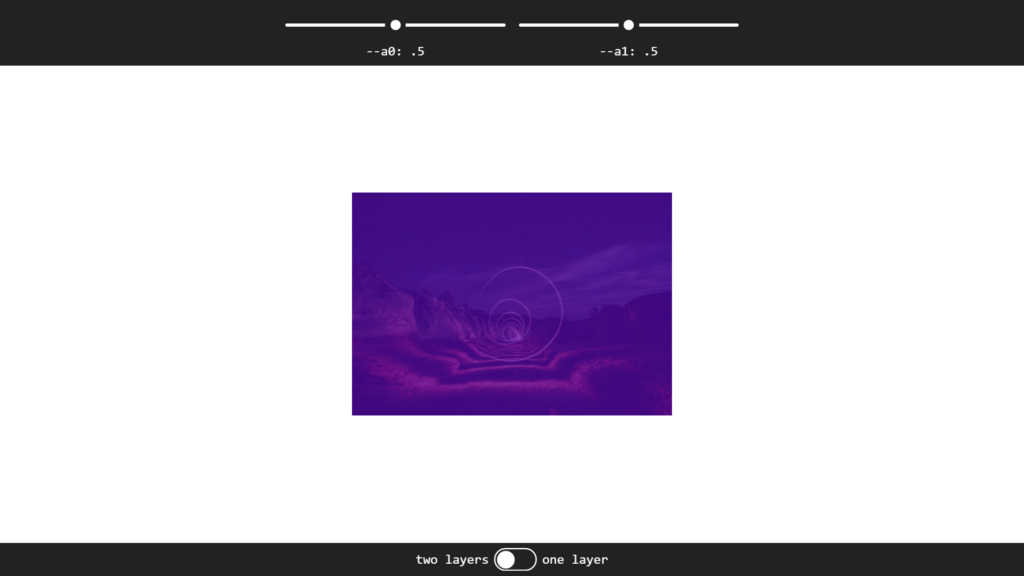
Below is an interactive demo that comprises a two-layer overlay. The first layer has opacity variables a1 and a0, while the second layer has an opacity variable of a1. These opacity layers are calculated with CSS calc using the values from the range inputs and the state of the toggle button. Let’s look at these different variables.
- –a0 is the first range input
- –a1 is the second range input
- –n is the toggle state, either 0 or 1
Whenever the toggle button is set on “two layers”. The layers are created using the ::before and ::after CSS pseudo-elements. The first layer’s color is red, while the second layer is blue.

Let’s look at how these two layers are calculated in CSS with the calc function.
/* Layer One (Red) */
figure:before {
    opacity: calc( var(--a0) + (1 - var(--n)) * (var(--a1) - var(--a0) * var(--a1)) );
}

/* Layer Two (Blue) */
figure:after {
    opacity: calc(var(--n) * var(--a1));
}
With layer one at 50% and layer two at 50%, we get a purple color. Since red and blue make purple.
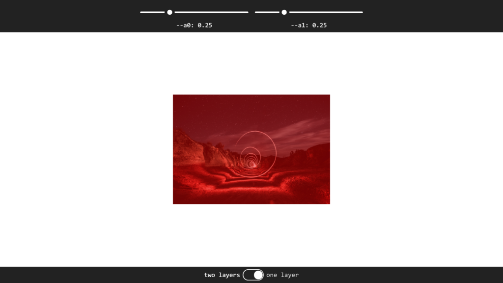
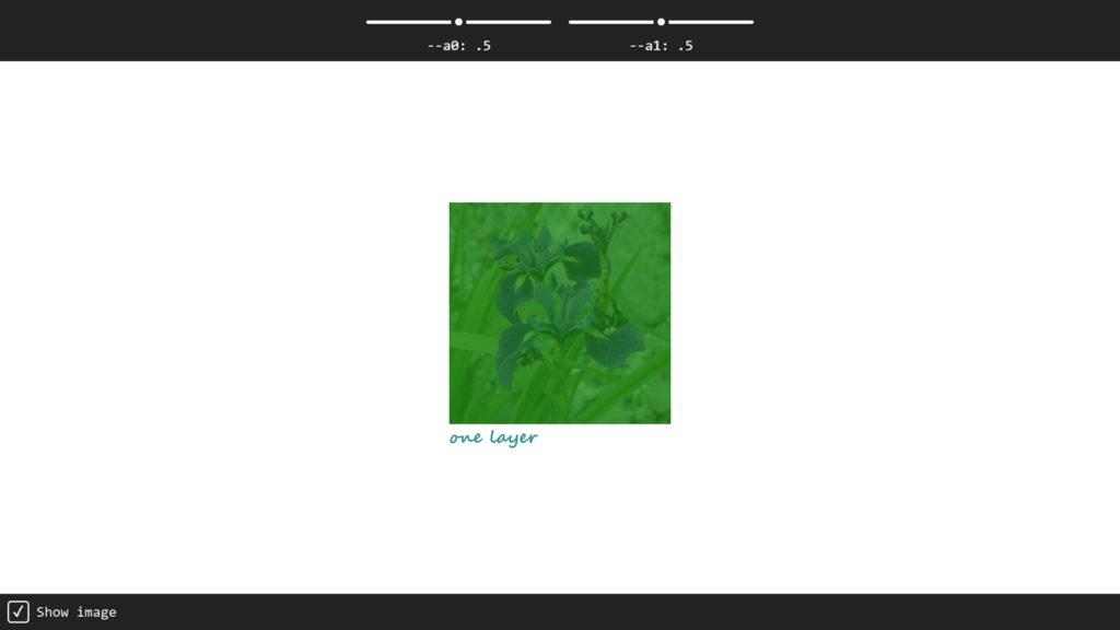
If the toggle switch is set to “one layer”, the second layer is disabled via the –n variable, and only the ::before pseudo-element layer is used.

See how the opacity of the second layer has a value of 0 when the toggle is set at “one layer”? The toggle button disables the layer from showing because the toggle has a value of 0, which makes the opacity value 0 in the function.
/* Layer Two */
figure:after {
    opacity: calc(var(--n) * var(--a1)); Since 0 * 0.5 = 0 Opacity (Disabled)
}
The single-layer opacity is calculated using the calc function from the figure::before class, as seen below.
/* Layer One (Red) */
figure:before {
    opacity: calc( var(--a0) + (1 - var(--n)) * (var(--a1) - var(--a0) * var(--a1)) );
}
If we set the range output where –a0 is 0.25 and –a1 is 0.25, we get a transparent red filter.
Now we understand how the layers works, let’s create the demo in our browser using HTML, CSS, and JavaScript below.
HTML
<form>
  <section class='slider'>
    <input id='a0' type='range' />
    <label for='a0'>--a0: <output for='a0'>.5</output></label>
  </section>
  <section class='slider'>
    <input id='a1' type='range' />
    <label for='a1'>--a1: <output for='a1'>.5</output></label>
  </section>
</form>

<main>
  <figure>
    <img src='https://appcode.app/wp-content/uploads/2022/02/Night-Lights-Without-CSS-Mask-Layer.jpeg'>
  </figure>
</main>

<form>
  <section class='toggle'>
    <input type='radio' id='n0' name='n' value='0' />
    <label for='n0' style='--i: 0'>one layer</label>
    <input type='radio' id='n1' name='n' value='1' />
    <label for='n1' style='--i: 1' checked>two layers</label>
  </section>
</form>
CSS
* {
  --hl: 0;
  margin: 0;
  font: inherit;
}

body {
  --a0: 0.5;
  --a1: 0.5;
  --n: 1;
  display: grid;
  grid-template-rows: max-content 1fr max-content;
  overflow-x: hidden;
  margin: 0;
  min-width: 275px;
  min-height: 100vh;
  color: #0000ff;
  font: 900 1em segoe script, comic sans ms, purisa, cursive;
}

@media (max-width: 400px) {
  body {
    font-size: 0.875em;
  }
}

form {
  display: flex;
  flex-wrap: wrap;
  justify-content: center;
  width: 100%;
  background: #222;
  color: #eee;
  font: 1.25em consolas, monospace, ubuntu mono;
  text-align: center;
}

section {
  padding: 0.5em;
}

.slider:nth-child(1) {
  --a: var(--a0);
}

.slider:nth-child(2) {
  --a: var(--a1);
}

[id],
[for],
.toggle {
  filter: Contrast(var(--hl)) Brightness(calc(2 - var(--hl)))
    GrayScale(calc(1 - var(--hl)));
}

input:focus {
  outline: solid 0 transparent;
}

input:focus,
input:focus ~ [for] {
  --hl: 1;
}

input[type="range"] {
  --pos: calc(var(--a) * 15em);
  display: block;
  border: solid 0 transparent;
  padding: 0.25em 0;
  width: calc(15em + 1.5em);
  height: 2.25em;
  background: transparent;
  cursor: pointer;
}

input[type="range"]::-webkit-slider-runnable-track,
input[type="range"]::-webkit-slider-thumb,
input[type="range"] {
  -webkit-appearance: none;
}

input[type="range"]::-webkit-slider-runnable-track {
  border: none;
  width: 100%;
  height: 0.25em;
  border-radius: 0.125em;
  background: #bbb;
  background: radial-gradient(
    circle at calc(var(--pos) + 0.75em) 50%,
    transparent 0.75em,
    #bbb calc(0.75em + 1px)
  );
  color: transparent;
}

input[type="range"]::-moz-range-track {
  border: none;
  width: 100%;
  height: 0.25em;
  border-radius: 0.125em;
  background: #bbb;
  background: radial-gradient(
    circle at calc(var(--pos) + 0.75em) 50%,
    transparent 0.75em,
    #bbb calc(0.75em + 1px)
  );
  color: transparent;
}

input[type="range"]::-ms-track {
  border: none;
  width: 100%;
  height: 0.25em;
  border-radius: 0.125em;
  background: #bbb;
  background: radial-gradient(
    circle at calc(var(--pos) + 0.75em) 50%,
    transparent 0.75em,
    #bbb calc(0.75em + 1px)
  );
  color: transparent;
}

input[type="range"]::-webkit-slider-thumb {
  margin-top: -0.625em;
  box-sizing: border-box;
  border: none;
  width: 1.5em;
  height: 1.5em;
  transform: scale(calc((0.5 + 0.5 * var(--hl))));
  border-radius: 50%;
  background: #0000ff;
  transition: 0.3s;
}

input[type="range"]::-moz-range-thumb {
  box-sizing: border-box;
  border: none;
  width: 1.5em;
  height: 1.5em;
  transform: scale(calc((0.5 + 0.5 * var(--hl))));
  border-radius: 50%;
  background: #0000ff;
  transition: 0.3s;
}

input[type="range"]::-ms-thumb {
  margin-top: 0;
  box-sizing: border-box;
  border: none;
  width: 1.5em;
  height: 1.5em;
  transform: scale(calc((0.5 + 0.5 * var(--hl))));
  border-radius: 50%;
  background: #0000ff;
  transition: 0.3s;
}

input[type="range"]::-ms-fill-lower,
input[type="range"]::-ms-fill-upper {
  background: transparent;
}

input[type="range"]::-ms-tooltip {
  display: none;
}

main {
  flex: 1;
  display: flex;
  flex-wrap: wrap;
  align-items: center;
  justify-content: center;
}

figure {
  position: relative;
  margin: 0.5vmin;
  width: 16.5em;
}

figure:before {
}

figure:after {
  background: blue;
}

figure:before {
  background: red;
}

figure:before,
figure:after {
  position: absolute;
  top: 0;
  left: 0;
  content: "";
  bottom: 0;
  right: 0;
}

figure:before {
  opacity: calc(
    var(--a0) + (1 - var(--n)) * (var(--a1) - var(--a0) * var(--a1))
  );
}

figure:after {
  opacity: calc(var(--n) * var(--a1));
}

img {
  width: 100%;
  display: block;
}

figcaption {
  font-size: 1.5em;
}

.toggle {
  display: grid;
  place-content: center;
  grid-auto-flow: row dense;
  grid-template-columns: max-content 3em max-content;
  transition: filter 0.3s ease-out;
}

.toggle::before,
.toggle::after {
  grid-column: 2;
  grid-row: 1;
  z-index: 0;
  height: 1.5em;
  border-radius: 0.75em;
  content: "";
}

.toggle::before {
  box-shadow: 0 0 0 2px;
}

.toggle::after {
  box-sizing: border-box;
  padding: 2px;
  width: 1.5em;
  transform: translate(calc((1 - var(--n)) * 100%));
  background: #0000ff content-box;
  transition: transform 0.3s ease-out;
}

.toggle:focus-within {
  --hl: 1;
}

input[type="radio"] {
  position: absolute;
  right: 100vw;
  clip-path: inset(50%);
}

input[type="radio"] + label {
  --j: calc(1 - var(--i));
  align-self: center;
  grid-column: calc(2 * var(--j) + 1);
  position: relative;
  z-index: 1;
  padding: 0 0.5em;
  cursor: pointer;
}

input[type="radio"] + label::before {
  position: absolute;
  top: calc(50% - 0.75em);
  left: calc(var(--i) * 100% - var(--j) * 1.5em);
  width: 1.5em;
  height: 1.5em;
  content: "";
}

input[type="radio"]:checked + label {
  color: #0000ff;
}
JavaScript
function update(e) {
let _t = e.target,
id = _t.id,
val;
if (_t.type === "range") {
val = +(0.01 * _t.value).toFixed(2);
document.querySelector(`output[for='${id}']`).textContent = val;
document.body.style.setProperty(`--${id}`, val);
}
if (_t.type === "radio") {
val = +_t.value;
document.body.style.setProperty(`--${_t.name}`, val);
}
}
addEventListener("input", update, false);
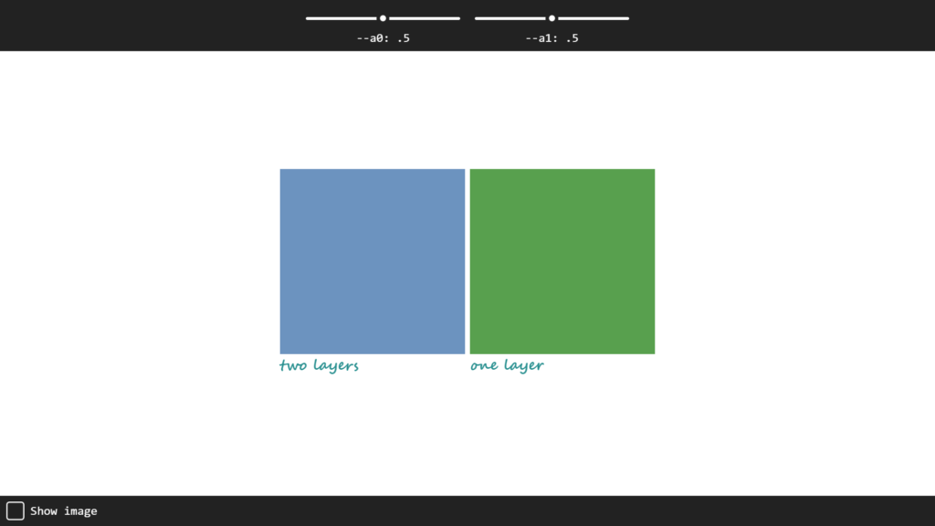
addEventListener("change", update, false);Two Layer Transparency Side-by-side
Here’s another example. The demo is quite similar to the first one.
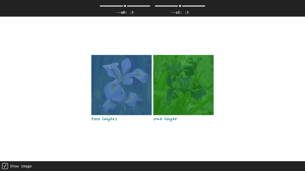
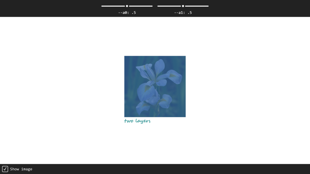
The first image uses a purple violate and an aqua green layer.
First Image:
Look at the CSS code below.
/* First Layer */
figure:nth-of-type(1):before {
    opacity: var(--a0);
    background: blueviolet;
}

/* Second Layer */
figure:nth-of-type(1):after {
    opacity: var(--a1);
    background: #088f8f;
}
On the other hand, the second image uses only a green layer.
/* Single Green Layer */
figure:nth-of-type(2):before {
    opacity: calc(var(--a0) + var(--a1) - var(--a0) * var(--a1));
    background: green;
}
Addionally, we can remove the images from the transparency with a checkbox! We can toggle the images by unchecking the “Show image” checkbox in the bottom right corner.
We can now move on to creating the demo in the browser for this example. Place the HTML, CSS, and JavaScript below into an HTML file and load it in a browser.
HTML
<form>
  <section>
    <input id='a0' type='range' />
    <label for='a0'>--a0: <output for='a0'>.5</output></label>
  </section>
  <section>
    <input id='a1' type='range' />
    <label for='a1'>--a1: <output for='a1'>.5</output></label>
  </section>
</form>

<main>
  <figure>
    <img src='https://appcode.app/wp-content/uploads/2022/02/Iris-virginica-is-a-species-of-iris-native-to-eastern-North-America-with-a-common-name-of-Virginia-iris.-1.jpg'>
    <figcaption>two layers</figcaption>
  </figure>

  <figure>
    <img src='https://appcode.app/wp-content/uploads/2022/02/Iris-versicolor-is-a-species-of-iris-is-also-known-as-the-blue-flag-larger-blue-flag-harlequin-blueflag-and-northern-blue-flag-1.jpg'>
    <figcaption>one layer</figcaption>
  </figure>
</main>

<form>
  <section>
    <input type='checkbox' id='img' checked />
    <label for='img'>Show image</label>
  </section>
</form>
CSS
@charset "UTF-8";
body {
  --a0: 0.5;
  --a1: 0.5;
  --img: 1;
  display: grid;
  grid-template-rows: max-content 1fr max-content;
  overflow-x: hidden;
  margin: 0;
  min-width: 275px;
  min-height: 100vh;
  color: #088f8f;
  font: 900 1em segoe script, comic sans ms, purisa, cursive;
}

@media (max-width: 400px) {
  body {
    font-size: 0.875em;
  }
}

form {
  display: flex;
  flex-wrap: wrap;
  width: 100%;
  background: #222;
  color: #eee;
  font: 1.25em consolas, monospace, ubuntu mono;
  text-align: center;
}

form:first-child {
  justify-content: center;
}

section {
  padding: 0.5em;
}

section:nth-child(1) {
  --a: var(--a0);
}

section:nth-child(2) {
  --a: var(--a1);
}

[id],
[for] {
  --hl: 0;
  filter: Contrast(var(--hl)) Brightness(calc(2 - var(--hl)))
    GrayScale(calc(1 - var(--hl)));
}

input:focus {
  outline: solid 0 transparent;
}

input:focus,
input:focus ~ [for] {
  --hl: 1;
}

input[type="range"] {
  --pos: calc(var(--a) * 17.5em);
  display: block;
  border: solid 0 transparent;
  padding: 0.25em 0;
  width: calc(17.5em + 1.5em);
  height: 2.25em;
  background: transparent;
  cursor: pointer;
}

input[type="range"]::-webkit-slider-runnable-track,
input[type="range"]::-webkit-slider-thumb,
input[type="range"] {
  -webkit-appearance: none;
}

input[type="range"]::-webkit-slider-runnable-track {
  border: none;
  width: 100%;
  height: 0.375em;
  border-radius: 0.1875em;
  background: #bbb;
  background: radial-gradient(
    circle at calc(var(--pos) + 0.75em) 50%,
    transparent 0.75em,
    #bbb calc(0.75em + 1px)
  );
  color: transparent;
}

input[type="range"]::-moz-range-track {
  border: none;
  width: 100%;
  height: 0.375em;
  border-radius: 0.1875em;
  background: #bbb;
  background: radial-gradient(
    circle at calc(var(--pos) + 0.75em) 50%,
    transparent 0.75em,
    #bbb calc(0.75em + 1px)
  );
  color: transparent;
}

input[type="range"]::-ms-track {
  border: none;
  width: 100%;
  height: 0.375em;
  border-radius: 0.1875em;
  background: #bbb;
  background: radial-gradient(
    circle at calc(var(--pos) + 0.75em) 50%,
    transparent 0.75em,
    #bbb calc(0.75em + 1px)
  );
  color: transparent;
}

input[type="range"]::-webkit-slider-thumb {
  margin-top: -0.5625em;
  box-sizing: border-box;
  border: none;
  width: 1.5em;
  height: 1.5em;
  transform: scale(calc((0.5 + 0.5 * var(--hl))));
  border-radius: 50%;
  background: #088f8f;
  transition: 0.3s;
}

input[type="range"]::-moz-range-thumb {
  box-sizing: border-box;
  border: none;
  width: 1.5em;
  height: 1.5em;
  transform: scale(calc((0.5 + 0.5 * var(--hl))));
  border-radius: 50%;
  background: #088f8f;
  transition: 0.3s;
}

input[type="range"]::-ms-thumb {
  margin-top: 0;
  box-sizing: border-box;
  border: none;
  width: 1.5em;
  height: 1.5em;
  transform: scale(calc((0.5 + 0.5 * var(--hl))));
  border-radius: 50%;
  background: #088f8f;
  transition: 0.3s;
}

input[type="range"]::-ms-fill-lower,
input[type="range"]::-ms-fill-upper {
  background: transparent;
}

input[type="range"]::-ms-tooltip {
  display: none;
}

input[type="checkbox"] {
  position: absolute;
  right: 100vw;
  clip-path: inset(50%);
}

input[type="checkbox"] + label {
  display: flex;
  align-items: center;
}

input[type="checkbox"] + label::before {
  margin-right: 0.5em;
  width: 1.5em;
  height: 1.5em;
  border-radius: 5px;
  box-shadow: inset 0 0 0 2px;
  font-weight: 900;
  content: "";
}

input[type="checkbox"]:checked + label {
  color: #088f8f;
}

input[type="checkbox"]:checked + label::before {
  content: "✓";
}

main {
  flex: 1;
  display: flex;
  flex-wrap: wrap;
  align-items: center;
  justify-content: center;
}

figure {
  position: relative;
  margin: 0.5vmin;
  width: 19em;
}

figure:before,
figure:after {
  position: absolute;
  top: 0;
  left: 0;
  content: "";
  bottom: 39px;
  right: 0;
}

figure:nth-of-type(1):before {
  opacity: var(--a0);
  background: blueviolet;
}

figure:nth-of-type(1):after {
  opacity: var(--a1);
  background: #088f8f;
}

figure:nth-of-type(2):before {
  opacity: calc(var(--a0) + var(--a1) - var(--a0) * var(--a1));
  background: green;
}

figure:nth-of-type(2):after {
  opacity: 0;
}

img {
  width: 100%;
  opacity: var(--img);
  display: block;
}

figcaption {
  font-size: 1.5em;
}
JavaScript
function update(e) {
  let _t = e.target,
    id = _t.id,
    val;

  if (_t.type === "range") {
    val = +(0.01 * _t.value).toFixed(2);
    document.querySelector(`output[for='${id}']`).textContent = val;
  }
  if (_t.type === "checkbox") {
    val = 1 * _t.checked;
  }

  document.body.style.setProperty(`--${id}`, val);
}

addEventListener("input", update, false);
addEventListener("change", update, false);
Now that we have walked through building the demos, it’s easy to understand how transparency works. We now know that adding the CSS opacity property ultimately creates an easy to define the transparency of any HTML element and the children in CSS.
Next→
Recommended Articles
- The Awesome CSS Clip-path Property
- Diving into Conic and Radial Color Gradients in CSS
- A Spotlight on CSS Viewport Units
- The Awesome CSS mask-image Property
- The CSS justify-self Property
- The Awesome CSS Transform Property and Scale Function
- A Guide on How To Use CSS Grids for Layouts