AppCode
This reference demonstrates the CSS mask-image property and its ability to add masks and clips to images. Included are tips, tricks, and code.
You will learn to add a mask layer to an image using HTML and CSS. Don’t worry whether you are new to CSS or someone who wants to make their website more attractive. I will walk you through adding a mask layer to various images.
What is CSS masking?
CSS masking gives you the option of using an image as a mask layer. Using an image as a mask layer means that you can use an image, an SVG, or a gradient as your mask, to create exciting effects without using an image editor. There are four ways we’ll show you how to include masking in your project, and these examples include shapes, gradients, animation, and text.
- Using Image Shapes As Mask Layer
- Using Gradient As Mask Layer
- Using Mask Image To Create Animation
- Using Text With Mask Image
How to use CSS masking?
With CSS masking, you create a mask layer over an element to partially or fully hide portions of the element.
The CSS mask-image property specifies a mask layer image.
Info- The mask layer image can be a PNG image, an SVG image, a CSS gradient, or an SVG <mask> element.
Syntax-
mask-image: none;Here the “none” value implies that no mask layer is set, and a transparent black layer is set.
Note- Most browsers only have partial support for CSS masking. You will need to use the WebKit prefix -webkit- in addition to the standard property in most browsers, mask-image.
WebKit Prefix-
-webkit-mask-image: linear-gradient(black, transparent);Standard-
mask-image: linear-gradient(black, transparent);We now know that the mask-image property adds the mask layer to an image. So, let’s try to add a mask layer.
Using Image Shapes As Mask Layer
To use an image as the mask layer, use a url() value to pass in the mask layer image.
Note- The mask image needs a transparent or semi-transparent area (Black indicates fully transparent).
-webkit-mask-image: url();
mask-image: url();
-webkit-mask-repeat: no-repeat;
mask-repeat: no-repeat;
Here, the mask-image property specifies the image used as a mask layer for an element.
The mask-repeat property specifies if a mask image will repeat or how it will repeat. The no-repeat value means that the mask image will only be shown once or will not repeat.
<img src=" ">Here, we will specify the image over which the mask layer will be added. (Try to use a transparent image for mask layer) We will use these two images below.
For mask layer-
The image mask is sourced from a site on cloudfront.net.
Image over which the mask will be added-
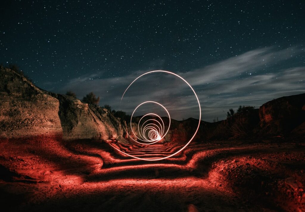
Image sourced from unsplash.com
Here is the HTML and CSS to implement this CSS mask effect.
<!DOCTYPE html>
<html>
  <head>
    <style>
      .ml1 {
        -webkit-mask-image: url(https://d33wubrfki0l68.cloudfront.net/d319533ac3d22c3186498254e0caee871796a29e/d7ce9/images/css/masking/image-mask.png);
        mask-image: url(https://d33wubrfki0l68.cloudfront.net/d319533ac3d22c3186498254e0caee871796a29e/d7ce9/images/css/masking/image-mask.png);
        -webkit-mask-repeat: no-repeat;
        mask-repeat: no-repeat;
      }
    </style>
  </head>

  <body>
    <h1 style="text-align: center">Using Image As Mask Layer</h1>
    <div class="ml1" style="width: 550px; margin: 0 auto;">
      <img src="https://images.unsplash.com/photo-1580824026089-8b429c3834f0?ixlib=rb-1.2.1&ixid=MnwxMjA3fDB8MHxwaG90by1wYWdlfHx8fGVufDB8fHx8" alt="Night Lights" width="550" height="350">
    </div>
  </body>
</html>
Output-

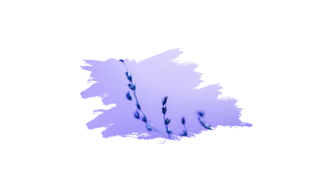
You can also use other CSS image layer masks like this marker mask.
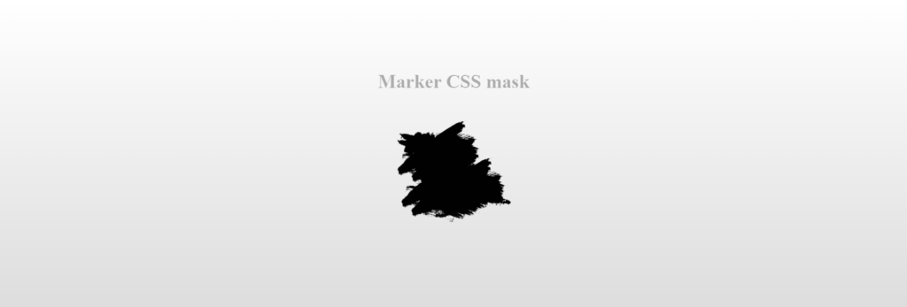
Image to have the mask applied to. This image can be found on unsplash.com
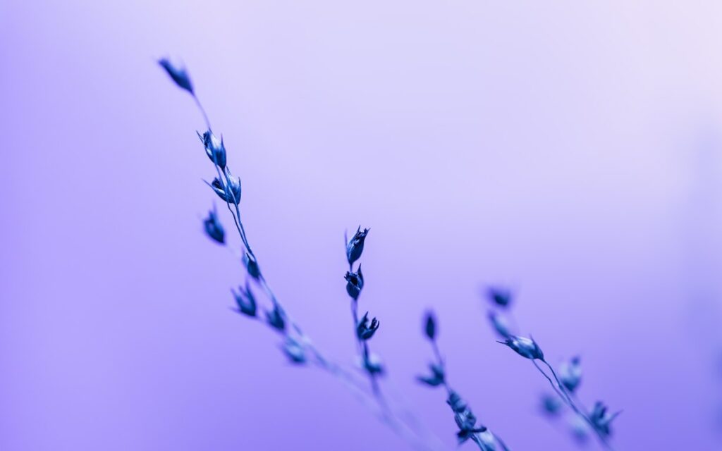
As you see, the result is the interior silhouette of the image after the mask layer is applied.
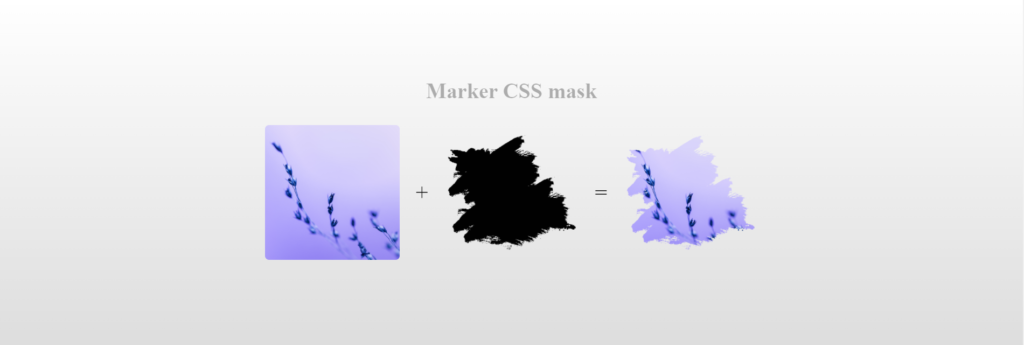
HTML for the marker mask layer-
<div class="container">
  <div class="wrapper">
    <h1>Marker CSS mask</h1>
    <div class="instamask">
      <img src="https://images.unsplash.com/photo-1644174735211-9a0c61400e0e?ixlib=rb-1.2.1&ixid=MnwxMjA3fDB8MHxwaG90by1wYWdlfHx8fGVufDB8fHx8" alt="" />
      <span>+</span>
      <img src="https://tympanus.net/codrops-playground/assets/images/cssref/properties/mask-position/mask-image.png" alt="" />
      <span>=</span>
      <img class="mask-layer" src="https://images.unsplash.com/photo-1644174735211-9a0c61400e0e?ixlib=rb-1.2.1&ixid=MnwxMjA3fDB8MHxwaG90by1wYWdlfHx8fGVufDB8fHx8" alt="" />
    </div>
  </div>
</div>
CSS for the marker mask layer-
.instamask {
  margin: 20px auto;
  text-align: center;
}

.instamask img {
  width: 200px;
  height: 200px;
  object-fit: cover;
  border-radius: 6px;
}

.instamask > * {
  display: inline-block;
  margin: 10px;
  vertical-align: middle;
  font-size: 2em;
}

.mask-layer {
  -webkit-mask-image: url(https://tympanus.net/codrops-playground/assets/images/cssref/properties/mask-position/mask-image.png);
  mask-image: url(https://tympanus.net/codrops-playground/assets/images/cssref/properties/mask-position/mask-image.png);
    -webkit-mask-size: 100% 100%; */
     -webkit-mask-position: center;
  transition: -webkit-mask-size .3s;
}

.instamask img:hover {
  -webkit-mask-size: calc(100% / 3) calc(100% / 3);
}

html {
  text-align: center;
  min-height: 100%;
  background: linear-gradient(white, #ddd);
}

h1,
p {
      margin-top: 20px;
  color: rgba(0, 0, 0, 0.3);
}

.container {
  width: 100%;
  background: transparent;
  text-align: center;
  -webkit-box-align: center !important;
  -ms-flex-align: center !important;
  align-items: center !important;
  -webkit-box-pack: center !important;
  -ms-flex-pack: center !important;
  justify-content: center !important;
  display: -webkit-box !important;
  display: -ms-flexbox !important;
  display: flex !important;
  height: 100%;
}

html, body {
  height: 100%;
  margin: 0;
}

.wrapper {
  height: 318px;
}
Output-
Using Gradient As Mask Layer
CSS linear and radial gradients can also be used as mask images. Using a CSS gradient as your mask is an elegant way of achieving a masked area without needing to go to the trouble of creating an image or SVG. A simple linear gradient used as a mask could ensure that the bottom part of an image will not be too dark underneath a caption.
Let’s use the image above and add the linear gradient as a mask layer.
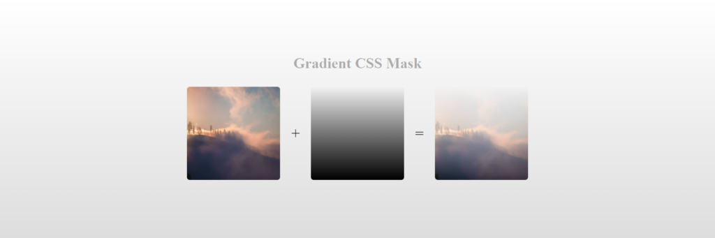
Update the .ml1 class like this-
-webkit-mask-image: linear-gradient(black, transparent);
mask-image: linear-gradient(black, transparent);
Practical representation-
<div class="ml1" style="width: 550px; margin: 0 auto;">
  <img src="https://images.unsplash.com/photo-1643948962441-c8947e0fe565?ixlib=rb-1.2.1&ixid=MnwxMjA3fDB8MHxwaG90by1wYWdlfHx8fGVufDB8fHx8&auto=format&fit=crop&w=1170&q=80" alt="Mountains" width="550" height="350">
</div>
.ml1 {
-webkit-mask-image: linear-gradient(transparent, black);
mask-image: linear-gradient(transparent, black);
-webkit-mask-repeat: no-repeat;
mask-repeat: no-repeat;
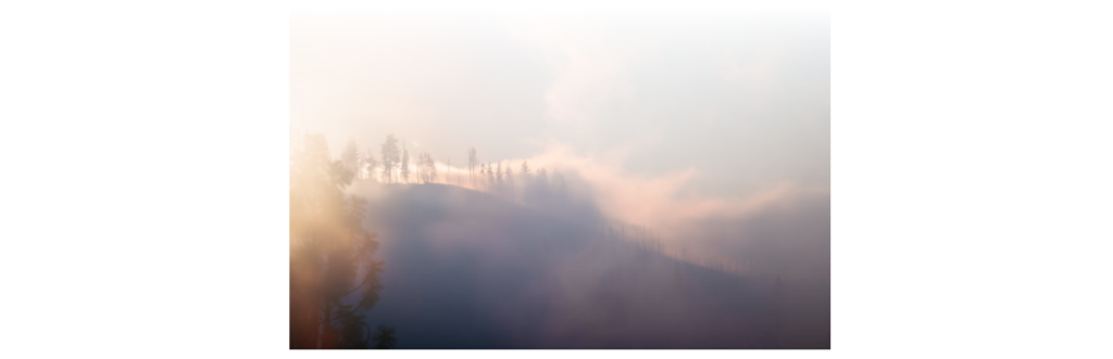
}Output-
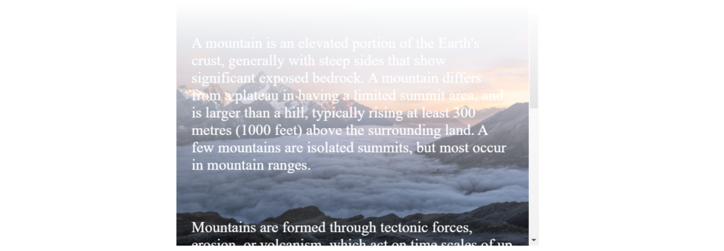
Now, let’s use a linear gradient and text masking as the mask layer for our image.
Text masking is an elegant, simple, and time-proven way of transforming taglines or slogans into the show’s star.
In the <style> tag, add these lines to define the text format that we need to display.
p {
  font-size: 25px;
  padding: 25px;
  color: white;
}
Change the contents of class .ml1 as-
.ml1 {
max-width: 600px;
height: 400px;
overflow-y: scroll;
background: url(https://images.unsplash.com/photo-1506905925346-21bda4d32df4?ixlib=rb-1.2.1&ixid=MnwxMjA3fDB8MHxwaG90by1wYWdlfHx8fGVufDB8fHx8)
no-repeat;
-webkit-mask-image: linear-gradient(transparent, black);
mask-image: linear-gradient (transparent, black);
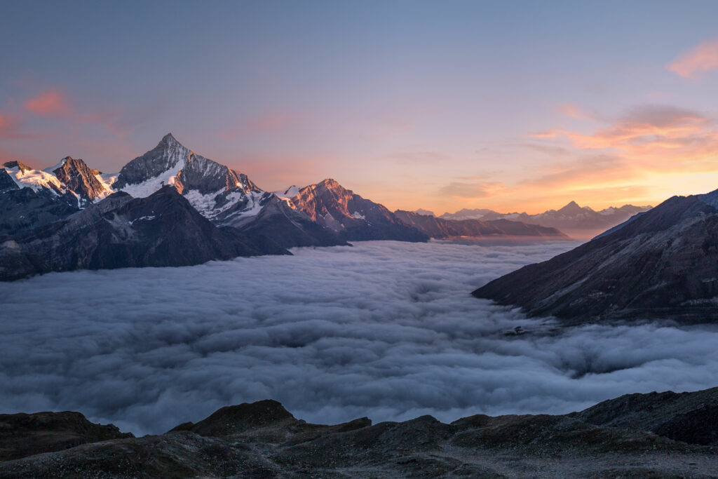
}Here, we use another mountain image as the background.
The overflow-y property specifies whether to clip the content, add a scroll bar, or display overflow content of a block-level element when it overflows at the top and bottom edges.
overflow-y: scroll;We will use this to add a scroll bar. Now, all you need to do is add the information you want to display in the <p> tags.
Here, is the complete compilation of the code-
<div class="ml1">
  <p>A mountain is an elevated portion of the Earth's crust, generally with steep sides that show significant exposed bedrock. A mountain differs from a plateau in having a limited summit area, and is larger than a hill, typically rising at least 300 metres (1000 feet) above the surrounding land. A few mountains are isolated summits, but most occur in mountain ranges.</p>
  <p>Mountains are formed through tectonic forces, erosion, or volcanism, which act on time scales of up to tens of millions of years. Once mountain building ceases, mountains are slowly leveled through the action of weathering, through slumping and other forms of mass wasting, as well as through erosion by rivers and glaciers.</p>
  <p>High elevations on mountains produce colder climates than at sea level at similar latitude. These colder climates strongly affect the ecosystems of mountains: different elevations have different plants and animals. Because of the less hospitable terrain and climate, mountains tend to be used less for agriculture and more for resource extraction, such as mining and logging, along with recreation, such as mountain climbing and skiing.</p>
</div>
p {
font-size: 25px;
padding: 25px;
color: white;
}
.ml1 {
margin: 0 auto;
max-width: 600px;
height: 400px;
overflow-y: scroll;
background: url(https://images.unsplash.com/photo-1506905925346-21bda4d32df4?ixlib=rb-1.2.1&ixid=MnwxMjA3fDB8MHxwaG90by1wYWdlfHx8fGVufDB8fHx8)
no-repeat;
background-size: cover;
-webkit-mask-image: linear-gradient(transparent, black);
mask-image: linear-gradient (transparent, black);
}
Output-
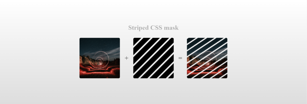
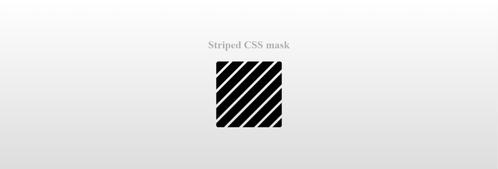
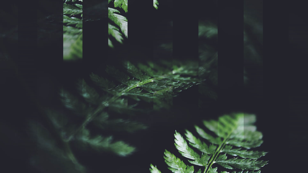
Here is another example of using a gradient as a mask layer. This image includes a linear gradient to create stripes in this fern image.
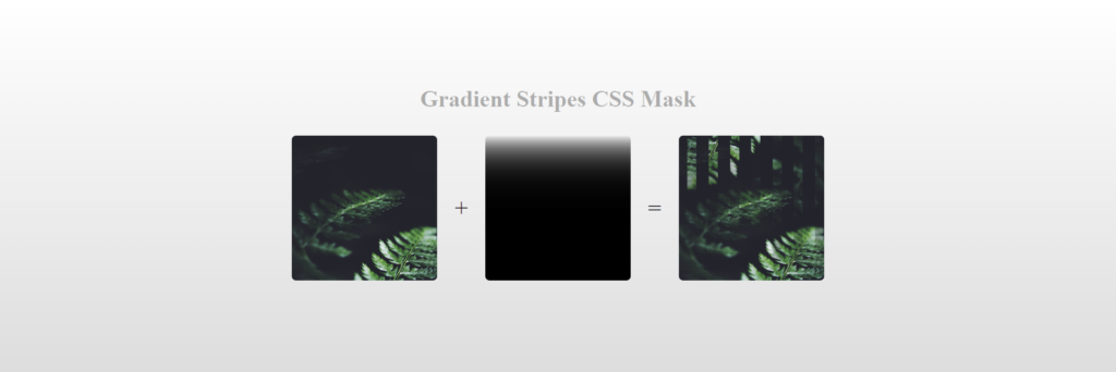
As you see in the image above, the fern has blurred stripes. These stripes are created using the mask-image property combined with a linear gradient.
-webkit-mask-image: linear-gradient(to bottom, transparent, rgba(0, 0, 0, 0.99)), linear-gradient(to bottom, transparent, rgba(0, 0, 0, 0.99)), linear-gradient(to bottom, transparent, rgba(0, 0, 0, 0.99)), linear-gradient(to bottom, transparent, rgba(0, 0, 0, 0.99)), linear-gradient(to bottom, transparent, rgba(0, 0, 0, 0.99)), linear-gradient(to bottom, transparent, rgba(0, 0, 0, 0.99)), linear-gradient(to bottom, transparent, rgba(0, 0, 0, 0.99)), linear-gradient(to bottom, transparent, rgba(0, 0, 0, 0.99));Addionally a mask-position property is used. The mask position positions the mask layer over the image.
-webkit-mask-position: 0% 0, 15.625% 0, 31.25% 0, 46.875% 0, 62.5% 0, 78.125% 0, 93.75% 0, 109.375% 0;Complete code to produce striped fern using CSS mask image.
*, *:before, *:after {
  margin: 0;
  padding: 0;
  box-sizing: border-box;
}

html,
body {
  width: 100%;
  height: 100%;
}

body,
body:after {
  background-image: url("https://s3-us-west-2.amazonaws.com/s.cdpn.io/46992/noah-silliman-141979.jpg");
  background-size: cover;
  background-position: center;
}

body:after {
  content: "";
  position: absolute;
  top: 0;
  left: 0;
  width: 100%;
  height: 100%;
  transform: rotate(180deg);
  -webkit-mask-image: linear-gradient(to bottom, transparent, rgba(0, 0, 0, 0.99)), linear-gradient(to bottom, transparent, rgba(0, 0, 0, 0.99)), linear-gradient(to bottom, transparent, rgba(0, 0, 0, 0.99)), linear-gradient(to bottom, transparent, rgba(0, 0, 0, 0.99)), linear-gradient(to bottom, transparent, rgba(0, 0, 0, 0.99)), linear-gradient(to bottom, transparent, rgba(0, 0, 0, 0.99)), linear-gradient(to bottom, transparent, rgba(0, 0, 0, 0.99)), linear-gradient(to bottom, transparent, rgba(0, 0, 0, 0.99));
  mask-image: linear-gradient(to bottom, transparent, rgba(0, 0, 0, 0.99)), linear-gradient(to bottom, transparent, rgba(0, 0, 0, 0.99)), linear-gradient(to bottom, transparent, rgba(0, 0, 0, 0.99)), linear-gradient(to bottom, transparent, rgba(0, 0, 0, 0.99)), linear-gradient(to bottom, transparent, rgba(0, 0, 0, 0.99)), linear-gradient(to bottom, transparent, rgba(0, 0, 0, 0.99)), linear-gradient(to bottom, transparent, rgba(0, 0, 0, 0.99)), linear-gradient(to bottom, transparent, rgba(0, 0, 0, 0.99));
  -webkit-mask-position: 0% 0, 15.625% 0, 31.25% 0, 46.875% 0, 62.5% 0, 78.125% 0, 93.75% 0, 109.375% 0;
  mask-position: 0% 0, 15.625% 0, 31.25% 0, 46.875% 0, 62.5% 0, 78.125% 0, 93.75% 0, 109.375% 0;
  -webkit-mask-size: 6.25% 100%;
  mask-size: 6.25% 100%;
  -webkit-mask-repeat: no-repeat;
  mask-repeat: no-repeat;
}
Output-
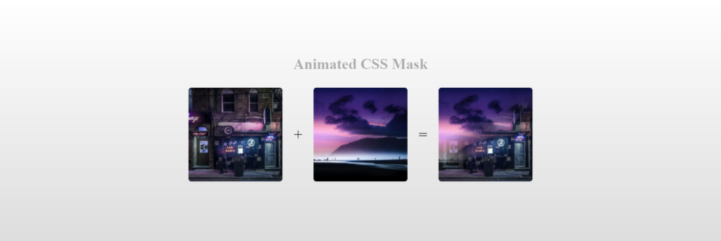
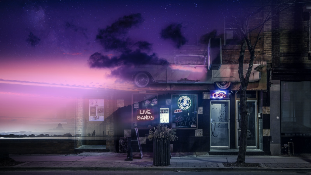
Using Mask Image To Create Animation
Another trick you can do is create an animation using CSS mask image and JavaScript. This example includes two images that fade circularly to show the other image.
We need to create the background and foreground, so we do that with HTML.
<main>
  <div class="background"></div>
  <div class="foreground"></div>
</main>
Next, we will create the CSS that sets the images to the HTML elements by implementing a linear gradient mask layer and the background image properties.
:root {
  --direction: -45deg;
}

body {
  margin: 0;
  padding: 0;
}

main {
  position: relative;
}

div {
  position: absolute;
  top: 0;
  left: 0;
  width: 100vw;
  height: 100vh;
  background-size: cover;
  background-repeat: none;
}

.background {
  background-image: url(https://images.unsplash.com/photo-1456743625079-86a97ff8bc86?crop=entropy&cs=tinysrgb&fit=crop&fm=jpg&h=900&ixid=MnwxfDB8MXxyYW5kb218MHx8bmlnaHR8fHx8fHwxNjQ1NzQ3NDkx&ixlib=rb-1.2.1&q=80&utm_campaign=api-credit&utm_medium=referral&utm_source=unsplash_source&w=1600);
}

.foreground {
  background-image: url(https://images.unsplash.com/photo-1504892612018-159ffa1d147f?crop=entropy&cs=tinysrgb&fit=crop&fm=jpg&h=900&ixid=MnwxfDB8MXxyYW5kb218MHx8bmlnaHR8fHx8fHwxNjQ1NzQ3NDE3&ixlib=rb-1.2.1&q=80&utm_campaign=api-credit&utm_medium=referral&utm_source=unsplash_source&w=1600);
  -webkit-mask-image: linear-gradient(var(--direction), black 40%, rgba(0, 0, 0, 0) 60%);
  -webkit-mask-position: 50% 50%;
}
With the HTML and CSS, our mini project is almost complete. Without JavaScript to animate, the animation won’t work. The JavaScript below uses the requestAnimationFrame function to set the degrees on the linear gradient.
let c = 45;

function draw() {
  document.documentElement.style.setProperty("--direction", c++ + "deg");
  requestAnimationFrame(draw);
}

requestAnimationFrame(draw);
The HTML, CSS, and JavaScript combined will output the image below with animation.
Using Text With Mask Image
Another cool feature about mask images is that text flow works with the applied mask shapes. Check out the images below. When the user hovers on an image, the text information is shown within the mask applied.
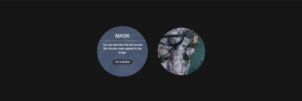
Info- You can see the text avoids the circular mask applied to the image.
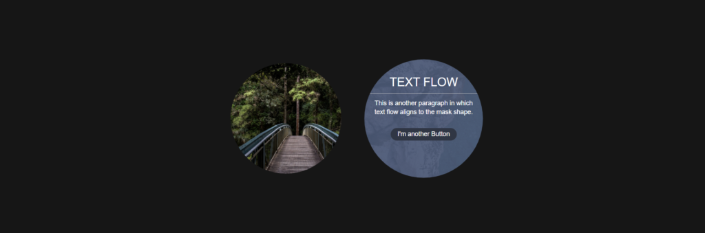
Info- Above is a paragraph that the text flow that aligns to the mask shape.
This is the HTML structure to create the circular cards with hidden text and buttons.
<div class="container">
  <section class="shape nerds">
    <a href="#" class="overlay round"></a>
    <div class="details bg">
      <header>Mask</header>
      <p>You can see here the text avoids the circular mask applied to the image.</p>
      <a href="/" class="button">I'm a Button</a>
    </div>
  </section>
  <section class="shape techmarkt">
    <a href="#" class="overlay octagon"></a>
    <div class="details">
      <header>Text Flow</header>
      <p>This is another paragraph in which text flow aligns to the mask shape.</p>
      <a href="#" class="button">I'm another Button</a>
    </div>
  </section>
</div>
The CSS code below applies a transform scale property and makes the text appear whenever the user hovers the images.
html,
body {
  margin: 0;
  padding: 0;
  font-size: 14px;
  font-family: "Helvetica Neue", Helvetica, sans-serif;
  text-align: center;
  background: #161616;
  height: 100%;
}

section {
  display: inline-block;
}

.shape {
  position: relative;
  width: 300px;
  height: 300px;
  background-color: #fff;
  overflow: hidden;
}

.shape .details {
  display: none;
  width: 310px;
  height: 310px;
  padding-top: 60px;
  color: #fff;
  background: rgba(75, 90, 120, 0.9);
}

.details header {
  display: block;
  padding-bottom: 10px;
  font-size: 26px;
  text-transform: uppercase;
  border-bottom: 1px solid #ccc;
}

.details p {
  width: 70%;
  margin: 10px auto;
  line-height: 1.4;
}

.button {
  position: relative;
  z-index: 2;
  display: inline-block;
  padding: 5px 15px;
  margin-top: 15px;
  text-decoration: none;
  color: #fff;
  background-color: #2f3644;
  border-radius: 20px;
}

.button:hover {
  background-color: #fff;
  color: #2f3644;
}

.shape.techmarkt {
  background: url(https://images.unsplash.com/photo-1645038151783-6dbc1d8643ec?ixlib=rb-1.2.1&ixid=MnwxMjA3fDB8MHxwaG90by1wYWdlfHx8fGVufDB8fHx8)
    no-repeat 30% 0%;
  background-size: cover;
}

.shape.nerds {
  background: url(https://images.unsplash.com/photo-1447752875215-b2761acb3c5d?ixlib=rb-0.3.5&q=80&fm=jpg&crop=entropy&w=1080&fit=max&s=e18a8e9c0b879cfb054cd6ee89ecf803)
    no-repeat 30% 0%;
  background-size: cover;
}

.shape:hover .details {
  display: block;
}

.overlay {
  position: absolute;
  top: 0;
  left: 0;
  width: 310px;
  height: 310px;
  background-repeat: no-repeat;
  background-position: 0 0;
  z-index: 1;
  outline: 0;
  transition: transform 0.6s ease-out;
  transform: scale(1);
}

.shape:hover .overlay {
  transform: scale(1.07);
}

.overlay.octagon {
  background-image: url(https://htmlacademy.ru/assets/course76/round.svg);
}

.overlay.round {
  background-image: url(https://htmlacademy.ru/assets/course76/round.svg);
}

.container {
  width: 100%;
  background: transparent;
  text-align: center;
  -webkit-box-align: center !important;
  -ms-flex-align: center !important;
  align-items: center !important;
  -webkit-box-pack: center !important;
  -ms-flex-pack: center !important;
  justify-content: center !important;
  display: -webkit-box !important;
  display: -ms-flexbox !important;
  display: flex !important;
  height: 100%;
}
Conclusion
I hope this article will assist you in creating a mask layer and applying it to another image.
Now, you know that masking is a technique that lets you display selected portions of an element or an image on the screen while hiding the rest. These features allow you to display masking effects on images and other elements in the browser without using image editing software, which is beneficial and time-saving.
Recommended Articles
- The CSS justify-self Property
- The Awesome CSS Transform Property and Scale Function
- Explaining the Scale Property in CSS
- A Guide on How To Use CSS Grids for Layouts