AppCode
This article demonstrates how to create a semi-transparent button over a scenic background. Included is code, image, and other references.
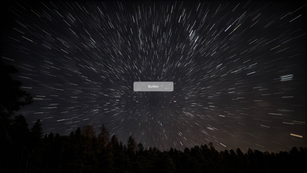
I recently designed a website that required a photo background. However, the client wanted a button on the same background. So, I decided to opt for a ghost button. Thanks to the transparency of the button’s background, the ghost button will not distract the eyes from the content in the photographic scene. It is more effective than you would have on a solid-colored background. So let’s keep reading to figure out how the transparency was created.
Creating a Transparent Button
How do we make the transparent button possible? Here’s an example:
The CSS property for the semi-transparent white background is:
background: rgba(255, 255, 255, 0.5);Let’s proceed to create the entire webpage by including the HTML and CSS code below.
HTML
<a class="semi-transparent-button" href="#">Button</a>CSS
body {
  height: 100%;

  background: url('https://images.unsplash.com/photo-1651010397255-06a8dc60d0ab?ixlib=rb-1.2.1&ixid=MnwxMjA3fDB8MHxwaG90by1wYWdlfHx8fGVufDB8fHx8');
  background-size: cover;
  display: flex;
  flex-wrap: wrap;
  align-items: center;
  justify-content: center;
  margin: 0;
  font-family: Arial;
}

html {
  height: 100%;
  margin: 0;
}

.semi-transparent-button {
  display: block;
  box-sizing: border-box;
  margin: 0 auto;
  padding: 15px;
  width: 80%;
  max-width: 200px;
  background: #fff;
  background: rgba(255, 255, 255, 0.5);
  border-radius: 8px;
  color: #fff;
  text-align: center;
  text-decoration: none;
  letter-spacing: 1px;
  transition: all 0.3s ease-out;
}
There you have it. You should now have a webpage that looks similar to the image above.
Applying transparency isn’t limited to only buttons. We’ve written an article demonstrating transparency and opacity using stacked layers above an image. The transparency is controlled via two range inputs. Direct Link →
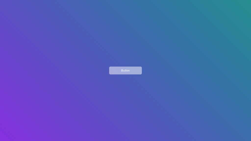
You can also switch out the background property in the body element with a gradient.
background: linear-gradient(45deg, blueviolet, #088f8f);The background now has a gradient.
Definitions of WebKit Browsers
The transparency results on WebKit browsers are pretty mixed. However, opting for an sRGB profile could make them look identical. The interesting part is when using two monitors, dragging the window between the two monitors can make a notable transparency difference because of the color profiles set on both panels. Fortunately, the difference isn’t often noteworthy.
Next→
Recommend Articles
- Diving into Conic and Radial Color Gradients in CSS
- Tips for Writing Modern CSS
- Fundamentals All Developers Should Know About CSS
- Template CSS Media Queries
- How To Use CSS (Cascading Style Sheets) To Style HTML
- A Guide on How To Use CSS Grids for Layouts