AppCode
This tutorial will show how to create a responsive flexbox grid, like Imgur or Pinterest, using CSS queries and no JavaScript or jQuery. (Updated on February 23, 2022)
It’s attractive when you can place content on your site in a grid-like formation. Don’t you love it when you can resize the screen or change the device’s orientation, and the content adapts? Well, good news, you can create a responsive flexbox grid.
A responsive flexbox grid is just as it sounds, a responsive grid. There are many examples of this online; for example, Imgur and Pinterest use grids to display their content.
The grids they use are also responsive, changing and adapting to different screen sizes. This tutorial will show you how to create a responsive flexbox grid using no JavaScript or jQuery.
How CSS Flexbox Works
CSS Flexbox was designed to dynamically allow content within containers to be spaced according to an unknown size. It’s more efficient than using float and width CSS properties.
Natively CSS Flexbox distributes the width of each item in a flexbox container to fill the space and prevent overflow. The items will shrink or expand according to the parent flexbox container width. The browser will automatically calculate the width of each item in a flexbox container.
Flexbox allows the items to be stacked (column) or side-by-side (row). With this flexibility, one could use CSS media queries to tell the flexbox container to display the child elements as a row or columnize them.
/* On screens that are 992px or less, triggers the CSS properties */
@media screen and (max-width: 992px) {
  .column {
    /* Some CSS Properties */
  }
}

/* On screens that are 600px or less, triggers the CSS properties */
@media screen and (max-width: 600px) {
  .column {
    /* Some CSS Properties */
  }
}
Creating a Responsive Flexbox Grid
This tutorial will require some basic knowledge of HTML and CSS. We won’t be using JavaScript or jQuery. Let’s get started by adding HTML to create the structure and model for the grid. Below, you’ll find the code to create the model for the grid.
<div>
  <h2>Responsive Flexbox Grid</h2>
  <p>Resize the browser window to see the grid adapt to the new window size.</p><br><br>
</div>
<div class="flex-container">
  <div class="column">
    <div class="content-container">1</div>
    <div class="content-container">2</div>
    <div class="content-container">3</div>
  </div>
  <div class="column">
    <div class="content-container">4</div>
    <div class="content-container">5</div>
    <div class="content-container">6</div>
  </div>
  <div class="column">
    <div class="content-container">7</div>
    <div class="content-container">8</div>
    <div class="content-container">9</div>
  </div>
  <div class="column">
    <div class="content-container">10</div>
    <div class="content-container">11</div>
    <div class="content-container">12</div>
  </div>
</div>
Info: When we call an element by its name, we will be referring to the CSS class name the element was given.
Essentially, we are adding four div elements to an element called .flex-container using a CSS class as the reference. When the screen changes, we will use CSS media queries to dictate the number of child elements in the .flex-container allowed in a row. Each of these four div elements will be called .column and they will function just as the name indicates. The columns will have child elements, and these elements within each .column will be the container for the content you would like to place on your website.
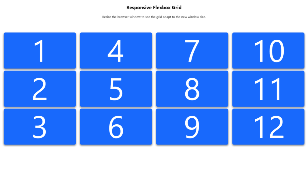
Rendering of Grid Without CSS
Below is a rendering of the grid without any styling or layout properties. It doesn’t look charming, so it’s required that we need to decorate the grid to give it some fashion and love.
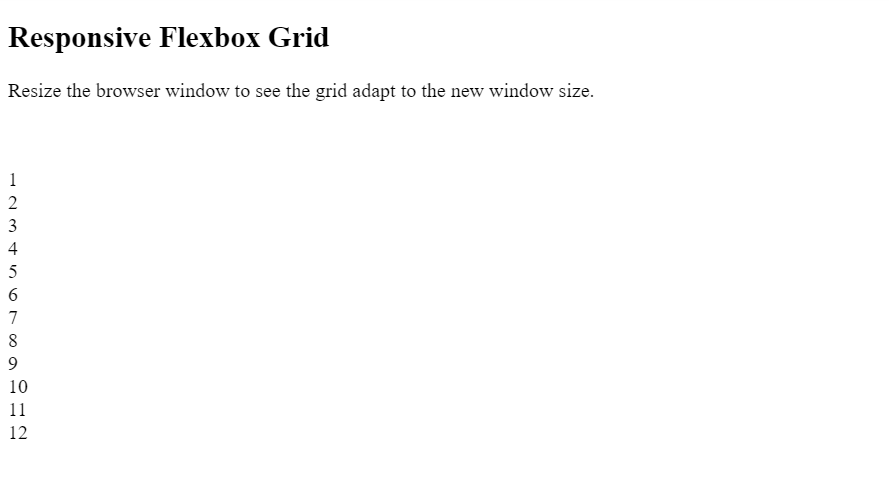
So as you see above, it’s essential again that we must use CSS to achieve the looks and functionality of a flexbox grid.
Giving the Grid Style
Let’s give the grid some style! Below we will add styling to all the HTML elements in the structure above.
html {
  font-family: -apple-system, BlinkMacSystemFont, "Segoe UI", Roboto, Oxygen,
    Ubuntu, Cantarell, "Open Sans", "Helvetica Neue", sans-serif;
}

h2 {
  text-align: center;
}

p {
  text-align: center;
}

.flex-container {
  width: 100%;
  overflow: auto;
  display: flex;
  flex-wrap: wrap;
  overflow: hidden;
}

.content-container {
  height: 180px;
  background: #0066ff;
  line-height: 180px;
  text-align: center;
  color: white;
  font-size: 20vh;
  width: 100%;
  margin: 10px 0;
  box-shadow: 0 5px 9px 0 #0000008c;
  border-radius: 8px;
}

.column {
  padding: 0 10px;
  box-sizing: border-box;
  flex: 25%;
  max-width: 25%;
}

@media (max-width: 800px) {
  .column {
    flex: 50%;
    max-width: 50%;
  }
}

@media (max-width: 400px) {
  .column {
    flex: 100%;
    max-width: 100%;
  }
}

.content-container:hover {
  background: #2055a4;
}
Important CSS properties to take note of are the .flex-container and the .column class. The flex-container class declares that all its children elements are part of a flex display. The declaration is done using the display and flex-wrap property.
.flex-container {
  display: flex;
  flex-wrap: wrap;
  /* Other Properties */
}
The column class tells the grid how the columns will work within the flexbox grid. The flex and max-width property set the size of the column to 25%.
.column {

  flex: 25%;
  max-width: 25%;

  /* Other CSS Properties */
}
How the Grid Works
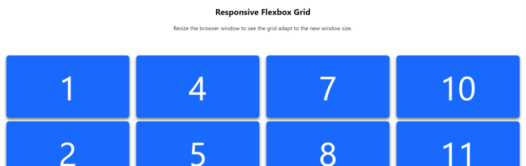
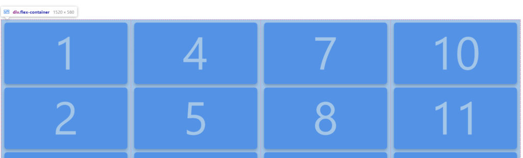
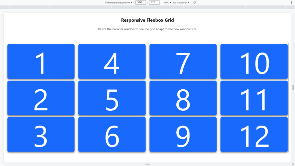
By default, the flexbox grid sets the columns as 25%. Since 25% is 1/4 of 100. That means all four columns will be in the “flex-container” as a row.
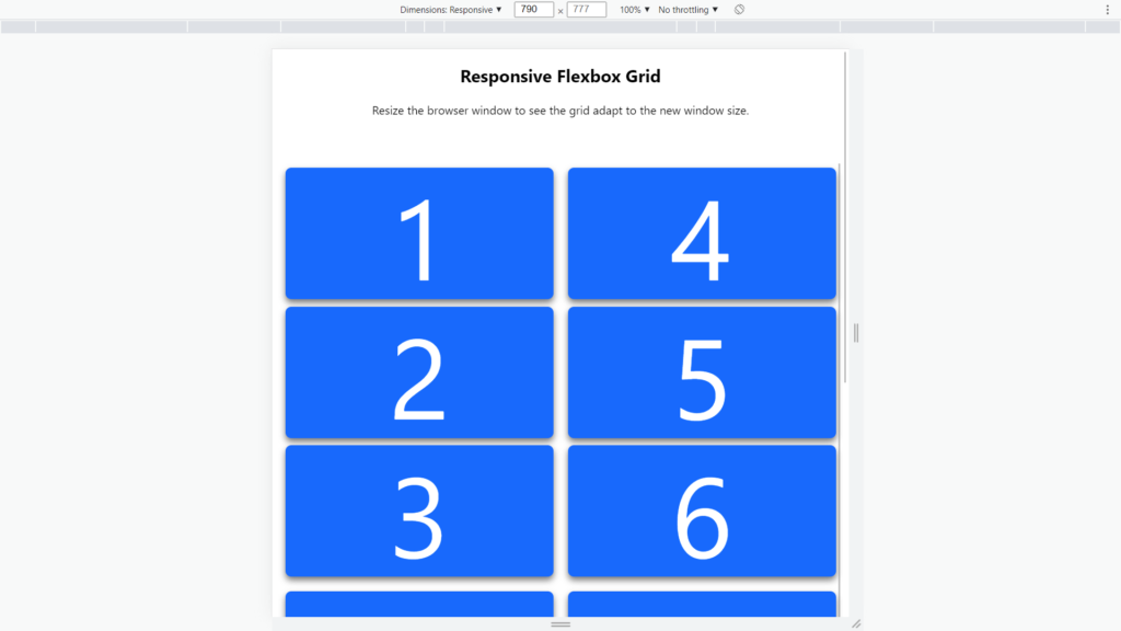
When the screen size is between 800 and 400 pixels. The “max-width: 800px” CSS media query is activated. This sets each column to be 50% of the available space within the “flex-container”. This would result in two columns being displayed simultaneously next to each other.
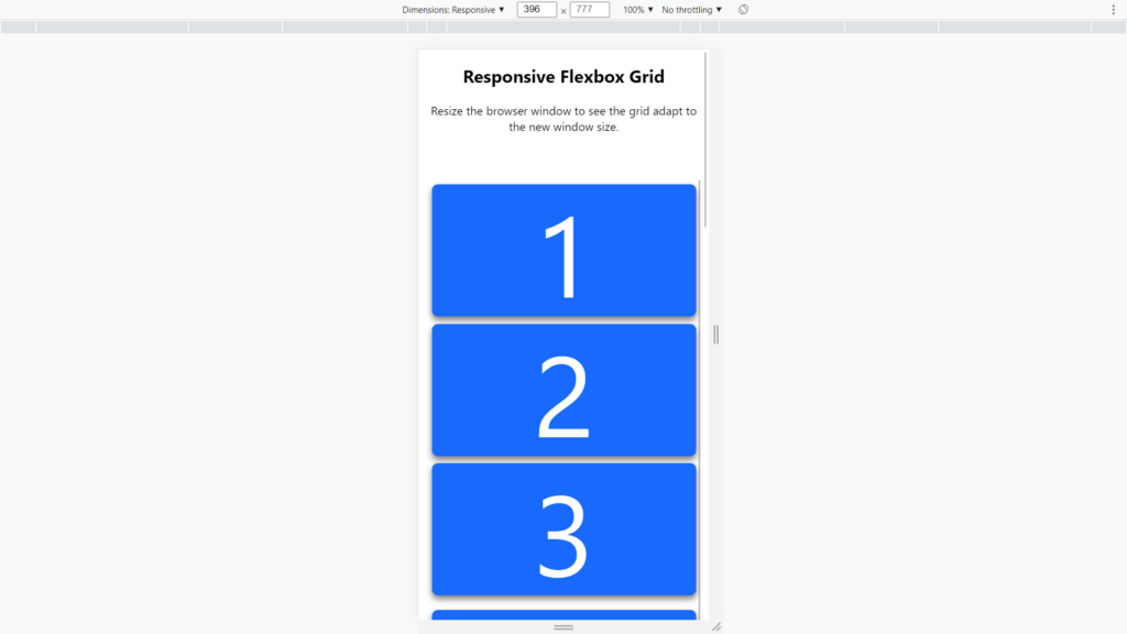
The last media query will be activated at 400 pixels. At 400 pixels, we set each column to be 100% of the area in the flexbox. This stacks all the columns on top of each other, which looks like a single large content column.
.column {
  flex: 25%;
  max-width: 25%;
}

@media (max-width: 800px) {
  .column {
    flex: 50%;
    max-width: 50%;
  }
}

@media (max-width: 400px) {
  .column {
    flex: 100%;
    max-width: 100%;
  }
}
Rendering the Flexbox Grid
You are rendering the responsive flexbox grid with the HTML and CSS together.
Edit and Use This Example
You can find the code for this example on codepen.io. Just click this link: Responsive Flexbox Grid.
Recommended Content
- CSS Flexbox Navigation Menus Tutorial and Examples
- 15 Flexbox CSS Examples and Code
- A Guide on How To Use CSS Grids for Layouts