AppCode
This article demonstrates how to create CSS color palettes, and palette hover effects with an example walk-through and related questions. In addition to a walk-through on color scheme palettes, we use a responsive flexbox container to hold our color cards using jQuery classes.
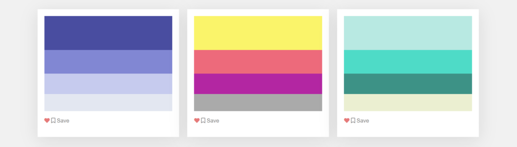
A brief summary of the walk-through is that we will create several color combination tiles placed in a grid. Each color palette will implement an animation effect when the cursor hovers over each card using a cubic-bezier timing function in a CSS animation property.
We will be using two types of color schemes in this example. The first color scheme is a gradient using hues of the same or related colors. However, the second scheme will be a tetradic color combination consisting of three colors with a fourth accent. Both of these schemes are created with the CSS background property.
Frequently Asked Questions
Before creating the example in the above image, let’s explore some frequently asked questions about color themes, combinations, and schemes.
What is a theme in CSS?
A web page or site usually contains a theme made up of a set of CSS color properties that create a theme of colors. In summary, a theme is considered a set of styles worn by a website; these styles are the theme CSS properties. These themes are frequently created with individual CSS style sheets containing all the properties necessary to draw the theme. These theme style sheets can be swapped out on user setting preferences or actions, such as when they change to a light or dark mode with an available setting.
What are color schemes in CSS?
A color scheme is considered the colors used in various artistic and design contexts throughout the concept of color theory. For example, the achromatic system uses black text with a white background and is an example of a fundamental and common default color scheme in web design. Another color scheme example could be a 4 color, tetradic color combination. In simple terms, a color scheme in CSS is a combination of colors used to make a theme of a website or page using CSS styles and properties.
What are the 4 types of color schemes?
The four primary color schemes are monochromatic, two-color, three-color, and four-color. One color is a monochromatic color scheme that uses varying tints and shades, while the two, three, and four-scheme methods use the number of colors in their respective names.
What is a color scheme with 4 colors?
The tetradic color combination is a scheme that includes one primary and two complementary colors, and it also uses one additional color that highlights accents. All four shades are distributed evenly around the color wheel, so one color has no clear dominance.
Why is a color scheme important?
One of the first elements in a webpage is a color scheme that communicates the message behind the design. Both visual and psychological levels are part of a color scheme’s message. A color scheme, in fact, is one of the most crucial design aspects because, when used ideally, color can reflect an overall business marketing strategy and niche. A good color scheme can allow a business to drastically increase the number of customers using its service, various conversions on sales, products, etc. Overall a good color scheme can increase the success of a business when implemented correctly.

Creating a Color Palette Flex Container
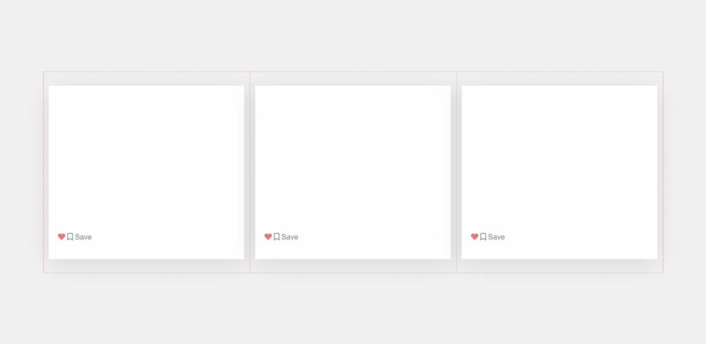
The first task we must perform is to create a grid of scheme tiles using a flexbox, the grid containing our color scheme tiles. The HTML code below creates rows and columns for the color palette layout. These rows and columns are made with the help of a third-party CSS library called Bootstrap, and will explain how to add the Bootstrap library at the end of the article. CSS classes such as .container, .row, and .col-md-5 are part of the library and are not included in our custom CSS.
Additionally, in the HTML snippet, we have created elements with a class name of .colors. The .color elements are the parent element of each card. The parent element produces a card’s box shadow and white background, four color rectangles that create a particular scheme, and a few clickable buttons.
At the bottom of the .color element is an element that includes two action buttons. One button has a favorite icon, and the other has a bookmark. We added these buttons to demonstrate how you could add tiles to a website with actions such as favoriting and saving a scheme to a user’s account. These icons come from Font-Awesome, which includes a vast library of other icons you could switch to your preference. We will have more information on Font-Awesome towards the end of the article.

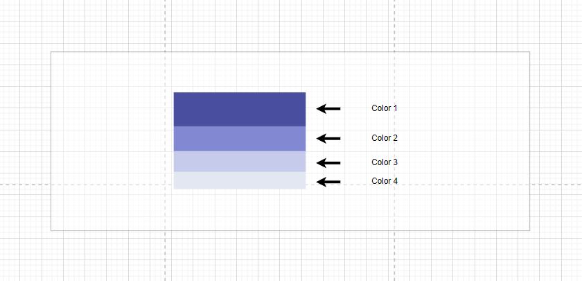
The most significant part of each card is the HTML elements with the .color-item class. These elements are the different colors that make up each individual scheme. The colors for each .color-item are created using a unique CSS background property.
Now that we understand the different parts that make up the structure of each card let’s move forward to adding the HTML code below to a web page.
HTML
<div class="colors-container">
  <div class="container">
    <div class="row">
      <div class="col-md-4">
        <div class="colors box-1">
          <span class="color-item"></span>
          <span class="color-item"></span>
          <span class="color-item"></span>
          <span class="color-item"></span>
          <div class="color-buttons py-3">
            <div class="like-btn d-inline-block float-left">
              <i class="fas fa-heart"></i>
            </div>
            <div class="save-btn d-inline-block float-right">
              <i class="far fa-bookmark"></i> Save
            </div>
          </div>
        </div>
      </div>
      <div class="col-md-4">
        <div class="colors box-2">
          <span class="color-item"></span>
          <span class="color-item"></span>
          <span class="color-item"></span>
          <span class="color-item"></span>
          <div class="color-buttons py-3">
            <div class="like-btn d-inline-block float-left">
              <i class="fas fa-heart"></i>
            </div>
            <div class="save-btn d-inline-block float-right">
              <i class="far fa-bookmark"></i> Save
            </div>
          </div>
        </div>
      </div>
      <div class="col-md-4">
        <div class="colors box-3">
          <span class="color-item"></span>
          <span class="color-item"></span>
          <span class="color-item"></span>
          <span class="color-item"></span>
          <div class="color-buttons py-3">
            <div class="like-btn d-inline-block float-left">
              <i class="fas fa-heart"></i>
            </div>
            <div class="save-btn d-inline-block float-right">
              <i class="far fa-bookmark"></i> Save
            </div>
          </div>
        </div>
      </div>
      <div class="col-md-4">
        <div class="colors box-4">
          <span class="color-item"></span>
          <span class="color-item"></span>
          <span class="color-item"></span>
          <span class="color-item"></span>
          <div class="color-buttons py-3">
            <div class="like-btn d-inline-block float-left">
              <i class="fas fa-heart"></i>
            </div>
            <div class="save-btn d-inline-block float-right">
              <i class="far fa-bookmark"></i> Save
            </div>
          </div>
        </div>
      </div>
      <div class="col-md-4">
        <div class="colors box-5">
          <span class="color-item"></span>
          <span class="color-item"></span>
          <span class="color-item"></span>
          <span class="color-item"></span>
          <div class="color-buttons py-3">
            <div class="like-btn d-inline-block float-left">
              <i class="fas fa-heart"></i>
            </div>
            <div class="save-btn d-inline-block float-right">
              <i class="far fa-bookmark"></i> Save
            </div>
          </div>
        </div>
      </div>
      <div class="col-md-4">
        <div class="colors box-6">
          <span class="color-item"></span>
          <span class="color-item"></span>
          <span class="color-item"></span>
          <span class="color-item"></span>
          <div class="color-buttons py-3">
            <div class="like-btn d-inline-block float-left">
              <i class="fas fa-heart"></i>
            </div>
            <div class="save-btn d-inline-block float-right">
              <i class="far fa-bookmark"></i> Save
            </div>
          </div>
        </div>
      </div>
      <div class="col-md-4">
        <div class="colors box-7">
          <span class="color-item"></span>
          <span class="color-item"></span>
          <span class="color-item"></span>
          <span class="color-item"></span>
          <div class="color-buttons py-3">
            <div class="like-btn d-inline-block float-left">
              <i class="fas fa-heart"></i>
            </div>
            <div class="save-btn d-inline-block float-right">
              <i class="far fa-bookmark"></i> Save
            </div>
          </div>
        </div>
      </div>
      <div class="col-md-4">
        <div class="colors box-8">
          <span class="color-item"></span>
          <span class="color-item"></span>
          <span class="color-item"></span>
          <span class="color-item"></span>
          <div class="color-buttons py-3">
            <div class="like-btn d-inline-block float-left">
              <i class="fas fa-heart"></i>
            </div>
            <div class="save-btn d-inline-block float-right">
              <i class="far fa-bookmark"></i> Save
            </div>
          </div>
        </div>
      </div>
      <div class="col-md-4">
        <div class="colors box-9">
          <span class="color-item"></span>
          <span class="color-item"></span>
          <span class="color-item"></span>
          <span class="color-item"></span>
          <div class="color-buttons py-3">
            <div class="like-btn d-inline-block float-left">
              <i class="fas fa-heart"></i>
            </div>
            <div class="save-btn d-inline-block float-right">
              <i class="far fa-bookmark"></i> Save
            </div>
          </div>
        </div>
      </div>
    </div>
  </div>
</div>
Creating the Tile’s Color Schemes Using CSS
In the above section, we have included the HTML code for the example, but there is no visual decoration because we haven’t added the CSS styles yet.
We should explain an essential part of our CSS styles; we use a ::nth-child(n) pseudo-element to select the correct .color-item elements and apply a unique background color. The pseudo-element is helpful because we don’t have to specify a special class name in the HTML for the 36 different colors in this example. Additionally, the pseudo-element shortens the amount of HTML we would have to write by a small percentage.
Let’s add the below CSS styles to an external style sheet or style tag in the HTML header.
CSS
body {
  font-family: "Poppins", sans-serif;
  background: #f1f1f1;
}

span {
  display: block;
}

.colors {
  background: #fff;
  margin: 30px 0px;
  padding: 20px;
  box-shadow: 0 10px 50px 0 rgba(0, 0, 0, 0.1);
}

.colors:hover {
  box-shadow: 0 10px 50px 0 rgba(0, 0, 0, 0.5);
  transform: scale(1.05);
  transition: 0.5s cubic-bezier(0.01, 0.66, 0.99, 0.38);
  cursor: pointer;
}

.color-buttons .like-btn {
  color: #eb7979;
}

.color-buttons .save-btn {
  color: #7e7e7e;
}

.box-1 > span:nth-child(1) {
  background: #494ca2;
  height: 100px;
}

.box-1 > span:nth-child(2) {
  background: #8186d5;
  height: 70px;
}

.box-1 > span:nth-child(3) {
  background: #c6cbef;
  height: 60px;
}

.box-1 > span:nth-child(4) {
  background: #e3e7f1;
  height: 50px;
}

.box-2 > span:nth-child(1) {
  background: #faf562;
  height: 100px;
}

.box-2 > span:nth-child(2) {
  background: #f36a7b;
  height: 70px;
}

.box-2 > span:nth-child(3) {
  background: #b824a4;
  height: 60px;
}

.box-2 > span:nth-child(4) {
  background: #aaaaaa;
  height: 50px;
}

.box-3 > span:nth-child(1) {
  background: #b4e9e2;
  height: 100px;
}

.box-3 > span:nth-child(2) {
  background: #32dbc6;
  height: 70px;
}

.box-3 > span:nth-child(3) {
  background: #309286;
  height: 60px;
}

.box-3 > span:nth-child(4) {
  background: #ebefd0;
  height: 50px;
}

.box-4 > span:nth-child(1) {
  background: #cd4545;
  height: 100px;
}

.box-4 > span:nth-child(2) {
  background: #f16821;
  height: 70px;
}

.box-4 > span:nth-child(3) {
  background: #f3a333;
  height: 60px;
}

.box-4 > span:nth-child(4) {
  background: #fffe9a;
  height: 50px;
}

.box-5 > span:nth-child(1) {
  background: #c9f658;
  height: 100px;
}

.box-5 > span:nth-child(2) {
  background: #dbff3d;
  height: 70px;
}

.box-5 > span:nth-child(3) {
  background: #55968f;
  height: 60px;
}

.box-5 > span:nth-child(4) {
  background: #8acbbb;
  height: 50px;
}

.box-6 > span:nth-child(1) {
  background: #5c4d4d;
  height: 100px;
}

.box-6 > span:nth-child(2) {
  background: #915b4a;
  height: 70px;
}

.box-6 > span:nth-child(3) {
  background: #a96851;
  height: 60px;
}

.box-6 > span:nth-child(4) {
  background: #f2f1e7;
  height: 50px;
}

.box-7 > span:nth-child(1) {
  background: #ffaaaa;
  height: 100px;
}

.box-7 > span:nth-child(2) {
  background: #e37070;
  height: 70px;
}

.box-7 > span:nth-child(3) {
  background: #c7004c;
  height: 60px;
}

.box-7 > span:nth-child(4) {
  background: #8f1537;
  height: 50px;
}

.box-8 > span:nth-child(1) {
  background: #b5edba;
  height: 100px;
}

.box-8 > span:nth-child(2) {
  background: #f06f32;
  height: 70px;
}

.box-8 > span:nth-child(3) {
  background: #a44444;
  height: 60px;
}

.box-8 > span:nth-child(4) {
  background: #594129;
  height: 50px;
}

.box-9 > span:nth-child(1) {
  background: #00a8b5;
  height: 100px;
}

.box-9 > span:nth-child(2) {
  background: #774898;
  height: 70px;
}

.box-9 > span:nth-child(3) {
  background: #de4383;
  height: 60px;
}

.box-9 > span:nth-child(4) {
  background: #f3ae4b;
  height: 50px;
}
You can view and edit the live demo on codepen.io
Creating an Animated Tile Hover Effect
In the above sections, we have created the color schemes for each palette using CSS properties and HTML. These schemes can be used to develop themes on a webpage or website.
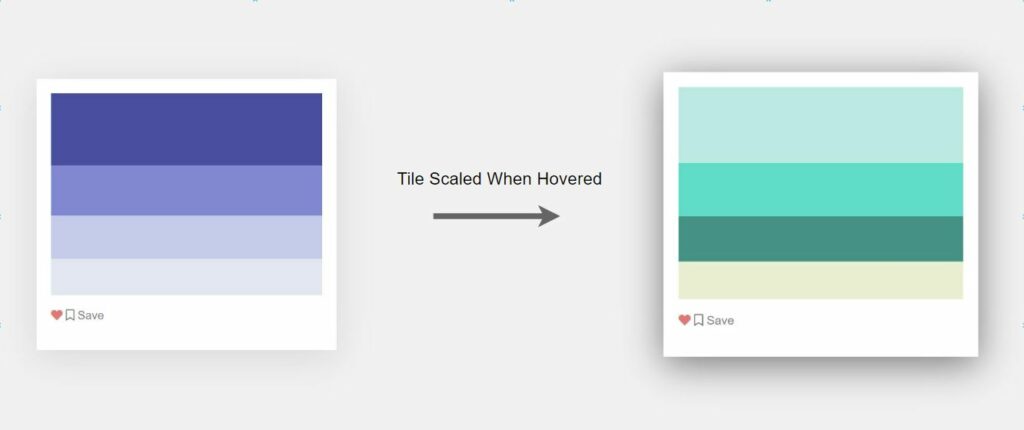
In addition to each tile’s color properties, we have added an animation to improve the web page experience when users search for a scheme. The CSS code includes a hover selector that animates the cards with a CSS transform scale. This animation makes the cards more significant in appearance as the user interacts.
.colors:hover {
/* Effect Properties */
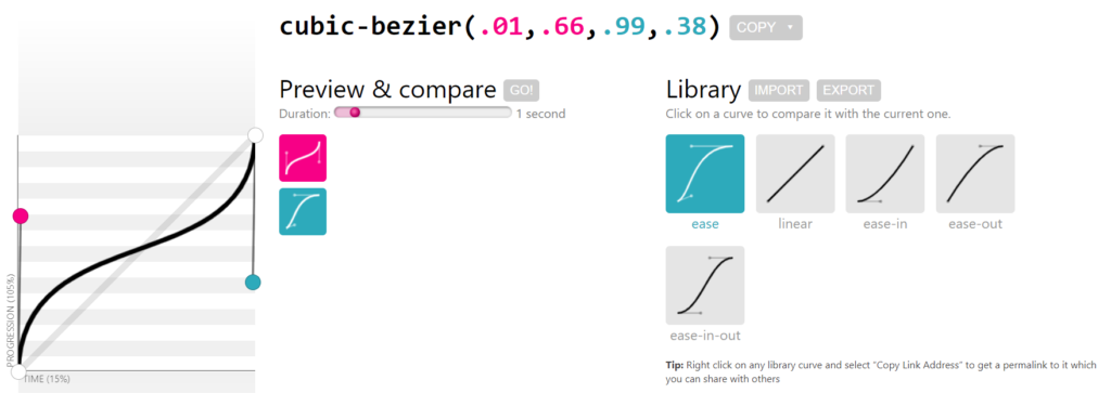
}The hover effect includes a timing function, cubic-bezier(0.01, 0.66, 0.99, 0.38), to smooth out the scaling effect over 0.5 seconds. This CSS transition timing function was created with a cubic-bezier generator. We selected a cubic bezier to ease the animation from start to finish instead of being a linear transition.
Adding the Bootstrap CSS Library
In the project, we used third-party CSS code. The example uses a CSS bootstrap library for a flexbox layout, the container for the CSS color palette tiles. The CSS style used from the bootstrap library is Bootstrap’s column grid layout feature which includes a few class names to implement. We use a .container, .row, and .col-$-$ class names to create the grid you see for the palettes. More information on how to use bootstrap’s grid system.
To use the bootstrap library, we must include it from a CDN. A file hosted on the CDN is a minified version of Bootstrap, bootstrap.min.css. To have this library in a project, we can start by adding a link element in a <head></head> of your HTML webpage. Below, you can see how a link is used so a browser can fetch the CDN resource.
It’s important to remember that including a library from the Cloudflare CDN can provide a performance benefit. Since a file is CDN hosted, the chance that a user has loaded a page with this library is exceptionally high. Whenever a user page loads a library, it is fetched from a server on Cloudflare and cached within your browser. This reduces the resources users will need to download from your servers when they visit your page.
<head>
<link href="https://cdnjs.cloudflare.com/ajax/libs/bootstrap/5.0.2/css/bootstrap.min.css" rel="stylesheet">
</head>
Adding the Font Awesome CSS Library
We’ve included the icons in the example using the Font Awesome CSS library. Font Awesome consists of a massive library of icons you can search for to replace the favorite and bookmark icons in the example. A stylesheet link below includes a CSS resource to add Font Awesome library to a web page when the HTML loads.
<head>
<link href="https://cdnjs.cloudflare.com/ajax/libs/font-awesome/5.15.4/css/all.min.css" rel="stylesheet">
</head>
Recommended Articles
- How To Create CSS Circle Color Palettes
- How To Change the Background Color on Hover With jQuery
- Diving into Conic and Radial Color Gradients in CSS
- Random CSS Gradient Generator JavaScript Example and Code