AppCode
This article demonstrates creating CSS circle color palettes, including a walk-through explaining the color wheel and how to make CSS circles. In addition to the walk-through, we’ll review frequently asked questions related to circles, gradients, and color theory. By the end of the article, we’ll have created several types of circles using the methods provided, and a web page with a grid of circle color palettes picked from a color wheel.
A related article on color gradients explains how to generate square color palette cards. So if you would like a different shape besides a circle, you can check out the article here. Direct Link →
Color Wheel in Color Theory
Before we jump into creating circles and attaching color schemes, it might be a good idea to read over what is a color wheel. A color wheel is vital to this project because we will use it to build our schemes.
Here is a collection of frequently asked questions about color wheels in color theory. These questions and answers will help you understand the concept of a color wheel, its functions, and how we can use it to generate circle color palettes.
What is a color wheel?
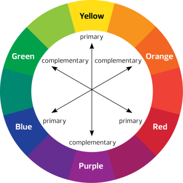
Sometimes called a color circle, the color wheel is a circular arrangement of colors. These colors on the wheel are arranged and organized by their chromatic relationship. The primary colors are of equal distance from each other on the wheel and contain colors between them. These secondary and tertiary colors sit between the primary colors, with their spaces similar to each other too.
When was the color wheel first invented?
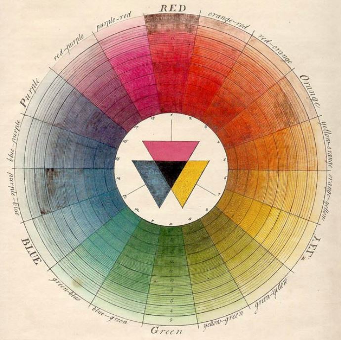
In 1666, the color wheel was invented by Isaac Newton. Isaac Newton mapped the color spectrum into the shape of a circle. The color wheel is significant in color theory because it shows the relationship between colors, and the association helps match colors that look good together to create color harmony.
What is a color wheel, and what is its purpose?
A color wheel is an artist’s device to organize colors based on the relationship between color values. The base construction of a color wheel is the three primary colors spaced evenly apart. Directly between each primary color is the secondary color created by combining the nearest primary colors.
What is a color wheel example?
The typical artists’ paint or pigment color wheel includes the primary colors of blue, red, and yellow. The corresponding secondary and complementary colors are green, orange, violet, or purple. The tertiary colors are green-yellow, yellow-orange, orange-red, red-violet/purple, purple/violet-blue, and blue-green.
Circles in Web Development
Now that we know what a color wheel is, we’ll also need to understand how to create circles on a web page for the next step in making circle gradients. Here is a list of frequently asked questions about drawing circles on a webpage using HTML and CSS.
How do I create a circle using SVG?
You can quickly fabricate circles using a <circle> tag in web development. The <circle> has a parent tag, an SVG tag in HTML. The <circle> element creates a circle in the SVG, which is declared using 3 essential parameters. These parameters include cx, cy, and r, and are briefly demonstrated further in this article.
How do I make a circle in CSS?
A circle can be created with primarily pure CSS on a web page. This method requires you to use the CSS border-radius property and combine the height and width properties with matching values. These properties will be added to a class with a selector pointing at a single HTML element.
Methods for Creating Circles
Now let’s move on to demonstrating how to create circles since there several ways to create circles in HTML or CSS. We’ll display several methods to create circles before choosing colors from a color wheel to make circle palettes. These methods will enable you to create circles in different styles necessary to your design requirements or preferences.
Method 1: Creating Circles using CSS Border
The first method of creating a circle in a webpage is widely used but has yet to be discovered by newer developers. With the CSS border-radius property, you can transform an element from a square-like shape to a complete circle by setting the border-radius to 50% and giving the element an equal height and width value. In the example below, the circle has a background color of #f00, and the height and width are 200px.
#circle {
    background: #f00;
    width: 200px;
    height: 200px;
    border-radius: 50%;
}
Method 2: Unicode symbol for a circle (25CF)
Another method is using a Unicode symbol to create a circle on a webpage. Unicode involves utilizing the :before pseudo-element on an element such as span. The pseudo-element sets the content to the value that appears before the element. In this case, \25CF represents a Unicode circle character and can have the color and size set with additional CSS properties.
<span class="circle"></span>.circle:before {
content: ' \25CF';
font-size: 200px;
}Method 3: Drawing a circle using an SVG <circle> tag
A third method for creating a circle within a webpage is using an SVG element with an SVG circle element. The <circle> element effectively creates a circle using the cx, cy, and r parameters, and many options, such as the fill color and stroke settings, can be included.
<svg height="200" width="200">
  <circle cx="100" cy="100" r="80" fill="green" />
</svg>
Turning Circles into Color Palettes Cards
Now that we understand how to make circles and the purpose of a color wheel, let’s combine the two topics to generate circular color palette cards.
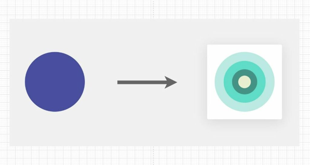
By picking colors from a color wheel, we can create gradient schemes or a tetradic (double complementary) scheme. The tetradic scheme is a rich one of the rich schemes because it uses four colors organized into two complementary color pairs, of which one color is typically the accent.
The HTML markup below creates the HTML structure for the color palettes.
HTML
<div class="circle-container">
  <div class="circle-color box-1">
    <div class="item-1 rounded-circle">
      <div class="item-2 rounded-circle">
        <div class="item-3 rounded-circle">
          <div class="item-4 rounded-circle">
          </div>
        </div>
      </div>
    </div>
  </div>
  <div class="circle-color box-2">
    <div class="item-1 rounded-circle">
      <div class="item-2 rounded-circle">
        <div class="item-3 rounded-circle">
          <div class="item-4 rounded-circle">
          </div>
        </div>
      </div>
    </div>
  </div>
  <div class="circle-color box-3">
    <div class="item-1 rounded-circle">
      <div class="item-2 rounded-circle">
        <div class="item-3 rounded-circle">
          <div class="item-4 rounded-circle">
          </div>
        </div>
      </div>
    </div>
  </div>
  <div class="circle-color box-4">
    <div class="item-1 rounded-circle">
      <div class="item-2 rounded-circle">
        <div class="item-3 rounded-circle">
          <div class="item-4 rounded-circle">
          </div>
        </div>
      </div>
    </div>
  </div>
  <div class="circle-color box-5">
    <div class="item-1 rounded-circle">
      <div class="item-2 rounded-circle">
        <div class="item-3 rounded-circle">
          <div class="item-4 rounded-circle">
          </div>
        </div>
      </div>
    </div>
  </div>
  <div class="circle-color box-6">
    <div class="item-1 rounded-circle">
      <div class="item-2 rounded-circle">
        <div class="item-3 rounded-circle">
          <div class="item-4 rounded-circle">
          </div>
        </div>
      </div>
    </div>
  </div>
  <div class="circle-color box-7">
    <div class="item-1 rounded-circle">
      <div class="item-2 rounded-circle">
        <div class="item-3 rounded-circle">
          <div class="item-4 rounded-circle">
          </div>
        </div>
      </div>
    </div>
  </div>
  <div class="circle-color box-8">
    <div class="item-1 rounded-circle">
      <div class="item-2 rounded-circle">
        <div class="item-3 rounded-circle">
          <div class="item-4 rounded-circle">
          </div>
        </div>
      </div>
    </div>
  </div>
  <div class="circle-color box-9">
    <div class="item-1 rounded-circle">
      <div class="item-2 rounded-circle">
        <div class="item-3 rounded-circle">
          <div class="item-4 rounded-circle">
          </div>
        </div>
      </div>
    </div>
  </div>
</div>
We will use the third method in the four strategies we discussed earlier on creating circles for a webpage. The third method uses CSS properties and a single div element to generate a circle shape, and this method implements a CSS border-radius to create a rounded edge.
#circle {
    background: #000;
    width: 100px;
    height: 100px;
    border-radius: 50%;
}
Instead of using the #circle, we’ll use a class called .rounded-circle as the base for all the palettes.
.rounded-circle {
border-radius: 100%;
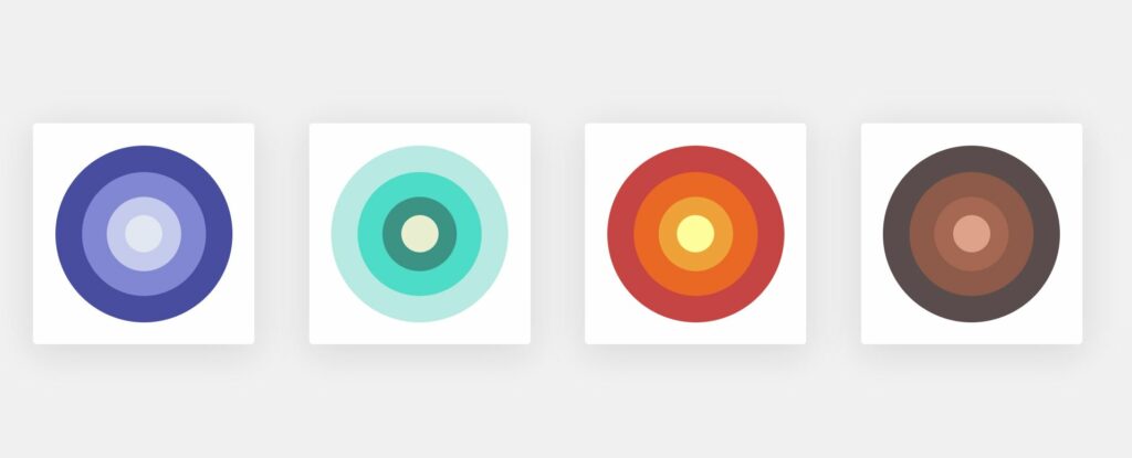
}Each circle will be declared using a .item-$ class with the background, height, and width properties set. Here is an example of the first card’s circle using a width and height of 80% and a background color of #494ca2;
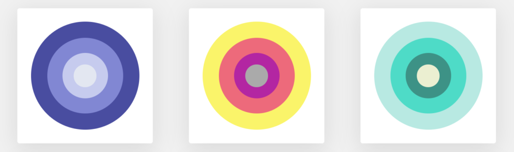
.circle-container .box-1 .item-1 {
  background: #494ca2;
  width: 80%;
  height: 80%;
}
The four colors chosen for each card were picked from a more advanced color wheel that isn’t included in this article. In fact, we’ve also included a few gradient hue schemes in the cards. The purple, teal, orange, and brown cards are great examples of gradient hues.
Below is the complete CSS stylesheet containing all the properties and styles needed to give the HTML palette cards their colors and shapes.
CSS
body {
background: #f1f1f1;
}
.circle-container {
max-width: 1140px;
margin: 50px auto;
}
.circle-container * {
display: flex;
justify-content: center;
align-items: center;
}
.circle-container .circle-color {
position: relative;
background: #fff;
float: left;
cursor: pointer;
border-radius: 5px;
width: 300px;
height: 300px;
margin: 20px 40px;
box-shadow: 0 10px 50px 0 rgba(0, 0, 0, 0.1);
}
.circle-container .circle-color:hover {
box-shadow: 0 10px 50px 4px rgba(34, 34, 34, 0.32);
}
.circle-container .circle-color .like-btn {
position: absolute;
top: 10px;
right: 10px;
color: #eb7979;
font-size: 20px;
}
.circle-container .box-1 .item-1 {
background: #494ca2;
width: 80%;
height: 80%;
}
.circle-container .box-1 .item-2 {
background: #8186d5;
width: 70%;
height: 70%;
}
.circle-container .box-1 .item-3 {
background: #c6cbef;
width: 60%;
height: 60%;
}
.circle-container .box-1 .item-4 {
background: #e3e7f1;
width: 50%;
height: 50%;
}
.circle-container .box-2 .item-1 {
background: #faf562;
width: 80%;
height: 80%;
}
.circle-container .box-2 .item-2 {
background: #f36a7b;
width: 70%;
height: 70%;
}
.circle-container .box-2 .item-3 {
background: #b824a4;
width: 60%;
height: 60%;
}
.circle-container .box-2 .item-4 {
background: #aaaaaa;
width: 50%;
height: 50%;
}
.circle-container .box-3 .item-1 {
background: #b4e9e2;
width: 80%;
height: 80%;
}
.circle-container .box-3 .item-2 {
background: #32dbc6;
width: 70%;
height: 70%;
}
.circle-container .box-3 .item-3 {
background: #309286;
width: 60%;
height: 60%;
}
.circle-container .box-3 .item-4 {
background: #ebefd0;
width: 50%;
height: 50%;
}
.circle-container .box-4 .item-1 {
background: #cd4545;
width: 80%;
height: 80%;
}
.circle-container .box-4 .item-2 {
background: #f16821;
width: 70%;
height: 70%;
}
.circle-container .box-4 .item-3 {
background: #f3a333;
width: 60%;
height: 60%;
}
.circle-container .box-4 .item-4 {
background: #fffe9a;
width: 50%;
height: 50%;
}
.circle-container .box-5 .item-1 {
background: #c9f658;
width: 80%;
height: 80%;
}
.circle-container .box-5 .item-2 {
background: #dbff3d;
width: 70%;
height: 70%;
}
.circle-container .box-5 .item-3 {
background: #55968f;
width: 60%;
height: 60%;
}
.circle-container .box-5 .item-4 {
background: #8acbbb;
width: 50%;
height: 50%;
}
.circle-container .box-6 .item-1 {
background: #5c4d4d;
width: 80%;
height: 80%;
}
.circle-container .box-6 .item-2 {
background: #915b4a;
width: 70%;
height: 70%;
}
.circle-container .box-6 .item-3 {
background: #a96851;
width: 60%;
height: 60%;
}
.circle-container .box-6 .item-4 {
background: #e1a28a;
width: 50%;
height: 50%;
}
.circle-container .box-7 .item-1 {
background: #ffaaaa;
width: 80%;
height: 80%;
}
.circle-container .box-7 .item-2 {
background: #e37070;
width: 70%;
height: 70%;
}
.circle-container .box-7 .item-3 {
background: #c7004c;
width: 60%;
height: 60%;
}
.circle-container .box-7 .item-4 {
background: #8f1537;
width: 50%;
height: 50%;
}
.circle-container .box-8 .item-1 {
background: #b5edba;
width: 80%;
height: 80%;
}
.circle-container .box-8 .item-2 {
background: #f06f32;
width: 70%;
height: 70%;
}
.circle-container .box-8 .item-3 {
background: #a44444;
width: 60%;
height: 60%;
}
.circle-container .box-8 .item-4 {
background: #594129;
width: 50%;
height: 50%;
}
.circle-container .box-9 .item-1 {
background: #00a8b5;
width: 80%;
height: 80%;
}
.circle-container .box-9 .item-2 {
background: #774898;
width: 70%;
height: 70%;
}
.circle-container .box-9 .item-3 {
background: #de4383;
width: 60%;
height: 60%;
}
.circle-container .box-9 .item-4 {
background: #f3ae4b;
width: 50%;
height: 50%;
}
@media only screen and (max-width: 768px) {
.circle-container .circle-color {
width: 150px;
height: 150px;
margin: 15px;
}
}
.rounded-circle {
border-radius: 100%;
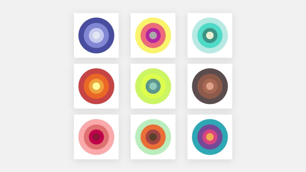
}Now that we have added the HTML code to a web page and the CSS styles, the webpage should render a grid of color palette cards, as seen in the image below.
Here is a link to a live code example on codepen.io
Recommended Articles
- How To Change Text Color on Hover With jQuery
- How To Hide Placeholder Text on Focus With CSS
- How to Create a jQuery Ajax Contact Form in PHP