AppCode
This article demonstrates how to use CSS conic-gradient and CSS radial-gradient. Included in the tutorial are code and examples to use.
Conic and radial color gradients are unique. However, using a monotone color has always been a tradition. Therefore, incorporating conic and radial color gradients into your projects will add an extra oomph to the overall design. Without these CSS gradient color recipes, you’ll have to create a gradient graphic design using third-party software like Ai or Corel draw to use gradients as the background.
Because CSS gradients are not easy to remember, I came up with this conic and radial color gradient article, coupled with different examples to help you understand the syntax.
Both conic- and radial-gradient colors work in different ways. However, some differences and similarities are worth highlighting. So, read on to find out more about both.
Overview
Conic and Radial CSS gradients are essential CSS features that authors use to create incredible UI effects or help draw something without creating HTML elements or image backgrounds. Each one is unique. The radial gradients are straight lines, while conic gradients, on the other hand, are curved.
What is a conic gradient?
The CSS conic-gradient () function creates a sort of gradient that rotates around the center of the HTML element. The gradients often start from the element’s mid-point and turn in a clock-like fashion.
background: conic-gradient($color, $color);You can see more syntaxes for the conic-gradient on the Mozilla Developer website.
Let’s proceed to demonstrate the conic gradient with CSS.
HTML
<div class="gradient"></div>CSS
html, body {
  margin: 0;
  height: 100%;
}

.gradient {
  width: 100%;
  height: 100vh;
  margin: 0 auto;
  background: conic-gradient(#2193b0, #6dd5ed);
}
From the center point (0 degrees) to 360 degrees.
Result:

But what happens when you add a stop value for the initial color?
conic-gradient(#cc2b5e 65%, #753a88)Let’s see what happens when we add a first color stop:
HTML
<div class="gradient"></div>CSS
html, body {
  margin: 0;
  height: 100%;
}

.gradient {
  width: 100%;
  height: 100vh;
  margin: 0 auto;
  background: conic-gradient(#cc2b5e 65%, #753a88);
}
The first color fills 65% of the element, while the second one appears 100%.
Here’s the result:

Let’s try something different. What if we apply a hard stop on the second color as well?
conic-gradient(#cc2b5e 65%, #753a88 0);Let’s do just that:
CSS
.gradient {
    width: 700px;
    height: 400px;
    margin: 0 auto;
    background: conic-gradient(#cc2b5e 65%, #753a88 0);
}
When we applied a hard stop of “0” on the second color, it means while the first color fills 65% of this element, the second color will start from 65% to 100%.

Remember, these are just examples, and you can also create yours.
Here is a fun article on freecodecamp that introduces creating multiple CSS-only pie charts. This article uses different CSS gradients to make several pies. Hungry for pie? Direct Link →
What is a radial gradient?
As the name suggests, radial-gradient offers authors the luxury of creating radial-type designs in HTML elements. It could be in the form of a circle or ellipse. Here is the basic syntax for the radial-gradient CSS function.
background: radial-gradient($color, $color);So, what are some of the basic examples? We’ll start by showing you a simple example using two colors.
HTML
<div class="gradient"></div>CSS
html,
body {
  margin: 0;
  height: 100%;
}

.gradient {
  width: 100%;
  height: 100vh;
  margin: 0 auto;
  background: radial-gradient(#cc2b5e, #753a88);
}
Note: You’re probably wondering why the default design is an ellipse. Here’s why: if you don’t define the gradient’s shape, it will give the gradient the element’s shape. If the element is a rectangle, the shape will be elliptical. On the other hand, if the element were square, the gradient shape would be circular. The gradient takes on these shapes because of the element’s two values – its width and height. You can change the gradient shape by changing the element’s width and height.
The first example in this section has two colors filling the width and height. The ellipse shape looks blurry because the web browser assumes that both the start and stop points are 0% and 100%.
What happens when we append the circle shape before the first color stop? Here’s what it will look like:
HTML
<div class="gradient"></div>CSS
html,
body {
  margin: 0;
  height: 100%;
}

.gradient {
  width: 100%;
  height: 100vh;
  margin: 0 auto;
  background: radial-gradient(circle, #cc2b5e , #753a88);
}
Understanding positioning is vital. In the two examples stated above, you’d notice the horizontal and vertical positions in the container.
Notice how the positioning starts from the circle’s center and the ellipse shape.
Let’s try out other examples with different positioning:
Example 1 (Circle at top left)
CSS
html,
body {
  margin: 0;
  height: 100%;
}

.gradient {
  width: 100%;
  height: 100vh;
  margin: 0 auto;
  background: radial-gradient(circle at top left, #cc2b5e , #00cdac);
}
Example 2 (Circle at top right)
CSS
html,
body {
  margin: 0;
  height: 100%;
}

.gradient {
  width: 100%;
  height: 100vh;
  margin: 0 auto;
  background: radial-gradient(circle at top right, #cc2b5e , #00cdac);
}
Here’s the result:

There you have it!
Use Cases for Conic and Radial Gradients
Icons Using Radial Gradients
HTML
<div class="icons">
   <div>
      <svg class="svg-icon" viewBox="0 0 20 20">
         <path d="M15.573,11.624c0.568-0.478,0.947-1.219,0.947-2.019c0-1.37-1.108-2.569-2.371-2.569s-2.371,1.2-2.371,2.569c0,0.8,0.379,1.542,0.946,2.019c-0.253,0.089-0.496,0.2-0.728,0.332c-0.743-0.898-1.745-1.573-2.891-1.911c0.877-0.61,1.486-1.666,1.486-2.812c0-1.79-1.479-3.359-3.162-3.359S4.269,5.443,4.269,7.233c0,1.146,0.608,2.202,1.486,2.812c-2.454,0.725-4.252,2.998-4.252,5.685c0,0.218,0.178,0.396,0.395,0.396h16.203c0.218,0,0.396-0.178,0.396-0.396C18.497,13.831,17.273,12.216,15.573,11.624 M12.568,9.605c0-0.822,0.689-1.779,1.581-1.779s1.58,0.957,1.58,1.779s-0.688,1.779-1.58,1.779S12.568,10.427,12.568,9.605 M5.06,7.233c0-1.213,1.014-2.569,2.371-2.569c1.358,0,2.371,1.355,2.371,2.569S8.789,9.802,7.431,9.802C6.073,9.802,5.06,8.447,5.06,7.233 M2.309,15.335c0.202-2.649,2.423-4.742,5.122-4.742s4.921,2.093,5.122,4.742H2.309z M13.346,15.335c-0.067-0.997-0.382-1.928-0.882-2.732c0.502-0.271,1.075-0.429,1.686-0.429c1.828,0,3.338,1.385,3.535,3.161H13.346z"></path>
      </svg>
   </div>
   <div>
      <svg class="svg-icon" viewBox="0 0 20 20">
         <path d="M17.927,5.828h-4.41l-1.929-1.961c-0.078-0.079-0.186-0.125-0.297-0.125H4.159c-0.229,0-0.417,0.188-0.417,0.417v1.669H2.073c-0.229,0-0.417,0.188-0.417,0.417v9.596c0,0.229,0.188,0.417,0.417,0.417h15.854c0.229,0,0.417-0.188,0.417-0.417V6.245C18.344,6.016,18.156,5.828,17.927,5.828 M4.577,4.577h6.539l1.231,1.251h-7.77V4.577z M17.51,15.424H2.491V6.663H17.51V15.424z"></path>
      </svg>
   </div>
   <div>
      <svg class="svg-icon" viewBox="0 0 20 20">
         <path d="M17.35,2.219h-5.934c-0.115,0-0.225,0.045-0.307,0.128l-8.762,8.762c-0.171,0.168-0.171,0.443,0,0.611l5.933,5.934c0.167,0.171,0.443,0.169,0.612,0l8.762-8.763c0.083-0.083,0.128-0.192,0.128-0.307V2.651C17.781,2.414,17.587,2.219,17.35,2.219M16.916,8.405l-8.332,8.332l-5.321-5.321l8.333-8.332h5.32V8.405z M13.891,4.367c-0.957,0-1.729,0.772-1.729,1.729c0,0.957,0.771,1.729,1.729,1.729s1.729-0.772,1.729-1.729C15.619,5.14,14.848,4.367,13.891,4.367 M14.502,6.708c-0.326,0.326-0.896,0.326-1.223,0c-0.338-0.342-0.338-0.882,0-1.224c0.342-0.337,0.881-0.337,1.223,0C14.84,5.826,14.84,6.366,14.502,6.708"></path>
      </svg>
   </div>
   <div>
      <svg class="svg-icon" viewBox="0 0 20 20">
         <path d="M18.121,9.88l-7.832-7.836c-0.155-0.158-0.428-0.155-0.584,0L1.842,9.913c-0.262,0.263-0.073,0.705,0.292,0.705h2.069v7.042c0,0.227,0.187,0.414,0.414,0.414h3.725c0.228,0,0.414-0.188,0.414-0.414v-3.313h2.483v3.313c0,0.227,0.187,0.414,0.413,0.414h3.726c0.229,0,0.414-0.188,0.414-0.414v-7.042h2.068h0.004C18.331,10.617,18.389,10.146,18.121,9.88 M14.963,17.245h-2.896v-3.313c0-0.229-0.186-0.415-0.414-0.415H8.342c-0.228,0-0.414,0.187-0.414,0.415v3.313H5.032v-6.628h9.931V17.245z M3.133,9.79l6.864-6.868l6.867,6.868H3.133z"></path>
      </svg>
   </div>
   <div>
      <svg class="svg-icon" viewBox="0 0 20 20">
         <path d="M18.303,4.742l-1.454-1.455c-0.171-0.171-0.475-0.171-0.646,0l-3.061,3.064H2.019c-0.251,0-0.457,0.205-0.457,0.456v9.578c0,0.251,0.206,0.456,0.457,0.456h13.683c0.252,0,0.457-0.205,0.457-0.456V7.533l2.144-2.146C18.481,5.208,18.483,4.917,18.303,4.742 M15.258,15.929H2.476V7.263h9.754L9.695,9.792c-0.057,0.057-0.101,0.13-0.119,0.212L9.18,11.36h-3.98c-0.251,0-0.457,0.205-0.457,0.456c0,0.253,0.205,0.456,0.457,0.456h4.336c0.023,0,0.899,0.02,1.498-0.127c0.312-0.077,0.55-0.137,0.55-0.137c0.08-0.018,0.155-0.059,0.212-0.118l3.463-3.443V15.929z M11.241,11.156l-1.078,0.267l0.267-1.076l6.097-6.091l0.808,0.808L11.241,11.156z"></path>
      </svg>
   </div>
   <div>
      <svg widht="24" height="24" class="svg-icon" viewBox="0 0 20 20">
         <path d="M14.68,12.621c-0.9,0-1.702,0.43-2.216,1.09l-4.549-2.637c0.284-0.691,0.284-1.457,0-2.146l4.549-2.638c0.514,0.661,1.315,1.09,2.216,1.09c1.549,0,2.809-1.26,2.809-2.808c0-1.548-1.26-2.809-2.809-2.809c-1.548,0-2.808,1.26-2.808,2.809c0,0.38,0.076,0.741,0.214,1.073l-4.55,2.638c-0.515-0.661-1.316-1.09-2.217-1.09c-1.548,0-2.808,1.26-2.808,2.809s1.26,2.808,2.808,2.808c0.9,0,1.702-0.43,2.217-1.09l4.55,2.637c-0.138,0.332-0.214,0.693-0.214,1.074c0,1.549,1.26,2.809,2.808,2.809c1.549,0,2.809-1.26,2.809-2.809S16.229,12.621,14.68,12.621M14.68,2.512c1.136,0,2.06,0.923,2.06,2.06S15.815,6.63,14.68,6.63s-2.059-0.923-2.059-2.059S13.544,2.512,14.68,2.512M5.319,12.061c-1.136,0-2.06-0.924-2.06-2.06s0.923-2.059,2.06-2.059c1.135,0,2.06,0.923,2.06,2.059S6.454,12.061,5.319,12.061M14.68,17.488c-1.136,0-2.059-0.922-2.059-2.059s0.923-2.061,2.059-2.061s2.06,0.924,2.06,2.061S15.815,17.488,14.68,17.488"></path>
      </svg>
   </div>
</div>
CSS
body {
  height: 100vh;
  margin: 0;
  background: radial-gradient(circle at top left, #00cdac, #cc2b5e);
  background-repeat: no-repeat;
  display: grid;
  place-items: center center;
}

.icons {
  display: grid;
  grid-template-columns: 1fr 1fr 1fr;
  grid-gap: 10px;
  width: 400px;
  height: 300px;
}
.icons > div {
  border-radius: 10px;
  display: grid;
  place-items: center center;
  background: radial-gradient(circle, #bdc3c7 15px, #2c3e50);
  box-shadow: 0 10px 10px -5px rgba(0, 0, 0, 0.2);
}
.icons > div > svg {
  width: 50px;
  height: 50px;
}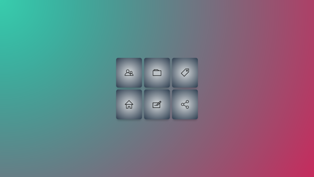
Radial Gradient Hero Banner
HTML
<div class="gradient">
  <h1>Hero Banner</h1>
</div>
CSS
html,
body {
  height: 100%;
  overflow: hidden;
  font: -apple-system, BlinkMacSystemFont, "Segoe UI", Roboto, Helvetica, Arial,
    sans-serif, "Apple Color Emoji", "Segoe UI Emoji", "Segoe UI Symbol";
  margin: 0;
}

.gradient {
  margin: 0 auto;
  background: radial-gradient(circle at top right, #614385, #2c3e50);
  text-align: center;
}

h1 {
  display: inline-block;
  font-family: "Syncopate", sans-serif;
  text-transform: uppercase;
  color: white;
  line-height: 100vh;
  margin: 0;
}

Pie Chart Conic Gradient
HTML
<div class="gradient"></div>CSS
html,
body {
  height: 100vh;
  place-items: center center;
  margin: 0;
  display: grid;
  background: conic-gradient(from 0deg, #6948bf 120deg, #3bc6aa);
}

.gradient {
  margin: 0 auto;
  width: 250px;
  height: 250px;
  background: conic-gradient(from 0deg, #49b8c7 120deg, #2f7bab 0);
  border-radius: 50%;
  box-shadow: 0 2px 4px rgb(0 0 0 / 50%);
}
Recommended Articles
- How To Create CSS Gradient Buttons
- Random CSS Gradient Generator JavaScript Example and Code
- 15 CSS Gradients Examples and Gradient Code