AppCode
This article demonstrates using the CSS blur filter function on elements and a filter property with documentation, syntax, and examples.
The CSS blur function is a value of the CSS filter property. This function takes a radius value that defines the amount of Gaussian blur to use or pixels on a screen blending into each other.
Syntax
When using blur with CSS, syntax formation can either be a single function or combined with other functions.
filter: blur(value);Parameters
- value (required)
The parameter is a radius value defined as a CSS length, which can be a length that is relative or absolute. The size determines how many pixels mix in a radius. The more significant or more considerable value provided will create more blur. A CSS length is specified as a parameter but does not accept percentage values. The initial value for interpolation is 0; if no value is set, 0 is used, resulting in no effect.
This radius value is a standard deviation of the Gaussian function and differs from the deviation used for a box-shadow property’s blur radius.
Parameter Examples
A few examples below use absolute and relative values for the parameter of a blur filter function. PX, REM, PT, VH, and many more are accepted as valid parameter values.
blur(0);        /* No effect */
blur(1rem);     /* 1rem blur radius */
blur(20px);     /* 20px blur radius */
blur(2em);      /* 2em blur radius */
blur(2Q);       /* 2Q blur radius */
blur(5pt);      /* 5pt blur radius */
blur(0.15vh);   /* 0.15vh blur radius */
Gaussian
A Gaussian function in mathematics is often called a Gaussian and is named after the mathematician Carl Friedrich Gauss. It is a function of the base form with parametric extension for the arbitrary real constants a, b, and non-zero c. A graph associated with a gaussian typically takes on the form of a symmetric bell curve shape. The standard deviation controls this bell width, also called the Gaussian RMS (Square Root Mean) width.
Suppose you would like to understand more about how the gaussian in mathematics applies to a CSS blur function. You can check out the Wikipedia article we included to provide information to demonstrate how a Gaussian function works.
Usage
You can apply a blur function to any element or image by using CSS selectors. The function can be applied to most elements and SVGs. It applies to container elements but excludes the SVG <defs> element and all graphic elements.
The selectors below use an ID selector, element name, and class name to apply the blurring function effect to the target elements and images.
/* ID selector */
#element-id {
  filter: blur(5px);
}

/* element selector */
img {
  filter: blur(0.25em);
}

/* class selector */
.element-class {
  filter: blur(1rem);
}
Combining blur() With Other Functions
You may combine functions to manipulate a rendering of a target element or image. However, the order still matters; for example, using an opacity(0) after blur(4px) will still create in completely transparent effect. Multiple functions can be used by using spaces to separate the function names. In the example below, we use three functions, opacity, blur, and saturate. You can see these three functions used below.
filter: opacity(0.5) blue(2px) saturate(30%);Examples
Having different effects on HTML elements, especially images, is a standard web development practice. Using CSS within modern browsers has made it easy to use effects to spice up a web page and achieve special and unique effects. Behind some of these effects is the CSS filter, a potent property to apply to web elements. They act like filters from photoshop or other studios and allow you to apply graphical effects like blurring. These examples will show how to use a blur filter in various situations, including a hover effect.
Let’s review a few examples of using the blur function with its effect on images and backgrounds.
Using the blur() on Images
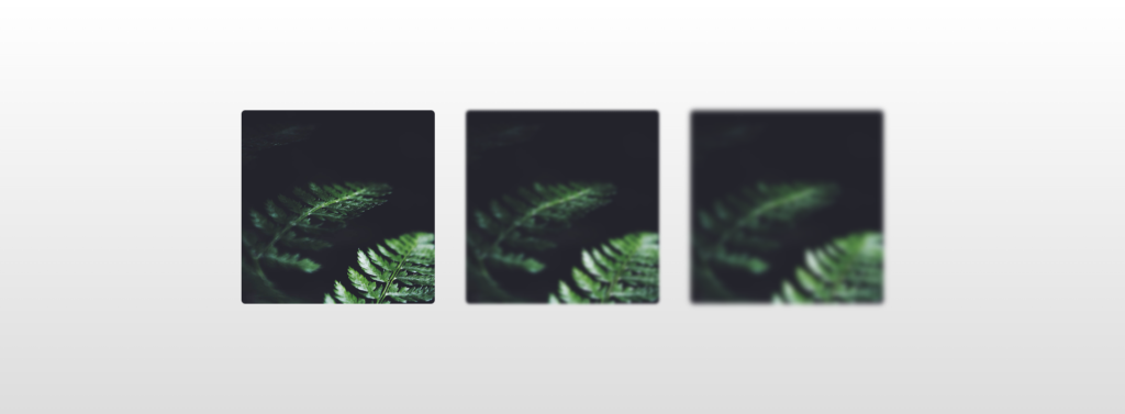
This example uses three images. The first image doesn’t have a blur effect, while the other two do.
HTML
<div class="container">
<div class="wrapper">
  <img src="https://s3-us-west-2.amazonaws.com/s.cdpn.io/46992/noah-silliman-141979.jpg" alt="" />
  <img src="https://s3-us-west-2.amazonaws.com/s.cdpn.io/46992/noah-silliman-141979.jpg" alt="" />
  <img src="https://s3-us-west-2.amazonaws.com/s.cdpn.io/46992/noah-silliman-141979.jpg" alt="" />
</div>
We applied a blur effect using an image element CSS selector and :nth-child() pseudo-elements to select our target elements. We use a filter property with a blur function inside the two rulesets that selects the last two images. The second image uses a blur radius of 2px, while the third image uses a radius of 4px.
CSS
.wrapper img {
  width: 300px;
  height: 300px;
  object-fit: cover;
  border-radius: 6px;
  margin: 0 20px;
  vertical-align: middle;
}

.wrapper img:nth-child(2) {
  filter: blur(2px);
}

.wrapper img:nth-child(3) {
  filter: blur(4px);
}

html {
  text-align: center;
  min-height: 100%;
  background: linear-gradient(white, #ddd);
}

.wrapper {
  width: 100%;
  background: transparent;
  text-align: center;
  -webkit-box-align: center !important;
  -ms-flex-align: center !important;
  align-items: center !important;
  -webkit-box-pack: center !important;
  -ms-flex-pack: center !important;
  justify-content: center !important;
  display: -webkit-box !important;
  display: -ms-flexbox !important;
  display: flex !important;
  height: 100%;
}

html,
body {
  height: 100%;
  margin: 0;
}
Using blur() Against a Background

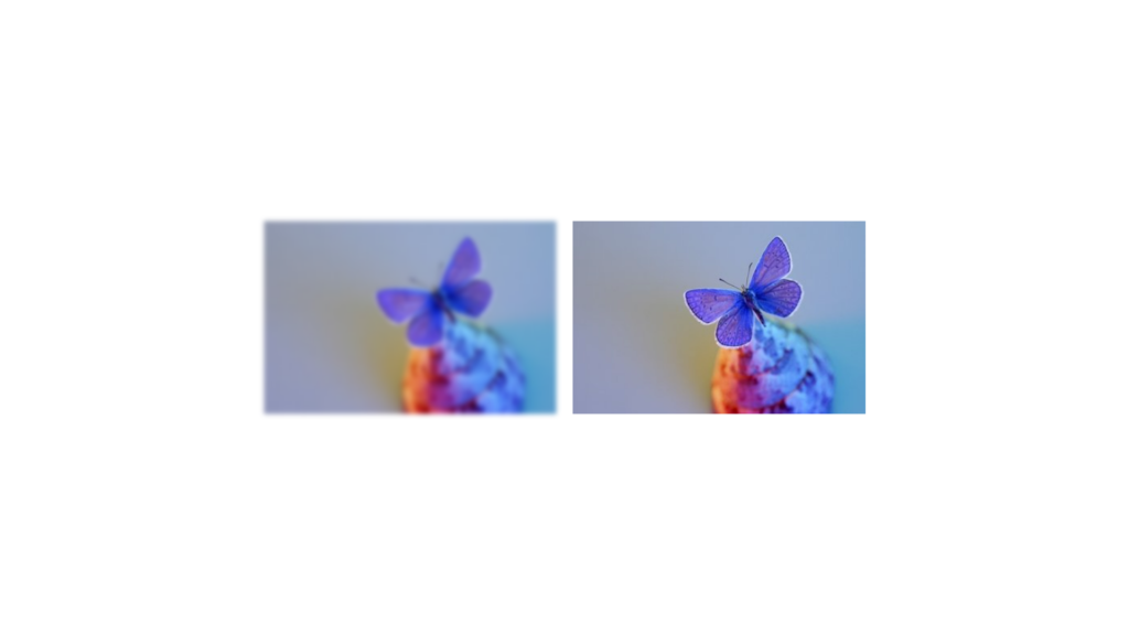
Here we have an example where we set an image as the background of a website or page and then blur the background. This effect is achieved using an HTML element in combination with a CSS ruleset.
<img class="background" src="{ image_source_url }" alt="Blurred Image">To apply a blur effect using a blur function to the background image, we first need to set the image as a page’s background.
We can utilize the width and height 100% to have a full background image. Then we use a filter property with the blur function effect of a 5px radius.
img.background {
    width: 100%;
    height: 100%;
    filter: blur(5px);
}
Blur on Hover
This example demonstrates using a blur filter when hovering over an element or image. As we want to apply a blur effect on hover, we need to use the :hover selector. Inside the :hover selector, pass a decimal but not a percentage value to the blur function. The bigger the number is, the more blur is created. In this case, we used a value of 3px.
.blur {
  filter: blur(0);
  -webkit-transition: 0.3s ease-in-out;
  transition: 0.3s ease-in-out;
}

.blur:hover {
  filter: blur(3px);
}
Note: The CSS transition property in the classes above allows you to change property values smoothly in a browser, from one value to another, over a set duration. Since the classes apply a blur effect on images when hovered, an animation transition from no blur to blur will ease in and out over a 0.3s timeframe since the transition property has a value of 0.3s ease-in-out.
Backdrop Blur Without ‘Backdrop-Filter’

It’s possible when using backgrounds to create a backdrop blur without using a backdrop-filter property. This example explains how to create glass-styled background designs to add to your web design space.
This glass design falls under glassmorphism, a design trend that uses a blurring effect to produce glass for forms and web elements. You can check out more on glassmorphism here, where we published examples of user interfaces using this design technique.
Moving on to our example, we can create an alternate solution using :before pseudo-elements to apply a blurring effect. Using the pseudo-element allows us to insert an effect before its parent element. So if a parent element has no styles and is transparent, we would see an effect from the pseudo-element if positioned behind it. That means if there is text within a parent element, it would not be blurred, but a background would be.
Let’s give a CSS example.
div::before {
  background-color: #0000006b;
  content: "";
  filter: blur(10px);
  position: absolute;
  z-index: -1;
  inset: 0;
}

body,
html {
  height: 100%;
  align-items: center !important;
  justify-content: center !important;
  display: flex !important;
}

body {
  background: linear-gradient(rgba(0, 0, 0, 0.4), rgba(0, 0, 0, 0.4)),
    url("https://source.unsplash.com/random/1920x1080/");
  font-family: arial;
}

button {
  padding: 10px 20px;
  border-radius: 4px;
}

div {
  inset: 0%;
  border: 1px solid #b2b2b2;
  text-align: center;
  color: white;
  position: relative;
  height: 200px;
  margin: 0 auto;
  width: 400px;
}
The HTML only includes a div, image, heading, line break, and paragraph element.
<div>
  <h1>Hello World</h1>
  <p>Glassmorphism
<p>
    <br>
    <button>pointless button</button>
</div>
Note: Remember that you can change background colors within pseudo-elements, such as :before, to create different backdrop blurring effects besides black or gray.
Note: This CSS feature is similar to a backdrop filter when applying blurring to an image or element. There is a difference between blur() and backdrop-filter property, which is that backdrop applies to everything behind the element it’s applied to, unlike blur, which applies to everything inside an HTML element.
If you are interested in the backdrop-filter version of the blur, check out this article on medium that briefly explains what the property is and how to use it.
Animating With Blur
Since filters are animatable, they can open a few doors for a lot of fun. In the animation below, we animate a blur rendering using keyframes. The animation starts with no blurring and then becomes blurred. This effect is created because the blur starts at 0 and transitions to 4px at 100%.
@keyframes filter-animation {
  0% {
    filter: blur(0);
  }

  100% {
    filter: blur(4px);
  }
}
SVG Markup Equivalent to Blur
Here we’ve provided an example SVG filter element that uses a feGaussianBlur filter. This is a markup equivalent that can be used instead of the property. The example uses two attributes to set a standard deviation and the edge mode for a blur effect. When using an SVG version of CSS blur, they are very similar and can be swapped with each other to produce the same blurring effect during rendering.
<filter id="blur">
  <feGaussianBlur stdDeviation="[radius radius]" edgeMode="[edge mode]" >
</filter>
Interpolation
When using a CSS blur function, its interpolation is similar to any other filter property functions within the spec. In an animation, if a keyframe contains a filter list of different sizes, the missing equivalent function values are added to the end of the shorter keyframe function lists. The length does not include the url() value. The property is interpolated according to its rules if the size is equal for each keyframe.
Frequently Asked Questions
Here is a list of frequently asked questions related to the CSS filter blur function, such as how to apply it, what it is, and other related information.
What is a blur filter?
The blur filter function is typically used to soften an image or a selection. In addition to retouching an image by softening, hard edges of shaded and defined areas can be smoothed by averaging the color values of the pixels next to the regions. In significant color transitions in images, blur can also eliminate noise. In summary, blur() is a valid option for retouching digital artwork on a website or app where applicable.
What does blur do in CSS?
The blur() CSS function applies a Gaussian blur to an image or other HTML elements on a web page.
How do you add a blur to an item in CSS?
Blur can be added to an item using CSS using the syntax filter: blur(radius);. The syntax is used within a CSS ruleset that selects an image or other element using a selector. A practical use would be to set a full background image as a website background and fit it to a screen using 100% width and height. Once the image is set as a background, you can apply the filter syntax with a blur value to give the content more focus instead of the back scene.
How do I blur the background of text with CSS?
The background of text can be blurred using the filter or the backdrop-filter property. If the filter property is used, the background element should have a style declared for it that includes the property with the correct value.
Specifications
The blur() function is defined in Filter Effects Module Level 1 (W3C Working Draft), and you can reference the documentation below.
W3C CSS Filter Effects Module Level 1
#funcdef-filter-blur