AppCode
This article demonstrates CSS 3D image effects, definitions, walk-throughs, code examples, FAQs, and other 3D image effect information.
3D image effects can be a very appealing effect one can use in a website project. When a user visits your website and interacts with images using these effects, it can create a more exciting interaction. This enhanced interaction can result in a more positive experience for a user. That’s one plus on your user experience design bar.
Before we start reviewing applying 3D effects on images, there are a series of reference materials regarding interesting approaches to CSS and how to incorporate its perks into various sections of your web project. These articles are helpful for developers who are beginning to learn CSS or are hardened developers looking to refresh. Both of these articles can help to gain more information on this topic. The first material reviews how to use the CSS syntax, and the second article provides several tips on writing CSS. Direct Link →
We have an article that reviews creating general CSS image effects. Unfortunately, we still need to cover how to apply 3D effects to your web photos which is what we shall be doing in this article. So, sit tight, grab a PC and a cup of your favorite drink, and code along.
This article will go through a few commonly used three-dimensional image effects to help you create a one-of-a-kind visual experience for your users. Then, using some popular CSS techniques, you’ll learn how to apply these effects and animation to images.
The Transform & Translate Properties
Creating three dimension effects for images in CSS most of the time requires using the transform property and the translate function. You can use the transform property to visually manipulate an element by skewing, rotating, translating, or scaling.
On the other hand, CSS translate allows you to adjust the location of elements. The translate function defines an element’s x- and y-coordinates in 2D. To modify the location in 3D, you can also specify the z-coordinate.
To grasp the examples, you must first be grounded in the CSS transform property and its function, translate() – it is crucial.
3D Photo Frame Effect
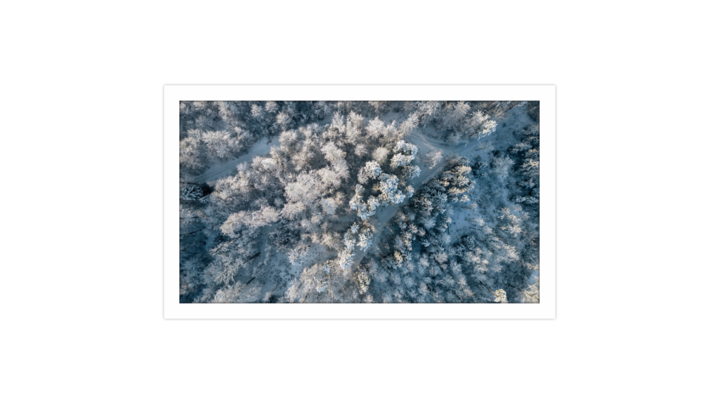
Adding border effects to photos can improve the appearance of website images depending on how it is used. This example will show you how to apply a CSS 3D frame border effect for an image during mouse hover.
Interestingly, this 3D frame requires no picture editing tools such as Photoshop or Canva. With CSS, we can quickly implement an image border effect with a small handful of lines using code.
Let’s begin by creating the necessary HTML markup. First, wrap an image in a <div> block and give the <div> element the CSS class frame. We’ll need to add an overlay <div> and an image element. All of these elements will be wrapped in the very outer .container.
<div class="container">
  <div class="frame">
    <div class="overlay"></div>
    <img src="https://source.unsplash.com/random/1920x1080/">
  </div>
</div>
Now comes the CSS, so let’s begin by establishing some basic styles.
html,
body {
  height: 100%;
  margin: 0;
}

.container {
  align-items: center !important;
  justify-content: center !important;
  display: flex !important;
  height: 100%;
}

.frame img {
  width: 100%;
}

.frame {
  border-radius: 2px;
  background-color: #fefefe;
  width: 700px;
  height: 394px;
  padding: 30px;
  box-shadow: 0px 0px 5px 0px #aaa;
  position: relative;
}

.overlay {
  box-shadow: inset 0px 0px 5px 0px #000;
  position: absolute;
  top: 30px;
  left: 30px;
  right: 30px;
  bottom: 30px;
}
The styles for the frame element for hovering are next. Add the :hover selector to the CSS class above if you want the 3D effect on mouse hover. To achieve the desired 3D look, add the box shadow and transform properties to the image frame, as we’ve done below.
.frame:hover {
    box-shadow: 1px 1px 1px 0px #999,
        2px 2px 1px 0px #888,
        3px 3px 1px 0px #777,
        4px 4px 1px 0px #666,
        5px 5px 1px 0px #555,
        6px 6px 1px 0px #444,
        7px 7px 1px 0px #333,
        8px 8px 3px 0px #303030;
    transform: translate(-8px,-8px);

}
While the cursor is hovering over the element, we will apply a tiny CSS transition to make it move to the new effect fluidly. Let’s add the CSS transition property to the .frame class to achieve a smooth and seamless transformation animation.
.frame {
    /* Other Properties */

    transition: all 0.5s ease 0s;
}
The portrait has a raised bottom and right-hand side whenever the cursor hovers over it.
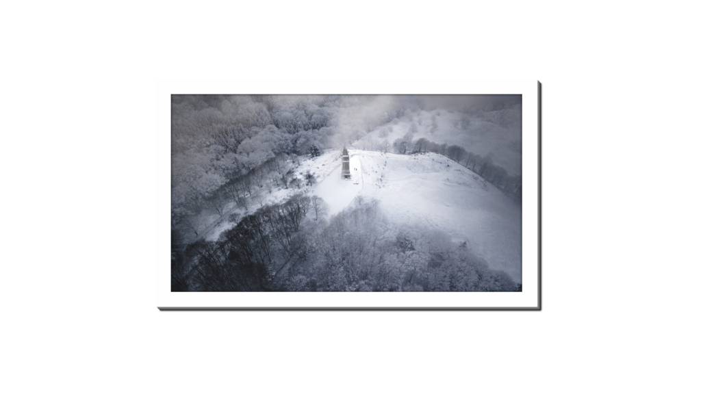
Image 3D Tilting Effect
You may believe that creating a 3D effect with a few elements is impossible. On contrary, CSS has a mechanism to make it happen. It could be an excellent option for authors who have 3D mockups of their books.
First, let’s add the HTML markups for the elements. We’ll give one of the <div> elements a class name of image and the other the name container.
<div class="container">
	<div class="image"></div>
</div>
Now that we’ve added the HTML let’s style it using CSS. The lines of codes below will do the trick.
body {
  min-height: 100vh;
  display: flex;
  justify-content: center;
  align-items: center;
  text-align: center;
  margin: 0;
}

.container {
  width: 250px;
  height: 400px;
  perspective: 1000px;
  cursor: pointer;
}

.image {
  width: 100%;
  height: 100%;
  transform-style: preserve-3d;
  background-position: center;
  transition: all 0.3s;
  position: relative;
  box-shadow: 0 10px 20px rgba(0, 0, 0, 0.2);
}

.image::before {
  content: "";
  position: absolute;
  top: 0;
  left: 0;
  width: 60px;
  height: 100%;
  transform: rotateY(90deg);
  transform-origin: 0 50%;
  filter: brightness(70%);
}

.image,
.image::before {
  background-image: URL("https://images.unsplash.com/photo-1635322966219-b75ed372eb01?ixlib=rb-4.0.3&ixid=MnwxMjA3fDB8MHxwaG90by1wYWdlfHx8fGVufDB8fHx8&auto=format&fit=crop&w=464&q=80");
  background-size: cover;
  background-repeat: no-repeat;
}

.image:hover {
  transform: rotateY(35deg) scale(1.1);
}

.image:hover::before {
  box-shadow: 0 10px 20px rgba(0, 0, 0, 0.2);
}
Image Flip/Text Reveal 3D Effect
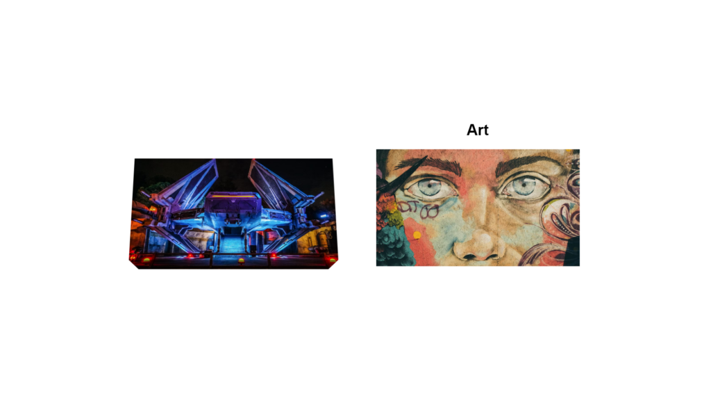
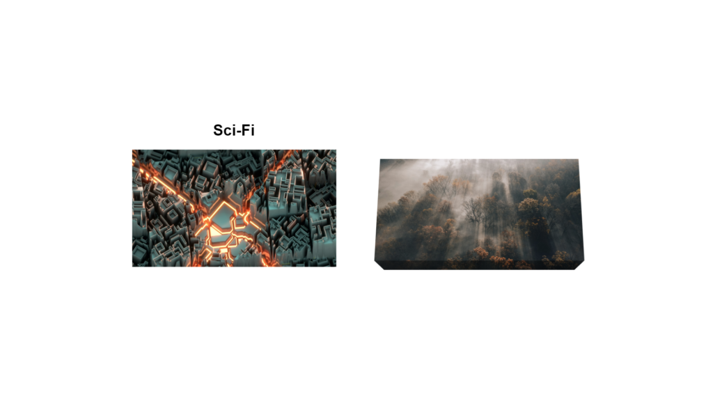
Imagine being able to flip multiple images and have the captions or other text components revealed once you hover over each image. This example goes over how to create two portraits with hidden text. Once the user places the cursor over the portraits, the text is revealed at the top. Let’s recreate this example.
First, we’ll start with the HTML markup as usual.
<div class="flip">
  <h2>Sci-Fi</h2>
  <img src="https://images.unsplash.com/photo-1578374173713-32f6ae6f3971?ixlib=rb-4.0.3&ixid=MnwxMjA3fDB8MHxwaG90by1wYWdlfHx8fGVufDB8fHx8&auto=format&fit=crop&w=870&q=80" />
</div>
<div class="flip">
  <h2>Art</h2>
  <img src="https://images.unsplash.com/photo-1547891654-e66ed7ebb968?ixlib=rb-4.0.3&ixid=MnwxMjA3fDB8MHxwaG90by1wYWdlfHx8fGVufDB8fHx8&auto=format&fit=crop&w=870&q=80">
</div>
Now, let’s style it up with CSS. Before we start writing the CSS, it’s vital to notice the use of the clip-path property. The clip-path allows us to wrap the image around the sides of the portrait to create a canvas effect. We use the –x and –y variables to control the calculations within the clip-path. The values for the variables can be changed to your desired requirements or ideal design.
img {
  /* adjust the below to control the 3D effect */
  --x: 20px;
  --y: 20px;
  transform: perspective(2000px) rotateX(var(--_a, 30deg));
  /* */
  clip-path: polygon(
    var(--y) var(--y),
    calc(100% - var(--y)) var(--y),
    calc(100% - var(--y)) calc(100% - var(--y)),
    calc(100% - var(--y) - var(--x)) var(--_c, 100%),
    calc(var(--x) + var(--y)) var(--_c, 100%),
    var(--y) calc(100% - var(--y))
  );
  outline: var(--y) solid rgba(0, 0, 0, 0.4);
  outline-offset: calc(-1 * var(--y));
  padding: var(--y) var(--y) 0 var(--y);
  transition: 1s;
}

.flip:hover img {
  --_a: 0deg;
  --_c: calc(100% - var(--y));
}

/* the below is irrelevant to the 3D effect */
.flip {
  cursor: pointer;
}

h2 {
  text-align: center;
  margin: 0;
  font-size: 30px;
  font-weight: bold;
  font-family: sans-serif;
  transform: translateY(250%);
  transition: 0.8s;
}

.flip:hover h2 {
  transform: translateY(0%);
  transition: 0.8s 0.2s;
}

body {
  display: grid;
  min-height: 100vh;
  grid-auto-flow: column;
  place-content: center;
  gap: 40px;
  margin: 0;
}

img {
  width: 400px;
  height: 250px;
}

@media (max-width: 900px) {
  body {
    grid-auto-flow: row;
  }
}
Hover your mouse over the two images, and you’ll see the animation effect that reveals the hidden category caption.
3D Image hover effect
This example uses minimal HTML and more CSS to create this 3D image hover effect where the image falls backward. The following demo uses a transform property and translate function to create the effect. First, we’ll start with the HTML elements.
<div class="fall">
  <a href="#"></a>
</div>
With the HTML out of the way, we can start styling the html, body, and .fall element, as we’ve named above.
html,
body {
  min-height: 100%;
  margin: 0;
  height: 100%;
  align-items: center !important;
  justify-content: center !important;
  display: flex !important;
}

.fall {
  width: 650px;
  height: 450px;
  perspective: 1000px;
}
As you can see, we’ve styled the html, body, gave .fall a width, height, and perspective property. Let’s add the hover effects now.
.fall a {
  display: block;
  width: 100%;
  height: 100%;
  background: linear-gradient(rgba(0, 0, 0, 0.4), rgba(0, 0, 0, 0.4)),
    url("https://source.unsplash.com/random/1920x1080/");
  background-size: 0, cover;
  transform-style: preserve-3d;
  transition: all 0.5s;
}

.fall:hover a {
  transform: rotateX(80deg);
  transform-origin: bottom;
}

.fall a:after {
  content: "";
  position: absolute;
  left: 0;
  bottom: 0;
  width: 100%;
  height: 36px;
  background: inherit;
  background-size: cover, cover;
  background-position: bottom;
  transform: rotateX(90deg);
  transform-origin: bottom;
}

.fall a:before {
  content: "";
  position: absolute;
  top: 0;
  left: 0;
  width: 100%;
  height: 100%;
  background: rgba(0, 0, 0, 0.5);
  box-shadow: 0 0 100px 50px rgba(0, 0, 0, 0.5);
  transition: all 0.5s;
  opacity: 0.15;
  transform: rotateX(95deg) translateZ(-80px) scale(0.75);
  transform-origin: bottom;
}

.fall:hover a:before {
  opacity: 1;
  box-shadow: 0 0 25px 25px rgba(0, 0, 0, 0.5);
  transform: rotateX(0) translateZ(-60px) scale(0.85);
}
Now that we’ve recreated the example with HTML and CSS, let’s explain what’s happening in the lines of codes above. We first applied a rotation effect at 80deg to make the image fall when you hover your mouse over it. We also used a 0.5s transition to the elements to make the falling effect appear smooth.
Note: It is optional to have the effect applied on mouse hover. However, if you wish to make the effect visible at all times, you can remove the hover selector.
Changing the effect to become permanent would look like this. Notice the missing hover pseudo-class.
.fall:hover a {
   /** Styles **/
}

.fall a {
   /** Styles **/
}
Wrapping Up
This article aims to expand our understanding of various CSS properties that create 3D effects for images. These effects can give the web application more interactivity. We can make these practical effects thanks to the translate function and transform property. Besides three-dimensional effects, you can also apply general image effects.
The next stage is applying all we’ve learned to additional elements besides images and, more importantly, to different future projects.
Frequently Asked Questions
Here is a list of frequently asked questions related to 3D image effects.
How do you add a 3D effect to an image in CSS?
There are several techniques to create 3D effects in CSS; these methods are 3D transformation functions available to the CSS transform property. The translate3d(), scale3d(), rotate3d(), and matrix3d() are a few possible functions you can use.
How do you make an image look 3D in HTML?
You can make an image look 3D by giving the item multiple planes. These planes are the faces of the object, like a square or rectangle. Places can be created by using the transformation and perspective features in CSS.
How to rotate an image 3D?
The rotate3d and other similar functions in CSS transform can rotate an image on multiple axes, such as the x, y, and z-axis.
Other Examples
This high-quality, hand-picked collection shows CSS 3D image effects across the web. Included are links with examples and code for use on your website.

CSS 3D Image Flip Gallery With Dynamic Shadows
About Project
Links

CSS 3D Flip Card Effect On Hover
About Project
Links

CSS 3D Image
About Project
Links

CSS 3D Image Direct Aware Effect
About Project
Links

Responsive CSS 3D Image Hover Effect
About Project
Links

CSS 3d Image Gallery
About Project
Links

CSS 3D Stacked Image Effect
About Project
Links

CSS 3D Image Flip
About Project
Links

Rotating CSS 3D Image Gallery
About Project
Links

Pure CSS 3D Image Slider and Gallery
About Project
Links

CSS 3D Image Card
About Project
Links
