AppCode
This tutorial demonstrates how to create alert buttons with CSS and HTML. Included are hover effects, different alert button types, and code.
What are buttons?
Buttons are the UI elements that allow website users to interact with the backend or frontend for the actions they want to perform.
For example, the Sign-Up button on the Instagram website allows users to enter their personal information and create a user in the app. When the user clicks the Sign-Up button, the operation is performed.
Modern websites have several types of buttons for a specific purpose. Similarly, these buttons provide a more excellent experience to the user by using various colors, texts, and fonts. This article will look at the types of alert buttons we mentioned, plus some others. So what are these alert buttons?
What are alert buttons?
Alert buttons inform the user about the action and attract their attention with color. For example, a button with a green background color and the text Confirm means that the relevant data will be confirmed when the user clicks that button. On the other hand, if the background color is orange, this may indicate to the user that there will be a problem with the action. This article will explain how these buttons can be made using only HTML and CSS, which can be created with styles. We will examine five different kinds of vanilla CSS alert buttons.
Most used alert button types
1. Success Button
A popular button color is green. The green button indicates that the user is getting ready to perform a positive action, and it is often used in a validation process.

2. Info Button
The most common color is blue. It provides the user with terms and conditions, navigating to more content, learning about subscriptions, or performing general activities such as submitting.

3. Warning Button
The warning button colors are orange and yellow. We used orange or yellow to indicate that the action being performed may pose a risk to the user.

4. Danger Button
Another popular warning color is red. Red buttons indicate that the user will commit a dangerous or potentially harmful action. It is also used for operations such as deletion.

5. Default Button
The general standard button color is gray, and it can be used for any none essential app operation.

HTML Code
We will create these five buttons with HTML, and then we will style these buttons with CSS and look at their design.
<button class="btn success">Success</button>
<button class="btn info">Info</button>
<button class="btn warning">Warning</button>
<button class="btn danger">Danger</button>
<button class="btn default">Default</button>
We will style the buttons using the class names.
CSS Code
Moving on from the HTML code section, we will style the buttons in this section using the class names provided above.
.btn {
  border: none; /* Remove borders */
  color: white; /* Add a text color */
  padding: 14px 28px; /* Add some padding */
  cursor: pointer; /* Add a pointer cursor on mouse-over */
}
For common styles that we will apply to all buttons, we named them .btn class. Common to all buttons in this tutorial, we will give white text color and remove their borders. We’ll also add padding and set the cursor property to the pointer value. The pointer value is when the mouse hovers over an element and becomes a pointer. A pointer is essential for buttons.
Now we will deal with the different CSS styles for each button one by one.
CSS properties for the success button :
.success {background-color: #04AA6D;} /* Green */
.success:hover {background-color: #46a049;}
CSS properties for the info button :
.info {background-color: #2196F3;} /* Blue */
.info:hover {background: #0b7dda;
CSS properties for the warning button :
.warning {background-color: #ff9800;} /* Orange */
.warning:hover {background: #e68a00;}
CSS properties for the danger button :
.danger {background-color: #f44336;} /* Red */
.danger:hover {background: #da190b;}
CSS properties for the default button :
.default {background-color: #e7e7e7; color: black;} /* Gray */
.default:hover {background: #ddd;}
Let’s see how all the buttons look together. Now we will examine in an only HTML file with using CSS in the <style> tag.
<!DOCTYPE html>
<html lang="en">
  <head>
    <meta charset="UTF-8" />
    <meta http-equiv="X-UA-Compatible" content="IE=edge" />
    <meta name="viewport" content="width=device-width, initial-scale=1.0" />
    <style>
        body,
        html {
          margin: 0;
          color: white;
          font-family: Arial;
          background-image: linear-gradient(
            to right top,
            #082756,
            #035f97,
            #01727c,
            #047649,
            #4e6a0e
          );
          height: 100%;
        }

        .grid-container {
          display: grid;
          grid-template-columns: auto auto auto;
          width: auto;
          grid-gap: 5px;
        }

        .header {
          grid-row: 1;
          grid-column: 1 / span 3;
          background-color: #5ab196;
          padding: 40px;
          font-size: 30px;
          border-radius: 5px;
        }

        .form {
          grid-row: 2;
          grid-column: 1 / span 3;
          background-color: #14906a;
          padding: 20px;
          font-size: 30px;
          width: 50%;
          height: 150px;
          justify-self: center;
          border-radius: 5px;
        }

        .footer {
          grid-row: 3;
          grid-column: 1 / span 3;
          background-color: #0a3442;
          padding: 40px;
          font-size: 30px;
          border-radius: 5px;
        }

        .container {
          width: 650px;
          height: 430px;
          border-radius: 10px;
          box-shadow: 0 5px 5px rgb(0 0 0 / 49%);
          padding: 20px;
          background: white;
        }

        .super-container {
          width: 100%;
          background: transparent;
          text-align: center;
          -webkit-box-align: center !important;
          -ms-flex-align: center !important;
          align-items: center !important;
          -webkit-box-pack: center !important;
          -ms-flex-pack: center !important;
          justify-content: center !important;
          display: -webkit-box !important;
          display: -ms-flexbox !important;
          display: flex !important;
          height: 100%;
        }
    </style>
    <title>Alert Buttons</title>
  </head>
  <body>
    <div>
      <button class="btn success">Success</button>
      <button class="btn info">Info</button>
      <button class="btn warning">Warning</button>
      <button class="btn danger">Danger</button>
      <button class="btn default">Default</button>
    </div>
  </body>
</html>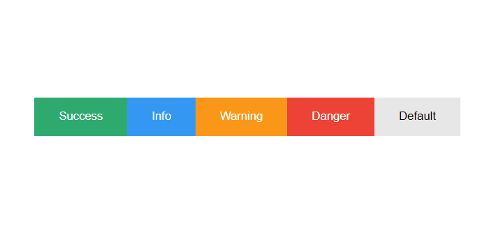
Wrapping up
Now you understand how to create five basic CSS alert buttons. Feel free to use the styles in this tutorial or even make up your colors!