AppCode
This article demonstrates how to the use the CSS drop-shadow filter function on elements with CSS filter. Included is code and examples.
The CSS drop-shadow function is a value of the CSS filter property. Drop-shadow applies a drop-shadow to the target HTML element. This can also include an image. The drop-shadow is a blurred alpha-mask with an offset and color applied.
Syntax
drop-shadow(offset-x, offset-y, blur-radius, color);Parameters
- offset-x (required)
The offset-x value of drop-shadow is an absolute or relative length. Offset-x applies an offset in a horizontal distance. A positive value moves the offset right, while a negative value moves the offset left. The default offset-x value is 0. When the value is 0, the shadow is applied directly behind the element with no offset.
- offset-y (required)
The offset-y value of drop-shadow is an absolute or relative length. Offset-y applies an offset in a vertical distance. A positive value moves the offset down, while a negative value moves the offset up. The default offset-y value is 0. When the value is 0, the shadow is applied directly behind the element with no offset.
- blur-radius (optional)
The blur-radius value of drop-shadow is an absolute or relative length. Blur-radius defines the length of the drop-shadow blur. A smaller value results in a short and less blurred shadow, while a larger value creates a longer and more blurred one. If the value of blur-radius is not applied it defaults to 0. A value of zero creates a sharp and unblurred shadow. Negative values are not accepted as a blur-radius.
- color (optional)
The color value of drop-shadow is any accepted CSS defined color, whether that is a color name, hex, rgb, etc. Color sets the color of the drop-shadow.
Notes: If a color is not set, the color is applied using the CSS color property.
color: red;
filter: drop-shadow(1px 1px 1px); /* The drop-shadow is red */
Defaults
The default value for all length values is zero, and the color is transparent. The initial value for interpolation is all length values set to 0.
Examples
The examples below uses colors and absolute and relative values for the parameters of the drop-shadow filter function.
color: blue;
filter: drop-shadow(1px 1px 1px);                /* Blue drop-shadow */

filter: drop-shadow(0.25re 0.25re 0.25rem #ccc); /* Gray drop-shadow */
filter: drop-shadow(5px 10px 2px purple);        /* Purple drop-shadow */
filter: drop-shadow(2px 2px green);              /* Green drop-shadow */
filter: drop-shadow(2pt 5pt cyan);               /* Cyan drop-shadow */
filter: drop-shadow(0.5em 0.5em 0.5em yellow);   /* Yellow drop-shadow */

filter: drop-shadow(2px 4px 6px #ff00006e);      /* Semi-transparent */
Usage
You can apply the drop-shadow filter to any element or image by using CSS selectors.
#element-id {
  filter: drop-shadow(5px 5px 5px black);
}

img {
  filter: drop-shadow(4px 8px 12px white);
}
Try It
HTML
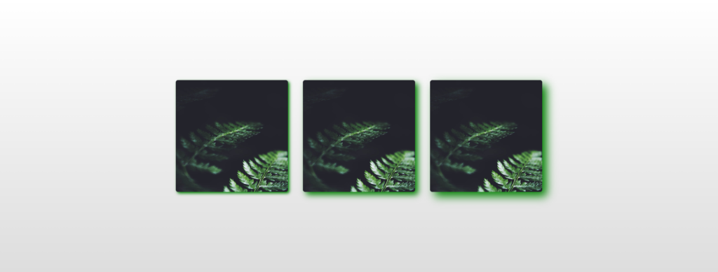
<div class="wrapper">
  <img src="https://s3-us-west-2.amazonaws.com/s.cdpn.io/46992/noah-silliman-141979.jpg" alt="" />
  <img src="https://s3-us-west-2.amazonaws.com/s.cdpn.io/46992/noah-silliman-141979.jpg" alt="" />
  <img src="https://s3-us-west-2.amazonaws.com/s.cdpn.io/46992/noah-silliman-141979.jpg" alt="" />
</div>
CSS
.wrapper img {
  width: 300px;
  height: 300px;
  object-fit: cover;
  border-radius: 6px;
  margin: 0 20px;
  vertical-align: middle;
}

.wrapper img:nth-child(1) {
  filter: drop-shadow(4px 4px 4px green);
}

.wrapper img:nth-child(2) {
  filter: drop-shadow(8px 8px 8px green);
}

.wrapper img:nth-child(3) {
  filter: drop-shadow(12px 12px 12px green);
}

html {
  text-align: center;
  min-height: 100%;
  background: linear-gradient(white, #ddd);
}

.wrapper {
  width: 100%;
  background: transparent;
  text-align: center;
  -webkit-box-align: center !important;
  -ms-flex-align: center !important;
  align-items: center !important;
  -webkit-box-pack: center !important;
  -ms-flex-pack: center !important;
  justify-content: center !important;
  display: -webkit-box !important;
  display: -ms-flexbox !important;
  display: flex !important;
  height: 100%;
}

html,
body {
  height: 100%;
  margin: 0;
}
Specifications
W3C CSS Filter Effects Module Level 1
#funcdef-filter-drop-shadow