Mandala   / / / / / / / / / / / /   / / / / / / / / / / / /   / / / / / / / / / / / /   / / / / / / / / / / / /   / / / / / / / / / / / /   / / / / / / / / / / / /   / / / / / / / / / / / /  + + + + + +  + + + + + +  + + + + + +  + + + + + +  + + + + + +  + + + + + +  + + + + + +{ { {} } } }  { { {} } } }  { { {} } } }  { { {} } } }  { { {} } } }  { { {} } } }      ../../    ../../    ../../    ../../    ../../    ../../    ../../ <></><></><></> <> </><></><></> <> </><></><></> <> </><></><></> <> </><></><></> <> </>

CSS Footers

This article demonstrates how to create several CSS footers for your webpage. Included are code walkthroughs and other footer examples.

What Is a Footer on a Web Page?

Many footers are often below a content’s main body at the bottom of a page. Often footers on websites contain contact information, terms of service, or even other products which enable users to contact businesses, read legal website documents, or even discover similar services. In simple terms, it is the bottom part of any site that contains links and information. These links and information can even include a sitemap to other pages on a website.

Web Page Footer Structure and Location
Web Page Footer Structure and Location Diagram

A fun fact is that the layout terminology comes from print media, in which the word “footer” is a common design element seen on the bottom of many document pages.

A footer can even help you gain traction on social media platforms by including social bars with icons leading to the website’s social media profiles. These social links ultimately create gain through new followers, conversions, and brand awareness.

Let’s go review items typically found in a website’s footer section.

  • Copyright
  • Sitemap
  • Privacy Policy
  • Terms of Use
  • Contact
  • Address and Link to Map / Directions
  • Phone Numbers
  • Emails
  • Navigation
  • Social Icons
  • Email Signup
  • Press
  • Latest Articles
  • Investor Relations
  • News
  • Events
  • Registration / Signup / Login
  • About Page

Creating a Static Footer

Simple Static Footer
Simple Static Footer Example

The following example will walk through creating a static footer that stays under the content and leaves the viewport when the user scrolls away from the bottom of a page.

The first task you will need to do is to create a structure of HTML elements. This structure will include <a> anchor link elements, a <p> paragraph element, and a <div> container element, and a few other elements. You’ll notice the structure uses the anchor links to create a home, login, and link to each page.

You will need to assign a .container class to the <div> element, so we have a root class to apply various styles to the child HTML elements.

Defining Four Columns Using CSS grid-template-columns
Diagram Defining Four Columns Using CSS grid-template-columns

Above, an image diagram shows that within the structure is a row of containerized items: login, home, about, and copyright notice. A row is created with a CSS display property and a “grid” value to create a horizontal container. Then we tell the browser how to create each width within the grid row using grid-template-columns: 120px 100px 100px auto;. Each value within grid-template-columns defines a column and its width.

In addition to using a CSS grid, we utilize the :hover pseudo-class selector to give each of the three anchor links a hover effect. The hover effect changes the background color of each link.

Link Hover Effect
Link Hover Effect

Now that we’ve dissected the images above let’s move on and create some HTML structure for our page.

HTML

<div class="content">Content</div>
<div class="container">
  <p class="container-text-left">
    <a href="/login.html" class="menu login">login</a>
    <a href="/" class="menu">home</a>
    <a href="/about.html" class="menu">about</a>
    <span class="copyright">Copyright Example.com</span>
  </p>
</div>

Next, we need to add a few styles for several classes in the HTML above.

CSS

body {
  margin: 0;
}

.container {
  width: 100%;
  background-color: #d0daee;
  height: 80px;
}

.container .container-text-left {
  font-size: 20px;
  height: 40px;
  line-height: 40px;
  display: grid;
  grid-template-columns: 120px 100px 100px auto;
  font-family: Arial;
  margin: 0;
  padding: 20px;
  text-align: right;
}

.container .menu {
  text-decoration: none;
  color: black;
  padding: 0 1rem;
  border-radius: 4px;
  margin: 0 0.5rem;
}

.container .menu:hover {
  background-color: #b3bed5;
}

.container .login {
  background: #3d5dec;
  color: white;
  padding: 0 2rem;
}

.container .login:hover {
  background: #2e48bc;
}

.container .copyright {
  font-size: 14px;
  color: gray;
  padding: 0 1rem;
  margin: 0 0.5rem;
}

.content {
   text-align: center;
    background: #927ac0;
    height: 400px;
    line-height: 400px;
    color: white;
    font-size: 20px;
    font-family: Arial;
}

Creating a Sticky Footer

Footer Which Sticks to Bottom of Page
Footer Example Which Sticks to the Bottom of a Page

Sometimes we might want to create a section of information that sticks to the bottom of the page instead of a static one that is positioned immediately after the content.

Two problems web developers may encounter and want to solve when creating footers are:

  • Sticking to a viewport window bottom when page content is short and the viewport is not filled, and
  • Staying at the document end while moving down as expected when there is more content than a viewport’s height (instead of overlapping).

There are several methods by which we can force a footer to the bottom of the page and solve both problems simultaneously.

First, we need to create some elements to apply styles, and then we will explore four methods using CSS, which all achieve a similar sticky result.

HTML

<body>
  <header contentEditable>Header</header>
  <article contentEditable>Content</article>
  <footer contentEditable>Footer</footer>
</body>

Each of these bullet point solutions demonstrates different ways to achieve the stickiness function.

  • Flexbox

Combining a flexbox property and the body element can turn the entire page into a flexbox. We can then set a content section to have a flex of 1, which results in the content taking up a whole viewport, reserving space for a header at the top and a footer at the bottom.

body {
  min-height: 100vh;
  margin: 0;
}

header {
  min-height: 50px;
  background: #f89427;
}

footer {
  min-height: 50px;
  background: #ec7272;
}

/**** Trick: ****/

body {
  display: flex;
  flex-direction: column;
}

/* The article fills all the space between the top and bottom elements in the body when flex set to 1 */
article {
  flex: 1;
}

  • Grid

Grid is similar to the flexbox method and is a straightforward approach with minimal CSS styles. We use grid and grid-template-rows properties to create a grid. Then the content uses 1fr unit for the leftover space in the grid container (the body element).

Since the header and footer have a defined height, a 1fr expands the content to fill the entire viewport. If the content is not longer than the viewport, this fr expansion forces a footer to stick to the bottom of a webpage. On the other hand, it will be at the bottom of the scrollable content if the document is longer than a viewport.

body {
  min-height: 100vh;
  margin: 0;
  display: grid;

  /**** Trick: ****/
  grid-template-rows: auto 1fr auto;
}

header {
  min-height: 50px;
  background: #f89427;
}

footer {
  min-height: 50px;
  background: #ec7272;
}

  • position:absolute (no dynamic height)

This method uses a ::after pseudo-element on a body, that is set to have the footer’s height. Using a ::after forces the pseudo-element to create space after the body which a footer will occupy. When the footer is positioned using absolute, it appears like the element is taking up the pseudo-element’s space and eliminates the adverse effects of its absolute positioning (For example, covering up a body’s content).

body {
  min-height: 100vh;
  margin: 0;
  position: relative;
}

header {
  min-height: 50px;
  background: #f89427;
}

footer {
  background: #ec7272;
}

/* Trick: */
body {
  position: relative;
}

/**** Trick: ****/

body::after {
  content: "";
  display: block;
  height: 50px; /* Same height as below */
}

footer {
  position: absolute;
  bottom: 0;
  right: 0;
  left: 0;
  height: 50px; /* Same height as body */
}

  • Table-layout

Another method is using display: table to turn a body into a table and setting a footer as a table-row. This method also ads min-height: 100% to the body resulting in a footer sticking to the page’s bottom.

header {
  min-height: 50px;
  background: #f89427;
}

footer {
  min-height: 50px;
  background: #ec7272;
}

html {
  height: 100%;
}

body {
  min-height: 100%;
  margin: 0;
}

article {
  height: 1%;
}

/**** Trick: ****/

body {
  display: table;
  width: 100%;
}

body > footer {
  display: table-row;
}

Creating a Fixed Footer

Fixed Footer Using CSS

Another popular method in creating footers is sticking them to the bottom of a viewport. We can make a fixed footer by utilizing the absolute positioning feature of CSS. This fixed element will hover over the content at the bottom of a page as the user scrolls. We will now review a standard solution.

  • position: fixed

The position method uses a position: fix to fix a footer to the bottom of a viewport while allowing the content to slide under it.

HTML

<div class="content">
  <p>Content Text</p>
  <br/>
</div>
<div class="bottom">I'm a fixed footer</div>

CSS

* {
  margin: 0;
  padding: 0;
  font-family: Roboto, "Helvetica Neue", Arial, sans-serif;
}

body {
  display: grid;
  grid-template-rows: 1fr;
  min-height: 100vh;
  color: #fff;
}

.content {
  background: #f4f4f4;
  padding: 2rem;
  width: 50%;
  margin: 0 auto;
  color: black;
}

button {
  padding: 1rem;
}

/**** Trick: ****/

.bottom {
  background: #ef476f;
  padding: 2rem;
  position: fixed;
  bottom: 0;
  left: 0;
  right: 0;
}

Other Examples

Here is a collection of CSS footer examples from across the web. Included are examples and code for reuse on your website.

Related

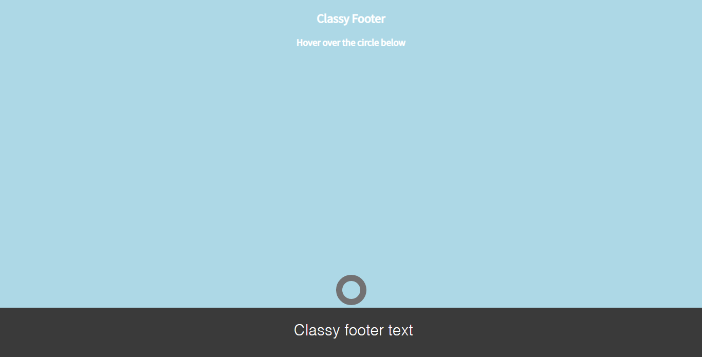
Pure CSS Classy Footer

Pure CSS Classy Footer

About Project

Author

  • Nick Braver
  • codepen.io
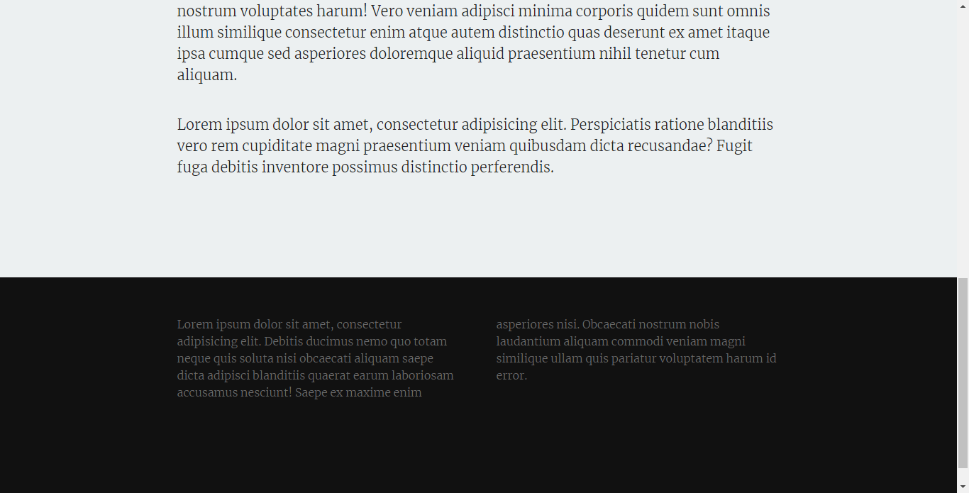
Simple Fixed Footer

Simple Fixed Footer

About Project

Author

  • Mads Håkansson
  • codepen.io
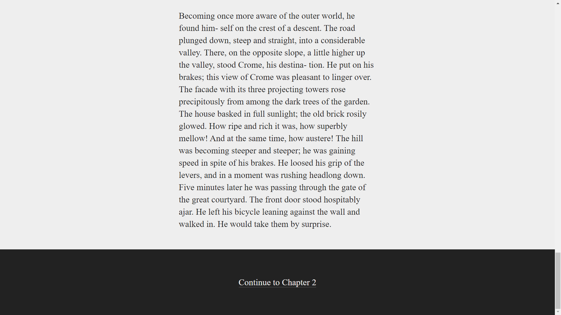
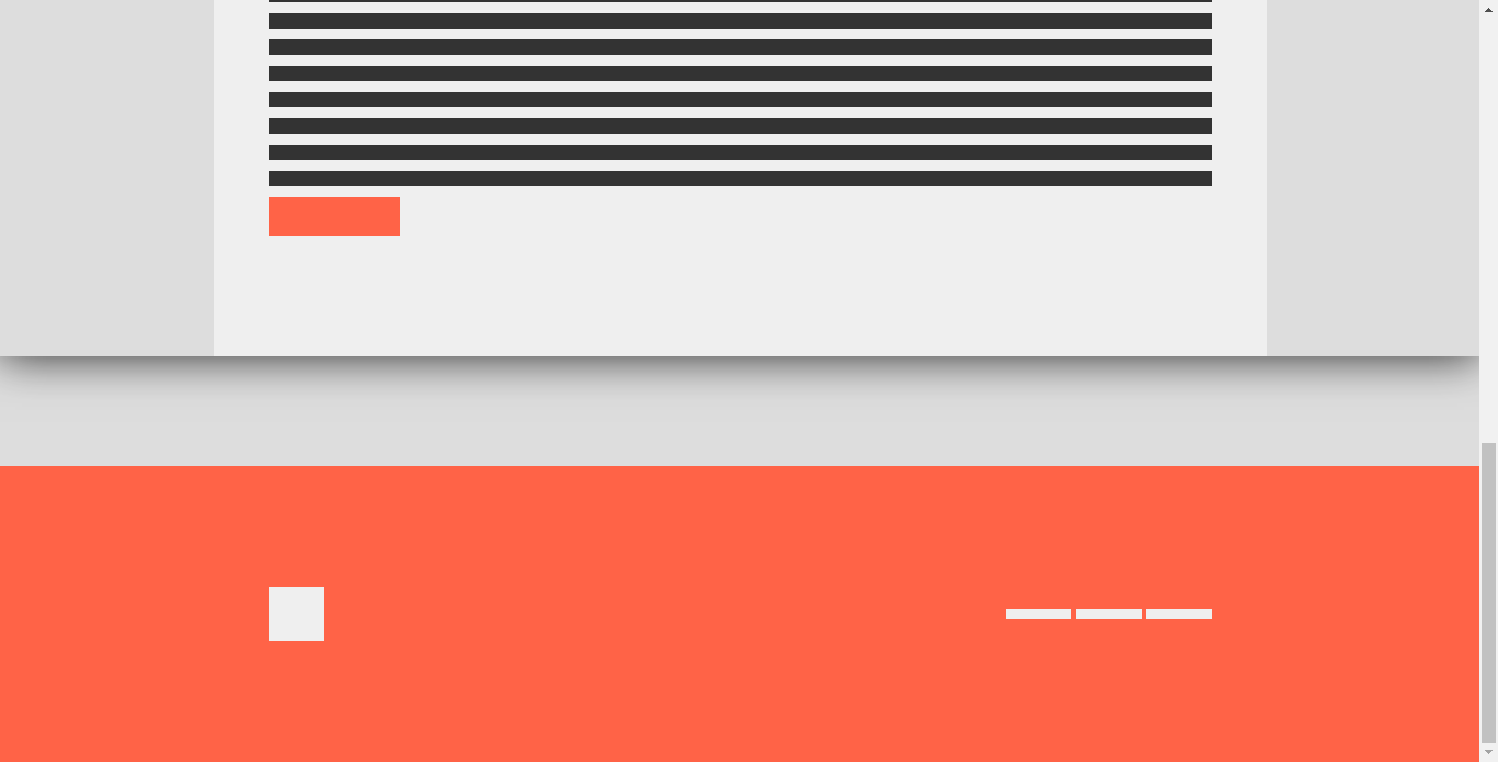
Simple Slide-Out Footer

Simple Slide-Out Footer

About Project
Author

  • Riley Shaw
  • codepen.io
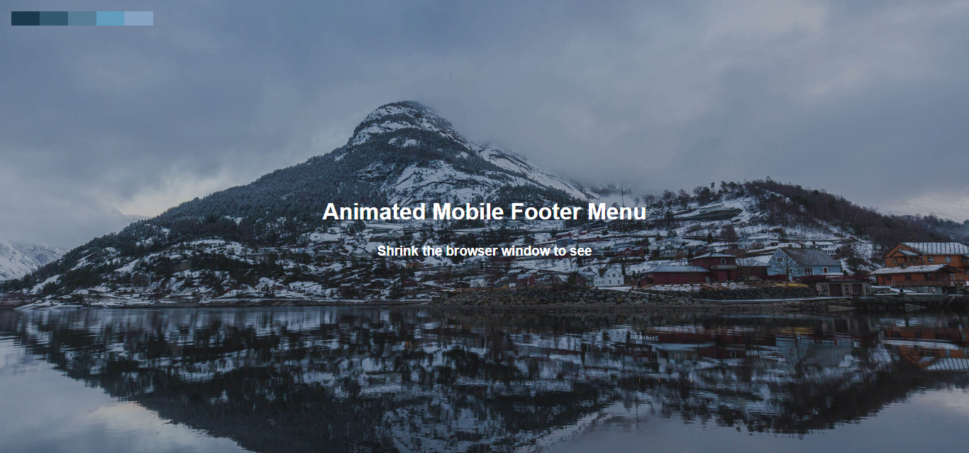
Simple Responsive Fixed Footer

Simple Responsive Fixed Footer

About Project
Author

  • Mātthīas
  • codepen.io
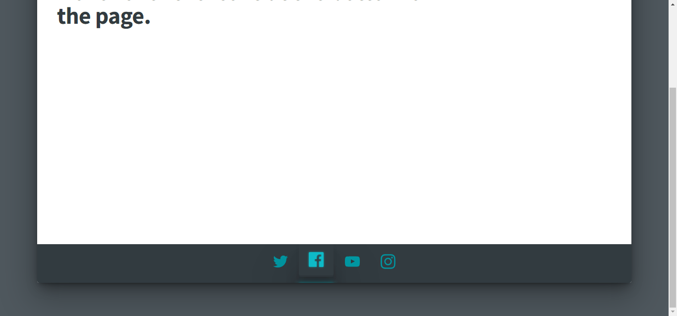
Animated Mobile Footer Menu

Animated Mobile Footer Menu

About Project
Author

  • Pete Lloyd
  • codepen.io
Social Media Footer

Social Media Footer

About Project

Author

  • Andrew Canham
  • codepen.io
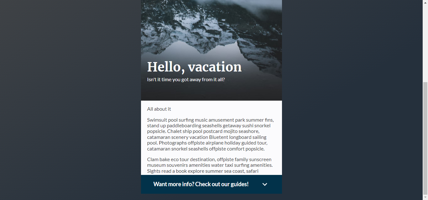
Footer With Conent Scale

Footer With Conent Scale

About Project
Author

  • Mātthīas
  • codepen.io
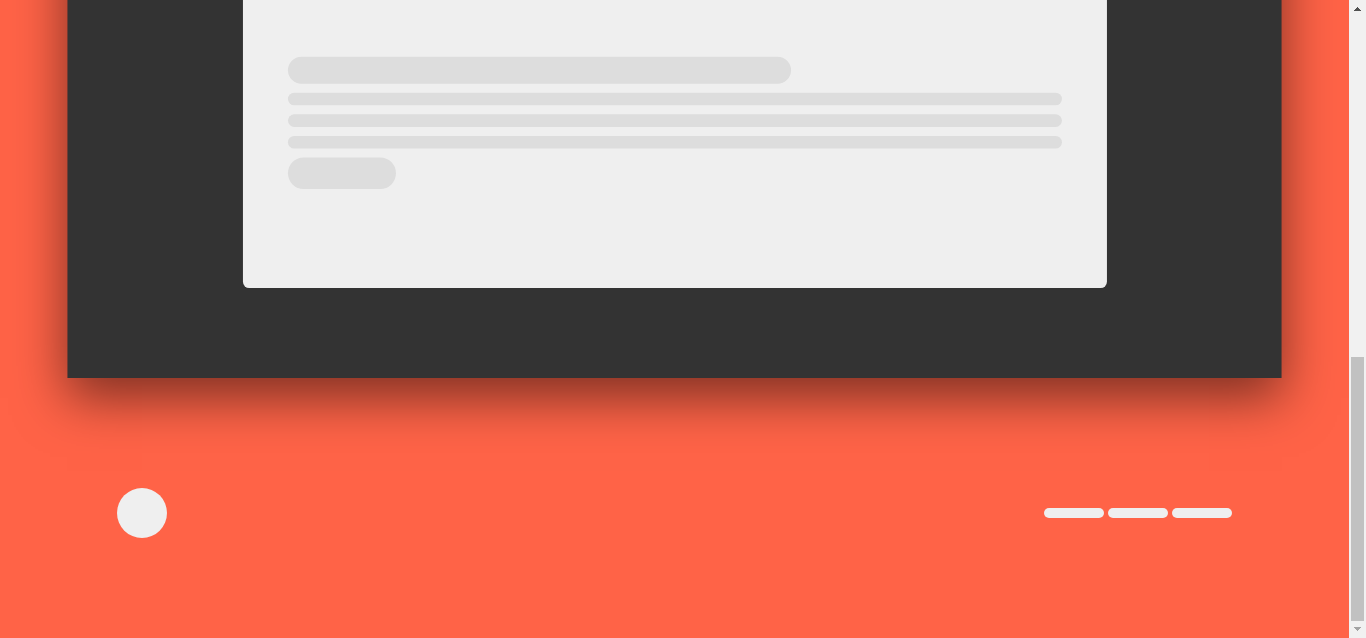
Parallax Fixed Footer

Parallax Fixed Footer

About Project

Author

  • Austin
  • codepen.io
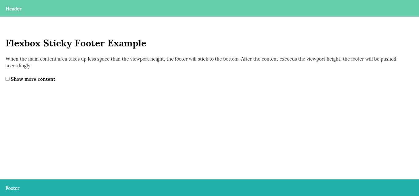
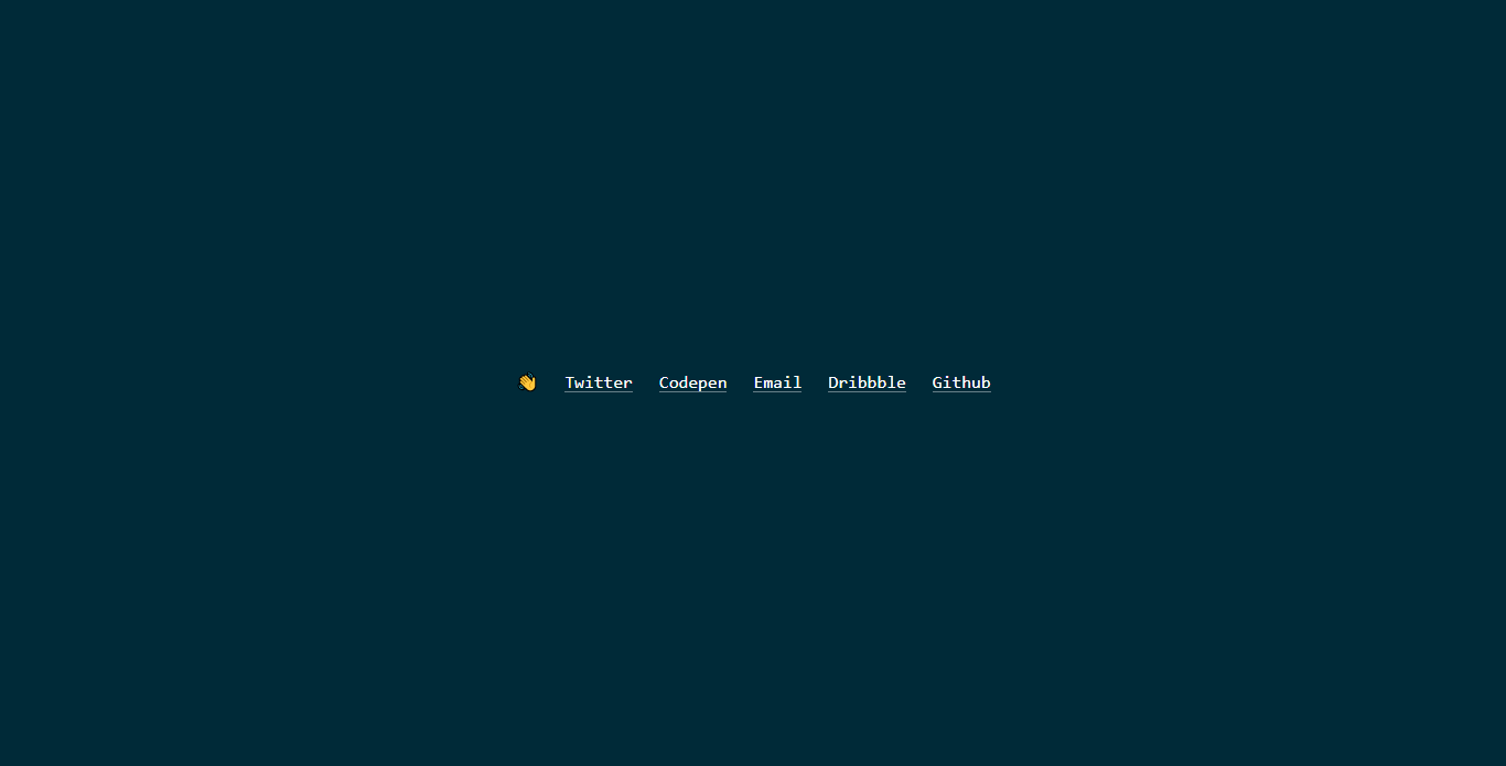
Flexbox Sticky Footer Example

Flexbox Sticky Footer Example

About Project
Author

  • Ryan Mulligan
  • codepen.io
Footer with CSS Grid

Footer with CSS Grid

About Project

Author

  • Jules Forrest
  • codepen.io
Animated Footer Toggle

Animated Footer Toggle

About Project

Author

  • Sheelah Brennan
  • codepen.io
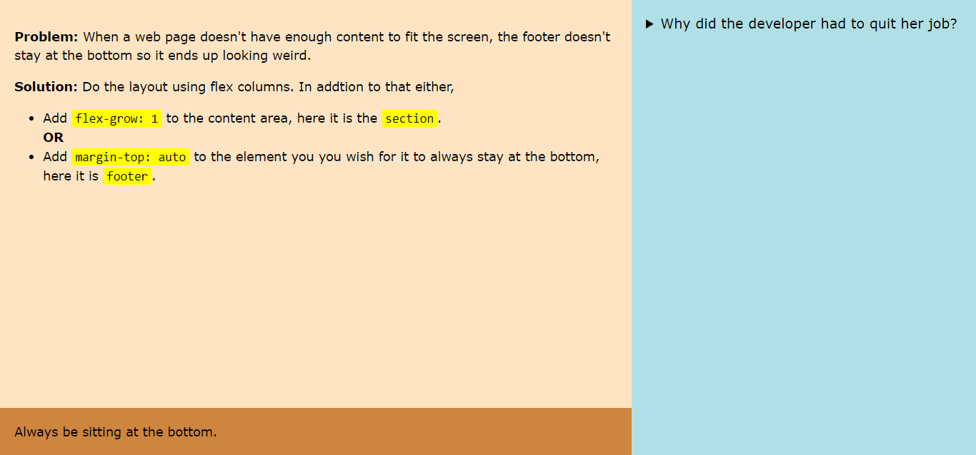
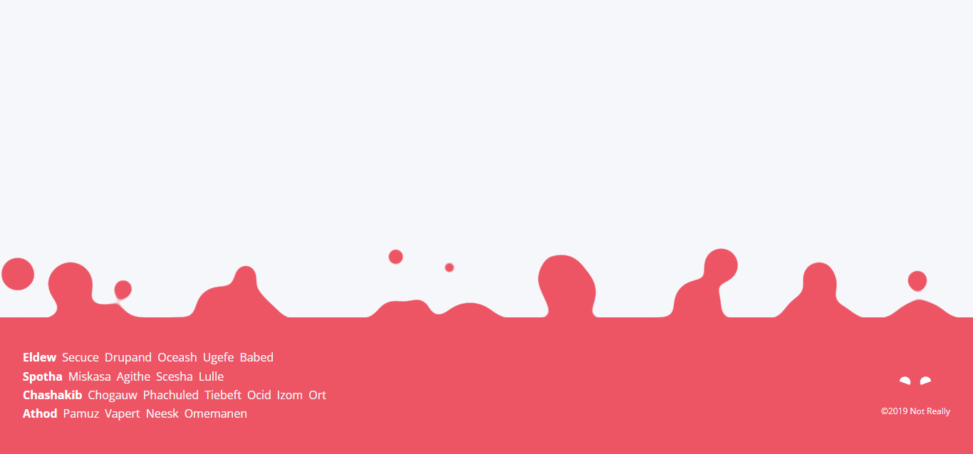
Footer Always at the Bottom – Flexbox

Footer Always at the Bottom – Flexbox

About Project
Author

  • Ananya Neogi
  • codepen.io
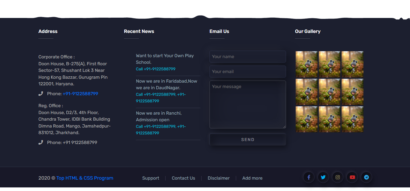
Bubble-Type CSS Goey Footer

Bubble-Type CSS Goey Footer

About Project
Author

  • Zed Dash
  • codepen.io
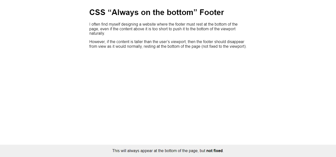
Footer Design With Embossed Effect

Footer Design With Embossed Effect

About Project
Author

  • Swarup Kumar Kuila
  • codepen.io
CSS “Always on the Bottom” Footer

CSS “Always on the Bottom” Footer

About Project

Author

  • Chris Bracco
  • codepen.io
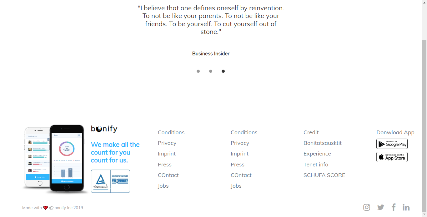
Bootstrap Footer 6(Source From Bootstrap)

Bootstrap Footer 6(Source From Bootstrap)

About Project
Author

  • haycuoilennao19
  • codepen.io
Bootstrap Footer 5 (source From Bootstrap)

Bootstrap Footer 5 (Source From Bootstrap)

About Project

Author

  • haycuoilennao19
  • codepen.io
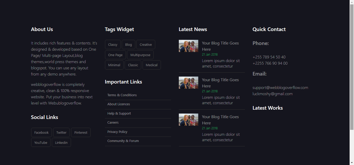
Bootstrap Footer 4 (Source From Bootstrap)

Bootstrap Footer 4 (Source From Bootstrap)

About Project
Author

  • haycuoilennao19
  • codepen.io
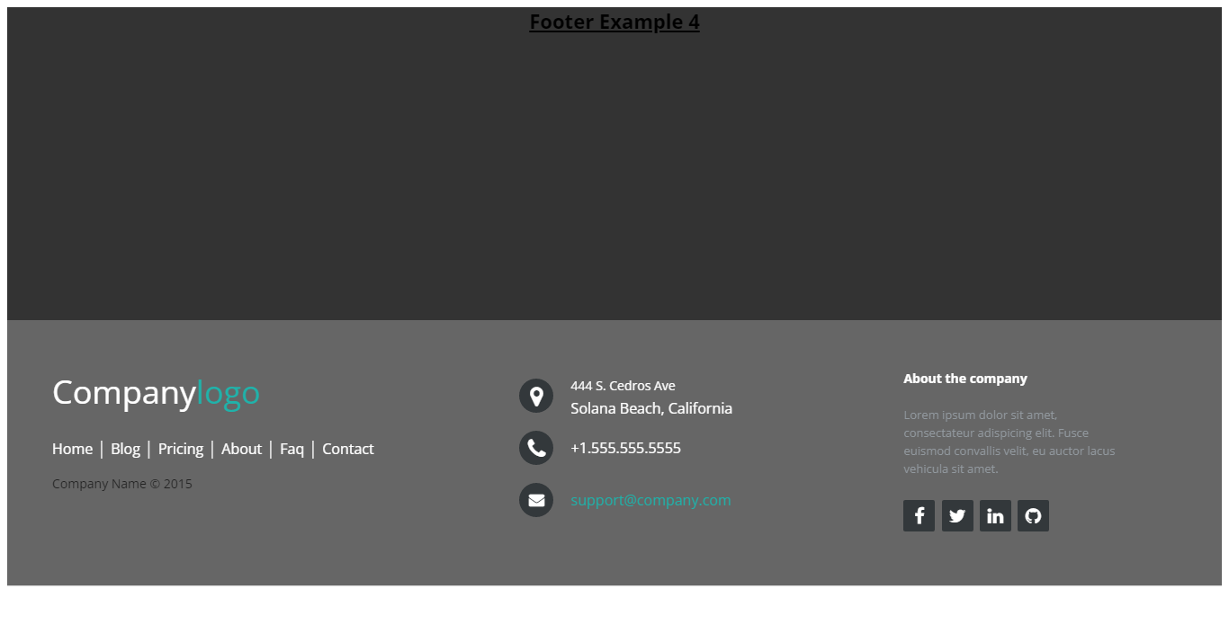
Bootstrap Footer 2 (Source From Bootsnipp)

Bootstrap Footer 2 (Source From Bootsnipp)

About Project
Author

  • haycuoilennao19
  • codepen.io
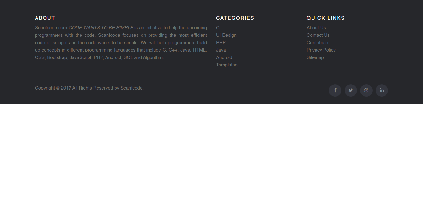
Footer With Company Logo

Footer With Company Logo

About Project
Author

  • Steve
  • codepen.io
Footer Template With Category

Footer Template With Category

About Project
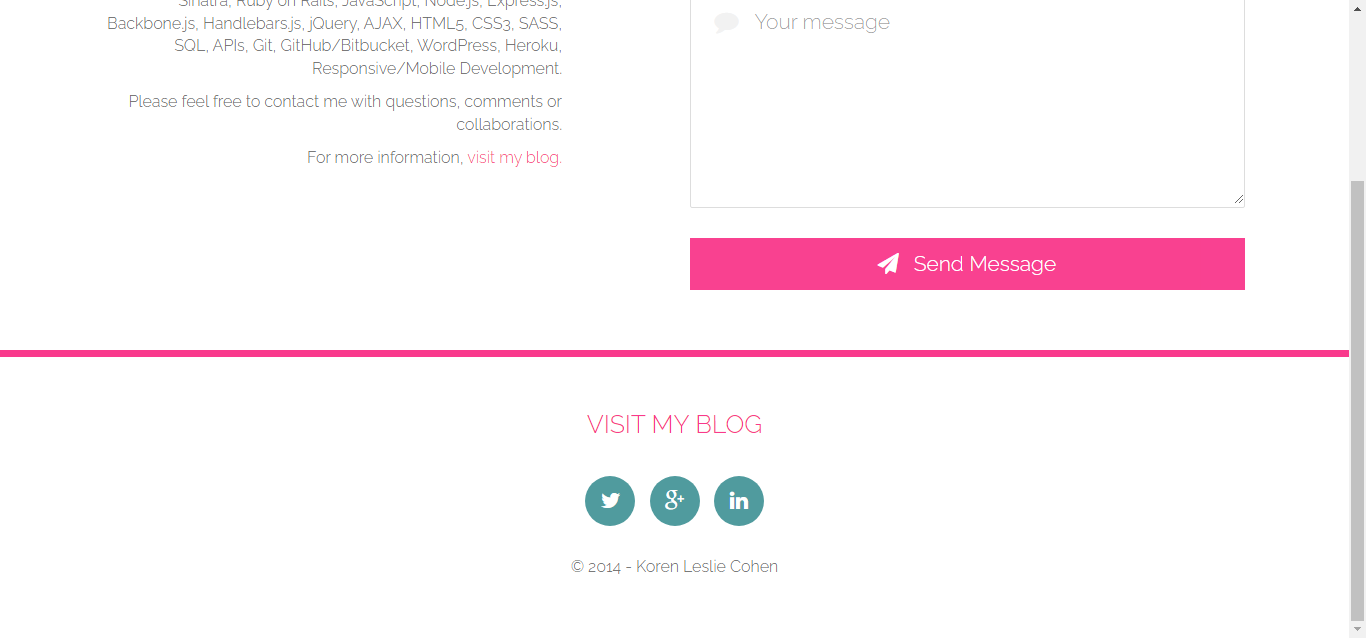
Author

  • scanfcode
  • codepen.io
Template Contact & Footer

Template Contact & Footer

About Project
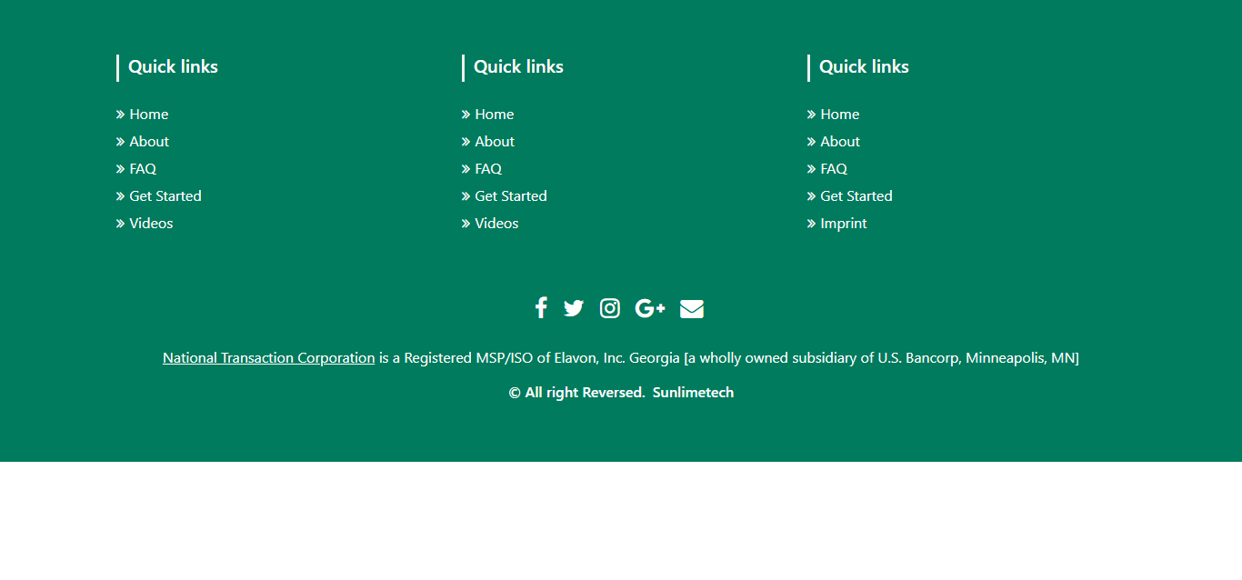
Author

  • Francesca Tabor
  • codepen.io
Footer Using Bootstrap 4(Source From Bootsnip)

Footer Using Bootstrap 4(Source From Bootsnip)

About Project

Author

  • haycuoilennao19
  • codepen.io
Bootstrap Footer With Company Logo 2

Bootstrap Footer With Company Logo 2

About Project
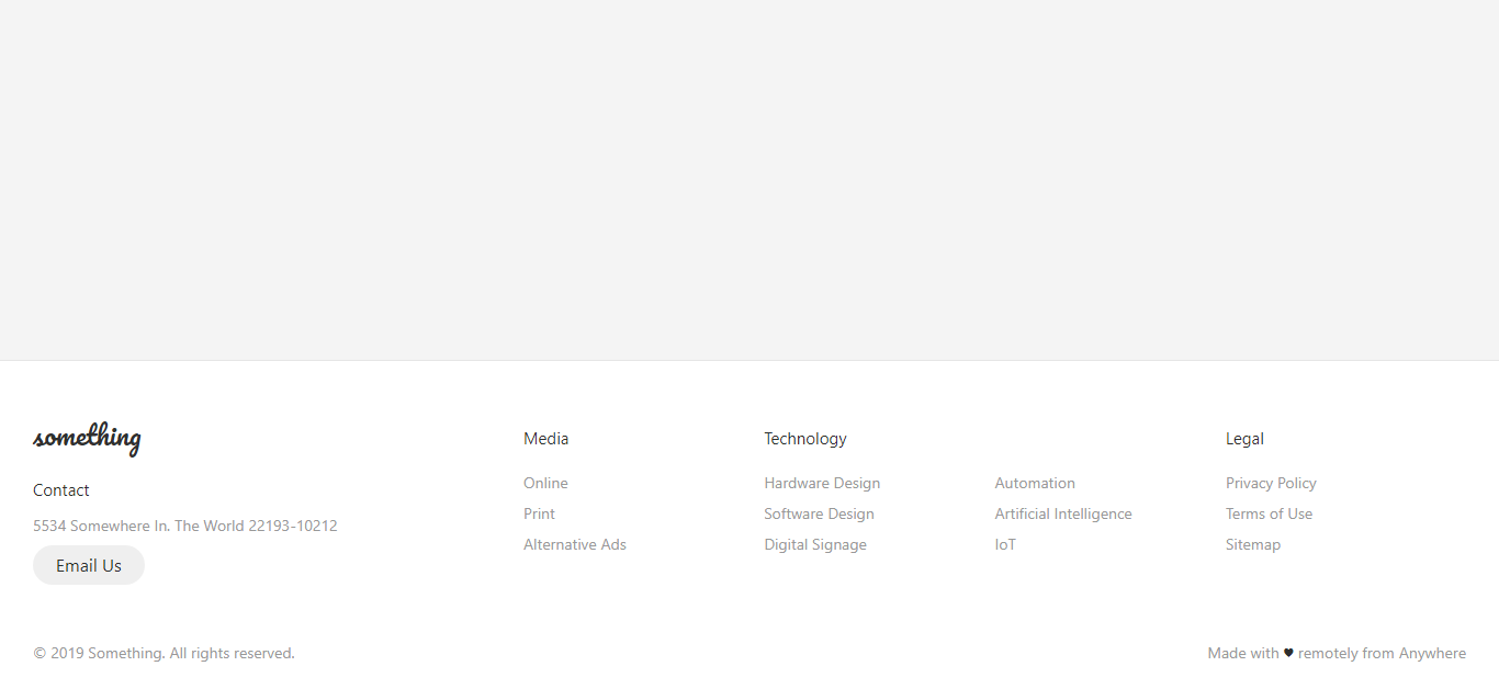
Author

  • Sebastian Sabadus
  • codepen.io
Responsive Flexbox Footer

Responsive Flexbox Footer

About Project
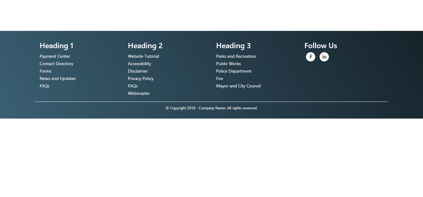
Author

  • Matheus Almeida
  • codepen.io
Bootstrap 4 Footer With Social Icons

Bootstrap 4 Footer With Social Icons

About Project
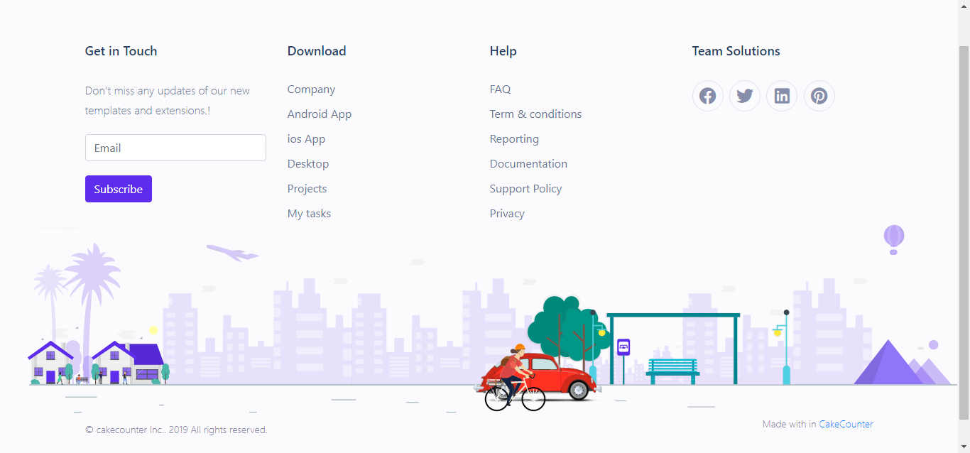
Author

  • Namiq Namaz
  • codepen.io
Stylish Footer With Animation

Stylish Footer With Animation

About Project
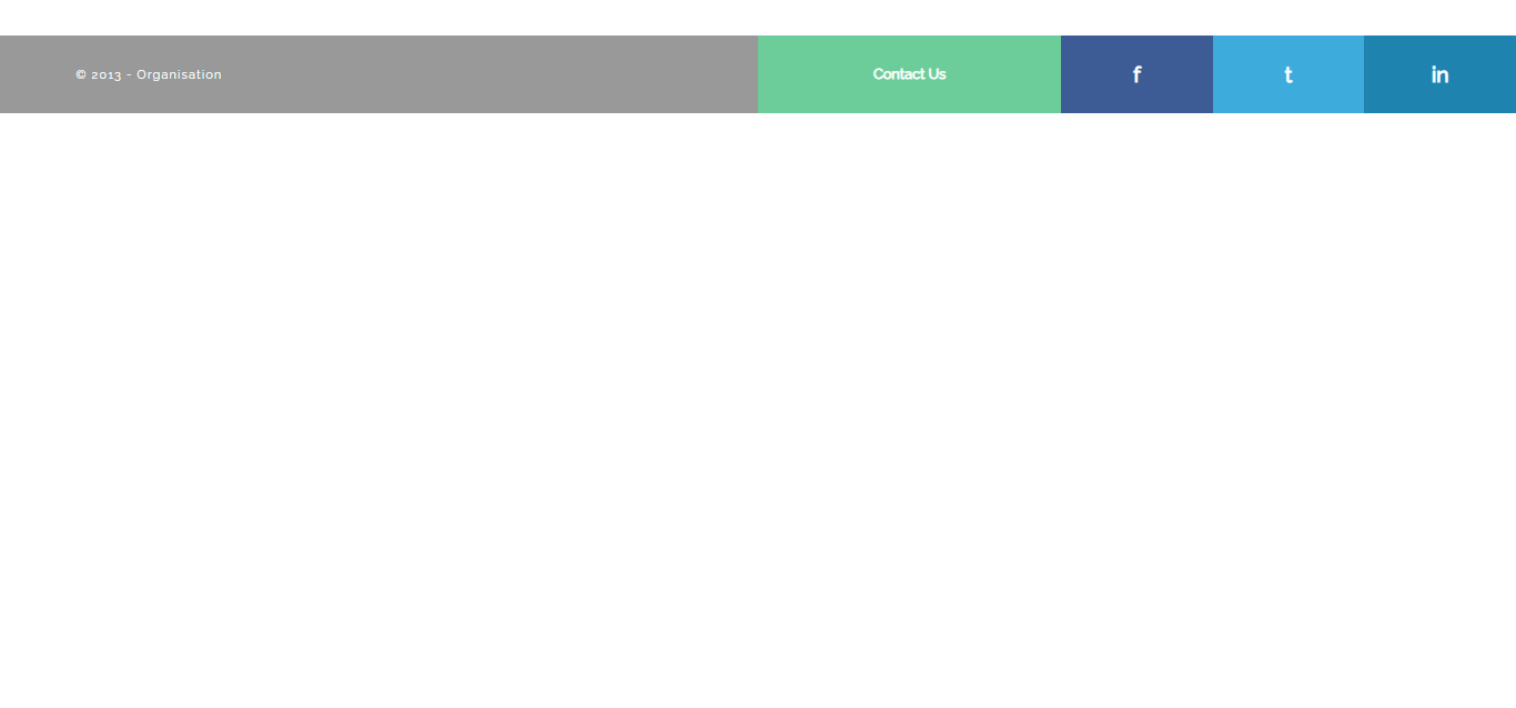
Author

  • Swarup Kumar Kuila
  • codepen.io
Just Another Simple Footer

Just Another Simple Footer

About Project

Author

  • Craig
  • codepen.io
Footer Responsive

Footer Responsive

About Project

Author

  • Baahubali
  • codepen.io
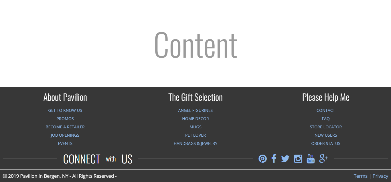
Responsive & Clean Footer Design

Responsive & Clean Footer Design

About Project
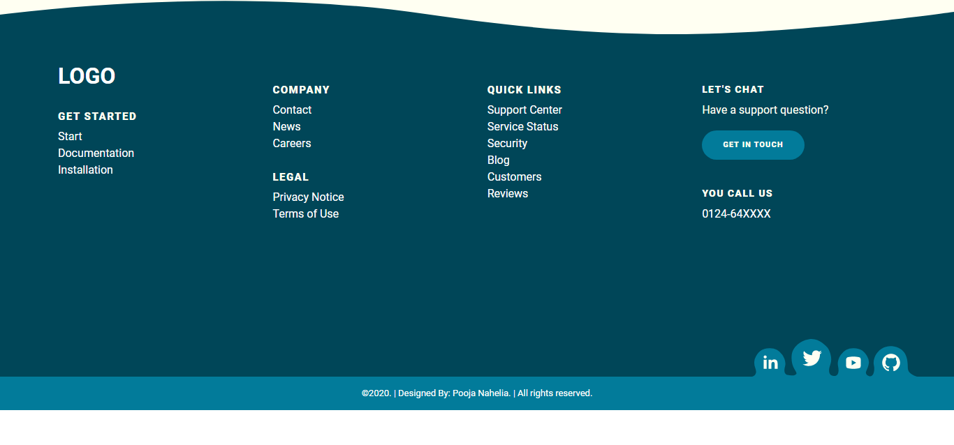
Author

  • Christopher Schuck
  • codepen.io
Attractive Responsive Footer

Attractive Responsive Footer

About Project
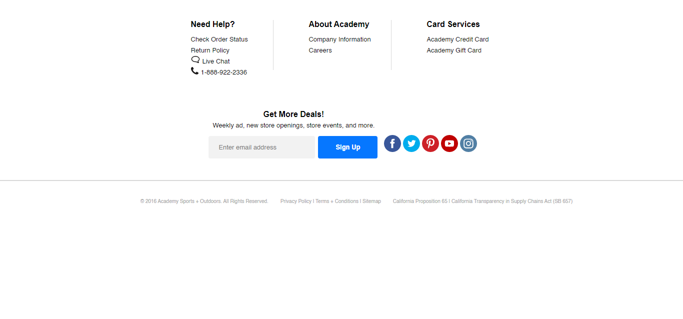
Author

  • Pooja Nahelia
  • codepen.io
3 Blocks Responsive Footer

3 Blocks Responsive Footer

About Project

Author

  • William White
  • codepen.io

Recommended Articles

Other Articles