AppCode
This article demonstrates how to create HTML buttons with CSS inset shadows. Included in this CSS shadow example are useable code and a demo.
This article was first seen on and republished from csstutorial.io
HTML
Included below is the HTML we use to construct the buttons we will be applying CSS styles to. We create each button with a “.btn” class and additionally a “.btn-$number” class. Each “.btn-$number” class represents a different CSS button style.
<div class="super-container">
  <div class="shadow-buttons">
    <div class="btn btn-1">
      Button Text
    </div>
    <div class="btn btn-2">
      Button Text
    </div>
    <div class="btn btn-3">
      Button Text
    </div>
    <div class="btn btn-4">
      Button Text
    </div>
    <div class="btn btn-5">
      Button Text
    </div>
    <div class="btn btn-6">
      Button Text
    </div>
    <div class="btn btn-7">
      Button Text
    </div>
    <div class="btn btn-8">
      Button Text
    </div>
    <div class="btn btn-9">
      Button Text
    </div>
    <div class="btn btn-10">
      Button Text
    </div>
    <div class="btn btn-11">
      Button Text
    </div>
    <div class="btn btn-12">
      Button Text
    </div>
  </div>
<div>
CSS
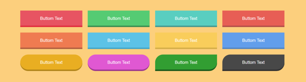
The CSS styles below create the individual color shade themes you see for each button. As we mentioned above, each button has its unique class “.btn-$number”. For example, let’s use class “.btn-1”. This class applies a background with the color #ed5562 and then sets a border and a CSS inset box-shadow of the color #e82e3e. With these two colors in combination, it gives the effect of a shadow on the bottom of the button. Additionally, whenever the user hovers over the button, a hover CSS pseudo-class is activated, setting the border-radius to 30px with an ease-in-out transition. As we see in the live demo below, the inset box-shadow wraps around the corners of the button whenever the border-radius changes. With these properties combined, they create the box-shadow effect we see on each button.
html {
  height: 100%;
  overflow: hidden;
}

body {
  font-family: "Poppins", sans-serif;
  background: #ffd079;
  max-width: 1140px;
  margin: 0 auto;
  height: 100%;
  overflow: hidden;
}

.super-container {
  -webkit-box-align: center !important;
  -ms-flex-align: center !important;
  align-items: center !important;
  -webkit-box-pack: center !important;
  -ms-flex-pack: center !important;
  justify-content: center !important;
  display: -webkit-box !important;
  display: -ms-flexbox !important;
  display: flex !important;
  height: 100%;
  flex-wrap: wrap;
}

.btn {
  float: left;
  color: #fff;
  text-align: center;
  cursor: pointer;
  margin: 1%;
  width: 23%;
  height: 60px;
  line-height: 60px;
}

.btn-1 {
  background: #ed5562;
  border-bottom: 3px solid #e82e3e;
  -webkit-box-shadow: inset 0 -3px #e82e3e;
  box-shadow: inset 0 -3px #e82e3e;
}

.btn-2 {
  background: #42cb6f;
  border-bottom: 3px solid #2f8e4e;
  -webkit-box-shadow: inset 0 -3px #2f8e4e;
  box-shadow: inset 0 -3px #2f8e4e;
}

.btn-3 {
  background: #47cec0;
  border-bottom: 3px solid #3c988f;
  -webkit-box-shadow: inset 0 -3px #3c988f;
  box-shadow: inset 0 -3px #3c988f;
}

.btn-4 {
  background: #ed5f55;
  border-bottom: 3px solid #b95049;
  -webkit-box-shadow: inset 0 -3px #b95049;
  box-shadow: inset 0 -3px #b95049;
}

.btn-5 {
  background: #f57c4f;
  border-bottom: 3px solid #b55f3f;
  -webkit-box-shadow: inset 0 -3px #b55f3f;
  box-shadow: inset 0 -3px #b55f3f;
}

.btn-6 {
  background: #4ec2e7;
  border-bottom: 3px solid #32a5ca;
  -webkit-box-shadow: inset 0 -3px #32a5ca;
  box-shadow: inset 0 -3px #32a5ca;
}

.btn-7 {
  background: #fcce54;
  border-bottom: 3px solid #d6ae43;
  -webkit-box-shadow: inset 0 -3px #d6ae43;
  box-shadow: inset 0 -3px #d6ae43;
}

.btn-8 {
  background: #5c9ded;
  border-bottom: 3px solid #4e84c3;
  -webkit-box-shadow: inset 0 -3px #4e84c3;
  box-shadow: inset 0 -3px #4e84c3;
}

.btn-9 {
  background: #ecaf0d;
  border-bottom: 3px solid #b3850c;
  -webkit-box-shadow: inset 0 -3px #b3850c;
  box-shadow: inset 0 -3px #b3850c;
  border-radius: 30px;
}

.btn-10 {
  background: #e657d4;
  border-bottom: 3px solid #9e3691;
  -webkit-box-shadow: inset 0 -3px #9e3691;
  box-shadow: inset 0 -3px #9e3691;
  border-radius: 30px;
}

.btn-11 {
  background: #199e29;
  border-bottom: 3px solid #0c5815;
  -webkit-box-shadow: inset 0 -3px #0c5815;
  box-shadow: inset 0 -3px #0c5815;
  border-top-left-radius: 30px;
  border-bottom-right-radius: 30px;
}

.btn-12 {
  background: #484848;
  border-bottom: 3px solid #313030;
  -webkit-box-shadow: inset 0 -3px #313030;
  box-shadow: inset 0 -3px #313030;
  border-top-left-radius: 30px;
  border-bottom-right-radius: 30px;
}

.btn:hover {
  transition: 1s all ease-in-out;
  border-radius: 30px;
}
Edit a live demo of this project on codepen.io
In this example we use a class called “.super-container”. This CSS class includes CSS properties to vertically and horizonatally center the group of buttons.
More on how to horizontally and vertically center an HTML element with flexbox. Using display, align-items, and justify-content CSS properties.
.class-name {
    display: flex;
    align-items: center;
    justify-content: center;
}