AppCode
This tutorial explains how to design three column layout using pure CSS (table-less layout) and a background image with images for li lists.
Contents
Images Used in This Tutorial
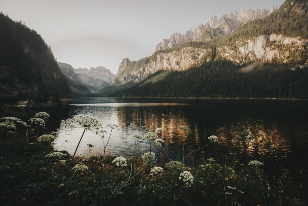
A Valley With Flowers Website Background 
Blue Circle List Bullet Points
HTML
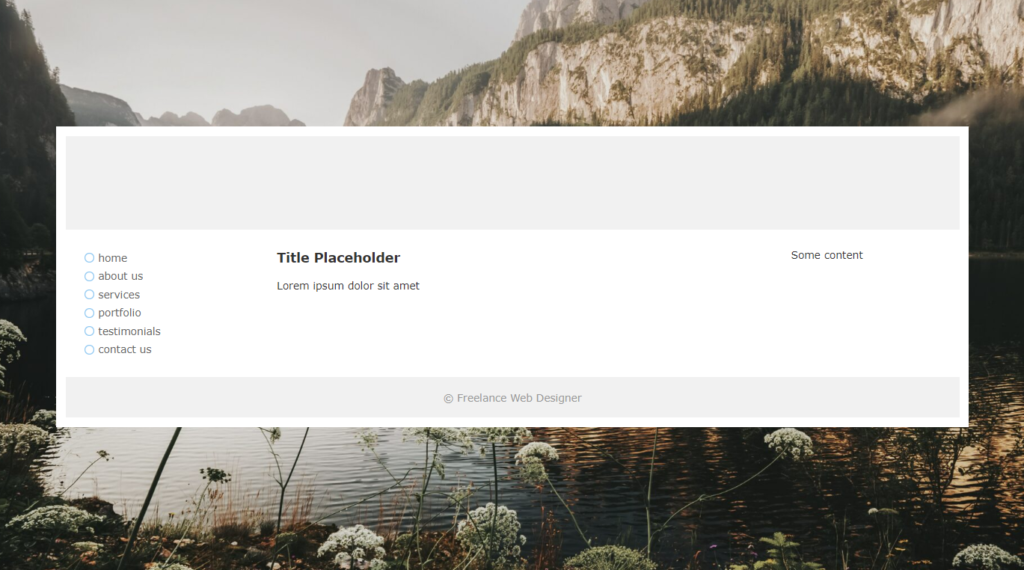
To start, let’s create a structure for our page. Please copy and paste the following content into your blank HTML file:
<div id="wrapper">
  <div id="header"></div>
  <div id="container">
    <div id="left">
      <ul id="nav">
        <li><a href="#" title="home">home</a></li>
        <li><a href="#" title="about us">about us</a></li>
        <li><a href="#" title="services">services</a></li>
        <li><a href="#" title="portfolio">portfolio</a></li>
        <li><a href="#" title="testimonials">testimonials</a></li>
        <li><a href="#" title="contact us">contact us</a></li>
      </ul>
    </div>
    <div id="center">
      <h1>Title Placeholder</h1>
      <p>Lorem ipsum dolor sit amet</p>
    </div>
    <div id="right">Some content</div>
    <div class="clearer"> </div>
  </div>
  <div id="footer">
    <p>© <a href="/" title="Freelance Web Designer" target="_blank">Freelance Web Designer</a></p>
  </div>
</div>
CSS
Note: If you are unsure about including CSS styles in a CSS file or an HTML file you can use our article to help you out. Direct Link →
Then you’ll need to add the CSS styles in the head of the HTML or as a separate style sheet.
body {
  font-family: Verdana, Arial, Helvetica, sans-serif;
  font-size: 11px;
  color: #333;
  text-align: center;
  margin: 0;
  padding: 20px 0px 20px 0px;
  background-attachment: scroll;
  background: url(https://appcode.app/wp-content/uploads/2022/07/a-valley-with-flowers-website-background-scaled.jpg)
    no-repeat center center fixed;
  -webkit-background-size: cover;
  -moz-background-size: cover;
  -o-background-size: cover;
  background-size: cover;
}
#wrapper {
  width: 956px;
  padding: 10px;
  margin: 0 auto 0 auto;
  height: auto;
  text-align: left;
  background: white;
}
#header {
  margin: 0;
  padding: 0;
  height: 100px;
  width: auto;
  background-color: #f1f1f1;
}
#container {
  padding: 0;
  margin: 10px 0 0 0;
  height: 1%;
  width: auto;
}
#left {
  margin: 0;
  width: 160px;
  padding: 10px 20px 10px 20px;
  float: left;
}
#nav {
  margin: 0;
  padding: 0;
  list-style-image: none;
  list-style-type: none;
}
#nav li {
  margin: 0;
  padding: 0;
  display: block;
  background-attachment: scroll;
  background-image: url(https://appcode.app/wp-content/uploads/2022/07/blue-circle-list-bullet-points.png);
  background-repeat: no-repeat;
  background-position: 0 50%;
  background-size: 10px 10px;
}
#nav li a:link,
#nav li a:visited,
#nav li a:active {
  color: #666;
  text-decoration: none;
  display: block;
  margin: 0px;
  padding: 3px 15px 3px 15px;
  width: 130px;
}
#nav li a:hover {
  color: #999;
  text-decoration: none;
}
#center {
  height: auto;
  width: 504px;
  padding: 10px 20px 10px 20px;
  float: left;
  margin: 0 0 0 6px;
  line-height: 1.8em;
}
h1 {
  font-size: 14px;
  margin: 0;
  padding: 0;
}
#right {
  padding: 10px 20px 10px 20px;
  height: auto;
  width: 160px;
  float: left;
  margin: 0 0 0 6px;
}
.clearer {
  font-size: 0;
  line-height: 0;
  display: block;
  margin: 0;
  padding: 0;
  clear: both;
  height: 0;
  width: auto;
}
#footer {
  margin: 10px 0 0 0;
  text-align: center;
  padding: 15px 0 15px 0;
  background-color: #f1f1f1;
}
#footer p {
  color: #999;
  margin: 0 auto 0 auto;
  padding: 0;
}
#footer a:link,
#footer a:visited,
#footer a:active {
  color: #999;
  text-decoration: none;
}
#footer a:hover {
  color: #ccc;
  text-decoration: none;
}
Explaining The Layout
Okay, so what actually has happened?
Our entire layout is “wrapped” in the outside div with id=”wrapper”
<div id="wrapper">
<!-- Contents -->
</div>
The width of the wrapper is 956px plus it has 10px padding on each side.
There is also an added 10px padding border to create the outline of our div against the background of the body tag.
Next, there is a div element with id=”header”. This is just a simple header with a height of 100px.
<div id="header"></div>The next element in the hierarchy is div with id=”container”.
<div id="container">
<!-- HTML Contents -->
</div>
The container also has a background image. This image is centered to fill in the entire space vertically and horizontally using the CSS image properties.
background: url(https://appcode.app/wp-content/uploads/2022/07/a-valley-with-flowers-website-background-scaled.jpg)
 no-repeat center center fixed;
-webkit-background-size: cover;
-moz-background-size: cover;
-o-background-size: cover;
background-size: cover;
Inside container there are four divs with ids: #left, #center, #right and a class .clearer. All of them except .clearer have float=left to ensure they are in line.
<div id="left">
   <ul id="nav">
      <li><a href="#" title="home">home</a></li>
      <li><a href="#" title="about us">about us</a></li>
      <li><a href="#" title="services">services</a></li>
      <li><a href="#" title="portfolio">portfolio</a></li>
      <li><a href="#" title="testimonials">testimonials</a></li>
      <li><a href="#" title="contact us">contact us</a></li>
    </ul>
  </div>
  <div id="center">
    <h1>Title Placeholder</h1>
    <p>Lorem ipsum dolor sit amet</p>
  </div>
  <div id="right">Some content</div>
  <div class="clearer"> </div>
</div>
The center and right divs have also a left margin of 6px to give a gap in between the columns.
margin: 0 0 0 6px;.clearer has font-size, line-height, margin, padding, and height equal 0, and clear equals both.
This way it separates our divs from what’s after .clearer.
.clearer {
  font-size: 0;
  line-height: 0;
  display: block;
  margin: 0;
  padding: 0;
  clear: both;
  height: 0;
  width: auto;
}
Then it’s just the footer and some simple formatting – feel free to use anything you want.
I hope you’ll enjoy this tutorial.
Recommended Articles
- How To Build Web Layouts for Dual-Screen
- A Guide on How To Use CSS Grids for Layouts
- 32 CSS Header Examples and Code
- 32 CSS Footer Examples and Code