AppCode
This article demonstrates how to use CSS grids to improve the layout of your web pages. It includes well-elaborated examples of implementing a grid using the different grid properties, and it also includes code snippets that you can try.
When displaying content on a web page, it’s crucial to think about how the different items like the icons, images, headers, footers, sidebars, search bars, and text will be positioned. The layout can get messy when displayed on different browsers or devices without a proper blueprint. CSS grid provides you with the flexibility to tell all platforms (browsers and devices) how the content will organize and arrange itself.
Why You Should be Using CSS Grid Layout
CSS grid provides a way for web developers to easily map how the space on a web page will hold content. You can create rows and columns because the grid uses a two-dimensional positioning algorithm, and a grid can make it easy to organize complex web pages. Addionally with mapping and structure, the CSS grid can create a responsive web page layout that automatically adjusts to device screen size and orientation. It can adapt to PCs, tablets, mobile phones, and other devices. With this said, you may wonder about compatibility. The good news is that the grid layout is compatible with all your favorite browsers such as Chrome, Mozilla Firefox, Safari, Brave, Edge, Opera, and more.
Important CSS Classes
| .grid-container | The grid-container class is the parent element that holds the grid within its boundaries. In this tutorial, we use the CSS properties grid-template-cols and grid-template-rows. |
| .grid-item | The grid-item class is the immediate child element of a grid-container. We use the grid-columns property here to set the column origin and span. |
Key CSS Grid Properties
| display: grid; | The display property combined with the grid value activates the grid model layout. The grid value makes the element behave like a block element and is applied to the parent container that holds the grid items. The property is used as display: grid; |
| grid-template-cols | The grid-template-cols property defines the column size, the sizing track functions, and the name of the lines of the columns in the grid template. |
| grid-template-rows | The grid-template-rows property defines the row size, the sizing track functions, and the name of the row lines in the grid template. |
| grid-row | The grid-row property defines the row placement of an item and how it spans (where it starts and ends). The value of the grid-row can be nothing (automatic), a row number for placement, or the span, which indicates how many rows to span. |
| grid-column | The grid-column property defines the column placement of an item and how it spans (where it starts and ends). The value of the grid-column can be nothing (automatic), a column number for placement, or the span, which indicates how many columns to span. |
| grid-gap | The grid-gap property specifies the size of the gap between columns or rows for the grid layout and is a shorthand for the grid-row-gap property and grid-column-gap property. |
| position | The position property is used to define the position type that will be used for an element such as static, relative, absolute, fixed, or sticky. |
Examples of Web Page Layout Using CSS Grid
Now that we have been introduced to the CSS grid, let’s see the different ways how you can build beautiful design layouts using the grid layout. We’ve included seven various examples below.
- CSS Grid Layout With Three Columns
- CSS Grid Layout With Profile
- CSS Grid Layout for a Basic Messenger
- CSS Grid Layout for Accordion Sections
- CSS Grid Layout for an Image Grid
- CSS Grid Layout for a Web Form With Sidebars
- CSS Grid Layout With Footnotes
Layout 1: CSS Grid Layout With Three Columns
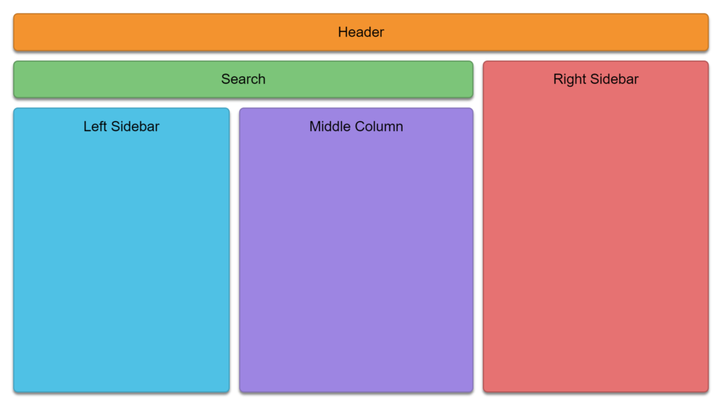
Looking a the image above, the layout has three significant areas, the header section, the search section, and the columns. To create these sections, we need to define some HTML elements.
<!-- GRID MESH -->
<div class="grid-container">
  <div class="grid-item item-1">Header</div>
  <div class="grid-item item-2">Search</div>
  <div class="grid-item item-3">Right Sidebar</div>
  <div class="grid-item item-4">Left Sidebar</div>
  <div class="grid-item item-5">Middle Column</div>
</div>
We define the grid container, which contains the grid mesh, and the grid item, which holds the items. Once the mesh has been described with HTML elements, the next step is to position the five sections onto the grid by specifying their positions (rows and columns) with CSS.
All five sections above are contained within a .grid-container class. Included in the .grid-container is a CSS property called display.
Whenever the display property has a value of grid, the property turns the element and its children into a grid.
.grid-container {
  display: grid;
  grid-template-columns: auto auto auto;
  padding: 10px;
}
Addionally you see another property called the grid-template-columns. This property defines the names of lines and the functions used in the grid.
grid-template-columns: auto auto auto;In this example, the value of grid-template-columns doesn’t indicate the name of lines, but it does use auto auto auto. The auto value is defined three times, which tells the grid to use automatic widths to fill the parent element’s width.
Here is the style for the above CSS grid design. You can combine the code with the HTML above and the CSS to complete the layout.
.grid-container {
  display: grid;
  grid-template-columns: auto auto auto;
  padding: 10px;
}

.grid-item {
  box-shadow: 0 5px 5px rgb(0 0 0 / 49%);
  margin: 10px;
  border: 0;
  border-radius: 10px;
  padding: 20px;
  font-size: 30px;
  grid-template-columns: repeat(3, 1fr);
  grid-template-rows: repeat(3, 1fr);
  text-align: center;
  font-family: Arial;
}

.item-1 {
  grid-row: 1;
  grid-column: 1 / span 3;
  border: 3px solid #c87922;
  background: #f89427;
  padding: 20px;
  font-size: 30px;
}

.item-2 {
  grid-row: 2;
  grid-column: 1 / span 2;
  border: 3px solid #5a985b;
  background: #75c576;
  padding: 20px;
  font-size: 30px;
}

.item-3 {
  grid-row: 2 / span 3;
  grid-column: 3;
  border: 3px solid #b85757;
  background: #ec7272;
  padding: 20px;
  font-size: 30px;
}

.item-4 {
  grid-row: 3;
  grid-column: 1;
  border: 3px solid #34a2c2;
  background: #3dc0e6;
  padding: 20px;
  font-size: 30px;
  height: 560px;
}

.item-5 {
  grid-row: 3;
  grid-column: 2;
  border: 3px solid #8774bc;
  background: #9e84e4;
  padding: 20px;
  font-size: 30px;
  height: 560px;
}
Here is the entire code and example on Codepen.io for layout one.
Layout 2: CSS Grid Layout With Profile
This layout demonstrates creating a web page with a profile and main body. The main body section is where you design a feed or other features the user can see whenever they log in to their profile.
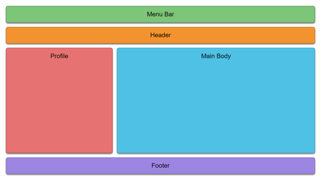
This is the HTML code below which the structure is the same across most of the layout examples in this tutorial.
<!-- GRID MESH -->
<div class="grid-container">
  <div class="grid-item item-1">Menu Bar</div>
  <div class="grid-item item-2">Header</div>
  <div class="grid-item item-3">Profile</div>
  <div class="grid-item item-4">Main Body</div>
  <div class="grid-item item-5">Footer</div>
</div>
/* LAYOUT 2 */
.grid-container {
display: grid;
grid-template-columns: auto auto auto;
padding: 10px;
}
.grid-item {
box-shadow: 0 5px 5px rgb(0 0 0 / 49%);
margin: 10px;
border: 0;
border-radius: 10px;
padding: 20px;
font-size: 30px;
grid-template-columns: repeat(12, 1fr);
grid-template-rows: repeat(12, 1fr);
text-align: center;
font-family: Arial;
}
.item-1 {
grid-row: 1;
grid-column: 1 / span 3;
border: 3px solid #5a985b;
background: #75c576;
padding: 20px;
font-size: 30px;
}
.item-2 {
grid-row: 2;
grid-column: 1 / span 3;
border: 3px solid #c87922;
background: #f89427;
padding: 20px;
font-size: 30px;
}
.item-3 {
grid-row: 3;
grid-column: 1;
border: 3px solid #b85757;
background: #ec7272;
padding: 20px;
font-size: 30px;
}
.item-4 {
grid-row: 3;
grid-column: 2 / span 2;
border: 3px solid #34a2c2;
background: #3dc0e6;
padding: 20px;
font-size: 30px;
height: 460px;
}
.item-5 {
grid-row: 5;
grid-column: 1 / span 3;
border: 3px solid #8774bc;
background: #9e84e4;
padding: 20px;
font-size: 30px;
}
To edit layout two, visit the layout two CSS and HTML code on Codepen.io
Layout 3: CSS Grid Layout for a Basic Messenger
This design shows how you can use the grid mesh to create a basic messenger-style app structure. This example uses eight sections, and we also include icons from font-awesome.
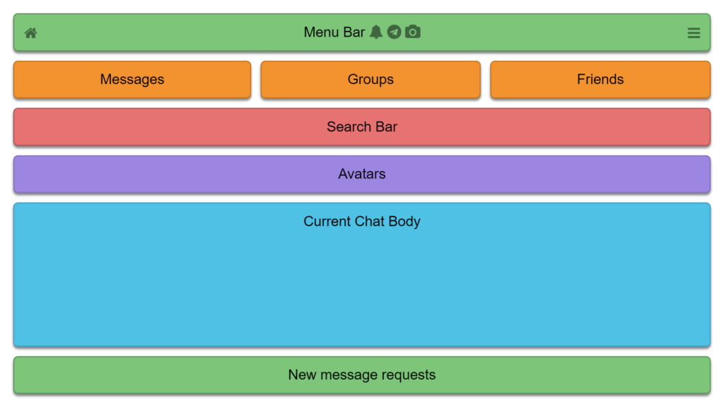
Here is the HTML grid mesh below.
<!-- GRID MESH -->
<div class="grid-container">
  <div class="grid-item item-1">
    <i class="fa fa-home bottomleft" aria-hidden="true"></i>
    <center>
      <span>Menu Bar</span>
      <i class="fa fa-bell" aria-hidden="true"></i>
      <i class="fa fa-telegram" aria-hidden="true"></i>
      <i class="fa fa-camera" aria-hidden="true"></i>
    </center>
    <i class="fa fa-bars bottomright" aria-hidden="true"></i>
  </div>
  <div class="grid-item item-2">Messages</div>
  <div class="grid-item item-3">Groups</div>
  <div class="grid-item item-4">Friends</div>
  <div class="grid-item item-6">Search Bar</div>
  <div class="grid-item item-7">Avatars</div>
  <div class="grid-item item-8">Current Chat Body</div>
  <div class="grid-item item-9">New message requests</div>
</div>
.grid-container {
display: grid;
grid-template-columns: auto auto auto;
padding: 10px;
}
.fa {
color: #3c663d;
}
.grid-item {
box-shadow: 0 5px 5px rgb(0 0 0 / 49%);
margin: 10px;
border: 0;
border-radius: 10px;
padding: 20px;
font-size: 30px;
grid-template-columns: repeat(12, 1fr);
grid-template-rows: repeat(12, 1fr);
text-align: center;
font-family: Arial;
}
.item-1 {
grid-row: 1;
grid-column: 1 / span 3;
border: 3px solid #5a985b;
background: #75c576;
position: relative;
}
.item-2 {
grid-row: 2;
grid-column: 1;
border: 3px solid #c87922;
background: #f89427;
}
.item-3 {
grid-row: 2;
grid-column: 2;
border: 3px solid #c87922;
background: #f89427;
}
.item-4 {
grid-row: 2;
grid-column: 3;
border: 3px solid #c87922;
background: #f89427;
}
.item-8 {
grid-row: 6;
grid-column: 1 / span 3;
border: 3px solid #34a2c2;
background: #3dc0e6;
height: 260px;
}
.item-9 {
grid-row: 7;
grid-column: 1 / span 3;
border: 3px solid #5a985b;
background: #75c576;
}
.bottomleft {
position: absolute;
bottom: 20px;
left: 20px;
}
.bottomright {
position: absolute;
bottom: 20px;
right: 20px;
}
.item-7 {
grid-row: 4;
grid-column: 1 / span 3;
border: 3px solid #8774bc;
background: #9e84e4;
}
.item-6 {
grid-row: 3;
grid-column: 1 / span 3;
border: 3px solid #b85757;
background: #ec7272;
}
Layout three can be created with the code above, or you may visit codepen.io.
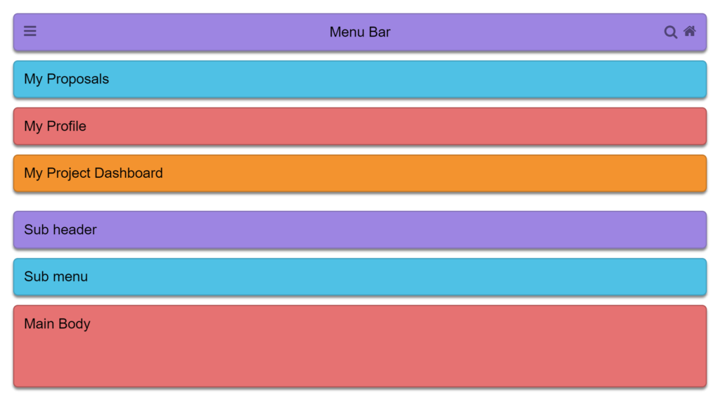
Layout 4: CSS Grid Layout for Accordion Sections
Layout four illustrates a web page broken down into horizontal blocks like an accordion because the sections are stacked.
<!-- GRID MESH -->
<div class="grid-container">
  <div class="grid-item item-1">
    <center>Menu Bar</center>
    <a href="#">
      <i class="fa fa-bars topleft" aria-hidden="true"></i>
    </a>
    <a href="GRID_1.html">
      <i class="fa fa-home topright" aria-hidden="true"></i>
    </a>
    <a href="#">
      <i class="fa fa-search bottomright" aria-hidden="true"></i>
    </a>
  </div>
  <div class="grid-item item-2">My Proposals</div>
  <div class="grid-item item-3">My Profile</div>
  <div class="grid-item item-4">My Project Dashboard</div>
</div>

<div class="grid-container">
  <div class="grid-item item-1">Sub header</div>
  <div class="grid-item item-2">Sub menu</div>
  <div class="grid-item item-6">Main Body</div>
</div>
Addionally we position content like the icons within a grid item using CSS classes like the topleft corner, bottomleft corner, topright corner, or bottomright corner.
/* POSITIONING */
.topleft {
  position: absolute;
  top: 20px;
  left: 20px;
}

.topright {
  position: absolute;
  top: 20px;
  right: 20px;
}

.bottomright {
  position: absolute;
  bottom: 23px;
  right: 60px;
}

.bottomright {
  position: absolute;
  bottom: 20px;
  left: 20px;
}
To view the entire code for this example, look it up here.
Layout 5: CSS Grid Layout for an Image Grid
This layout design is for websites that deal with images or videos on their platform. CSS Grid Layout provides an easy-to-use framework to organize the graphics more presentably.
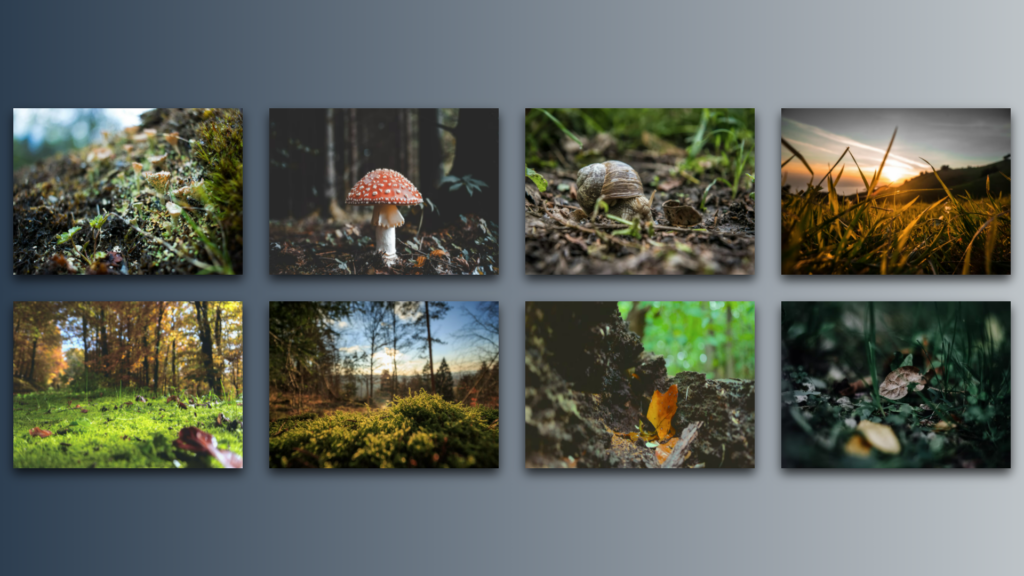
The images are placed in a grid format using the display, grid-gap, and the grid-template-columns properties.
.img-container {
  display: grid; /* Set the grid */
  grid-template-columns: repeat(
    auto-fit,
    minmax(300px, 1fr)
  ); This function sets the grid item column behavior */
  grid-gap: 40px;
  padding: 20px;
  width: 100%;
}
This example uses the repeat function for the grid-template-columns.
  grid-template-columns: repeat(
    auto-fit,
    minmax(300px, 1fr)
  ); /* This function sets the grid item column behavior */
The line grid-template-columns: repeat(auto-fit, minmax(300px,1fr));: subdivides the grid into columns 300 pixels wide in which the images will be contained. It automatically fits them depending on the size of the display device. The entire code is available on Codepen.
Layout 6: CSS Grid Layout for a Web Form With Sidebars
This layout demonstrates creating a web page with a form and two sidebars.
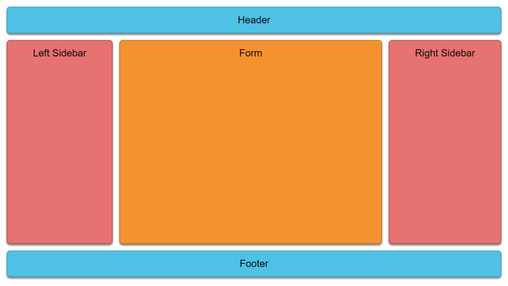
<div class="grid-container">
  <div class="grid-item item-1">Header</div>
  <div class="grid-item item-4">Left Sidebar</div>
  <div class="grid-item item-2">Form</div>
  <div class="grid-item item-5">Right Sidebar</div>
  <div class="grid-item item-3">Footer</div>
</div>
html,
body {
margin: 0;
}
.grid-container {
display: grid;
grid-template-columns: auto auto;
padding: 10px;
width: auto;
}
.grid-item {
box-shadow: 0 5px 5px rgb(0 0 0 / 49%);
margin: 10px;
border: 0;
border-radius: 10px;
padding: 20px;
font-size: 30px;
text-align: center;
font-family: Arial;
}
.item-1 {
grid-row: 1;
grid-column: 1 / span 8;
border: 3px solid #34a2c2;
background: #3dc0e6;
}
.item-3 {
grid-row: 3;
grid-column: 1 / span 8;
border: 3px solid #34a2c2;
background: #3dc0e6;
}
.item-2 {
grid-row: 2;
grid-column: 2 / span 6;
height: 570px;
border: 3px solid #c87922;
background: #f89427;
}
.item-4 {
grid-row: 2;
grid-column: 1 / span 1;
height: 570px;
border: 3px solid #b85757;
background: #ec7272;
}
.item-5 {
grid-row: 2;
grid-column: 8 / span 1;
height: 570px;
border: 3px solid #b85757;
background: #ec7272;
}You can check out this layout on codepen.io
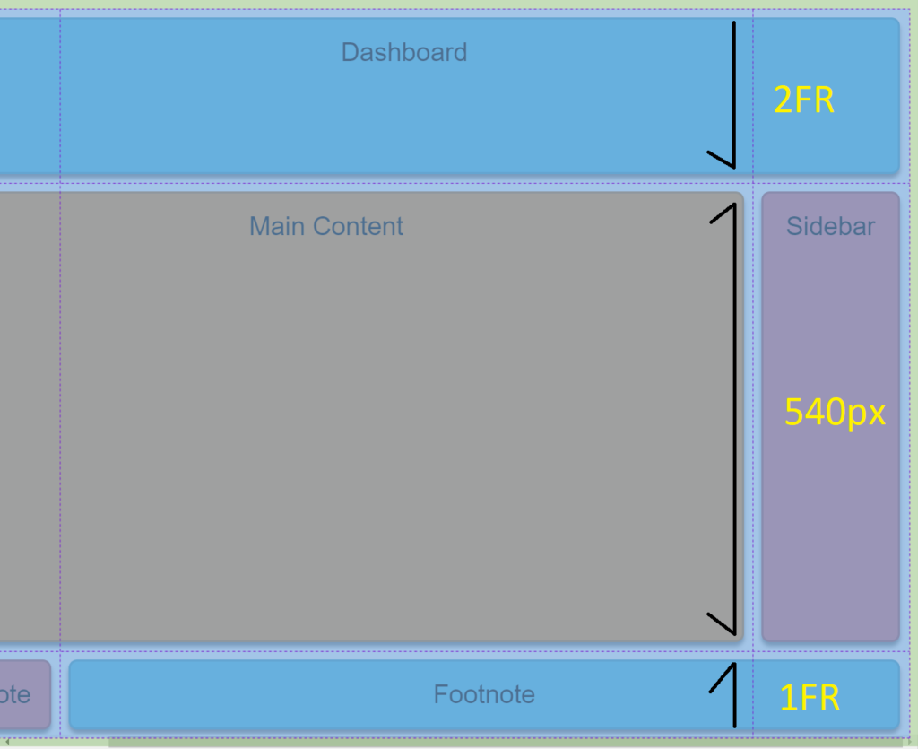
Layout 7: CSS Grid Layout With Footnotes
Layout seven illustrates how to set the exact width for grid rows and columns using pixels. Addionally we add footers underneath the bottom of the columns.
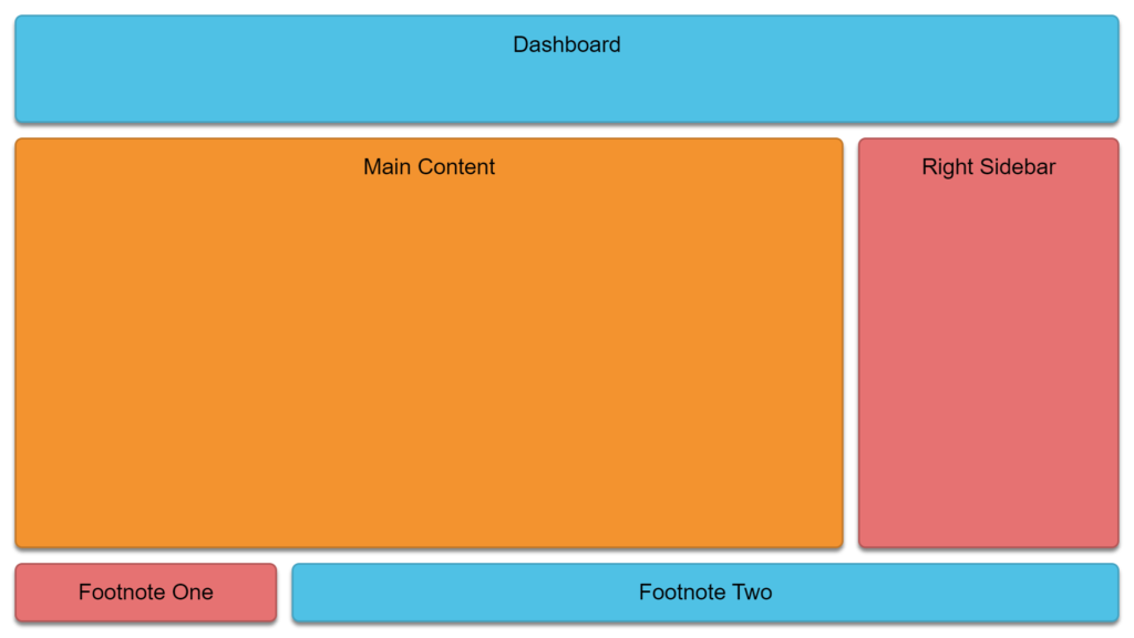
<div class="grid-container">
  <div class="grid-item item-1">Dashboard</div>
  <div class="grid-item item-2">Main Content</div>
  <div class="grid-item item-5">Sidebar</div>
  <div class="grid-item item-3">Footnote</div>
  <div class="grid-item item-4">Footnote</div>
</div>
html,
body {
margin: 0;
}
.grid-container {
display: grid;
padding: 10px;
width: auto;
grid-template-columns: 1fr 800px 1fr;
grid-template-rows: 2fr 540px 1fr;
}
.grid-item {
box-shadow: 0 5px 5px rgb(0 0 0 / 49%);
margin: 10px;
border: 0;
border-radius: 10px;
padding: 20px;
font-size: 30px;
text-align: center;
font-family: Arial;
}
.item-1 {
grid-row: 1;
grid-column: 1 / span 3;
border: 3px solid #34a2c2;
background: #3dc0e6;
}
.item-3 {
grid-row: 3;
grid-column: 2 / span 2;
border: 3px solid #34a2c2;
background: #3dc0e6;
}
.item-2 {
grid-row: 2;
grid-column: 1 / span 2;
border: 3px solid #c87922;
background: #f89427;
}
.item-4 {
grid-row: 3;
grid-column: 1 / span 1;
border: 3px solid #b85757;
background: #ec7272;
}
.item-5 {
grid-row: 2;
grid-column: 3;
border: 3px solid #b85757;
background: #ec7272;
}
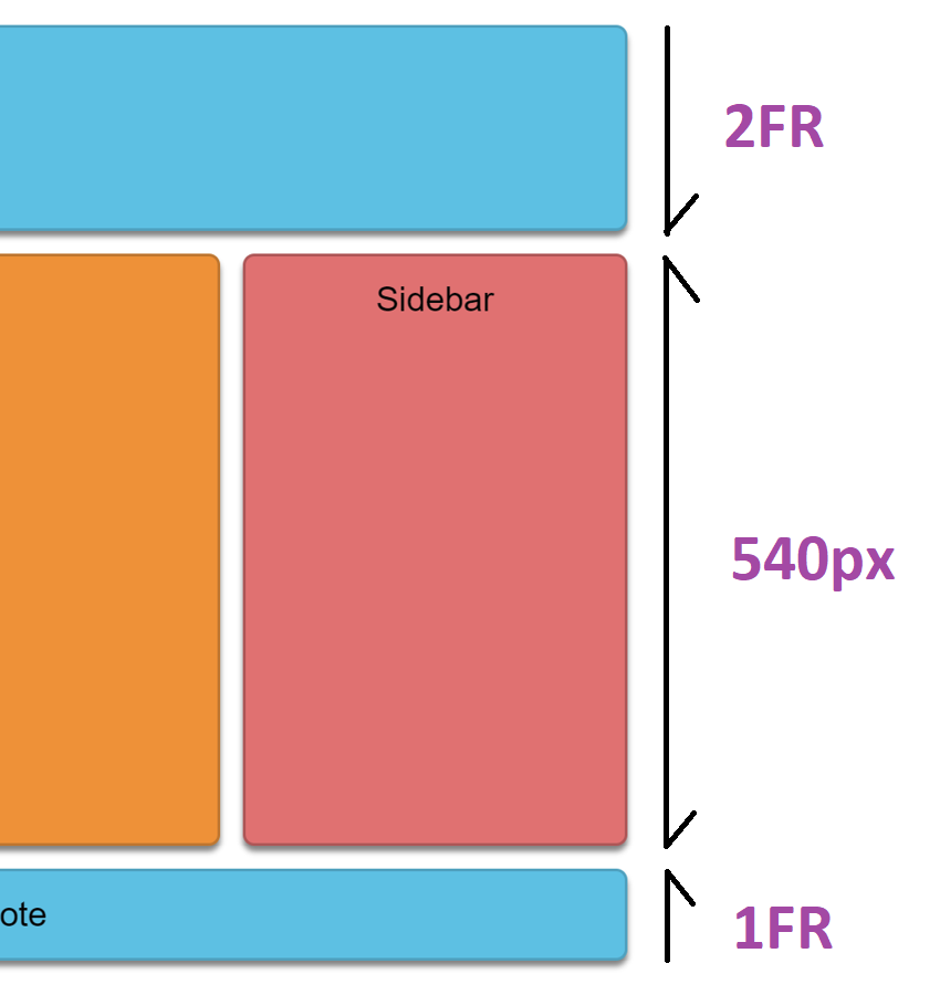
This design has a header, two columns, and two footers, respectively. The trick here is these two lines of code in the grid container that constructs a nine-by-nine grid template. Then we use some CSS properties to make the visible rows and columns fit within this structure the way we want.
.grid-container {
  grid-template-columns: 1fr 800px 1fr;
  grid-template-rows: 2fr 540px 1fr;
}
The two properties above accept uniform measurements for each row or column.
We see that grid-template-columns: 1fr 800px 1fr; sets the width of three invisible columns; this is the column template. The first and third column is set to 1fr, and the second column is set to 800px.
grid-template-columns: 1fr 800px 1fr;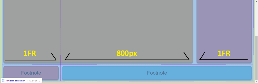
Addionally above, you see the visible footnote rows. The rows also use a template, which is the row grid template. To create the row template, we used the grid-template-rows property.
grid-template-rows: 2fr 540px 1fr;The grid-template-rows effectively sets the first row’s height to 2 fractions, the second row to 540px, and the last row to 1 fraction. This template can be seen in the image below.
Now moving on to constructing the visible grid.
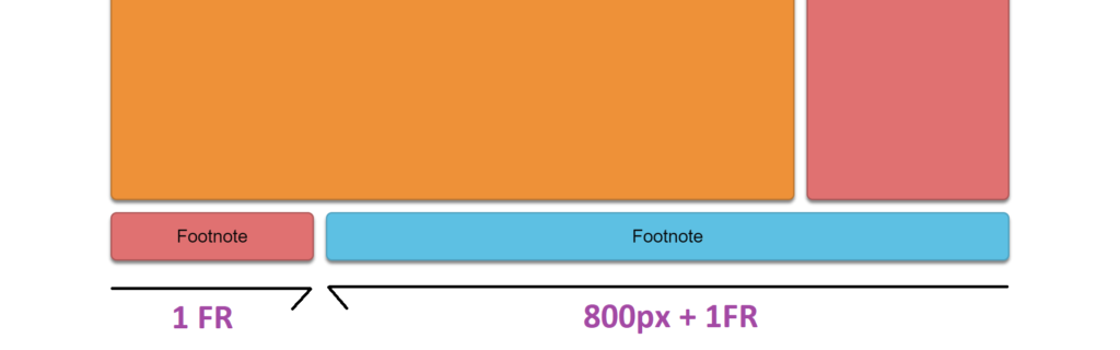
In the first image above, you see there are two footer columns. In the CSS code, there is a property called grid-column. We use the grid-column property to set the first column’s width to take up the first template column. The grid column declares the column should start in the first template column and span only one column.
grid-column: 1 / span 1;Since we used the value of 1fr as the first value in grid-template-columns, the first column’s width is 1fr.
On the other hand, the 2nd column starts in the second template column and spans two columns. The column width equals 800 pixels + 1fr (the last two template columns). Spanning the column is done with CSS grid-column property as follows.
grid-column: 2 / span 2;The total width of these two columns equals 1fr + 800px + 1fr, the same as the value of grid-template-columns. You can check the CSS code for the Dashboard, Main Content, and the Sidebar values for grid-column property values.
In the second image above, we don’t use the grid-column property; the row heights are set to the values of grid-template-row property. The grid-template-rows: 2fr 540px 1fr; sets the first row to two fractions, sets the size of the 2nd row to 540 pixels, and then the remaining row is a single fraction.
You may view and test the entire code for Layout 7 here.
Let’s end here
Thanks for going through this article. I hope you found it helpful and that it helped you better understand how to use CSS Grid Layout in your projects to make them more responsive and appealing.