AppCode
Contribute and help us stay up-to-date. Edit this page on GitHub.
Who said radio buttons should be simple on a web page? We’ll show you how to spice up radio inputs with a few CSS pseudo-selectors and HTML. We’ll turn these simple radio buttons below.

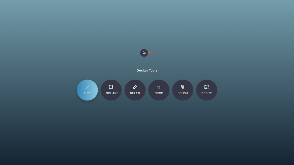
Into these fancy dual-themed radio buttons.
Before we begin we need to include two CSS libraries, which will be added to the head of the page.
The first library is the [Bootstrap library(https://getbootstrap.com/).
<link href="https://cdn.jsdelivr.net/npm/[email protected]/dist/css/bootstrap.min.css" rel="stylesheet" integrity="sha384-1BmE4kWBq78iYhFldvKuhfTAU6auU8tT94WrHftjDbrCEXSU1oBoqyl2QvZ6jIW3" crossorigin="anonymous">
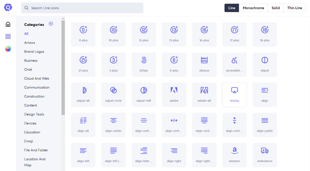
The second library is an icon library. The icon library we’ll be using is called Unicons by iconscout.
<link rel="stylesheet" href="https://unicons.iconscout.com/release/v4.0.0/css/line.css">
You can see below the picture of the Unicon library there is a vast selection of icons available.
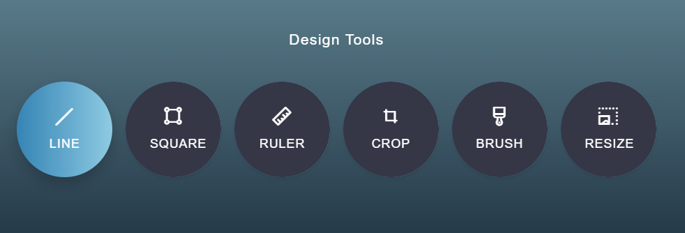
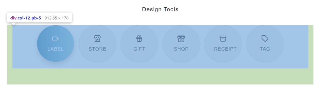
You can see the six icons we’ve used below, representing various design tools.
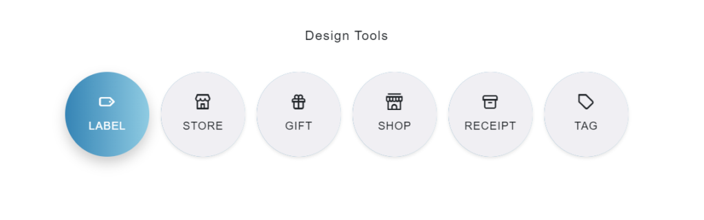
It’s also an option to switch the icons to something else, like perhaps an eCommerce theme. We’ve used label, store, gift, shop, receipt, and tag icons.
We’ve upgraded the fancy design buttons by centering the content within the page vertically and horizontally. We’ve centered the content using the CSS flex property in the .container class.
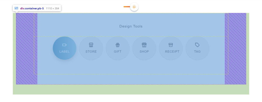
If you remember, we’ve added the Bootstrap library. Bootstrap is crucial because we use the column feature to group the Design Tools heading and the radio buttons into their rows. Creating the columns is done with the .col-12 class provided by the bootstrap library, which is part of Bootstrap’s grid feature.
<div class="col-12 pb-5">
Here is the complete HTML for the new radio buttons.
<div class="container">
  <div class="section over-hide z-bigger">
    <input class="checkbox" type="checkbox" name="general" id="general">
    <label class="for-checkbox" for="general"></label>
    <div class="background-color"></div>
    <div class="section over-hide z-bigger">
      <div class="container pb-5">
        <div class="row justify-content-center pb-5">
          <div class="col-12 pt-5">
            <p class="mb-4 pb-2">Design Tools</p>
          </div>
          <div class="col-12 pb-5">
            <input class="checkbox-tools" type="radio" name="tools" id="tool-1" checked>
            <label class="for-checkbox-tools" for="tool-1">
              <i class='uil uil-line-alt'></i>
              line
            </label>
            <input class="checkbox-tools" type="radio" name="tools" id="tool-2">
            <label class="for-checkbox-tools" for="tool-2">
              <i class='uil uil-vector-square'></i>
              square
            </label>
            <input class="checkbox-tools" type="radio" name="tools" id="tool-3">
            <label class="for-checkbox-tools" for="tool-3">
              <i class='uil uil-ruler'></i>
              ruler
            </label>
            <input class="checkbox-tools" type="radio" name="tools" id="tool-4">
            <label class="for-checkbox-tools" for="tool-4">
              <i class='uil uil-crop-alt'></i>
              crop
            </label>
            <input class="checkbox-tools" type="radio" name="tools" id="tool-5">
            <label class="for-checkbox-tools" for="tool-5">
              <i class='uil uil-brush-alt'></i>
              brush
            </label>
            <input class="checkbox-tools" type="radio" name="tools" id="tool-6">
            <label class="for-checkbox-tools" for="tool-6">
              <i class='uil uil-image-resize-landscape'></i>
              resize
            </label>
          </div>
        </div>
      </div>
    </div>
  </div>
</div>
We’ve shown you that this fancy radio button design has a theme switcher. This theme switcher uses a styled checkbox element, and the toggle button switches the theme whenever the value of the checkbox changes from checked to unchecked.
<input class="checkbox" type="checkbox" name="general" id="general">

To apply the different themed whenever the checkbox is checked, we use the CSS :checkedpseudo-class selector. If the checkbox is checked, we apply the white theme.
.checkbox:checked {
 /* CSS properties */
}
Else if the checkbox is not checked, we apply the dark theme. We check if the checkbox is not checked in CSS by using the CSS :not pseudo-class selector like :not(:checked).
.checkbox:not(:checked) {
 /* CSS properties */
}
We can create advanced CSS selected using the combination of :checked and :not(:checked) which will apply the different styles to the elements on the page.
.checkbox:checked + label:before {
  /* CSS properties */
}
Note: the pseudo-class selectors :not and :checked are easy to use. You can add different class names after the .checkbox:checked .someClassName. If the condition is true, the class properties will be applied to the element.
Here is the complete CSS code below.
body,
html {
  height: 100%;
  margin: 0;
}

:root {
  --white: #ffffff;
  --light: #f0eff3;
  --black: #000000;
  --dark-blue: linear-gradient(#709dab, #122332);
  --dark-light: #353746;
  --red: #da2c4d;
  --yellow: #f8ab37;
  --grey: #ecedf3;
}

body {
  width: 100%;
  background: var(--dark-blue);
  overflow-x: hidden;
  font-family: Poppins, sans-serif;
  font-size: 17px;
  line-height: 30px;
  -webkit-transition: all 0.3s linear;
  transition: all 0.3s linear;
}

p {
  font-family: Poppins, sans-serif;
  font-size: 17px;
  line-height: 30px;
  color: var(--white);
  letter-spacing: 1px;
  font-weight: 500;
  -webkit-transition: all 0.3s linear;
  transition: all 0.3s linear;
}

::selection {
  color: var(--white);
  background-color: var(--black);
}

::-moz-selection {
  color: var(--white);
  background-color: var(--black);
}

.section {
  position: relative;
  width: 100%;
  display: block;
  text-align: center;
  margin: 0 auto;
}

.over-hide {
  overflow: hidden;
}

.z-bigger {
  z-index: 100 !important;
}

.background-color {
  position: fixed;
  top: 0;
  left: 0;
  width: 100%;
  height: 100%;
  background-color: var(--dark-blue);
  z-index: 1;
  -webkit-transition: all 0.3s linear;
  transition: all 0.3s linear;
}

.checkbox:checked ~ .background-color {
  background-color: var(--white);
}

[type="checkbox"]:checked,
[type="checkbox"]:not(:checked),
[type="radio"]:checked,
[type="radio"]:not(:checked) {
  position: absolute;
  left: -9999px;
  width: 0;
  height: 0;
  visibility: hidden;
}

.checkbox:checked + label,
.checkbox:not(:checked) + label {
  position: relative;
  width: 70px;
  display: inline-block;
  padding: 0;
  margin: 0 auto;
  text-align: center;
  margin: 17px 0;
  margin-top: 100px;
  height: 6px;
  border-radius: 4px;
  background-image: linear-gradient(298deg, var(--red), var(--yellow));
  z-index: 100 !important;
}

.checkbox:checked + label:before,
.checkbox:not(:checked) + label:before {
  position: absolute;
  font-family: unicons;
  cursor: pointer;
  top: -17px;
  z-index: 2;
  font-size: 20px;
  line-height: 40px;
  text-align: center;
  width: 40px;
  height: 40px;
  border-radius: 50%;
  -webkit-transition: all 0.3s linear;
  transition: all 0.3s linear;
}

.checkbox:not(:checked) + label:before {
  content: "eac1";
  left: 0;
  color: var(--grey);
  background-color: var(--dark-light);
  box-shadow: 0 4px 4px rgba(0, 0, 0, 0.15), 0 0 0 1px rgba(26, 53, 71, 0.07);
}

.checkbox:checked + label:before {
  content: "eb8f";
  left: 30px;
  color: var(--yellow);
  background-color: var(--dark-blue);
  box-shadow: 0 4px 4px rgba(26, 53, 71, 0.25), 0 0 0 1px rgba(26, 53, 71, 0.07);
}

.checkbox:checked ~ .section .container .row .col-12 p {
  color: var(--dark-blue);
}

.checkbox-tools:checked + label,
.checkbox-tools:not(:checked) + label {
  position: relative;
  display: inline-block;
  padding: 28px;
  width: 110px;
  height: 110px;
  font-size: 14px;
  line-height: 20px;
  letter-spacing: 1px;
  margin: 0 auto;
  margin-left: 5px;
  margin-right: 5px;
  margin-bottom: 10px;
  text-align: center;
  border-radius: 100px;
  overflow: hidden;
  cursor: pointer;
  text-transform: uppercase;
  color: var(--white);
  -webkit-transition: all 0.3s linear;
  transition: all 0.3s linear;
}

.checkbox-tools:not(:checked) + label {
  background-color: var(--dark-light);
  box-shadow: 0 2px 4px 0 rgba(0, 0, 0, 0.1);
}

.checkbox-tools:checked + label {
  background-color: transparent;
  box-shadow: 0 8px 16px 0 rgba(0, 0, 0, 0.2);
}

.checkbox-tools:not(:checked) + label:hover {
  box-shadow: 0 8px 16px 0 rgba(0, 0, 0, 0.2);
}

.checkbox-tools:checked + label::before,
.checkbox-tools:not(:checked) + label::before {
  position: absolute;
  content: "";
  top: 0;
  left: 0;
  width: 100%;
  height: 100%;
  border-radius: 4px;
  background: linear-gradient(to right, #2a83b6, #89cbe3);
  z-index: -1;
}

.checkbox-tools:checked + label .uil,
.checkbox-tools:not(:checked) + label .uil {
  font-size: 24px;
  line-height: 24px;
  display: block;
  padding-bottom: 10px;
}

.checkbox:checked
  ~ .section
  .container
  .row
  .col-12
  .checkbox-tools:not(:checked)
  + label {
  background-color: var(--light);
  color: var(--dark-blue);
  box-shadow: 0 1x 4px 0 rgba(0, 0, 0, 0.05);
}

.container {
  width: 100%;
  background: 0 0;
  text-align: center;
  -webkit-box-align: center !important;
  -ms-flex-align: center !important;
  align-items: center !important;
  -webkit-box-pack: center !important;
  -ms-flex-pack: center !important;
  justify-content: center !important;
  display: -webkit-box !important;
  display: -ms-flexbox !important;
  display: flex !important;
  height: 100%;
}
- CSS Checkbox Examples and Code
- How To Handle Form Data With jQuery
- How to Create a jQuery Ajax Contact Form in PHP
- Creating a Basic Web Form With CSS in Minutes!