AppCode
This article demonstrates the power of building dual-screen enabled web applications. Included is media queries, JavaScript, and ENV variables.
We’ve had dual-screen devices on the market for a long time. And within this time, we’ve witnessed the emergence of different web technologies coupled with developer feedback. These new web platforms and developer feedbacks enable web layouts on the web to adapt to these different devices.
It’s important to know dual-screen web features and capabilities integrate seamlessly with other concepts, like media queries and viewports units.
You can check out this awesome article on CSS viewports units that allow you to design more responsive webpages using viewport units. Direct Link →
The emergence of web technology aims to help developers and web designers spend more time using ways to leverage dual displays to create enhanced experiences rather than learning a new set of HTML code to build them.
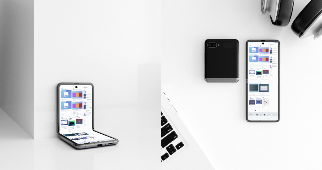
- Motorola Razr 5G
- Microsoft Surface Duo 2
- Oppo Find N
- Samsung Galaxy Fold
- the Galaxy Z Fold 3
- Z Flip 3
- Surface Duo 2
The above phones are popular dual-screen gadgets that readily come to mind. As we speak, foldable smartphones are being used by consumers. So, herein lies the question – how do we reinvent the wheel? How do we ensure that these new devices can view HTML web pages? How can we design so nobody feels left out? As a developer, you need to start exploring these new devices and the next evolution in responsive design.
How To Detect Foldable Devices Using the New CSS Media Features
Dual screens are the next step in website responsive design, and they are often viewed as another responsive design target that web developers and designers can style with media features. This part of CSS is relatively old; we already used these features and media queries to target popular gadgets such as desktops, tablets, and mobile phones. But now, we’ve got the CSS viewport segments features to target both foldable and dual-screen devices.
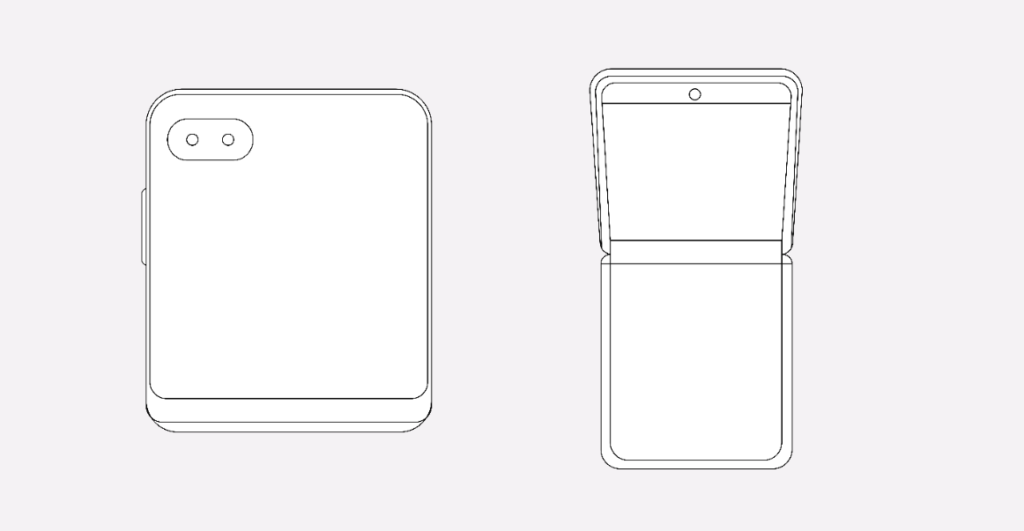
Traditionally, viewports have two values. The first is the horizontal-viewport-segments. It represents the state of the mobile device when the particular device hinge is vertical, and the viewports fold into columns or are divided sectionally by the hardware.
To fetch styles that are specifically designed for the foldable devices in this layout, we would need to write the following codes:
@media (horizontal-viewport-segments: 2) {
  // The styles specific to the device in this orientation
}
Notice the integer (:2); it represents the number of viewports present in the mobile device screen orientation. When the phone is placed in a vertical fold posture, we have two different viewports in the horizontal direction and just one viewport in the vertical direction.
But note; we can combine the media queries to target dual-screen devices coupled with certain viewports widths to create specific styles:
@media (horizontal-viewport-segments: 2) and (min-width: 460px) {
  body {
    background: #ff2052;
  }
}
Meanwhile, the second value of this media feature is the “vertical-viewport-segments”. It is the state of the mobile device when its (the device) hinge is horizontal. Meanwhile, the hardware also hinge splits the viewport into multiple rows. To target mobile devices that rotate in this direction, we would need to make use of the following code:
@media (vertical-viewport-segments: 2) {
  // Styles specific to the mobile device in this particular orientation
}
How To Use JavaScript To Detect Foldable Mobile Devices
We’ve seen instances where developers have found it difficult to detect the user’s device to using CSS media queries. Detecting foldable devices is where the JavaScript API comes in handy. There’s a new API called Windows Segments Enumeration, though, after the feedback from the developer community, it made more sense to build off the Visual Viewport API draft specification.
Here is an example using the JavaScript visual viewport API.
const segments = window.visualViewport.segments;For example, we have a map page that needs to present the map on the first segment, and the location results in the second half if a dual-screen device is detected. [1]
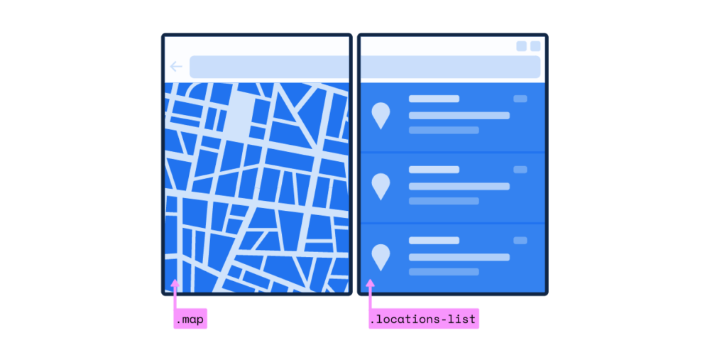
To implement this feature, we can use the viewport API to obtain the segments and check for dual-screen to implement this feature. If the device is dual-screen, we apply CSS classes to break the application into two parts and display them on their respective segments. Take a note of the custom .flex-one-half class, which sizes the part into a segment.
const segments = window.visualViewport.segments;

if (segments && segments.length > 1) {
	// now we know the device is a foldable

	// and we can update CSS classes in our layout as appropriate
	document.body.classList.add('is-foldable');
	document.querySelector('.map').classList.add('flex-one-half');
	document.querySelector('.locations-list').classList.add('flex-one-half');
}
Making Use of CSS env() Variables
In addition to the CSS media features, there are size relatively new CSS environment variables designed to help web developers to calculate the geometry of the mobile display regions. The CSS env variables can be used to place content within the bounds of each display region.
Note: Of course, you can also calculate the geometry of the hinge with it, but that can only be done when it is being obscured by a hardware feature such as in the Surface Duo.
Here are the six new CSS env variables:
- env(viewport-segment-bottom <x> <y>);
- env(viewport-segment-right <x> <y>);
- env(viewport-segment-width <x> <y>);
- env(viewport-segment-height <x> <y>);
- env(viewport-segment-top <x> <y>);
- env(viewport-segment-left <x> <y>);
But note, the x, and y in these different variables represent the two-dimensional grid built by hardware features that divide each viewport segment using the coordinates 0, 0, which start at the top left segment.
So, for example, if the device you are targeting is in the vertical fold posture, the viewport segment on the left side would be represented by env (viewport-segment-width 0 0). Meanwhile, the one on the right would be represented by env (viewport-segment-width 1 0).
How To Place Content With the CSS Env Variables
Place content within the display with the use of CSS environment variables. These are helpful if you wish to place content against the fold or hinge. For instance, you can place an image against the hinge in the first section of the screen. Meanwhile, this is the right segment of the viewport, which is why we’ll use “viewport-segment-right” to place it using the following code:
img {
  max-width: 540px;
}

@media (horizontal-viewport-segments: 2) {
  img {
    position: absolute;
    left: env (viewport-segment-right 0 0);
  }
}
What you’ve got with this line of code won’t be the ideal result. So, what do we do? First, we need to make the image be displayed on the left side instead. Because the photo in question is positioned (check out the example above) using the left property. The left edge would align with the viewport-segment-right section of the display area. In summary, we need to subtract the total width of the image from the environment variable to get the image perfectly aligned to the hinge edge of the mobile device.
img {
  max-width: 540px;
}

@media (horizontal-viewport-segments: 2) {
  img {
    position: absolute;
    left: calc (env(viewport-segment-right 0 0) - 540px);
  }
}
With the code highlighted above, the image will be placed in the right spot.
Conclusion
We can’t undermine that dual-screen or foldable phones are the game changers, the next evolution in responsive design. The APIs are out there on the internet if you own a website, making it hassle-free to integrate into your existing code. It’s an exciting time for web layout. Dual-screens will ultimately allow every developer to get more creative and explore the new world.
Next→