AppCode
This tutorial demonstrates the CSS viewport units such as vw, vh, vmin, and vmax. Included are code and examples using the viewport units.
CSS can be one of the most frustrating things to work with. On the other hand, it can be a paintbrush through which a website masterpiece is built for a web developer. When it works, it brings joy; it makes your site accessible and intuitive. There are many functions of CSS that allow you to create several possibilities. Let’s turn our spotlight on CSS viewport, the CSS feature you probably don’t know about but should.
This article sheds more light on the viewport concept, the definition, how it’s incorporated into web development, and the differences between the layout viewport and the visual viewport.
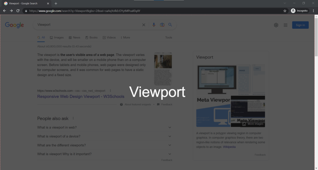
What is a viewport?
Using web browser terms, a viewport represents the section in computer graphics that is being viewed on a screen. The viewport is the same as a typical web browser window but without the browser’s user interface and menu bars. Instead, it’s the part of the HTML document you are viewing in real-time.
According to what’s published on the CSS spec, viewport-percentage units are relative to the initial containing block’s size, which is the root element of all web pages. The viewport units include vw / vh and vmin / vmax (we’ll shed more light on these four).
CSS viewports were first introduced with the CSS values in the units level 3 spec. With the feature, developers could size elements and font sizes as a percentage of the width and height of every user’s screen, known as the viewport.
vw & vh
The vw unit stands for viewport width, while the vh unit stands for viewport height. Let’s try out a scenario.
Setting an element’s width value to 20vw equals 20% of the total viewport width. Likewise, a value of 30vh is 30% of the viewport height. These facts stay true when the viewport is resized.
.element {
  width: 40vw; /* 40vw is equal to 40% of the width of the viewport.
  height: 60vh; /* 60vh is equal to 60% of the height of the viewport.
}
CSS Percentage vs Viewport Units
Your first thought may have been that percentage values, and viewport units are the same. This statement is not valid. The difference is a percentage value is a percentage size of the element’s parent. When using viewport units, they are always a percentage of the absolute size of a viewport.
vmin & vmax
The vmin and the vmax are enhanced versions of the viewport units. They work like percentages but are opposites of each other. For example, vmin is the smallest part of the height or width of a viewport. So if the width is smaller than the height, the width is used. On the other hand, vmax is the largest part of the height or width of a viewport. That would mean the height would be used if it was larger than the width.
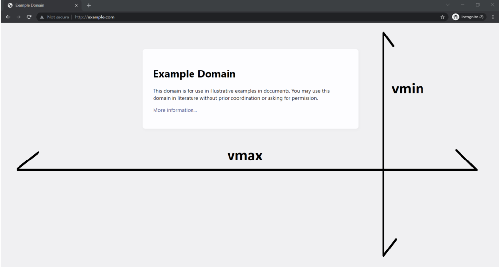
As you see above, the vmax with the viewport’s width is the largest, while the vmin is the height because the height is shorter than the width.
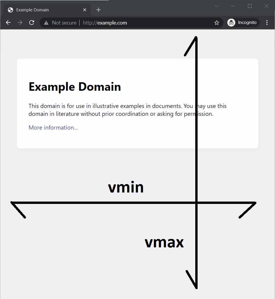
On the other hand, in the image above, the viewport is taller than wider. The new size would make the vmax the height because it’s bigger than the width, leaving vmin as the viewport’s width.
Using the vmax value
If your viewports are 1920px wide and 1080px tall, and the element is set to have a height of 40vmax, that’ll be 40% of the width (614px). The vmax would be 614px because it is 40% of 1080px.
.element {
  height: 40vmax;
}
The element is 614px in height.

But if we set the element to have a width of 40vmax, it will also be 40% of the width (614px).
.element {
  width: 40vmax;
}
The width of the element is 614px.

Using the vmin value
When using the vmin value, the value is calculated using the smallest dimensions of a viewport. If your viewports are 1920px wide, 1080px tall, and the element is set to have a height of 40vmin, that’ll be 40% of the height (432px).
.element {
  height: 40vmin;
}
You can see the height of this element is 432px.

But if we set the element to have a width of 40vmin, it will also be 40% of the height (432px).
.element {
  width: 40vmin;
}
If using either the code in the vmax or vmin example and your screen is different than 1920px wide and 1080px tall, the pixel units of the elements will be different.
Viewport Units vs Percentage Example
We mentioned earlier, one thing, is the similarity between percentages and viewport units. What do we mean? Here’s a perfect scenario below using the 80% and 80vw widths. The percent will only be the relative width of the parent element. On the other hand, the viewport unit will be relative to the width of the user’s viewport. Try it yourself.
<div class="parent-1">
  <div class="child-1"></div>
</div>

<div class="parent-2">
  <div class="child-2"></div>
</div>
Creating the CSS styles.
* {
  box-sizing: border-box;
}

body {
  text-align: center;
  font-family: "Lato";
}

.parent-1 {
  width: 50%;
  height: 310px;
  background: #f89427;
  padding-top: 30px;
  margin-bottom: 50px;
}
.child-1 {
  width: 80%;
  height: 250px;
  background: #5e5085d6;
}

.parent-2 {
  width: 50%;
  height: 310px;
  background: #f89427;
  padding-top: 30px;
  margin-bottom: 50px;
}

.child-2 {
  width: 80vw;
  height: 250px;
  background: #5e5085d6;
}
The results:

You can see in the first orange box, the purple child element is 80% of the parent element. In the second box, the purple element is 80% of the width of the viewport. Try it yourself, let’s create some markup.
Applications of Viewport Units
Viewport units are based on the different viewport dimensions. It is convenient to apply the units to real-life situations where the width or height must be set relative to the viewport. So, here are some perfect examples to study.
Sections or Background Images
Setting backgrounds or images on elements that would cover the screen is a popular option. However, you may also want to design a website where each section about a displayed service or product stretches to the full viewport in an article.
Let’s create the full-width feature ourselves. You can set the section’s width to 100vw and set the left and right margins with a value of -50vw.
.full-width {
  width: 100vw;
  position: relative;
  left: 50%;
  right: 50%;
  margin-left: -50vw;
  margin-right: -50vw;
}
We then apply those properties to an element. Inside of the full-width element we have a section. This section will also be 100% of the viewport because of its parent’s size.
<article>
  <p>Lorem ipsum dolor sit amet, consectetur adipiscing elit, sed do eiusmod tempor incididunt ut labore et dolore magna aliqua. Ut enim ad minim veniam, quis nostrud exercitation ullamco laboris nisi ut aliquip ex ea commodo consequat. Duis aute irure dolor in reprehenderit in voluptate velit esse cillum dolore eu fugiat nulla pariatur. Excepteur sint occaecat cupidatat non proident, sunt in culpa qui officia deserunt mollit anim id est laborum.</p>

  <div class="full-width">
    <div class="section">Section</div>
  </div>

  <p>Lorem ipsum dolor sit amet, consectetur adipiscing elit, sed do eiusmod tempor incididunt ut labore et dolore magna aliqua. Convallis posuere morbi leo urna molestie. Tempor orci dapibus ultrices in iaculis nunc. Id aliquet lectus proin nibh nisl condimentum id venenatis. Donec massa sapien faucibus et. Senectus et netus et malesuada fames ac turpis.</p>
</article>
Creating the other styles.
body {
  overflow-x: hidden;
}

.section {
  height: 150px;
  background: linear-gradient(115deg, #4e54c8, #8f94fb);
  text-align: center;
  display: flex;
  justify-content: center;
  align-items: center;
  font-size: 30px;
  color: white;
}

article {
  max-width: 800px;
  margin-left: auto;
  margin-right: auto;
  padding: 0 1rem;
}

.full-width {
  width: 100vw;
  position: relative;
  left: 50%;
  right: 50%;
  margin-left: -50vw;
  margin-right: -50vw;
}

* {
  box-sizing: border-box;
}

img {
  width: 100%;
  height: auto;
  vertical-align: bottom;
}

p {
  box-shadow: 0 2px 4px rgb(0 0 0 / 50%);
  padding: 60px;
  font-size: 1.5vw;
  border-radius: 10px;
}
Here is the result:
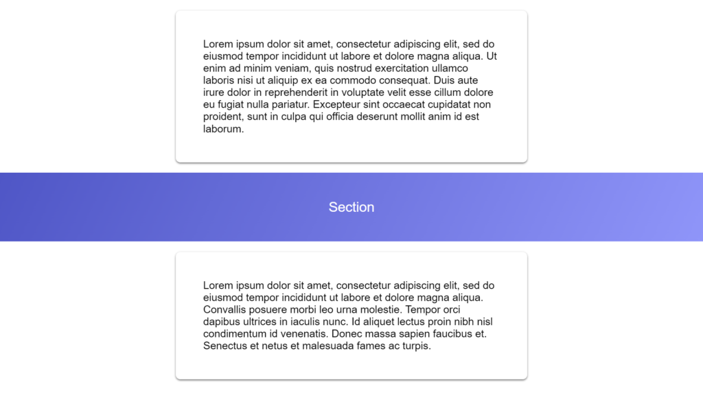
The example above shows an easy way to achieve a fullwidth background using pure CSS within an article.
Creating a Responsive Headline
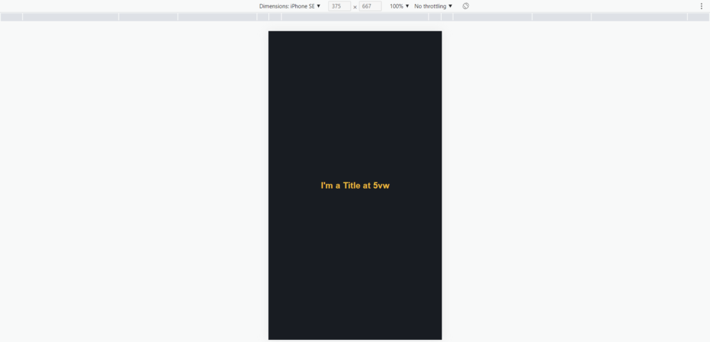
Remember, the size of each viewport unit changes based on the size of the viewport itself. What this means is if you use these units to set the font size of your headings and title. After setting the size using viewport units, they are bound to fit on the screen perfectly.
<div class="container">
  <section class="large-title">
    <h1>I'm a Title at 5vw</h1>
  </section>
</div>
html,
body {
margin: 0;
height: 100%;
background: #181c22;
}
.large-title {
padding: 80px 0;
text-align: center;
}
h1 {
color: #efbb35;
font-family: Arial;
font-size: 5vw;
margin: 0;
}
.container {
width: 100%;
background: transparent;
text-align: center;
-webkit-box-align: center !important;
-ms-flex-align: center !important;
align-items: center !important;
-webkit-box-pack: center !important;
-ms-flex-pack: center !important;
justify-content: center !important;
display: -webkit-box !important;
display: -ms-flexbox !important;
display: flex !important;
height: 100%;
}The 5vw value appears larger on a wider viewport

Whenever the screen changes, the web browser will adjust the scale of the text to align with the current viewport. Like so, being viewed on a smaller device such as an iPhone, the font size shrinks.
We can change that same value to 3vw and see a similar result.
h1 {
  color: #efbb35;
  font-family: Arial;
  font-size: 3vw;
  margin: 0;
}
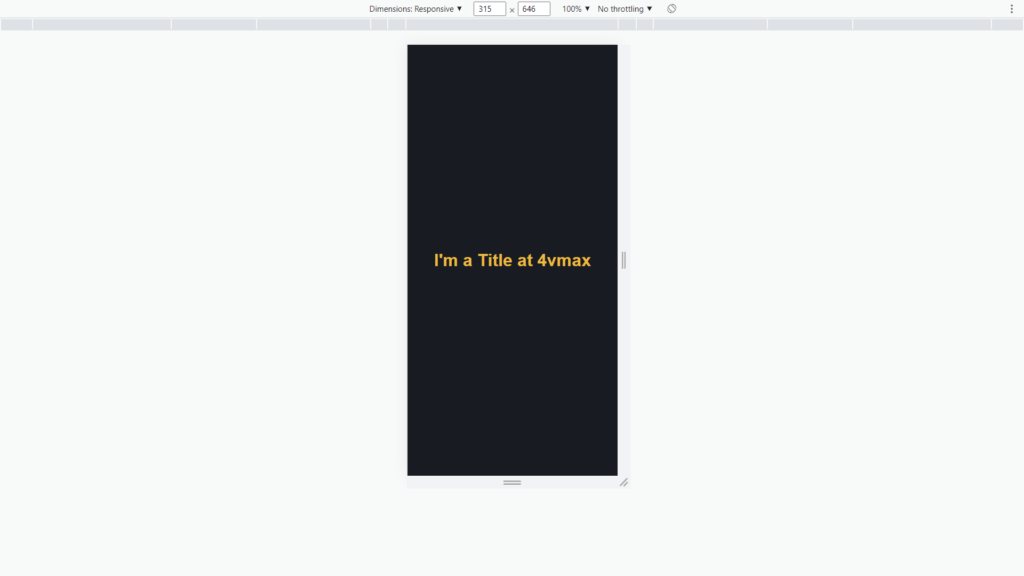
A common problem is the title on viewports becomes too large or very small. To partially fix the rendering size of titles is we can use the vmax unit. The vmax unit ensures the title doesn’t become too small. The title has a font size of 4% of either the width or height of the viewport, whichever one is larger.
h1 {
  color: #efbb35;
  font-family: Arial;
  font-size: 4vmax;
  margin: 0;
}
You can see the font size does not get too small.
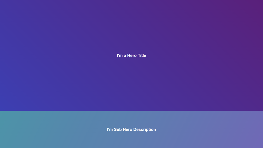
Viewport Units for Hero Sections
With the viewport units, you can create full-height hero sections. To illustrate, we can create a hero section with a title and a smaller hero with a description. These sections combined will take up the entire height of the user’s viewport. First, we’ll create some HTML markup for both heroes.
<section class="hero">
  <h1>I'm a Hero Title</h1>
</section>
<section class="sub-hero">
  <h1>I'm Sub Hero Description</h1>
</section>
Then we will add our CSS styles, which include the vw viewport unit in the width and margin properties.
html,
body {
  margin: 0;
  color: white;
  font-family: Arial;
}

.hero {
  height: 75vh;
  background: linear-gradient(45deg, #3c3db4, #5c1e7c);
}

.sub-hero {
  height: 25vh;
  background: linear-gradient(115deg, #4494a9, #7067b8);
}

.hero,
.sub-hero {
  display: flex;
  align-items: center;
  justify-content: center;
  width: 100vw;
  position: relative;
  left: 50%;
  margin-left: -50vw;
}
To accomplished the shared full viewport height. We will set the largest hero to 70vh and the sub hero to 25vh. This effectively creates 100% of the height of the viewport.
Let’s check the results:
Conclusion
If you made it this far, then you’ve grasped the concept of the fantastic CSS viewport. We’ve covered the definition and how you can apply it in your next project. If you wish to take your web development skills to the next level, I highly recommend studying this part of CSS. So, what do you think? Are you ready to start designing sleek and responsive websites?
Recommended Articles
- The Awesome CSS mask-image Property
- The CSS justify-self Property
- The Awesome CSS Transform Property and Scale Function
- Explaining the Scale Property in CSS
- A Guide on How To Use CSS Grids for Layouts
- How to Create a Responsive Flexbox Grid