AppCode
This article demonstrates how to create several carousels. Using HTML, CSS, JavaScript, Bootstrap, and then the Owl library.
In this tutorial, we will explain how to make HTML carousels. We will explore three different ways to implement this on your web page. We will only use HTML, CSS, and JavaScript in the first technique. We will examine creating a carousel using the Bootstrap Framework in the second technique. Last, we will discuss a carousel using the Owl library combined with the jQuery library, a JavaScript library, in our third and last technique.
What is a carousel
A carousel is a container that presents sliding content to the user, such as text, images, and videos. You can use a carousel in the upper and lower part of a website. Carousels have cyclical movement, and therefore, when the carousel area moves in a sliding fashion, the first slide is brought back to the beginning. Addionally, carousels contain buttons that you can use to switch slides manually.
The most significant benefit of using a carousel is that multiple slides use the same area, which is not visible until they are moved into view. Therefore, when a carousel is at the top of the page, it can extend a user’s interaction time since it displays new content as the user watches.
What is jQuery
The primary purpose of jQuery, the world’s most used JavaScript library, is to provide a free and open-source technology that makes the JavaScript language easy to use on the internet. One of the most significant advantages of jQuery is that it works consistently across all browsers. Therefore, you can easily use it in all environments. Since it is a JavaScript library, developers can access many prebuilt JavaScript functions when creating web software. In summary, jQuery is a fast, small, cross-platform, and feature-rich JavaScript library.
What are the conveniences of jQuery
There are a lot of conveniences that jQuery provides. These are listed below.
- HTML/DOM manipulation
- CSS manipulation
- Animations and effects
- AJAX operations
- Creating and managing events
- Support for many browsers
- 3rd party plugins
To learn more about jQuery, you can visit the official website.

What is Bootstrap
Bootstrap is a massive collection of practical, reusable web components written in HTML, CSS, and JavaScript. It is also a framework that enables developers and designers to create fully responsive websites quickly. Former Twitter employees Mark Otto and Jacob Thornton took the initiative to develop Bootstrap.
Bootstrap’s two most important advantages are that it provides the opportunity to work rapidly on ready-made templates, reducing the time it takes to reach the market. To understand the second advantage, we need to know what responsive design is because Bootstrap has yielded benefits in responsive web design.
What is responsive web design
Responsive web design is about developing a website design focused on rendering proportionately on all devices. Responsive websites show the same information and page elements no matter what device you’re on, resizing and repositioning text, images, and other content as the screen size changes.
What are the benefits of Bootstrap
There are a lot of benefits that Bootstrap provides. Some of these benefits are listed below.
- Responsive web structure
- Responsive images
- Functional components, carousels, navigation bars, dropdowns, progress bars, forms, and more
- JavaScript support
- Substantial documentation
- Easy customizing with classes
- Broad community support
- Themes
Why use the Bootstrap framework
While developing for the web, it is essential to use technologies to speed up the development process and create more successful content. Frameworks offer many benefits and conveniences; which Bootstrap is one of the most successful frameworks, and it makes using Bootstrap very practical.
To learn more about Bootstrap, you can visit the official website.

How to create a carousel with CSS and JavaScript
To create a carousel with CSS and JavaScript, you must have three parts. The HTML, which forms the backbone, the CSS styles that turn the spines into a visual treat, and the JavaScript, which gives the carousel its ability to slide and navigate.
The carousel that we will be creating will contain three images, side arrows, and navigation circles like the image below.

HTML Code
We will add the following HTML code to create the carousel structure. In the HTML, we will define the carousel container, the images with number and caption text, next and previous buttons, and the circles to jump to other slides in the carousel.
<div class="super-container">
<div class="container">
<!-- Carousel container -->
<div class="carousel-container">
<!-- Full-width images with number and caption text -->
<div class="myCarousel fade">
<div class="numbertext">1 / 3</div>
<img src="https://images.unsplash.com/photo-1425913397330-cf8af2ff40a1?ixlib=rb-1.2.1&ixid=MnwxMjA3fDB8MHxwaG90by1wYWdlfHx8fGVufDB8fHx8&auto=format&fit=crop&w=1074&q=80" style="width:100%">
<div class="text">Caption Text</div>
</div>
<div class="myCarousel fade">
<div class="numbertext">2 / 3</div>
<img src="https://images.unsplash.com/photo-1473448912268-2022ce9509d8?ixlib=rb-1.2.1&ixid=MnwxMjA3fDB8MHxwaG90by1wYWdlfHx8fGVufDB8fHx8&auto=format&fit=crop&w=1141&q=80" style="width:100%">
<div class="text">Caption Two</div>
</div>
<div class="myCarousel fade">
<div class="numbertext">3 / 3</div>
<img src="https://images.unsplash.com/photo-1440342359743-84fcb8c21f21?ixlib=rb-1.2.1&ixid=MnwxMjA3fDB8MHxwaG90by1wYWdlfHx8fGVufDB8fHx8&auto=format&fit=crop&w=1170&q=80" style="width:100%">
<div class="text">Caption Three</div>
</div>
<!-- Next and previous buttons -->
<a class="prev" onclick="plusSlides(-1)">❮</a>
<a class="next" onclick="plusSlides(1)">❯</a>
</div>
<br>
<!-- The dots/circles -->
<div style="text-align:center">
<span class="dot" onclick="currentSlide(1)"></span>
<span class="dot" onclick="currentSlide(2)"></span>
<span class="dot" onclick="currentSlide(3)"></span>
</div>
</div>
</div>CSS Code
Now we add our CSS code into the head of the HTML document. These styles will change the next and previous buttons, the caption text, the navigation dots. The CSS styles will give life to the otherwise dull HTML elements:
<style>
html,
body {
  height: 100%;
  margin: 0;
}

body {
  background: radial-gradient(circle, #81d46f 0%, rgba(41, 45, 62, 1) 100%);
}

.super-container {
  -webkit-box-align: center !important;
  -ms-flex-align: center !important;
  align-items: center !important;
  -webkit-box-pack: center !important;
  -ms-flex-pack: center !important;
  justify-content: center !important;
  display: -webkit-box !important;
  display: -ms-flexbox !important;
  display: flex !important;
  height: 100%;
}

.container {
  height: 330px;
}

* {
  box-sizing: border-box;
}

/* Carousel container */
.carousel-container {
  max-width: 1000px;
  position: relative;
  margin: auto;
  height: 100%;
  max-height: 300px;
  overflow: hidden;
}

/* Hide the images by default */
.myCarousel {
  display: none;
  height: 100%;
}

.myCarousel img {
  width: 100%;
  margin-top: -20%;
}

/* Next & previous buttons */
.prev,
.next {
  cursor: pointer;
  position: absolute;
  top: 50%;
  width: auto;
  margin-top: -22px;
  padding: 16px;
  color: white;
  font-weight: bold;
  font-size: 18px;
  transition: 0.6s ease;
  border-radius: 0 3px 3px 0;
  user-select: none;
}

/* Position the "next button" to the right */
.next {
  right: 0;
  border-radius: 3px 0 0 3px;
}

/* On hover, add a black background color with a little bit see-through */
.prev:hover,
.next:hover {
  background-color: rgba(0, 0, 0, 0.8);
}

/* Caption text */
.text {
  color: #f2f2f2;
  font-size: 20px;
  padding: 8px 12px;
  position: absolute;
  bottom: 0px;
  width: 100%;
  text-align: center;
  background: #0000008c;
  line-height: 30px;
}

/* Number text (1/3 etc) */
.numbertext {
  color: #f2f2f2;
  font-size: 12px;
  padding: 12px 20px;
  position: absolute;
  top: 0;
  background: #000000ba;
}

/* The dots/bullets/indicators */
.dot {
  cursor: pointer;
  height: 15px;
  width: 15px;
  margin: 0 2px;
  background-color: #fff;
  border-radius: 50%;
  display: inline-block;
  transition: background-color 0.6s ease;
}

.active,
.dot:hover {
  background-color: #3f3f3f;
}

/* Fading animation */
.fade {
  -webkit-animation-name: fade;
  -webkit-animation-duration: 1.5s;
  animation-name: fade;
  animation-duration: 1.5s;
}

@-webkit-keyframes fade {
  from {
    opacity: 0.4;
  }
  to {
    opacity: 1;
  }
}

@keyframes fade {
  from {
    opacity: 0.4;
  }
  to {
    opacity: 1;
  }
}
</style>
JavaScript Code
Now we add our JavaScript code into the tags in the HTML document. This code will make the created carousel design work and add functionality to the circles and the next and previous buttons.
let slideIndex = 1;
showSlides(slideIndex);

// Next/previous controls
function plusSlides(n) {
  showSlides((slideIndex += n));
}

// Thumbnail image controls
function currentSlide(n) {
  showSlides((slideIndex = n));
}

function showSlides(n) {
  let i;
  let slides = document.getElementsByClassName("myCarousel");
  let dots = document.getElementsByClassName("dot");
  if (n > slides.length) {
    slideIndex = 1;
  }
  if (n < 1) {
    slideIndex = slides.length;
  }
  for (i = 0; i < slides.length; i++) {
    slides[i].style.display = "none";
  }
  for (i = 0; i < dots.length; i++) {
    dots[i].className = dots[i].className.replace(" active", "");
  }
  slides[slideIndex - 1].style.display = "block";
  dots[slideIndex - 1].className += " active";
}
This carousel can be found on codepen.io
Now, when the code runs, the carousel will appear.
Suppose we want the carousel to slide the images at certain time intervals automatically. In that case, we need to run the following piece of code by replacing the showSlides() function with the one below. The new function below changes the slide every 2 seconds by using the JavaScript setTimeout method.
function showSlides(n) {
  let i;
  let slides = document.getElementsByClassName("myCarousel");
  let dots = document.getElementsByClassName("dot");
  for (i = 0; i < slides.length; i++) {
    slides[i].style.display = "none";
  }
  slideIndex++;
  if (slideIndex > slides.length) {
    slideIndex = 1;
  }
  for (i = 0; i < dots.length; i++) {
    dots[i].className = dots[i].className.replace(" active", "");
  }
  slides[slideIndex - 1].style.display = "block";
  dots[slideIndex - 1].className += " active";
  setTimeout(showSlides, 2000); // Change image every 2 seconds
}
How to create a carousel with Bootstrap
Bootstrap comes with many prebuilt features. One of these features is creating an auto-slide carousel, which includes navigations dots and arrows. Creating the carousel is simple but can be customized if desired.
This example will create a carousel, as in the image below.

Before working with Bootstrap, we need to add the following links between the tags of the head elements. These link tags include the Bootstrap JavaScript and CSS libraries whenever the browser loads the page, which is required for us to use Bootstrap. When working with Bootstrap, we will use the latest version of Bootstrap, Bootstrap v5.0, as seen below:
<link href="https://cdn.jsdelivr.net/npm/[email protected]/dist/css/bootstrap.min.css" rel="stylesheet">
<script src="https://cdn.jsdelivr.net/npm/[email protected]/dist/js/bootstrap.bundle.min.js"></script>
HTML Code
Once Bootstrap is included, we can start writing our code inside the body tags. The following code shows how to create a carousel with indicators and navigation controls in Bootstrap:
<!-- Carousel -->
<div id="demo" class="carousel slide" data-bs-ride="carousel">
  <!-- .carousel  creates a carousel -->
  <!-- .slide  Adds a CSS transition and animation effect when transitioning from one element to the next. If you don't want to use this effect, you can remove this class. -->
  <!-- Indicators/dots -->
  <div class="carousel-indicators">
    <!-- .carousel indicators create the dots. The ots can inform the user which slide it is on and how many images are in this carousel.-->
    <button type="button" data-bs-target="#demo" data-bs-slide-to="0" class="active"></button>
    <button type="button" data-bs-target="#demo" data-bs-slide-to="1"></button>
    <button type="button" data-bs-target="#demo" data-bs-slide-to="2"></button>
  </div>
  <!-- The slideshow/carousel -->
  <div class="carousel-inner">
    <!-- .carousel-inner add slides to the carousel -->
    <div class="carousel-item active">
      <img src="https://images.unsplash.com/photo-1604580864964-0462f5d5b1a8?ixlib=rb-1.2.1&ixid=MnwxMjA3fDB8MHxwaG90by1wYWdlfHx8fGVufDB8fHx8&auto=format&fit=crop&w=1170&q=80" class="d-block" style="width: 100%" />
    </div>
    <div class="carousel-item">
      <!-- .carousel-item specifies the content of each slide -->
      <img src="https://images.unsplash.com/photo-1472173148041-00294f0814a2?ixlib=rb-1.2.1&ixid=MnwxMjA3fDB8MHxwaG90by1wYWdlfHx8fGVufDB8fHx8&auto=format&fit=crop&w=1170&q=80" class="d-block" style="width: 100%" />
    </div>
    <div class="carousel-item">
      <img src="https://images.unsplash.com/photo-1447069387593-a5de0862481e?ixlib=rb-1.2.1&ixid=MnwxMjA3fDB8MHxwaG90by1wYWdlfHx8fGVufDB8fHx8&auto=format&fit=crop&w=1169&q=80" class="d-block" style="width: 100%" />
    </div>
  </div>
  <!-- Left and right controls/icons -->
  <!--.carousel-control-prev adds a left (previous) button to the loop that lets the user cycle back through slides -->
  <button class="carousel-control-prev" type="button" data-bs-target="#demo" data-bs-slide="prev">
    <span class="carousel-control-prev-icon"></span> <!-- .carousel-control-prev-icon adds a icon for previous button -->
  </button>
  <button class="carousel-control-next" type="button" data-bs-target="#demo" data-bs-slide="next">
    <span class="carousel-control-next-icon"></span> <!-- .carousel-control-next-icon adds a icon for next button -->
  </button>
</div>
</div>
CSS Code
We use the CSS style .carousel to add a few properties to the carousel container. This particular style contains the height, position, and overflow property to resize the carousel to 500 pixels.
.carousel {
  height: 500px;
  position: relative;
  overflow: hidden;
}
You can find this Bootstrap carousel slider on codepen.io
How to add captions to the Bootstrap carousel slides
To create a title for each slide, add the elements <div class="carousel-caption">, <h3>, and <p> inside each <div class="carousel-item"> like below:
<div class="carousel-item">
  <img src="test.jpg">
  <div class="carousel-caption">
    <h3>Why did the snowman get a divorce?</h3>
    <p>His wife was a total flake...</p>
  </div>
</div>
Once the new elements have been added, the first image will have a title and description like below:

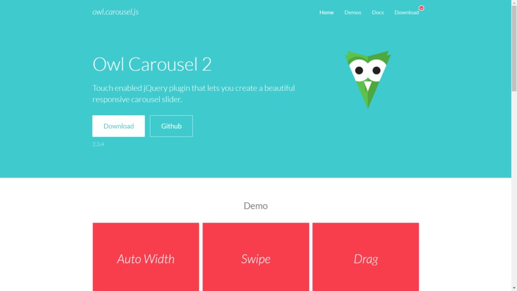
What is Owl Carousel
Owl carousel is a slider library that includes holding and dragging, auto-height, auto-play, and more. It is compatible with mobile devices and can swipe by touch. It can be used more than once on a page, and we can adjust the animations according to our wishes.
For more information about Owl Carousel, you can visit the official website.
How to use Owl Carousel
First, we need to download the carousel files and include them in the HTML web page. You can find the files on Owl Carousel, or optionally you can use the cdnjs CDN to include the files in the head of your document. Addionally, you will need to have the jQuery library as well.
Below are the three Owl files required:
- owl.carousel.css
- owl.theme.css
- owl.carousel.js
Then we call the files we downloaded into our HTML file by including them in the web page’s head.
<link rel=”stylesheet” href=”owl-carousel/owl.carousel.css”>
<link rel=”stylesheet” href=”owl-carousel/owl.theme.css”>
<script src="https://code.jquery.com/jquery-3.6.0.min.js"></script>
<script src=”assets/owl-carousel/owl.carousel.js”></script>
What are some features of Owl Carousel
- touch support
- drag and drop support
- more than once on a page
- forward and backward buttons
- customizable animations
- CSS 3D Support
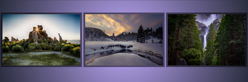
How to create a carousel with Owl Carousel
We will be creating a Carousel, and once finished, it will look something like this.
HTML Code
First, we add our HTML code.
<div class="container">
  <div id="owl-example" class="owl-carousel">
    <div class="first"><img src="https://images.unsplash.com/photo-1640919570975-420db180f038?ixlib=rb-1.2.1&ixid=MnwxMjA3fDB8MHxwaG90by1wYWdlfHx8fGVufDB8fHx8&auto=format&fit=crop&w=1170&q=80"></div>
    <div class="second"><img src="https://images.unsplash.com/photo-1640562329119-efcaa3dcf18d?ixlib=rb-1.2.1&ixid=MnwxMjA3fDB8MHxwaG90by1wYWdlfHx8fGVufDB8fHx8&auto=format&fit=crop&w=1170&q=80"></div>
    <div class="third"><img src="https://images.unsplash.com/photo-1481047874621-0ed2ab52598e?ixlib=rb-1.2.1&ixid=MnwxMjA3fDB8MHxwaG90by1wYWdlfHx8fGVufDB8fHx8&auto=format&fit=crop&w=1170&q=80"></div>
    <div class="fourth"><img src="https://images.unsplash.com/photo-1639993067709-f661045d9e79?ixlib=rb-1.2.1&ixid=MnwxMjA3fDB8MHxwaG90by1wYWdlfHx8fGVufDB8fHx8&auto=format&fit=crop&w=1170&q=80"></div>
  </div>
</div>
CSS Code
Second, here is some CSS styles to define the visual aspect of the carousel and the background of the webpage.
html,
body {
  background: rgb(47, 99, 134);
  background: radial-gradient(circle, #c3aaff 0%, rgba(41, 45, 62, 1) 100%);
  height: 100%;
  overflow: hidden;
  margin: 0;
}

.owl-carousel {
  padding-left: 10px;
}

.first {
  background: #00000082;
  padding: 10px;
  margin: 0 10px 0 0;
}

.second {
  background: #00000082;
  padding: 10px;
  margin: 0 10px 0 0;
}

.third {
  background: #00000082;
  padding: 10px;
  margin: 0 10px 0 0;
}

.fourth {
  background: #00000082;
  padding: 10px;
  margin: 0 10px 0 0;
}

.container {
  -webkit-box-align: center !important;
  -ms-flex-align: center !important;
  align-items: center !important;
  -webkit-box-pack: center !important;
  -ms-flex-pack: center !important;
  justify-content: center !important;
  display: -webkit-box !important;
  display: -ms-flexbox !important;
  display: flex !important;
  height: 100%;
}
jQuery Code
Finally, we call the owl plugin method on the element with the id of #owl-example. We can do this by using jQuery.
$(document).ready(function() {
  $("#owl-example").owlCarousel();
});
Will the code above, our carousel is now useable. You can visit and try the carousel yourself and edit it on codepen.io