AppCode
This article demonstrates how to the use the CSS hue-rotate filter function on elements with CSS filter. Included is code and examples.
The hue-rotate function is a value of the CSS filter property. Hue-rotate applies a rotation of the hue of the target HTML element. This can also include an image.
Syntax
filter: hue-rotate(degrees);Parameters
- degrees (required)
The degree parameter of hue-rotate is a degree or angle. The value passed determines the rotation around the color circle an element’s hue will be changed. A value of 0deg will leave the element unchanged. A positive value will result in a positive increase of a hue while a negative value will result in a negative value. There is no minimum or maximum value for the hue-rotate degrees because Ndeg will evaluate to 360degs. The default value when omitted is 0 and interpolation is 0deg.
Note: In order to implement animations above 360deg the value must not be normalized.
Examples
The examples below uses positive and negative numbers and degrees for the parameter of the hue-rotate filter function.
hue-rotate(0)       /* No effect */

hue-rotate(0deg)    /* No effect */

hue-rotate(27deg)   /* A hue rotation of 27deg */
hue-rotate(-35)     /* A hue rotation of -35deg */
hue-rotate(0.6deg)  /* A hue rotation of 0.6deg */
hue-rotate(102deg)  /* A hue rotation of 102deg */
hue-rotate(180deg)  /* A hue rotation of 180deg */

hue-rotate(-47deg)  /* A hue rotation of -47deg */
hue-rotate(478deg)  /* A hue rotation of 478deg */
Usage
You can apply the hue-rotate filter to any element or image by using CSS selectors.
#element-id {
  filter: hue-rotate(60deg);
}

img {
  filter: hue-rotate(-24deg);
}
Try It
HTML
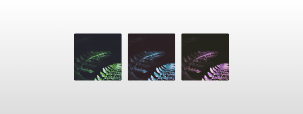
<div class="wrapper">
  <img src="https://s3-us-west-2.amazonaws.com/s.cdpn.io/46992/noah-silliman-141979.jpg" alt="" />
  <img src="https://s3-us-west-2.amazonaws.com/s.cdpn.io/46992/noah-silliman-141979.jpg" alt="" />
  <img src="https://s3-us-west-2.amazonaws.com/s.cdpn.io/46992/noah-silliman-141979.jpg" alt="" />
</div>
CSS
.wrapper img {
  width: 300px;
  height: 300px;
  object-fit: cover;
  border-radius: 6px;
  margin: 0 20px;
  vertical-align: middle;
}

.wrapper img:nth-child(1) {
  filter: hue-rotate(0);
}

.wrapper img:nth-child(2) {
  filter: hue-rotate(90deg);
}

.wrapper img:nth-child(3) {
  filter: hue-rotate(180deg);
}

html {
  text-align: center;
  min-height: 100%;
  background: linear-gradient(white, #ddd);
}

.wrapper {
  width: 100%;
  background: transparent;
  text-align: center;
  -webkit-box-align: center !important;
  -ms-flex-align: center !important;
  align-items: center !important;
  -webkit-box-pack: center !important;
  -ms-flex-pack: center !important;
  justify-content: center !important;
  display: -webkit-box !important;
  display: -ms-flexbox !important;
  display: flex !important;
  height: 100%;
}

html,
body {
  height: 100%;
  margin: 0;
}
Specifications
W3C CSS Filter Effects Module Level 1
#funcdef-filter-hue-rotate