AppCode
This tutorial explains how to create a sliding tab menu using HTML, CSS, JavaScript, and JQuery. It also includes code, steps, and examples.
Do you want a tab menu that is animated? Great you have arrived in the perfect location! In this tutorial, we will be creating a responsive, animated sliding tab menu. This tutorial will also provide two other themes you may use! We will be including Google Material Icons in this project. This tutorial will require the basic knowledge of HTML, CSS, JavaScript, and jQuery.
FUN FACT: This slider menu will also work on mobile devices with touch support!
Getting Started
We will need to include two JavaScript libraries before we begin this tutorial. We will Google Material Icons and the jQuery JavaScript library.
- Google Material Icons – More on including Google Material Icons
- JQuery Library – More on including on JQuery
After these libraries are added to the web page’s header we can begin. First, we will want to write some basic HTML code. This will create the HTML model we will be using.
<div class="mobile-container">
  <div class="container">
    <div class="tab tab-home">
      <span class="material-icons">home</span>
    </div>
    <div class="tab tab-account">
      <span class="material-icons">person_outline</span>
    </div>
    <div class="tab tab-cart">
      <span class="material-icons">shopping_cart</span>
    </div>
    <div class="tab tab-menu">
      <span class="material-icons">menu</span>
    </div>
    <div class="highlighter"></div>
  </div>
</div>

<div class="themePicker">
  <div class="theme themeClassic">
    <div class="type">Classic</div>
  </div>
  <div class="theme themeDark">
    <div class="type">Dark</div>
  </div>
  <div class="theme themeHue">
    <div class="type">Hue</div>
  </div>
</div>
Two div containers hold most of the other elements, including child div and span elements. The first group, called .mobile-container, is the container that holds the elements that display the menu.
The second container, .theme picker, changes the theme of the sliding menu. The theme selector isn’t required for implementing the slider menu in the project. It is here for demonstration purposes only.
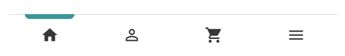
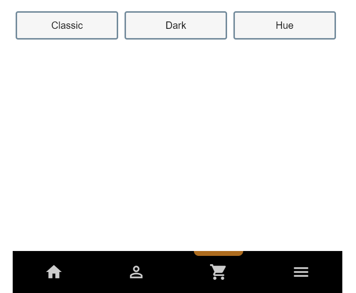
Rendering the HTML Slider Without Styles
Adding Some CSS
Let’s add some CSS to give the menu some style. You can also style the theme selector. Below, you find all the CSS styles and properties required to provide the slider with its structure and color.
html {
  font-family: Roboto, arial, sans-serif;
}

.tab {
  width: 25%;
  float: left;
  height: 60px;
  line-height: 60px;
  text-align: center;
  padding-top: 4px;
}

.mobile-container {
  margin: 50px auto 0 auto;
  margin-top: 5%;
  border-top: 1px solid #ccc;
  border-bottom: 1px solid #ccc;
  height: 68px;
  position: absolute;
  background: white;
  max-width: 540px;
  min-width: 200px;
  bottom: 0;
  right: 20%;
  left: 20%;
}

.material-icons {
  font-size: 30px !important;
  margin-top: 15px;
  color: #373737;
  pointer-events: none;
}

.highlighter {
  height: 8px;
  background: #2f9599;
  border-radius: 0 0 10px 10px;
  position: absolute;
  top: -1px;
  left: 5%;
  right: 80%;
  transition: 200ms 50ms cubic-bezier(0.4, 0, 0.6, 1);
}

.themePicker {
  position: absolute;
  max-width: 540px;
  min-width: 200px;
  top: 0;
  right: 20%;
  left: 20%;
  margin: 0 auto;
}

.theme {
  width: 30%;
  float: left;
  height: 40px;
  line-height: 40px;
  margin: 20px 0.9% 0 1%;
  color: #000;
  border: 3px solid #708a9b;
  border-radius: 4px;
  background: #f6f6f6;
}

.type {
  text-align: center;
}
Rendering With CSS
Now that we have the HTML and CSS, we have a basic slider model that is functionless, which means that the slider menu does not work, yet.

Adding Functionality (JavaScript & JQuery)
To add some functions to this menu, we added jQuery to speed up the development of the animation. We created a function called animate menu in JQuery with four parameters.
function animateMenu(
directionOne, directionOnePercent, directionTwo, directionTwoPercent
) {}
Whenever there is a touch or click event on one of the four tabs, we pass the absolute position (right or left) and a percent of the screen to the function. These values move the selected tab highlighter across the screen to the tab that has been selected.
How the function works is we calculate the last known position of the highlighter using the right absolute value, and compare it to the new one. If the new value is greater than the previous known, we tell the animation to move left.
(newValue > knownValue = moving left) If the new value is less than the old, the slider would be moved to the right.
(newValue < knownValue = moving right) Now that we know the direction of the animation, we can place a delay when we move the last corner of the highlighter. The delay gives the highlighter a stretching and then contracting animation as it moves across the tabs.
setTimeout(function () {
  trans.css({
    right: directionOnePercent
  });
}, 200);

setTimeout(function () {
  trans.css({
    left: directionTwoPercent
  });
}, 200);
Let’s add JavaScript and jQuery to give the model its function. Here is the full JavaScript and jQuery below.
var knownPosition = 80;

$(".tab-home").on("click", function () {
  animateMenu("right", "80%", "left", "5%");
});

$(".tab-account").on("click", function () {
  animateMenu("right", "55%", "left", "30%");
});

$(".tab-cart").on("click", function () {
  animateMenu("right", "30%", "left", "55%");
});

$(".tab-menu").on("click", function () {
  animateMenu("right", "5%", "left", "80%");
});

function animateMenu(
  directionOne,
  directionOnePercent,
  directionTwo,
  directionTwoPercent
) {
  newPosition = directionOnePercent.replace(/[^0-9]/g, "");

  if (parseInt(newPosition) > parseInt(knownPosition)) {
    var trans = $(".highlighter").css({
      left: directionTwoPercent
    });
    setTimeout(function () {
      trans.css({
        right: directionOnePercent
      });
    }, 200);
  } else {
    var trans = $(".highlighter").css({
      right: directionOnePercent
    });
    setTimeout(function () {
      trans.css({
        left: directionTwoPercent
      });
    }, 200);
  }

  knownPosition = newPosition;
}

$(".themeClassic").on("click", function () {
  $(".material-icons").css({
    color: "#373737"
  });
  $(".mobile-container").css({
    background: "#fff"
  });
  $(".highlighter").css({
    background: "#2f9599"
  });
});

$(".themeDark").on("click", function () {
  $(".material-icons").css({
    color: "#ccc"
  });
  $(".mobile-container").css({
    background: "black"
  });
  $(".highlighter").css({
    background: "#b06d19"
  });
});

$(".themeHue").on("click", function () {
  $(".material-icons").css({
    color: "#fff"
  });
  $(".mobile-container").css({
    background: "#4f053b"
  });
  $(".highlighter").css({
    background: "#b851a2"
  });
});
CSS Transition Effect
To achieve the sliding effect with the sliding menu. We need to include a CSS transition style. Without this transition effect, the tab will move instantly to the location we pass through as a parameter to the JavaScript function. Within the .highlighter CSS class, we will include:
.highlighter {
  transition: 200ms 50ms cubic-bezier(0.4, 0, 0.6, 1);
}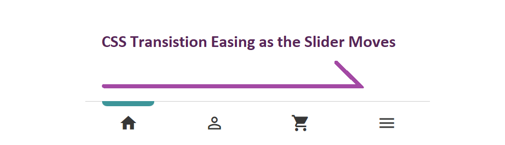
Without the CSS transition property, there will be no smooth transition easing for the highlighter to the new location.
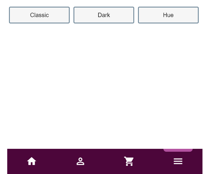
Functional Rendered Sliding Tab Menu
Now that we’ve provided all the steps, including HTML, CSS, JavaScript, and JQuery. We can display a working functional version. Remember that this animated menu works on mobile touch input and can be clicked on with a cursor on the desktop.
Full Code
<div class="mobile-container">
  <div class="container">
    <div class="tab tab-home">
      <span class="material-icons">home</span>
    </div>
    <div class="tab tab-account">
      <span class="material-icons">person_outline</span>
    </div>
    <div class="tab tab-cart">
      <span class="material-icons">shopping_cart</span>
    </div>
    <div class="tab tab-menu">
      <span class="material-icons">menu</span>
    </div>
    <div class="highlighter"></div>
  </div>
</div>

<div class="themePicker">
  <div class="theme themeClassic">
    <div class="type">Classic</div>
  </div>
  <div class="theme themeDark">
    <div class="type">Dark</div>
  </div>
  <div class="theme themeHue">
    <div class="type">Hue</div>
  </div>
</div>
html {
font-family: Roboto, arial, sans-serif;
}
.tab {
width: 25%;
float: left;
height: 60px;
line-height: 60px;
text-align: center;
padding-top: 4px;
}
.mobile-container {
margin: 50px auto 0 auto;
margin-top: 5%;
border-top: 1px solid #ccc;
border-bottom: 1px solid #ccc;
height: 68px;
position: absolute;
background: white;
max-width: 540px;
min-width: 200px;
bottom: 0;
right: 20%;
left: 20%;
}
.material-icons {
font-size: 30px !important;
margin-top: 15px;
color: #373737;
pointer-events: none;
}
.highlighter {
height: 8px;
background: #2f9599;
border-radius: 0 0 10px 10px;
position: absolute;
top: -1px;
left: 5%;
right: 80%;
transition: 200ms 50ms cubic-bezier(0.4, 0, 0.6, 1);
}
.themePicker {
position: absolute;
max-width: 540px;
min-width: 200px;
top: 0;
right: 20%;
left: 20%;
margin: 0 auto;
}
.theme {
width: 30%;
float: left;
height: 40px;
line-height: 40px;
margin: 20px 0.9% 0 1%;
color: #000;
border: 3px solid #708a9b;
border-radius: 4px;
background: #f6f6f6;
}
.type {
text-align: center;
}var knownPosition = 80;
$(".tab-home").on("click", function () {
animateMenu("right", "80%", "left", "5%");
});
$(".tab-account").on("click", function () {
animateMenu("right", "55%", "left", "30%");
});
$(".tab-cart").on("click", function () {
animateMenu("right", "30%", "left", "55%");
});
$(".tab-menu").on("click", function () {
animateMenu("right", "5%", "left", "80%");
});
function animateMenu(
directionOne,
directionOnePercent,
directionTwo,
directionTwoPercent
) {
newPosition = directionOnePercent.replace(/[^0-9]/g, "");
if (parseInt(newPosition) > parseInt(knownPosition)) {
var trans = $(".highlighter").css({
left: directionTwoPercent
});
setTimeout(function () {
trans.css({
right: directionOnePercent
});
}, 200);
} else {
var trans = $(".highlighter").css({
right: directionOnePercent
});
setTimeout(function () {
trans.css({
left: directionTwoPercent
});
}, 200);
}
knownPosition = newPosition;
}
$(".themeClassic").on("click", function () {
$(".material-icons").css({
color: "#373737"
});
$(".mobile-container").css({
background: "#fff"
});
$(".highlighter").css({
background: "#2f9599"
});
});
$(".themeDark").on("click", function () {
$(".material-icons").css({
color: "#ccc"
});
$(".mobile-container").css({
background: "black"
});
$(".highlighter").css({
background: "#b06d19"
});
});
$(".themeHue").on("click", function () {
$(".material-icons").css({
color: "#fff"
});
$(".mobile-container").css({
background: "#4f053b"
});
$(".highlighter").css({
background: "#b851a2"
});
});
Theme Picker
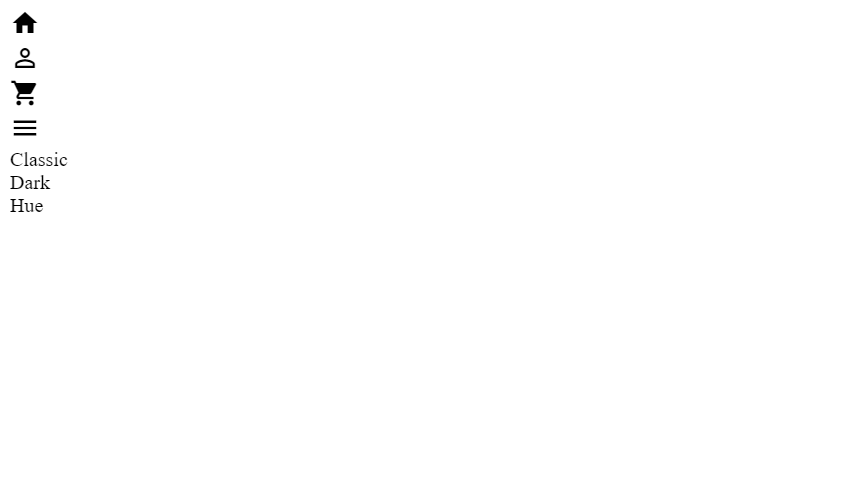
The theme picker built-in provides two other themes to choose from, down below we show the other two themes. The code for this project can be updated to include your own custom theme for the slider menu.
Customizing the Slider Menu
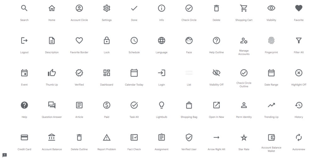
Remember that the slider menu in this article is customizable. You can change the style by changing .mobile-container, .highlighter, and the .material-icons CSS classes. Additionally, you can change the icons of the menu by using the Google Icon Library. There are many icons to choose from.
Stopping Here
Now that you’ve read through this tutorial you can put together a slider menu. Include the CSS styles, HTML, and JavaScript to get this example working. You can also view this example on Codepen.io
Recommended Articles
- How To Create an HTML Carousel
- How To Create a Page Loader Using HTML and CSS
- How To Create Alert Buttons With CSS
- A Guide on How To Use CSS Grids for Layouts
- How To Create a Stacked Card Hover Effect Using CSS
- How To Create An Icon Bar With CSS