AppCode
This tutorial demonstrates creating a simple circular page load using CSS and HTML. Included are keyframe rules, CSS, and HTML examples.
This article will teach you how to create two simple page loaders. Don’t worry whether you are new to CSS or want to make your website more user-friendly by using a loading animation. I will walk you through the process of creating a page loader.
What is a page loader?
A page loader is a user interface element that informs users that a website is currently processing data and has not crashed. While the page loads, visitors are entertained by exciting animations.
Blinking circles or moving stripes that reflect the loading time are common loading examples.
Unlike a GIF, a CSS animation does not need an image request. As a result, there is reduced bandwidth use, and the loading process is quicker.
Let’s get started
Step 1
First, you need to create a basic HTML structure like below. The HTML structure is a shell where we can start placing the good stuff (code).
<!DOCTYPE html>
<html>
   <head>
      <title>Page Loader</title>
   </head>
   <body>
   </body>
</html>
Step 2
In the <body> tag include the ring class in the DIV element. The .ring class will be used to create the page loader.
<body>
   <div class="ring"> </div>
</body>
Step-3
The next step is to add the CSS properties for .ring class to the <style> tag.
.ring {
  border: 20px solid rgb(211, 211, 211);
  position: absolute;
  left: 45%;
  border-radius: 50%;
  border-top: 20px solid red;
  width: 120px;
  height: 120px;
  animation: spin 1s linear infinite;
}
Explaining Some of the CSS Properties
The border property is used to set the size and color of the border within the ring class.
The border-radius property defines the radius of the element’s corners. We have used it to transform our page loader into a circular ring.
The spinner that spins inside the border is specified with the border-top property. You can also use border-bottom, border-left, or border-right instead of border-top (as it will only change the initiating position of the spinner).
The size of the ring is specified using the width and height properties.
One important thing in the CSS code is that we use the animation property to control the appearance of the animation. Here, the animation name and time to animate written, making the spinner spin with a 1-second animation speed using the “spin” animation.
animation: spin 1s linear infinite;You may notice if you try to execute this code; it will not move because we have not added the keyframe rules (animation rules).
Step-4
Adding the keyframe rules.
What are @keyframes rules?
The @keyframes rule specifies the animation code.
Which, the animation is created by gradually changing from one set of CSS styles to another.
During the animation, you can change the set of CSS styles many times.
Specify style changes using a percent or with the keywords “from” and “to”, the same as 0% and 100%. 0% is the beginning of the animation, 100% is when the animation is complete.
@keyframes spin {
  0% {
    transform: rotate(0deg);
  }
  100% {
    transform: rotate(360deg);
  }
}
Here we have defined the animation @keyframes spin.
You should also include a WebKit prefix for browsers that do not support animation and transform properties.
We have specified the style change that will happen with a percent. Then the transform property is used to rotate the spinner inside the border.
Note- The transform property is used to create an element’s 2D/3D transformation. In simple words, you can use it to move, rotate or scale your elements along the X, Y, and Z-axis, respectively.
Step-5
Add the keyframes rule below, to the .ring class which is inside the tag. Here is the complete implementation of the code for the spinner is below.
<!DOCTYPE html>
<html>
<head>
<title>Page Loader</title>
<style>
h1 {
text-align: center;
}
.ring {
border: 20px solid rgb(211, 211, 211);
position: absolute;
left: 45%;
border-radius: 50%;
border-top: 20px solid red;
width: 120px;
height: 120px;
animation: spin 1s linear infinite;
}
@keyframes spin {
0% {
transform: rotate(0deg);
}
100% {
transform: rotate(360deg);
}
}
</style>
</head>
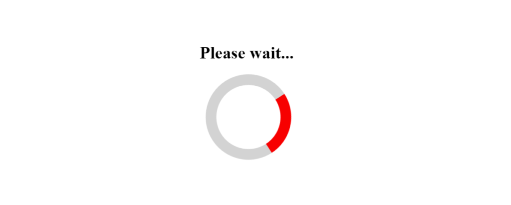
<body>
<h1>Please wait...</h1>
<div class="ring"> </div>
</body>
</html>Output
Now, let’s try to add more color to this ring.
Step-6
Adding more colors to the ring.
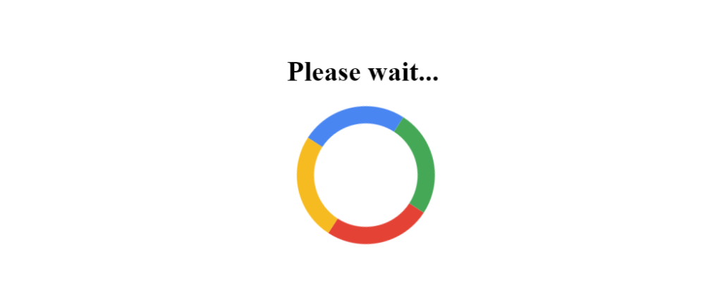
This can be done by again using the border property. Previously, we added the red color using the border-top property inside the .ring class. Now, let’s add color to the other parts inside the ring’s border-bottom, border-left, and border-right properties.
Inside the <style> tag, in the .ring class add the following CSS properties.
border-bottom: 20px solid #4285f4; /* blue */
border-right: 20px solid #fbbc05; /* yellow */
border-left:20px solid #34a853; /* green */
We will also update the red color to the #eb4335; hex color.
border-top: 20px solid #eb4335; /* red */The complete code for the updated colors is below.
<!DOCTYPE html>
<html>
   <head>
      <title>Page Loader</title>
      <style>
          h1 {
            text-align: center;
          }
          .ring {
            border: 20px solid rgb(211, 211, 211);
            position: absolute;
            left: 45%;
            border-radius: 50%;
            border-top: 20px solid #eb4335; /* red */
            border-bottom: 20px solid #4285f4; /* blue */
            border-right: 20px solid #fbbc05; /* yellow */
            border-left:20px solid #34a853; /* green */
            width: 120px;
            height: 120px;
            animation: spin 1s linear infinite;
          }
          @keyframes spin {
            0% {
              transform: rotate(0deg);
            }
            100% {
              transform: rotate(360deg);
            }
          }
      </style>
   </head>
   <body>
      <h1>Please wait...</h1>
      <div class="ring"> </div>
   </body>
</html>
You don’t have to change anything else.
Output
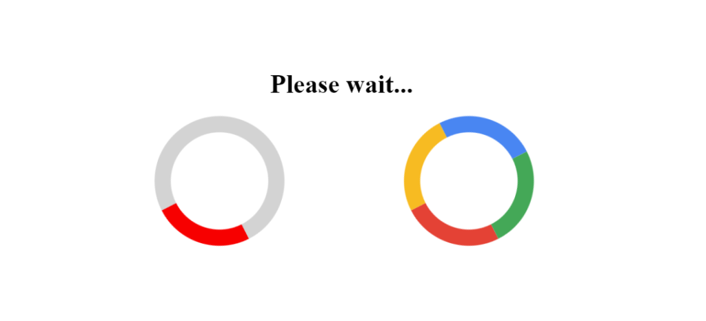
You can even use multiple page loaders. I will use the above two rings to give you a practical illustration.
All you need to do is create another class for another ring or page loader.
Use .ring1 class for the first ring and .ring2 for the second ring.
<!DOCTYPE html>
<html>
   <head>
      <title>Page Loader</title>
      <style>
          h1 {
            text-align: center;
          }
          .ring1 {
            border: 20px solid rgb(211, 211, 211);
            position: absolute;
            left: 35%;
            border-radius: 50%;
            border-top: 20px solid red;
            width: 120px;
            height: 120px;
            animation: spin 1s linear infinite;
          }
          .ring2 {
            border: 20px solid rgb(211, 211, 211);
            position: absolute;
            left: 55%;
            border-radius: 50%;
            border-top: 20px solid #eb4335; /* red */
            border-bottom: 20px solid #4285f4; /* blue */
            border-right: 20px solid #fbbc05; /* yellow */
            border-left:20px solid #34a853; /* green */
            width: 120px;
            height: 120px;
            animation: spin 1s linear infinite;
          }
          @keyframes spin {
            0% {
              transform: rotate(0deg);
            }
            100% {
              transform: rotate(360deg);
            }
          }
      </style>
   </head>
   <body>
      <h1>Please wait...</h1>
      <div class="ring1"> </div>
      <div class="ring2"> </div>
   </body>
</html>
Output
You can check out this enhanced version on codepen.io.
Conclusion
I hope this article will assist you in creating a page loader. A page loader helps make your site more responsive and keeps the visitors entertained by showing them animations. CSS animations can reduce browser load because they do not require an image request, unlike the GIF.
Similar Articles
- How to make an HTML Loader / Spinner Appear and Disappear
- 15 CSS Spinner Animation Examples and Code
- 15 CSS Loader Animation Examples and Code