AppCode
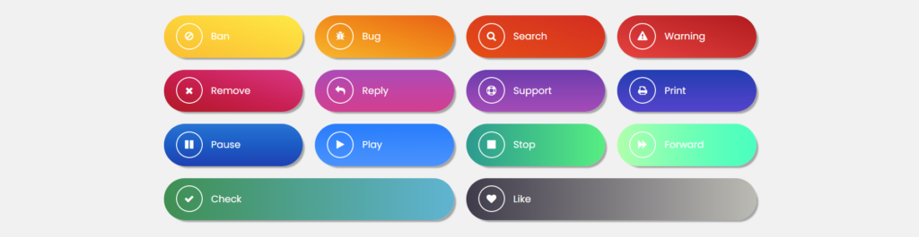
This article demonstrates how to create CSS gradient buttons. In this example, we create a grid of buttons with individual gradients. Included are a live demo and usable code.
This article was first seen on and republished from csstutorial.io
HTML
Included below is the HTML that we use to create the CSS gradient buttons. Each gradient button includes an icon from Font Awesome. The icons are included with the class name “.fa .fa-$iconName”. For example, the first icon is a bug icon which is defined with a class name of “.fa-bug”. Additionally, the gradient buttons are wrapped in an element with the class name of “.gradient-btn”. This defines the root element of each button. Finally, we include a unique class name of “.btn-$number” which defines the custom CSS properties and CSS gradients for each button.
<div class="container">
  <div class="gradient-buttons">
    <h1>Gradient Buttons</h1>
    <div class="gradient-btn btn-1">
      <i class="fa fa-ban"></i>
      <span>Ban</span>
    </div>
    <div class="gradient-btn btn-2">
      <i class="fa fa-bug"></i>
      <span>Bug</span>
    </div>
    <div class="gradient-btn btn-3">
      <i class="fa fa-search"></i>
      <span>Search</span>
    </div>
    <div class="gradient-btn btn-4">
      <i class="fa fa-warning"></i>
      <span>Warning</span>
    </div>
    <div class="gradient-btn btn-5">
      <i class="fa fa-remove"></i>
      <span>Remove</span>
    </div>
    <div class="gradient-btn btn-6">
      <i class="fa fa-reply"></i>
      <span>Reply</span>
    </div>
    <div class="gradient-btn btn-7">
      <i class="fa fa-support"></i>
      <span>Support</span>
    </div>
    <div class="gradient-btn btn-8">
      <i class="fa fa-print"></i>
      <span>Print</span>
    </div>
    <div class="gradient-btn btn-9">
      <i class="fa fa-pause"></i>
      <span>Pause</span>
    </div>
    <div class="gradient-btn btn-10">
      <i class="fa fa-play"></i>
      <span>Play</span>
    </div>
    <div class="gradient-btn btn-11">
      <i class="fa fa-stop"></i>
      <span>Stop</span>
    </div>
    <div class="gradient-btn btn-12">
      <i class="fa fa-forward"></i>
      <span>Forward</span>
    </div>
    <div class="gradient-btn btn-13">
      <i class="fa fa-check"></i>
      <span>Check</span>
    </div>
    <div class="gradient-btn btn-14">
      <i class="fa fa-heart"></i>
      <span>Like</span>
    </div>
  </div>
</div>
CSS
Down below are the CSS styles that we use to visually design and structure the HTML code in this demo. Something you may notice is the h1 CSS selector. This selector is a reference to the HTML heading element of the button grid that we created. The header text is “CSS Gradient Buttons” and this text uses a CSS gradient to create the color change you see as you read the text.
body,
html {
  height: 100%;
  overflow: hidden;
}

body {
  background: #f1f1f1;
  font-family: "Poppins", sans-serif;
}

.container {
  -webkit-box-align: center !important;
  -ms-flex-align: center !important;
  align-items: center !important;
  -webkit-box-pack: center !important;
  -ms-flex-pack: center !important;
  justify-content: center !important;
  display: -webkit-box !important;
  display: -ms-flexbox !important;
  display: flex !important;
  height: 100%;
}

h1 {
  text-align: center;
  text-transform: uppercase;
  background: linear-gradient(45deg, #f47d0d, #0621e0);
  letter-spacing: 10px;
  -webkit-background-clip: text;
  -webkit-text-fill-color: transparent;
  width: 100%;
}

.fa {
  width: 40px;
  height: 40px;
  line-height: 40px;
  border-radius: 50%;
  border: 2px solid #fff;
  margin-right: 10px;
  text-align: center;
}

.gradient-buttons {
  display: flex;
  flex-wrap: wrap;
  max-width: 1000px;
  margin: -50px 0 0 0;
}

.gradient-btn {
  color: #fff;
  display: inline-block;
  height: 70px;
  line-height: 70px;
  width: 180px;
  margin: 10px;
  padding-left: 20px;
  border-radius: 50px;
  box-shadow: 5px 5px 2px -2px #a5a5a5;
  flex: 1 0 21%;
}

.btn-1 {
  background-image: linear-gradient(
    to right top,
    #fdbe25,
    #fec928,
    #ffd42b,
    #ffdf31,
    #ffea37
  );
}

.btn-2 {
  background-image: linear-gradient(
    to right top,
    #fab823,
    #f9a315,
    #f68d0c,
    #f3770d,
    #ee5f13
  );
}

.btn-3 {
  background-image: linear-gradient(
    to right top,
    #eb4f12,
    #e74717,
    #e23f1b,
    #de361e,
    #d92d21
  );
}

.btn-4 {
  background-image: linear-gradient(
    to right top,
    #ed433f,
    #df3a37,
    #d2302f,
    #c42627,
    #b71b1f
  );
}

.btn-5 {
  background-image: linear-gradient(
    to right top,
    #b71c24,
    #c41c3c,
    #cf2154,
    #d72c6d,
    #db3a86
  );
}

.btn-6 {
  background-image: linear-gradient(
    to top,
    #d83f91,
    #d0409b,
    #c743a5,
    #bb47af,
    #ae4bb8
  );
}

.btn-7 {
  background-image: linear-gradient(
    to top,
    #a94bb9,
    #9b46b7,
    #8d42b5,
    #7d3eb2,
    #6d3ab0
  );
}

.btn-8 {
  background-image: linear-gradient(
    to top,
    #5540cd,
    #493fc7,
    #3c3ec0,
    #2e3dba,
    #1e3bb3
  );
}

.btn-9 {
  background-image: linear-gradient(
    to top,
    #1c3eb4,
    #154cbd,
    #1059c6,
    #1266ce,
    #1b73d5
  );
}

.btn-10 {
  background-image: linear-gradient(
    to top,
    #4292ff,
    #388cff,
    #2e86ff,
    #2380ff,
    #177aff
  );
}

.btn-11 {
  background: linear-gradient(to right, #11998e, #38ef7d);
}

.btn-12 {
  background: linear-gradient(to right, #aaffa9, #11ffbd);
}

.btn-13 {
  background: linear-gradient(to right, #348f50, #56b4d3);
}

.btn-14 {
  background: linear-gradient(to right, #403b4a, #bbbbb4);
}

.gradient-btn:nth-child(odd):hover {
  cursor: pointer;
  box-shadow: -6px -9px 2px -2px #a5a5a5;
  transition: all 2s ease;
  transform: translateX(10px);
}

.gradient-btn:nth-child(even):hover {
  cursor: pointer;
  box-shadow: 8px 8px 2px -2px #a5a5a5;
  transition: all 2s ease;
  transform: translateX(-10px);
}
This example includes a live demo on codepen.io.
Font Awesome CDN
To include the icons in this example in your project you must use the CSS library hosted on Cloudflare CDN. This script must be placed in the HTML head element like shown below. There may be other scripts, metadata, and files included in the head. The head element shown below may not be identical to yours.
<head>
  <link rel="stylesheet" href="https://cdnjs.cloudflare.com/ajax/libs/font-awesome/4.7.0/css/font-awesome.cs">
</head>
By including this CSS library from Cloudfare, you reduce the requests and request payload from your server that hosts the webpage.