AppCode
This article will explain how to make an icon bar using CSS. We will use the Font Awesome icon library, which can be found for free at fontawesome.com. Font awesome is a CSS library that presents frequently used icons as fonts when designing web pages.
What is an icon bar
An icon bar provides a menu to navigate an app quickly. Ideally, an icon bar is used horizontally or vertically. Additionally, icon bars optionally contain text labeled below the icons or to the right of them. I will share two examples of an icon bar at the bottom of this article for horizontal and vertical use.
How to include the Font Awesome library
No downloading or installation is required. To include the Font Awesome icons in our project, we call the icon library in the <head> of our page using a stylesheet link:
<link rel="stylesheet" href="https://cdnjs.cloudflare.com/ajax/libs/font-awesome/4.7.0/css/font-awesome.min.css">How to add icons to an HTML file
To add an icon, add the name of the icon class to any inline HTML elements. The <i> and <span> elements are commonly used inline elements to add symbols. All icons in the Font Awesome icon library below are customizable (size, color, shadow, etc.) To start searching for icons to use, you can visit fontawesome.com

We can place Font Awesome icons just about anywhere using a style prefix and the icon’s name.
The concepts of name and prefixes should be well understood for icons in an HTML file. There are two parts to include an icon:
- the icon’s name, prefixed with fa- (fa:font-awesome)
- The icon style prefix. (fas or fab class)
Adding an icon is simple by using a CSS class with an inline element (like <span> or <I>). Using inline elements is demonstrated below using the prefixes in the elements’ class:
<!-- this icon's 1) style prefix == fas and 2) icon name == camera -->
<i class="fas fa-camera"></i>

<!-- using an <i> element to reference the icon -->
<i class="fas fa-camera"></i>

<!-- using a <span> element to reference the icon -->
<span class="fas fa-camera"></span>
An alternative diagram showing style name and prefix with arrows:
<span class="fas fa-camera"></span>
 ^           ^   ^  ^
 |           |   |  |
 |           |   |  |—— Icon name
 |           |   |—— Icon name prefix
 |           |—— Icon style prefix
 |—— Inline element (span element)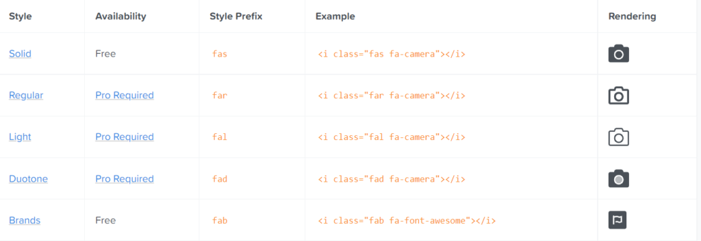
The fa prefix is deprecated. Now only fas solid style and fab brand style are used. If you are going to use it from the brand category, you should use fab, and if you are going to use it from the solid type, you should use fas. The other style prefixes are a Pro plan, a subscription paid annually.
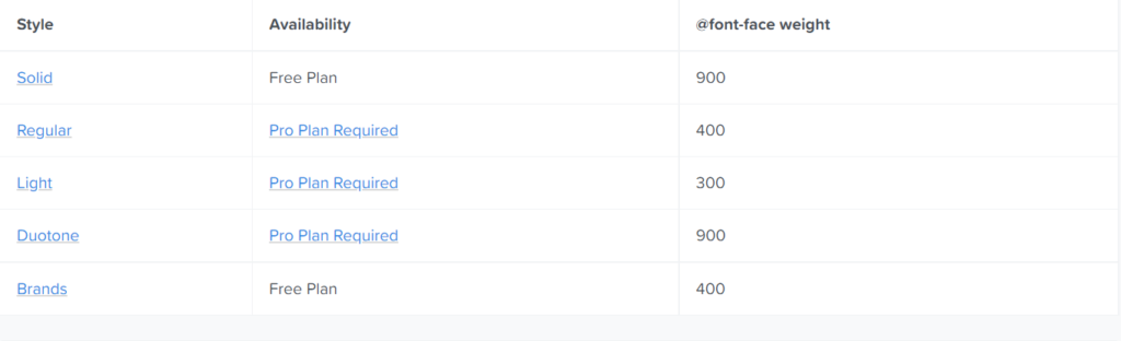
The @font-face rule allows different icons to be loaded on a web page. Once added to a style sheet, the rule instructs the browser to download the corresponding font style from its hosting location (Font Awesome CDN) and then displays it in the browser. Below are the font weights corresponding to the different icons in the Font Awesome library.
How to style Font Awesome icons with CSS
Font Awesome icons automatically apply the parent element’s CSS styles, and the inheritance means they blend in wherever you put them. Optionally we can edit and style them as a group by changing the parent element inline CSS styles. To demonstrate, we’ve created some CSS styles in the style attribute of the HTML elements below, where we’ve added some icons. Below, we have icons with parent elements with CSS styles to demonstrate the CSS inheritance.

<span style="font-size: 3em; color: Tomato;">
  <i class="fas fa-camera"></i>
</span>

<span style="font-size: 48px; color: Dodgerblue;">
  <i class="fas fa-camera"></i>
</span>

<span style="font-size: 3rem;">
  <span style="color: Mediumslateblue;">
    <i class="fas fa-camera"></i>
  </span>
</span>
We can do a lot of styling, such as resizing, aligning, or coloring icons. With the icons being customizable through CSS, we can write our own CSS rules, whether they are inlined or in an external CSS file.
Font Awesome recommends targeting icons with CSS in a couple of different ways. Down below is an example of using CSS selectors to add color with embedded CSS in the head section of an HTML file.
<html>
  <head>
    <!-- reference your copy Font Awesome here (from our CDN or by hosting yourself) -->
    <link href="/your-path-to-fontawesome/css/fontawesome.css" rel="stylesheet">
    <link href="/your-path-to-fontawesome/css/brands.css" rel="stylesheet">
    <link href="/your-path-to-fontawesome/css/solid.css" rel="stylesheet">
    <style type="text/css">
      <!-- custom styling for all icons -->
      i.fas,
      i.fab {
        border: 1px solid red;
      }

      <!-- custom styling for specific icons -->
      .fa-fish {
        color: salmon;
      }

      .fa-frog {
        color: green;
      }

      .fa-user-ninja.vanished {
        opacity: 0.0;
      }

      .fa-facebook {
        color: rgb(59, 91, 152);
      }
    </style>
  </head>
  <body>
    <i class="fas fa-fish"></i>
    <i class="fas fa-frog"></i>
    <i class="fas fa-user-ninja vanished"></i>
    <i class="fab fa-facebook"></i>
  </body>
</html>
Another way is to use an external CSS file.
If you are using the SVG framework when writing custom CSS, you should know that Font Awesome-based <i> DOM elements are replaced by new <svg> elements by default.
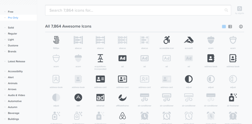
Visit the Font Awesome icon reference for a complete list of all Font Awesome icons.
How to use Google Icons on a web page
We can use Google icons too. No downloading or installation is required for this library as well. To use the Google icons, you will need to add the CSS library from the Google API CDN. To add the icons, add the following line inside the <head> section of the HTML page:
<link rel="stylesheet" href="https://fonts.googleapis.com/icon?family=Material+Icons">To get started adding the Google icons, we need to add the HTML code for the icons in the body of an HTML file, as shown below. There are five icons, cloud, favorite, attachment, computer, and traffic. The difference with google icons is the icon is loaded via the text in the inline element. Additionally, only the “material-icons” class is required on the element.
<body>

  <i class="material-icons">cloud</i>
  <i class="material-icons">favorite</i>
  <i class="material-icons">attachment</i>
  <i class="material-icons">computer</i>
  <i class="material-icons">traffic</i>

</body>
For a complete list of all Google icons, visit the Google icon reference.
How to create the icon bar
Now that we’ve discussed how to include icons and style them, we can begin creating the Icon Bar.
First, we add the HTML for the icons we’ll be using to our page. Three DIV elements wrap the icons, which are a DIV element with a class called “container”, then a DIV element “icon-bar”, and last the DIV element “icon-bar-container”. A link element wraps each of the icon inline elements.
<div class="container">
  <div class="icon-bar-container">
    <div class="icon-bar">
      <a href="#"><i class="fa fa-home"></i></a>
      <a href="#"><i class="fa fa-search"></i></a>
      <a href="#"><i class="fa fa-envelope"></i></a>
      <a href="#"><i class="fa fa-globe"></i></a>
      <a href="#"><i class="fa fa-trash"></i></a>
    </div>
  </div>
</div>
With the href attribute in the a element (link element), we tell the browser which targets anchors or a different page we want when the user clicks on the icon.
We write the class of the icon we want in the class attribute of the i tags. We can get the classes for the icons from Font Awesome icon list.
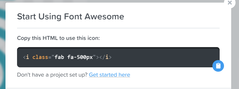
Let’s select the first icon from here and view how to copy its class. Copy the marked code.
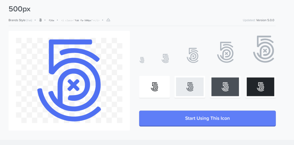
Above there is a button you can click, which triggers a modal to open up on the page. The modal includes a button that places the code into your clipboard. From there, you can paste the code in the body of the HTML doc.
How to create a horizontal icon bar with CSS
Now we add our CSS codes into the head of the HTML document. These styles convert the Icon Bar into a horizontal bar.
<style>
.icon-bar {
  width: 100%; /* Full-width */
  background-color: #454545; /* Dark-gray background */
  overflow: auto; /* Overflow due to float */
}

.icon-bar a {
  float: left; /* Float links side by side */
  text-align: center; /* Center-align text */
  width: 20%; /* Equal width (5 icons with 20% width each = 100%) */
  padding: 12px 0; /* Some top and bottom padding */
  transition: all 0.3s ease; /* Add transition for hover effects */
  color: white; /* White text color */
  font-size: 36px; /* Increased font size */
}

.icon-bar a:hover {
  background-color: #04aa6d; /* Add a hover color */
}

.icon-bar-container {
  width: 80%;
  padding: 10px;
  background: #ffffff2b;
  border-radius: 10px;
  box-shadow: 0 2px 4px rgb(0 0 0 / 50%);
}
</style>
Now, when the code runs, a horizontal icon bar will appear.
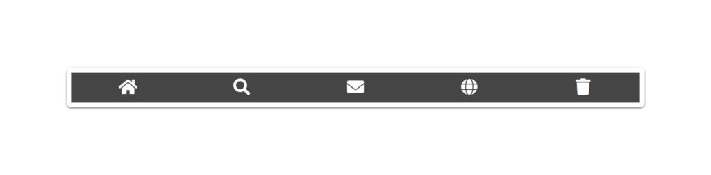
How to create a vertical icon bar with CSS
Or we add our CSS styles to the style sheet for the vertical icon bar. Our HTML code remains the same, and we edit the CSS at the head of the document:
<style>
.icon-bar {
  width: 90px; /* Set a specific width */
  background-color: #454545; /* Dark-gray background */
}

.icon-bar a {
  display: block; /* Make the links appear below each other instead of side-by-side */
  text-align: center; /* Center-align text */
  padding: 16px; /* Add some padding */
  transition: all 0.3s ease; /* Add transition for hover effects */
  color: white; /* White text color */
  font-size: 36px; /* Increased font-size */
}

.icon-bar a:hover {
  background-color: #04aa6d; /* Add a hover color */
}

.icon-bar-container {
  width: 80%;
  padding: 10px;
  background: #ffffff2b;
  border-radius: 10px;
  box-shadow: 0 2px 4px rgb(0 0 0 / 50%);
}
</style>
Now, when the code runs, a vertical icon bar will appear.
View the full icon bar project on Codepen
Here is a link to the full project code on Codepen.io