AppCode
This article demonstrates creating a web form using HTML and CSS. It also includes a walk-through for making and adding several form themes.
So you want to create a simple HTML web form? Well, it’s easy! The first thing we will need to do is make the form using elements in HTML. Then we’ll use CSS to style them.
Below we’ve included HTML code illustrating the elements used to create a form. We wrap all the elements in an HTML <form> element. Inside the form, there are four input elements and a submit button.
<form>
  <div class="super-container">
    <div class="container">
      <h4>Sign Up</h4>
      <div class="username-input">
        <input type="text" placeholder="Username">
      </div>
      <div class="email-input">
        <input type="text" placeholder="Email">
      </div>
      <div class="password-input">
        <input type="password" placeholder="Password">
      </div>
      <div class="confirm-password">
        <input type="password" placeholder="Confirm Password">
      </div>
      <button type="submit">Continue</button>
    </div>
  </div>
</form>
As you see above, we’ve wrapped all the elements in an HTML form element. The <form> element enables users to submit form data using HTML without JavaScript to a server. To facilitate processing for the form we’ve created, we’ll need to add attributes in the form element, such as the action and method attributes.
The attributes below post the form data to a file called example.php, where the data is processed. You can read more about processing form data in another article on AppCode.
<form action="/example.php" method="post">
  <!-- HTML elements -->
</form>
Also, check an article on jQuery with forms to learn how to handle form data, such as validation and input sanitization.
What Does HTML Look Like Without CSS?
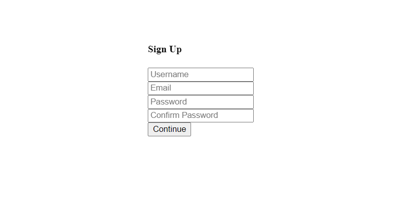
Now that we have built a form constructed with elements, we might wonder what a form would look like if no CSS styles were provided. It’s simple; a browser will use browser rendering, which will render the form without user-defined CSS styles and apply a browser’s default styles.
The HTML we wrote will render something like the image below. The heading, inputs, and single submit button have minimum styling.
How To Style a Web Form Using CSS Properties?
Since we don’t want a form to render with default browser styles, we might want to create several different themes for our new form.
The form structure is initially created using HTML, but we can enhance a form’s usability and looks with CSS styles. There are many different CSS properties, and we’ll have step-by-step instructions for designing a few styles that are easy to use and accessible. These styles we will be applying can be referenced as a theme, and we’ll use these styles to create a light theme, then move on to a colored version and a dark theme.
How To Create a Light-Colored Form Theme?
A light-form theme is easy to create, and the absence of color makes a light-themed form easy to develop. Below you will see the theme we will be creating.
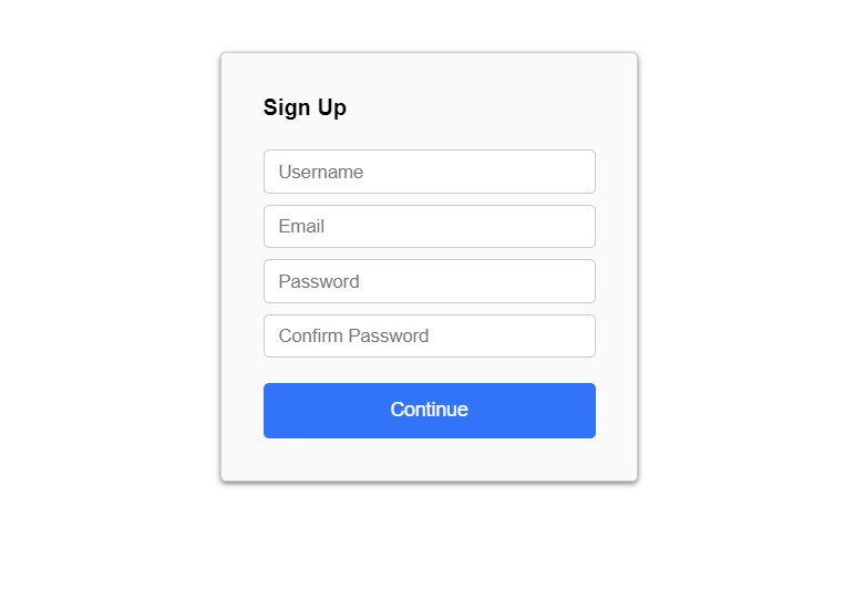
We will use the CSS class .super-container to create a light-form theme. Below, we’ve used a background property to give the super container a light gray color.
background: #fafafa;In addition to the background color, we will throw in CSS box-shadow property to give the form a raised effect that differentiates it from a white background. We use this property on all three form themes.
box-shadow: 0 2px 4px rgb(0 0 0 / 50%);The last task is giving the button color to increase the click-through rate and establish a healthy user inference feel. We would want a user to spend less time on this form than necessary, and colors are essential to increase useability; hence a colored button on a white form is easier to see.
We used a simple blue color and changed the text color to white.
color: #fff;
background: #2872fa;
Below are the complete CSS properties used to create this light-themed form. There are five classes below.
html, body {
  font-family: Roboto,arial,sans-serif;
  height: 100%;
}

input {
    display: block;
    width: 100%;
    margin: 0;
    padding: 0 10px;
    line-height: 30px;
    box-sizing: border-box;
    border: 1px solid #ccc;
    margin: 0 0 8px 0;
    border-radius: 4px;
}

.super-container {
    width: 300px;
    margin: 0 auto;
    border: 1px solid #ccc;
    border-radius: 4px;
    background: #fafafa;
    margin-top: 30px;
    box-shadow: 0 2px 4px rgb(0 0 0 / 50%);
    margin-top: 40px;
}

.container {
  margin: 30px
}

button {
  height: 40px;
  width: 100%;
  margin-top: 10px;
  color: #fff;
  border-radius: 4px;
  border: none;
  font-size: 14px;
  background: #2872fa;
}
How To Create a Gradient-Colored Form Theme?
The colored form theme might be the most exciting pick for some developers reading this article. We use multiple CSS background gradients to create an excellent blue color effect.
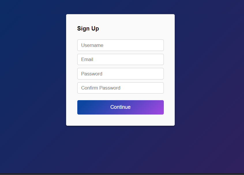
The first task is to set the page background color as we did in the previous theme. We use a linear gradient that contains two colors, purple and blue, to achieve the colors in the photo below.

html, body {
  background: linear-gradient(135deg,#002c68 10%,#411b5a);
}
Moving further, we need to style the form background and the button. Again the form background stays the same color.
background: #fafafa;On the other hand, the button color changes to a color gradient similar to the page background but brighter. We use two hex colors, #0045a2 and #a644e5. This will be applied to the button element using a button selector, button { /* Background Gradient */ }. Below you see a background property with a linear gradient value.

background: linear-gradient(135deg,#0045a2 10%,#a644e5);Below are the entire CSS properties for a gradient-themed form.
html, body {
  font-family: Roboto,arial,sans-serif;
  background: black;
  height: 100%;
  background: linear-gradient(135deg,#002c68 10%,#411b5a);
}

input {
    display: block;
    width: 100%;
    margin: 0;
    padding: 0 10px;
    line-height: 30px;
    box-sizing: border-box;
    border: 1px solid #ccc;
    margin: 0 0 8px 0;
    border-radius: 4px;
}

.super-container {
    width: 300px;
    margin: 0 auto;
    border: 1px solid #ccc;
    border-radius: 4px;
    background: #fafafa;
    margin-top: 30px;
    box-shadow: 0 2px 4px rgb(0 0 0 / 50%);
    margin-top: 40px;
}

.container {
  margin: 30px
}

button {
  height: 40px;
  width: 100%;
  margin-top: 10px;
  color: #fff;
  border-radius: 4px;
  border: none;
  font-size: 14px;
  background: linear-gradient(135deg,#0045a2 10%,#a644e5);
}
How To Create a Dark-Colored Form Theme?
You might wonder, how do we create a dark theme after creating a white theme? Well, if you think about it, it’s the opposite of white. We’ll be using dark colors!
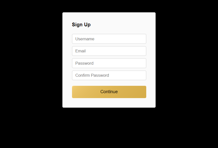
We’ll set the web page background for the first job to black. As you see below, we use a CSS background property with the html and body element CSS selectors.
html, body {
  background: black;
}
Once you add the background color, the entire webpage turns black. Next, we need to look at our form container again, the .super-container class. As in the first theme we created, we used the same background color, a light gray.
background: #fafafa;This time the button will get a yellowish CSS linear gradient. The gradient has a degree of 135 and uses two colors, #ffdb84 and #d7ad42.
background: linear-gradient(135deg,#ffdb84,10%,#d7ad42);Below are the CSS properties for a dark-themed form.
html, body {
  font-family: Roboto,arial,sans-serif;
  height: 100%;
  background: black;
}

input {
    display: block;
    width: 100%;
    margin: 0;
    padding: 0 10px;
    line-height: 30px;
    box-sizing: border-box;
    border: 1px solid #ccc;
    margin: 0 0 8px 0;
    border-radius: 4px;
}

.super-container {
    width: 300px;
    margin: 0 auto;
    border: 1px solid #ccc;
    border-radius: 4px;
    background: #fafafa;
    margin-top: 30px;
    box-shadow: 0 2px 4px rgb(0 0 0 / 50%);
    margin-top: 40px;
}

.container {
  margin: 30px
}

button {
  height: 40px;
  width: 100%;
  margin-top: 10px;
  border-radius: 4px;
  border: none;
  font-size: 14px;
  background: linear-gradient(135deg,#ffdb84,10%,#d7ad42);
  color: #000;
}
Wrapping Up
Now that we’ve walked through creating a simple form and then three different themes, you might notice a trend. The trend is that you only need to style three parts to create a “theme”. These parts include a web page background, a form background, and a button. Once you master creating color schemes, nothing will stop you from creating endless color possibilities!