AppCode
This article demonstrates how to create a hover stack effect using HTML and CSS. We use HTML cards with pseudo-elements to create the effect.
We will learn to create and add a stacked hover effect to an HTML card using CSS. Don’t worry whether you’re new to CSS, or if you want to use this effect to attract more visitors to your website, or if you want to experiment with new CSS capabilities. I’ll walk you through the process of making your first stacked card.
What is a card in HTML?
Cards are an essential component of websites. As they can be used to provide highlights of certain data or crucial information to visitors in a concise manner.
How to create a card using HTML?
In HTML, you can create a class name .card, .card-header, and .card-body which will contain properties to make the card components. First, you use the .card class is to create the card body. Then you can use a class called .card-header to give a heading to the card. Addionally, to write the card’s contents, the .card-body class is available.
When creating a card, it’s almost like when we learn to write a paper. First, the header comes, then the body, which will have the content.
An additional point here is that the content represented by the card class will contain a .card-inner element. All the information like the title of the card, its body (in other words, .card-title, .card-body, etc.) will be stored in this element.
Here is a practical representation of what I mean below:
<style>
  body {
    background: red;
  }
</style>
<center>
  <div class="card">
    <div class="card-inner">
      <h3 class="card-title">
        Merry X-MAS
      </h3>
      <div class="card-body">
        Wishing you a merry christmas & sending lots of love.
      </div>
    </div>
  </div>
</center>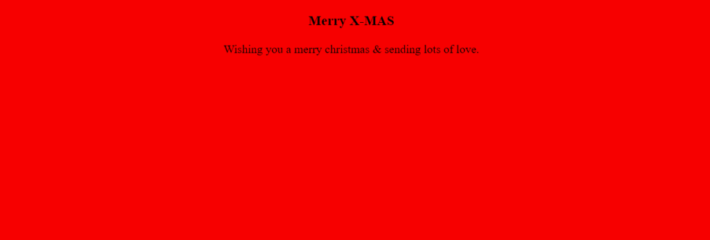
Note: In the <style> element above, I have used the red background just to give you an idea of what the card will look like on the webpage.
As you can see, the card contents are center-aligned and contain a title called “Merry X-Mas” using the .card-title class. For the content of the card, a class called .card-body wraps around “Wishing you a merry Christmas & sending lots of love”. The .card-inner element wraps around all of the information and contains it.
Even though we have the CSS classes and content in the correct locations, the webpage does not look like a card but a wall of red.
So, what’s missing here?
If you have guessed right, it needs some designing using CSS properties in each class. For example, .card-title has no properties associated with it. The class isn’t even defined in the style element above. A class with properties would look like this below:
.card-title {
   color: white;
   /* Property two */
   /* Property three */
   /* You get the idea! */
}
How to create a stack effect using CSS?
In order to create the stack effect, we will use the CSS pseudo-elements ::before and ::after. The ::before is used to add new content before the content an element. Similarly, ::after is used to add new content after the content of an element.
Note: You can use :before and ::before (same with after) optionally but, IE8 supports only the single “:” notation.
This next HTML code example remains the same as above, except we need to edit the CSS in the style element to add missing classes below to it:
<style>
  .card {
    position: relative;
    width: 400px;
    margin: 60px auto;
  }

  .card::before,
  .card::after {
    content: "";
    position: absolute;
    top: 0;
    left: 0;
    bottom: 0;
    right: 0;
  }

  .card::before,
  .card::after,
  .card .card-inner {
    background-color: green;
    border: 1px solid #01937C;
    transition: transform 0.5s;
  }

  .card::before,
  .card-inner {
    z-index: 1;
  }

  .card-inner {
    position: relative;
    padding: 4rem;
  }
</style>
Above, you can now see how the card will look. I used a few basic CSS properties to give its structure and style. As you can see, the .card class positions the card’s inner elements by using the CSS position and setting the card’s width.
Note: We add a z-index: 1 to all .card-inner classes so that the elements always sit on top of their pseudo-elements.
Additionally, the margin in the card class has the left and right set to auto to center the card horizontally.
Note: You can use margin: 0 auto and the width property to center most block type elements.
Don’t worry if you don’t completely understand everything above. In the next step, some confusion will clear up. Addionally, you can look at this CSS reference to know how the properties used above work.
How to add a hover effect to a card using CSS?
The CSS hover property is used to add effects on elements and activates by hovering over them. Using the hover property on cards, we may accomplish movement or effects whenever a user hovers over a card with a cursor.
The transform property creates a 2D/3D transformation of an element. In simple words, you can use it to move, rotate, or scale your elements along the X, Y & Z- axis respectively.
You can also move elements by giving angles, numbers, or offset variables.
What are the types of card hover effects?
- card-top-left
- card-top-right
- card-bottom-left
- card-bottom-right
- card-diagonal-from-right
- card-diagonal-from-left
- card-rotate
- card-perspective
- card-origin
How to create the top-left stack effect?
  .card:hover::before {
    transform: translate(-5px, -5px);
  }

  .card:hover::after {
    transform: translate(-10px, -10px);
  }
The above code implements a transform property that applies a transformation to the before & after pseudo-elements. When the user hovers over the card, the card’s before and after pseudo-elements will translate on the X & Y axis respectively. Here the card will translate on the -X (negative X-axis) and -Y(negative Y-axis) hence, creating multiple stacked card effects by utilizing the before and after pseudo-elements.

The picture above shows the resulting top-left stacked effect when the CSS classes are added to the style element.
A complete example of what we have learned
<!DOCTYPE html>
<html>
  <head>
    <title> Top-left stacked effect</title>
      <style>
      .card {
        position: relative;
        width: 400px;
        margin: 60px auto;
      }

      .card::before,
      .card::after {
        content: "";
        position: absolute;
        top: 0;
        left: 0;
        width: 100%;
        height: 100%;
      }

      .card::before,
      .card::after,
      .card .card-inner {
        background-color: green;
        border: 1px solid #01937C;
        transition: transform 0.5s;
      }

      .card::before,
      .card-inner {
        z-index: 1;
      }

      .card-inner {
        position: relative;
        padding: 4rem;
      }

      .card:hover::before {
        transform: translate(-5px, -5px);
      }

      .card:hover::after {
        transform: translate(-10px, -10px);
      }
    </style>
  </head>
  <body>
    <center>
      <div class="card">
        <div class="card-inner">
          <h3 class="card-title">
            Merry X-MAS
          </h3>
          <div class="card-body">
            Wishing you a merry christmas & sending lots of love.
          </div>
        </div>
      </div>
    </center>
  </body>
</html>
For those people who want to create more than one card and have the hover effect, you can use the .card element which will include all of the contents of the card. You can then paste the .card element on the page somewhere else and the card will be duplicated.
An advanced example of stacked cards

In the above photo, we have created a styled stacked card that includes vertically and horizontally centering. There is more CSS included in creating this card effect. To view or edit this example, you may visit codepen.io.
Conclusion
I hope this article will assist you in creating your personalized cards. Here we have demonstrated how easily we added the stacked effect to a card using the CSS hover property.