AppCode
Contribute and help us stay up-to-date. Edit this page on GitHub.
This article provides a comprehensive guide to the CSS invert filter function. Invert is a value of the CSS filter property.[1] The invert filter can be used to invert the colors of an element, making it look like a negative of itself.[2]
In the guide we’ll cover its syntax, parameters, specifications. We also discuss the various implimentations of the CSS invert filter by demostating simple usage and advanced examples utilizing CSS variables and functions as parameters to change the value of invert.
The syntax of invert can be expressed using the filter property with the invert function and an optional parameter.
filter: invert(value?) | ... other functions;
If multiple filters are applied to an element with invert, their order of application can be specified using multiple functions in a filter-order.[3]
The invert value is the percentage of inversion that is applied to the element. It can range from 0% (no inversion) to 100% (complete inversion).[4]
- value (required)
This value can be a number or percentage. The value is a proportion of the invert conversion, which means 5% or 0.05 is only 5% inverted and is linear between 0% and 100%. Values over 100% are accepted but they are clamped to 1 and negative values are not allowed. For interpolation the value is 0. When using invert without a parameter, the default value is 1 when omitted, which is completely inverted.[5]
The code block below shows example values for the parameter.
invert()        /* A invert of 100% */

invert(1)      /* A invert of 100% */
invert(100%)   /* A invert of 100% */

invert(0)       /* No effect */
invert(0%)      /* No effect */

invert(27%)     /* A invert of 27% */
invert(0.35)    /* A invert of 35% */

invert(0.6%)    /* A invert of 60% */
invert(12%)     /* A invert of 12% */
invert(0.18)    /* A invert of 18% */
The CSS invert filter can be applied to any element on a web page, including images, text, and backgrounds.[6] To apply the invert filter, the developer must first select the element they wish to modify and add the filter property to its style sheet. They then need to specify the type of filter they want to apply by adding the invert() function and setting its value.
#element-id {
  filter: invert(25%);
}

img {
  filter: invert(0.64);
}
Inverting a color value simply means subtracting the color value from the maximum value (typically 255 for an 8-bit color channel), which produces the “opposite” color. For example, inverting the color red rgb(255, 0, 0) would result in cyan rgb(0, 255, 255).[7]
When the invert filter is applied to an element, each color value in the element’s pixels is inverted according to the formula above. For example, applying the invert filter to a black and white image would result in a negative image with white elements becoming black and black elements becoming white. Applying the invert filter to a colorful image would result in a color-shifted image, where the colors are shifted towards their opposites.
Here are some examples of how the CSS invert filter can be used to create visual effects on a website:
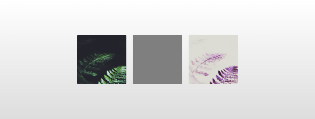
The invert filter can be applied to images to create an inverted visual effect.[8] In this example, the invert filter is applied to three images of a fern, creating a different degree of inverted images using the parameter values of 0%, 50%, and 100%.
<div class="wrapper">
  <img src="https://s3-us-west-2.amazonaws.com/s.cdpn.io/46992/noah-silliman-141979.jpg" alt="" />
  <img src="https://s3-us-west-2.amazonaws.com/s.cdpn.io/46992/noah-silliman-141979.jpg" alt="" />
  <img src="https://s3-us-west-2.amazonaws.com/s.cdpn.io/46992/noah-silliman-141979.jpg" alt="" />
</div>
.wrapper img {
  width: 300px;
  height: 300px;
  object-fit: cover;
  border-radius: 6px;
  margin: 0 20px;
  vertical-align: middle;
}

.wrapper img:nth-child(1) {
  filter: invert(0);
}

.wrapper img:nth-child(2) {
  filter: invert(50%);
}

.wrapper img:nth-child(3) {
  filter: invert(100%);
}

html {
  text-align: center;
  min-height: 100%;
  background: linear-gradient(white, #ddd);
}

.wrapper {
  width: 100%;
  background: transparent;
  text-align: center;
  align-items: center !important;
  justify-content: center !important;
  display: flex !important;
  height: 100%;
}

html,
body {
  height: 100%;
  margin: 0;
}
The invert filter can also be used to create an effect on text.[9] In this example, the invert filter is applied to a block of text inside a <h1> element, making it stand out against the background.
h1 {
  filter: invert(100%);
}
We can also use invert on a background of an element.[10] In this example, the invert filter is applied to the background, creating a negative image of a starry sky.
body {
  background-image: url(stars.jpg);
  filter: invert(100%);
}
The CSS invert filter can also be used in animations to create animation effects.[11] In this example, we will use the invert filter to create an animation where an image gradually transitions from its original colors to a fully inverted negative image.
<div class="container">
  <img src="image.jpg" alt="Original Image">
</div>
.container {
  width: 500px;
  height: 500px;
  position: relative;
}

img {
  position: absolute;
  top: 0;
  left: 0;
  width: 100%;
  height: 100%;
  animation: invert-animation 5s linear infinite alternate;
}

@keyframes invert-animation {
  0% {
    filter: invert(0%);
  }
  100% {
    filter: invert(100%);
  }
}
In the example above, we first create a <div> container with a fixed width and height. We then place an image inside the container and position it absolutely, so that it covers the entire container. We also set up an animation on the image using the animation property, with a duration of 5 seconds, a linear timing function, and an infinite repeat count that alternates between the start and end states of the animation.
We then define the keyframes for the animation using the @keyframes rule. The animation starts at 0% with no inversion, and ends at 100% with complete inversion. We use the filter property to apply the invert filter, with the invert() function taking a percentage value that specifies the degree of inversion.
When the animation runs, the image gradually transitions from its original colors to a fully inverted negative image.
Another use of the invert filter is to create a dark mode toggle button. This is achieved by inverting the colors of the entire page, effectively creating a negative image.[12] Here is an example of how this can be achieved:
<div>
  <header>
    <h1>My Website</h1>
    <input class="hidden" id="toggle" type="checkbox" name="toggle" onclick="document.querySelector('div').classList.toggle('dark')">
    <label class="container" for="toggle">Toggle Dark Mode</label>
  </header>
  <main>
    <p>Welcome to my website!</p>
  </main>
</div>
div {
  transition: filter 0.5s ease-in-out;
  background: white;
  padding: 2rem;
}

div.dark {
  filter: invert();
}

.hidden {
  position: absolute;
  visibility: hidden;
  opacity: 0;
}

#toggle + label {
  background-color: white;
  color: black;
  border: none;
  padding: 10px 20px;
  margin-top: 20px;
  cursor: pointer;
  user-select: none;
  border-radius: 4px;
}

#toggle:checked + label {
  background-color: black;
  color: white;
}

h1 {
  margin-top: 0;
}

html, body {
  padding: 0;
  margin: 0;
  box-sizing: border-box;
}
In this example, we apply the invert filter to the div element with a starting value of 0%, which means there is no inversion applied. We then define a transition on the filter property with a duration of 0.5 seconds and an easing function of ease-in-out.
We also define a div.dark selector, which applies an inversion of 100%, effectively creating a negative image. Finally, we create a checkbox with the ID toggle, which when clicked, toggles the dark class on the div element, effectively switching between light and dark mode.
Another implimentation of the invert filter is to create a highlight effect on text.[13] This is achieved by applying the invert filter to a background color, effectively inverting the color and creating a highlight effect. Here is an example of how this can be achieved:
<p>This is some <span class="highlight">highlighted</span> text.</p>
.highlight {
  background-color: #00ffff;
  filter: invert(100%);
  display: inline;
  padding: 0 5px;
}
The example creates a span element with a class of highlight, which we use to apply the invert filter to a background color of #00FFFF, creating a light blue highlight effect. We also apply the invert filter with a value of 100%, effectively inverting the color of the background and creating a red highlight effect.
The invert filter can also be used to create a hover effect on images, where the image is inverted on hover.[14] Here is an example of how this can be achieved:
<div class="image-container">
  <img src="image.jpg" alt="My Image">
</div>
.image-container {
  position: relative;
  width: 500px;
  height: 500px;
}

img {
  position: absolute;
  top: 0;
  left: 0;
  width: 100%;
  height: 100%;
  filter: invert(0%);
  transition: filter 0.5s ease-in-out;
}

img:hover {
  filter: invert(100%);
}
Using CSS variables and the calc() function can be a useful technique for dynamically adjusting the invert filter value based on user input or other factors.[15] Here’s an example of how to use CSS variables and calc() with the invert filter:
/* Define a CSS variable for the invert filter value */
:root {
  --invert-value: 0;
}

/* Apply the invert filter with a calc() function */
.my-element {
  filter: invert(calc(0 * 100%));
}
In this example, we define a CSS variable called --invert-value with an initial value of 0. We then apply the invert filter to an element using the calc() function, which multiplies the value of --invert-value by 100% to produce a percentage value for the invert filter.
To adjust the invert filter value dynamically, we can simply change the value of the --invert-value variable using JavaScript or a CSS pseudo-class such as :hover. For example, we can use JavaScript to update the --invert-value variable when a user clicks a button:
<button onclick="document.documentElement.style.setProperty('--invert-value', '0.5')">Invert 50%</button>
When the user clicks the button, the --invert-value variable is updated to 0.5, which will result in the invert filter applying a 50% inversion to the element.
One way to use a pseudo-class with the invert filter is to apply the invert filter to old elements. For example the even elements are unchanged:[16]
/* Apply the invert filter to odd-numbered list items */
li:nth-child(odd) {
  filter: invert(100%);
}
In this example, we then apply the invert filter to odd-numbered li elements using the :nth-child(odd) selector.
Combining the CSS calc and var functions with an HTML slider is a way to create a changing CSS filter invert effect using minumum JavaScript.[17] Here’s an example of how to achieve this effect:
/* Define a CSS variable for the invert filter value */
:root {
  --invert-value: 0;
}

/* Apply the invert filter with a calc() function */
div {
  filter: invert(calc(var(--invert-value)));
}
In this example, we first define a CSS variable called --invert-value with an initial value of 0, which will be used to control the invert filter value.
Finally, we apply the invert filter to the div element using a calc() function that gets the --invert-value variable based on the slider value. The calc(var(--invert-value)) expression produces a value where the div has a value the -invert-value.
To create a changing invert filter effect based on an HTML slider, we can use the input event to update the --invert-value variable as the user moves the slider:
<div>Test</div>
<input type="range" min="0" max="1" step="0.01" onchange="document.documentElement.style.setProperty('--invert-value', this.value);">
In this example, we define an HTML range input with a minimum value of 0, a maximum value of 1, and a step size of 0.01. We then use the onchange event to update the --invert-value variable to the value of the slider as the user moves it.
The CSS invert filter was first introduced in the CSS3 specification as a part of the CSS Image Filters Module. This module added several new properties to the CSS language that allowed web developers to apply different visual effects to images, including blurring, sharpening, and color manipulation.[18]
The invert filter is one of many filter functions available in CSS. Other filter functions include Blur, Grayscale, Sepia, and more. These filter functions can be combined and applied in various ways to achieve different visual effects.[19]
- ^ Quackit. (n.d.). CSS invert() function. Quackit. Retrieved April 13, 2023.
- ^ GeeksforGeeks. (2022, August 19). CSS: Invert() function. GeeksforGeeks. Retrieved April 13, 2023.
- ^ Zach Saucier. (2016, April 4). CSS filter application order. Stack Overflow. Retrieved April 13, 2023.
- ^ Staff. (2021, October 16). CSS: Filter functions: Invert(). Codecademy. April 13, 2023.
- ^ Coyier, C. (2022, October 12). filter. CSS-Tricks. April 13, 2023.
- ^ W3Schools. (2022, November 1). CSS filter Property. CSS filter property. April 13, 2023.
- ^ Stack. (2016, March 13). How can I generate the opposite color according to current color. Stack Overflow. April 13, 2023.
- ^ toxicate20. (2012, November 10). Invert colors of an image in CSS or JavaScript. Stack Overflow. April 13, 2023.
- ^ Sebhastian, N. (2021, August 25). How to invert color using CSS. Sebhastian. April 13, 2023.
- ^ Surender Thakran. (2014, May 2). How to invert colors in background image of a HTML element. Sebhastian. April 13, 2023.
- ^ T. J. (2012, April 15). How to use CSS Filter & CSS Animation on images. Thibault Jan Beyer. April 13, 2023.
- ^ Schennink, R. (2019, April 15). Poor man’s dark mode using CSS filter. DEV Community. April 13, 2023.
- ^ saravanan2310. (2023, March 22). Great examples of how to create an inverted color using CSS. Wonder Develop. April 13, 2023.
- ^ Manali. (2014, March 27). How to invert the color of a PNG image on mouseover which is inside tag. Stack Overflow. April 13, 2023.
- ^ D. S. H. (2019, October 8). Using CSS filters and either CSS variables or @keyframes together. DEV Community. April 13, 2023.
- ^ Ming, S. (2019, April 6). A guide to CSS counter. SamanthaMing.comy. April 13, 2023.
- ^ Shaan. (2019, August 10). CSS filter image editor using JavaScript: CSS image filters. Web Dev Trick. April 13, 2023.
- ^ W3C. (2018, December 18). Filter Effects Module Level 1. w3.org. April 13, 2023.
- ^ Singh, G. (2018, October 4).
CSS filter effects: Blur, Grayscale, brightness and more in CSS.
SitePoint. April 13, 2023.