AppCode
This article demonstrates how to convert an image to black and white using the CSS grayscale property. Included are CSS styles and a demo.
This article was first seen on and republished from csstutorial.io
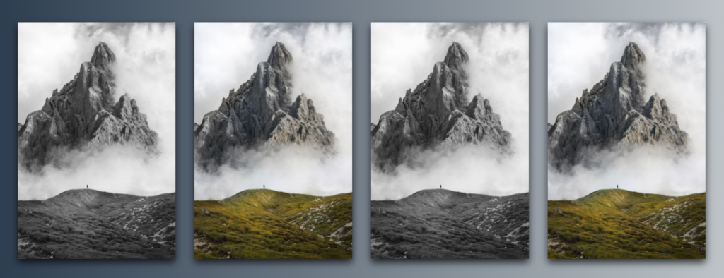
In the image below, the first mountain image has a CSS Grayscale applied to it. On the other hand, the last two images have a CSS hover effect that removes and applies the grayscale property.
HTML
The HTML in this example uses four HTML IMG elements wrapped in a DIV element. We do this to construct a DIV container designated as a CSS flexbox.
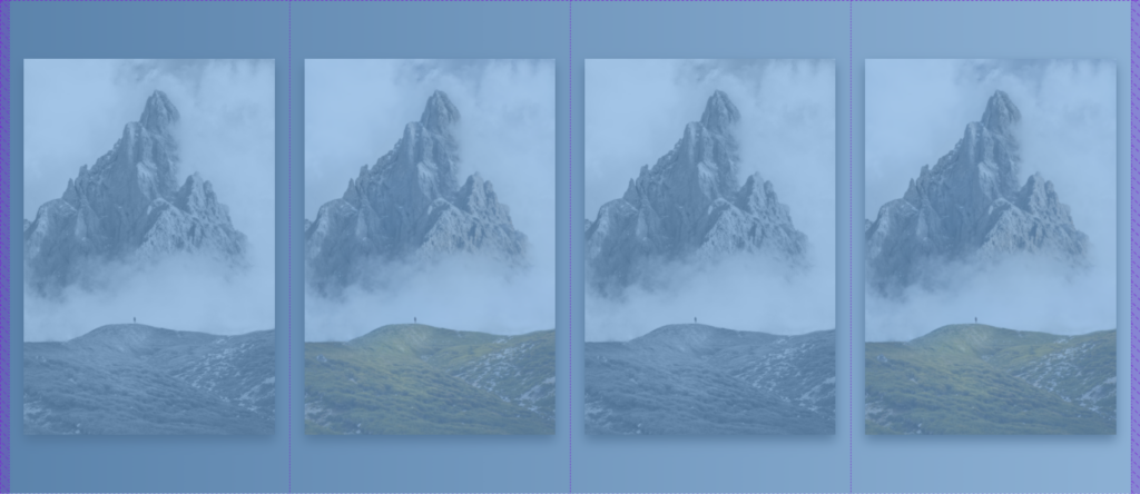
The images are the flexbox items and children of the div element. We will use the div flexbox to center the row of images horizontally and vertically on the web page.
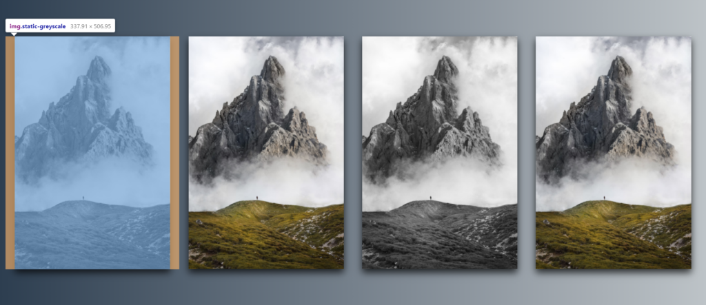
The image elements below, include an URL of a mountain range from unsplash.com in the src attribute.
src="https://images.unsplash.com/photo-1570641963303-92ce4845ed4c?ixid=MnwxMjA3fDB8MHxwaG90by1wYWdlfHx8fGVufDB8fHx8&ixlib=rb-1.2.1&auto=format&fit=crop&w=1887&q=80"As you see in the code below, three of the images have their own class name. The second IMG element has no class attribute.
<div class="container">
  <img class="static-greyscale" src="https://images.unsplash.com/photo-1570641963303-92ce4845ed4c?ixid=MnwxMjA3fDB8MHxwaG90by1wYWdlfHx8fGVufDB8fHx8&ixlib=rb-1.2.1&auto=format&fit=crop&w=1887&q=80">
  <img src="https://images.unsplash.com/photo-1570641963303-92ce4845ed4c?ixid=MnwxMjA3fDB8MHxwaG90by1wYWdlfHx8fGVufDB8fHx8&ixlib=rb-1.2.1&auto=format&fit=crop&w=1887&q=80">
  <img class="hoverRemoveGrayscale" src="https://images.unsplash.com/photo-1570641963303-92ce4845ed4c?ixid=MnwxMjA3fDB8MHxwaG90by1wYWdlfHx8fGVufDB8fHx8&ixlib=rb-1.2.1&auto=format&fit=crop&w=1887&q=80">
  <img class="hoverToGrayscale" src="https://images.unsplash.com/photo-1570641963303-92ce4845ed4c?ixid=MnwxMjA3fDB8MHxwaG90by1wYWdlfHx8fGVufDB8fHx8&ixlib=rb-1.2.1&auto=format&fit=crop&w=1887&q=80">
</div>
CSS
Down below we use CSS styles to visually design the example in this tutorial. An important CSS selector below is the “.container”. This is select that selects the DIV element which aligns the images. We use the CSS align-items, justify-content, and the display property to achieve the alignment.
Additionally, we use the CSS -webkit-filter and the CSS filter properties to apply the grayscale effect to the images.
To use the grayscale in the filter property, a value from 0 – 1 or 0% to 100% is set like so:
  -webkit-filter: grayscale(1);
  filter: grayscale(1);

  -webkit-filter: grayscale(0%);
  filter: grayscale(100%);
Here are the complete CSS styles for this project:
html {
  background: #bdc3c7; /* fallback for old browsers */
  background: -webkit-linear-gradient(
    to right,
    #2c3e50,
    #bdc3c7
  ); /* Chrome 10-25, Safari 5.1-6 */
  background: linear-gradient(
    to right,
    #2c3e50,
    #bdc3c7
  ); /* W3C, IE 10+/ Edge, Firefox 16+, Chrome 26+, Opera 12+, Safari 7+ */
}

body,
html {
  height: 100%;
  overflow: hidden;
}

img {
  width: 400px;
  transition: all 200ms ease-in-out;
  display: block;
  box-shadow: 0 8px 16px rgb(0 0 0 / 76%);
  margin: 0 20px;
  height: auto;
  width: 22%;
}

.static-greyscale {
  -webkit-filter: grayscale(100%);
  filter: grayscale(100%);
}

.container {
  -webkit-box-align: center !important;
  -ms-flex-align: center !important;
  align-items: center !important;
  -webkit-box-pack: center !important;
  -ms-flex-pack: center !important;
  justify-content: center !important;
  display: -webkit-box !important;
  display: -ms-flexbox !important;
  display: flex !important;
  height: 100%;
}

.hoverRemoveGrayscale {
  -webkit-filter: grayscale(1);
  filter: grayscale(1);
}

.hoverRemoveGrayscale:hover {
  -webkit-filter: grayscale(0);
  filter: grayscale(0);
}

.hoverToGrayscale:hover {
  -webkit-filter: grayscale(1);
  filter: grayscale(1);
}
Here is a link to play with a live demo on codepen.io