AppCode
This article demonstrates CSS image effects, definitions, walk-throughs, code examples, FAQs, and other developer image effect information.
Related
A website is only complete with the touch of well-laid-out images. So yes, on your path to becoming a guru in the web development field, knowing how to create stunning CSS image effects is one of the boxes you need to tick off the learning checklist.
But you need not be bothered. You didn’t stumble on this article; your curiosity and willingness to learn brought you here, and that’s what we’ll show you.
Images play an essential role in narrating the story when creating an image-heavy website, such as an e-commerce platform, portfolio, or travel website. In addition, rich graphics make it easier for users to explore content.
Website designers use effects such as changing the image to grayscale, rounding the corners, and so on to create engaging visuals.
In this article, you’ll learn how to use simple techniques to create essential CSS image effects. With little effort, you can achieve beautiful results on any website with CSS image hover effects. Continue reading to find out.
Image Rounded Corner Effect
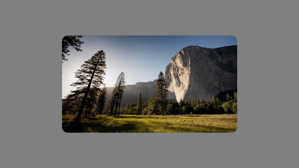
One of the widespread image effects is rounding the corners of images and, more broadly, HTML elements. Profile images, content cards, and even buttons are some of the rounded corner effects in use now.
The CSS border-radius property allows you to specify four values for the radius on the top-left, top-right, bottom-right, and bottom-left corners, respectively.
Note: Because the four corners in the preceding example have the same values, the border-radius property, in this context, can be rewritten using the CSS shorthand method, as shown below. This shorthand method gives all four corners of the image a radius of 30px.
border-radius: 30px;The values of a corner radius can also be specified using their CSS properties, such as border-top-left-radius: <some-value>; and so on.
Here’s an example of an image with rounded corners using just HTML and CSS:
<div class="container">
  <img src="https://images.unsplash.com/photo-1426604966848-d7adac402bff?ixlib=rb-4.0.3&ixid=MnwxMjA3fDB8MHxwaG90by1wYWdlfHx8fGVufDB8fHx8&auto=format&fit=crop&w=1470&q=80" alt="alternatetext">
</div>
body {
background-color: gray;
}
.container {
width: 900px;
height: 500px;
margin: auto;
}
img {
border-radius: 30px;
width: 100%;
height: 100%;
}
Note: To specify the radius, you can use any CSS length unit, such as px, rem, em, or percentage.
Image Thumbnail Effect
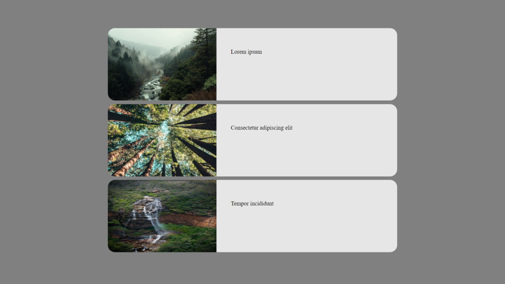
Image thumbnails are excellent for linking to posts from other website sections, such as related posts. Thumbnails can also help display clickable product images on affiliate marketing or eCommerce sites.
These thumbnails are typically low-resolution versions of higher-resolution images. E-commerce platforms frequently use image thumbnails on their search or listing pages, designed to link directly to a detailed page with high-resolution photos.
While an image thumbnail should ideally load a pre-resized, low-resolution image, we can also use CSS to scale down a high-resolution image while surfing them on our web browsers. Here’s a code example of what we’ve just explained using CSS to limit the size of images to create thumbnails.
<div class="container">
  <div>
    <div>
      <img src="https://source.unsplash.com/random/600×400/?forest" alt="alternatetext">
      <p>Lorem ipsum</p>
    </div>
    <div>
      <img src="https://source.unsplash.com/random/600x400/?forest,tree" alt="alternatetext">
      <p>Consectetur adipiscing elit</p>
    </div>
    <div>
      <img src="https://source.unsplash.com/random/600×400/?forest,rainforest" alt="alternatetext">
      <p>Tempor incididunt</p>
    </div>
  </div>
</div>
The images are loaded with a 600×400 resolution yet scaled down. We scale the photos to thumbnails using the CSS width properties set against the element containing these images. That would be the three <img> elements above.
body {
  background-color: gray;
}

.container {
  align-items: center !important;
  justify-content: center !important;
  display: flex !important;
  height: 100%;
}

html,
body {
  height: 100%;
  margin: 0;
}

img {
  width: 300px;
}

p {
  padding: 40px;
}

.container div {
  width: 800px;
}

.container div div {
  margin: auto;
  height: 200px;
  display: flex;
  background: #ffffffcc;
  border-radius: 20px;
  overflow: hidden;
  max-width: 950px;
  margin-bottom: 10px;
}
Image Transition Hover Effect

Image transitions are ideal for your website if you enjoy creativity and want to add something unique to your site and images. These transition effects allow users to traverse from one image to another by simply interacting with an image.
This effect can be distinct because it hides the image the cursor is on and fades and blurs the image back in when the cursor is moved away. This creates a transition and gives the viewer an animation award when interacting with the images on the web page.
You can use this to effect also to write text or something you want the viewers to read as they hover over the image, and they will find out once the cursor reveals the text beneath.
Adding a transition effect can make an image more enjoyable and bring a sense of satisfaction to the viewer. With this effect, you can make the photos and how you present them more unique and engaging. Let’s review the CSS and HTML to make an image transition effect.
<div class="w">
  <div class="i"></div>
  <div class="h">
    <h1>Don't Panic</h1>
  </div>
</div>
body {
background: #111b25;
font-family: "Open Sans", Helvetica, Arial, sans-serif;
color: #fff;
padding: 0;
margin: 0;
}
html,
body {
height: 100%;
}
h1 {
font-family: "Pacifico";
}
.container {
align-items: center !important;
justify-content: center !important;
display: flex !important;
height: 100%;
}
.w {
margin: 0 auto;
max-width: 1200px;
width: 100%;
height: 600px;
position: absolute;
top: 0;
left: 0;
right: 0;
bottom: 0;
overflow: hidden;
background: rgba(66, 66, 66, 0.5)
url("http://unsplash.imgix.net/reserve/de9uL9L7RSmzV4SAoAO5_Lauren%20and%20Winona%20Under%20a%20pass-1.jpg?fit=crop&fm=jpg&h=600&q=75&w=1200")
no-repeat fixed;
background-position: 50% 50%;
position: relative;
z-index: 5;
}
.i {
width: 100%;
height: 100%;
position: relative;
z-index: 4;
padding: 2px;
transition: all 2.5s linear;
background: rgba(66, 66, 66, 0.5)
url(https://images.unsplash.com/photo-1469474968028-56623f02e42e?fit=crop&fm=jpg&h=600&q=75&w=1200)
no-repeat fixed;
background-position: 50% 50%;
}
.i:hover {
  transition: all 0s linear;
  filter: blur(20px) opacity(0);
  transform: scale(2);
}
.h {
display: block;
position: absolute;
z-index: 2;
width: 100%;
text-align: center;
top: 35px;
font-size: 40px;
color: rgba(245, 245, 220, 1);
text-shadow: 0 5px 17px rgba(87, 87, 80, 0.85);
}If you gloss through the lines of code in the CSS section, you might need help understanding where the real magic is. We use a hover pseudo-class to transition the hovered image to 0 transparency with a blur radius of 20px.
.i:hover {
transition: all 0s linear;
filter: blur(20px) opacity(0);
transform: scale(2);
}The effect is instant since we have a transition time of 0 seconds; however, since there is another transition property in the .i selector, we fall back to 2.5 seconds when removing the blur and opacity whenever the cursor is no longer hovering.
transition: all 2.5s linear;The effect will only work with the line of codes above. Adding the blur and opacity filter property triggers the effect. The 20px value represents the radius size of the blur.
Hover Filter Effect in Portrait Images
Beautiful, delicate, and artistic photos can sometimes catch the eye and wow individuals who visit your website. With this statement, adding some effects to your images is highly recommended to encourage the images to be more interesting. This impact is crucial because it can increase positive user engagement on your site for specific actions.
Let’s go over how to create a filter effect on an image whenever the user hovers over it. This filter effect casts a contemporary yellow shadow over the print made from a secondary image. The CSS and HTML code below demonstrate how to use this effect on your next project.
<div class="container">
  <div class="portrait" id="portrait">
    <div class="fill cover-img"></div>
    <div class="fill z-10 hover">
      <div class="fill cover-img hover-img"></div>
    </div>
  </div>
</div>
html,
body {
height: 100%;
}
body {
margin: 0;
padding: 0;
background-color: gray;
}
.container {
align-items: center !important;
justify-content: center !important;
display: flex !important;
height: 100%;
}
.portrait {
width: 80%;
max-width: 600px;
margin: 0 auto;
height: 600px;
position: relative;
overflow: hidden;
}
.portrait:hover .hover {
filter: progid:DXImageTransform.Microsoft.Alpha(Opacity=40);
opacity: 0.4;
}
.portrait:hover .hover-img {
transform: translate(30px, -20px);
}
.fill,
.hover-img:after {
width: 100%;
height: 100%;
position: absolute;
top: 0;
left: 0;
z-index: 5;
}
.z-10 {
z-index: 10;
}
.hover {
transition: all 380ms cubic-bezier(0.16, 0.01, 0.77, 1);
filter: progid:DXImageTransform.Microsoft.Alpha(Opacity=0);
opacity: 0;
}
.hover-img {
transition: opacity, transform 320ms cubic-bezier(0.16, 0.01, 0.77, 1);
}
.hover-img:after {
content: "";
background-color: #ffeb3b;
mix-blend-mode: color;
}
.cover-img {
background-size: cover;
background-position: top center;
background-repeat: no-repeat;
background-image: url(https://images.unsplash.com/photo-1516035069371-29a1b244cc32?ixlib=rb-4.0.3&ixid=MnwxMjA3fDB8MHxwaG90by1wYWdlfHx8fGVufDB8fHx8&auto=format&fit=crop&w=464&q=80);
}
Other Examples
This high-quality, hand-picked collection shows CSS effects for images from across the web. Included are links with examples and code for use on your website.

CSS Image Hover With Scale
About Project
Links

CSS Image Hover Folding Effect
About Project
Links

Document Thumbnail With Dog-Ear Using CSS Custom Property
About Project
Links

CSS Glitch Image Effect
About Project
Links

CSS Grid Image Effect
About Project
Links

CSS Stacked Image Effect Using Before and After Pseudo-elements
About Project
Links

CSS Viewport Image Effect
About Project
Links

CSS Pointillism Gradient Pattern Image Effect
About Project
Links

CSS Image Hover Effect Women
About Project
Links

CSS Duotone Image Effect
About Project
Links

CSS Circular Corner Borders 3D Hover Image
About Project
Links

CSS Pop-Up Gallery Image Effect
About Project
Links

CSS Glitch Pop Image Effect
About Project
Links

CSS Hover Image Effect
About Project
Links

CSS Parallax Image Effect
About Project
Links

CSS Background Rotation Awareness Image Effect
About Project
Links
Frequently Asked Questions
Here are a few frequently asked questions about effects and images for web development.
How to animate an image in CSS?
Three things are needed when animating an image using CSS. These are an HTML element to animate, a CSS ruleset to connect an animation to an element, and the keyframes that make up the properties that animate over the start and end period. Some aspects of an image that can be animated are filters, border radius, size, and more. You can customize the speed and delay using the CSS transition property.
Hubspot has a reference blog post covering some CSS keyframes and animation topics. The items discussed can be used when animating images.
Can you style images in CSS?
To style an image using CSS, you can use the CSS rulesets to uniformly specify how images should be presented across a web page. These rulesets contain a selector and a declaration block consisting of properties applied to the image.
With these rulesets, you can easily apply several effects to images on your page. Here is an article you can read that uses styles on an image to place a red border and a small border radius.
Conclusion
CSS effects can be beneficial for developers, and they can save time and lessen their reliance on graphic design tools to develop image effects, such as photoshop and animation software.
These CSS image effects are an excellent starting point for anyone interested in learning how CSS can be used to create a visually appealing website.
The CSS expertise required to achieve these effects is essential, but as you grow with the language and gain a deeper understanding of it, you’ll want to move on to implementing some fantastic effects on your own.