AppCode
This article illustrates adding a CSS spinner or loader to your webpage. Additionally, with some jQuery, we can make loaders disappear.
User experience (UX) and user interface (UI) of a page are key factors front-end developers should always consider when designing web platforms. When a page is loading or fetching some details in the background, most users hate this period of inactivity and may close the page. This waiting period is where spinners or loaders come in.
What are CSS spinners and loaders?
CSS spinners or loaders are animated HTML elements that indicate activities in the background; for example, the display content is loading, data verification, or user authentication. They appeal to the users to wait patiently for the process to execute while entertained. Once the content or page loads, the spinner or loader disappears.
What are the types of CSS spinners?
There are two main types of CSS spinners:
- Pure CSS spinners coded entirely with CSS and HTML
- Hybrid CSS spinners coded with CSS plus other languages such as Javascript, jQuery, and more.
Front-end developers can choose from a pool of over 1000 different types of spinners/loaders. You can get templates for spinners from sources such as 365 web sources, loading.io, and slide revolution.
Here are some of the best CSS spinners
#1. Circular CSS Spinners
Most of them consist of a tube-like circular rotating wheel, and one can segment it into different parts and add colors and animations. Here is a code sample of a style for a Circular Spinner embedded in an HTML code below:
<!-- Circular CSS Loader -->
<!DOCTYPE html>
<html>
<head>
<meta name="viewport" content="width=device-width, initial-scale=1">
<style>
.loader {
border: 16px solid #f3f3f3;
border-radius: 50%;
border-top: 16px solid black;
border-bottom: 16px solid red;
border-right: 16px solid white;
border-left: 16px solid green;
width: 120px;
height: 120px;
-webkit-animation: spin 2s linear infinite;
/* Setting up animation in any browser */
animation: spin 2s linear infinite;
}
/* browser configuration */
@-webkit-keyframes spin {
0% {
-webkit-transform: rotate(0deg);
}
100% {
-webkit-transform: rotate(360deg);
}
}
@keyframes spin {
0% {
transform: rotate(0deg);
}
100% {
transform: rotate(360deg);
}
}
</style>
</head>
<body>
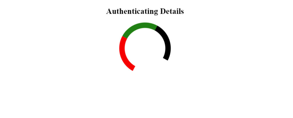
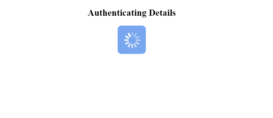
<h2><i></i>Authenticating Details</i></h2>
<!--Add some description for your Spinner or loader -->
<div class="loader"></div>
</body>
</html>As shown in the image, the spinner will exhibit the colors you give it. For example, if you wish to have a blue circular spinner. Define the color properties of either the top, bottom, right, or left borders as blue and leave the other borders with none. Below is an example of what you’d get:

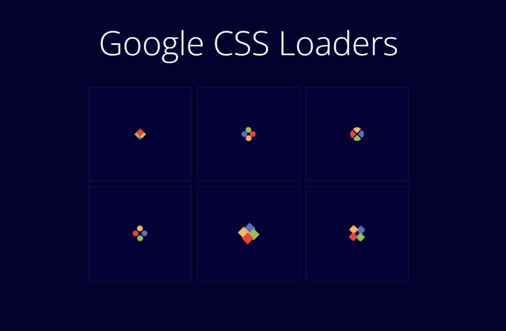
#2. Google CSS Spinners
Here is a set of 6 google loaders/spinners designed by Amine Bahmed.
#3. iOS CSS Spinners
Here is an example of an iOS spinner by victordg. View this example on dabblet.com.
#4. 3D-Model CSS Spinners
CSS Spinners with 3D-Model animation and keyframes is another excellent category to consider. Here is an example of a 3d model spinner below. The full code can be found on dabblet.com.

#5. Square CSS Spinners
Here is an example of one designed purely with CSS. Below, you will find the CSS and HTML code sample of a square CSS spinner.

<!-- THE CODE -->
<!-- SQUARE SINNER-->
<!DOCTYPE html>
<html lang="en">
<head>
  <meta name="viewport" content="width=device-width, initial-scale=1">
  <style>
    * {
      padding: 0;
      margin: 0;
      box-sizing: border-box;
    }

    body,
    html {
      background: rgb(30, 30, 30);
      position: relative;
      width: 100%;
      height: 100%;
    }

    .loading-container {
      width: 256px;
      height: 256px;
      position: absolute;
      top: 50%;
      left: 50%;
      transform: translate(-50%, -50%);
    }

    .loading {
      width: 64px;
      height: 64px;
      position: absolute;
      top: 36%;
      left: 36%;
      transform: rotate(45deg);
    }

    .loading div {
      width: 32px;
      height: 32px;
      position: absolute;
    }

    .l1 div,
    .l2 div,
    .l3 div,
    .l4 div {
      width: 100%;
      height: 100%;
      background-color: #3498db;
    }

    .l1 {
      transform: translate(0, 0);
    }

    .l2 {
      transform: translate(0, 32px);
    }

    .l3 {
      transform: translate(32px, 0px);
    }

    .l4 {
      transform: translate(32px, 32px);
    }

    @keyframes rot1 {
      0% {
        transform: rotate(0deg);
      }

      40% {
        transform: rotate(0deg);
      }

      50% {
        transform: rotate(0deg);
      }

      60% {
        transform: rotate(90deg);
      }

      100% {
        transform: rotate(90deg);
      }
    }

    @keyframes rot2 {
      0% {
        transform: rotate(0deg);
      }

      40% {
        transform: rotate(0deg);
      }

      50% {
        transform: rotate(0deg);
      }

      60% {
        transform: rotate(-90deg);
      }

      100% {
        transform: rotate(-90deg);
      }
    }

    @keyframes rot3 {
      0% {
        transform: rotate(45deg);
      }

      35% {
        transform: rotate(45deg);
      }

      65% {
        transform: rotate(405deg);
      }

      100% {
        transform: rotate(405deg);
      }
    }

    @keyframes l1-rise {
      0% {
        transform: translate(0px, 0px);
      }

      30% {
        transform: translate(-8px, -8px);
      }

      70% {
        transform: translate(-8px, -8px);
      }

      100% {
        transform: translate(0px, 0px);
      }
    }

    @keyframes l2-rise {
      0% {
        transform: translate(0, 32px);
      }

      30% {
        transform: translate(-8px, 40px);
      }

      70% {
        transform: translate(-8px, 40px);
      }

      100% {
        transform: translate(0, 32px);
      }
    }

    @keyframes l3-rise {
      0% {
        transform: translate(32px, 0px);
      }

      30% {
        transform: translate(40px, -8px);
      }

      70% {
        transform: translate(40px, -8px);
      }

      100% {
        transform: translate(32px, 0px);
      }
    }

    @keyframes l4-rise {
      0% {
        transform: translate(32px, 32px);
      }

      30% {
        transform: translate(40px, 40px);
      }

      70% {
        transform: translate(40px, 40px);
      }

      100% {
        transform: translate(32px, 32px);
      }
    }

    @keyframes color {
      0% {
        background-color: #3498db;
      }

      50% {
        background-color: #2980b9;
      }

      100% {
        background-color: #3498db;
      }
    }

    .l1 {
      animation: l1-rise 3s ease 0s infinite;
    }

    .l2 {
      animation: l2-rise 3s ease 0s infinite;
    }

    .l3 {
      animation: l3-rise 3s ease 0s infinite;
    }

    .l4 {
      animation: l4-rise 3s ease 0s infinite;
    }

    .l1 div,
    .l4 div {
      animation: rot1 3s ease 0s infinite, color 3s linear 0s infinite;
    }

    .l2 div,
    .l3 div {
      animation: rot2 3s ease 0s infinite, color 3s linear 0s infinite;
    }
  </style>
</head>

<body>
  <div class="loading-container">
    <div class="loading">
      <div class="l1">
        <div></div>
      </div>
      <div class="l2">
        <div></div>
      </div>
      <div class="l3">
        <div></div>
      </div>
      <div class="l4">
        <div></div>
      </div>
    </div>
  </div>
</body>
</html>
How to add a CSS spinner or loader?
First, identify the ideal place to embed the CSS styles for the spinner within your web page. There are two ways of adding CSS properties, and the properties can be either the tags or an external style sheet. Then you must add the HTML for the spinner or loader to the body of the HTML file. Below we describe the process of adding a CSS spinner or loader in detail.
Below we demonstrate inserting the CSS styles in the head of the HTML document. Using the <style> tags, you can directly insert the entire CSS code for your loader/spinner using the tags.
<!DOCTYPE html>
<html lang="en">
<head>
    <title>Loader</title>

    <style>
    <!-- EMBED YOUR CSS CODE FOR THE SPINNER/LOADER HERE -->
    </style>
</head>
Adding the CSS styles in an external file starts with creating a style sheet file (.css file) for the loader and then embedding the file into your code using the HTML tag as shown below:
<head>
    <title>Loader</title>
    <link rel="stylesheet" href="loader.css">
</head>
Most developers prefer this method, making the work more organized when working on IDEs. Another advantage is that you can design just one style and re-use it in multiple projects.
Now that we’ve established two ways to add CSS styles, you must add the HTML the styles animate. The next step is to implement the HTML elements into the HTML body tags.
Again, where to place the spinner or loader depends on the role you want it to play. In most cases, they come as preloaders in web pages. In this case, we want the loader or spinner to keep loading until the content for our page is ready.
Therefore we implement the loader immediately after the <body> tags.
Each spinner has a specific template on how to implement it. So make sure you copy both the HTML plus the CSS style of the loader from your source.
In our case, we’ll be using the blue square loader/spinner (No. 5 on the list above ). You can find the source code on dabblet.com. The implementation below loads the styles from an external CSS file.
<!DOCTYPE html>
<html lang="en">
<head>

  <title>Loader</title>
  <!-- STYLE FOR THE BLUE SQUARE SPINNER -->
  <link rel="stylesheet" href="loader.css">

</head>
<body>

  <!-- TEMPLATE FOR IMPLIMENTING THE LOADER -->
  <div class="loading-container" id="loader" role="status">
    <div class="loading"> Loading...
      <div class="l1">
        <div></div>
      </div>
      <div class="l2">
        <div></div>
      </div>
      <div class="l3">
        <div></div>
      </div>
      <div class="l4">
        <div></div>
      </div>
    </div>
  </div>
  <!-- LOADER IMPLIMENTED -->
  <div class="content"></div>
</body>
</html>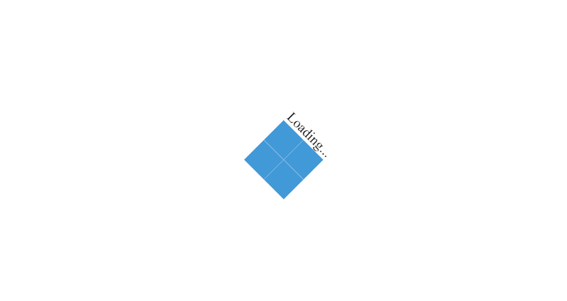
How to hide a CSS spinner or loader?
You realize that the loader keeps spinning even after the content loads. How do you make a spinner or loader disappear after the content loads? There are multiple ways of making a CSS loader disappear. Using JavaScript or a JavaScript library like jQuery, you can hide the CSS loader or spinner after content loads.
I won’t go into the details here because it’s not CSS, but I’ll demonstrate the most straightforward method.
We can use the jQuery JavaScript library to hide a loader or spinner. First, we need to include the jQuery library from the Cloudflare CDN by embedding the following script at the top of your HTML code. Below, this script fetches a copy of a minified jquery file from the Cloudflare servers on page load.
<head>
  <script src="https://cdnjs.cloudflare.com/ajax/libs/jquery/3.5.1/jquery.min.js"></script>
</head>
Last we need to place jQuery code at bottom of the webpage. This script states that after 1s the element with a “.loading” class fades out, as well as “.l1”, “.l2”, “.l3”, “.l4”, and the “.loading-container”. After these HTML elements start fading out, the element with the “.content” class fades in.
<script>
    $(window).on('load',function(){
        $(".loading").fadeOut(1000);
        $(".loading-container").fadeOut(1000);
        $(".l1").fadeOut(1000);
        $(".l2").fadeOut(1000);
        $(".l3").fadeOut(1000);
        $(".l4").fadeOut(1000);
        $(".content").fadeIn(2000);
    });
</script>
View the full example on codepen.io
The logic is to make the loader or spinner fade out and fade in your content, which is the easiest method.