AppCode
This tutorial focuses on how to create an HTML music visualizer using CSS, jQuery, and HTML. Live demo and code examples are included.
Creating an HTML music visualizer is pretty easy to include CSS and JavaScript. This article will instruct you step by step on creating this fun and exciting visualizer.
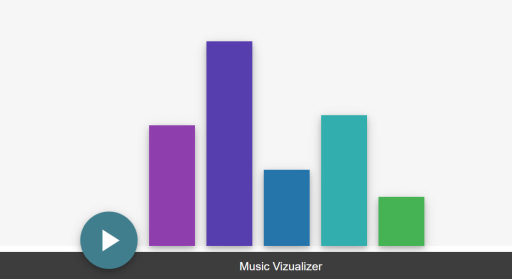
HTML Music Visualizer Live Demo
Getting Started
It is required to know some basic HTML, CSS, and JavaScript skills before you proceed with this tutorial, if you don’t know either of these languages, you can check out the HTML and CSS quick tutorials we’ve published.
The first thing we will need to do is create two HTML elements. The first element will be a div element. We will add a CSS class name to this element called super-container. The super-container element is important because it will wrap all of the other HTML elements.
<div class="super-container"></div>The second div will be a direct child of the super-container parent element. This will contain the visualizer bars and the controls to control the demo. The control will be a play and pause button. The name of this child div element will be called container using a CSS class attribute to set the name.
<div class="container"></div>Next, inside the container div element, we will add five child div elements. These elements will be direct children of the container div element and are the bars of the music visualizer.
<div class="bar barOne"></div>
<div class="bar barTwo"></div>
<div class="bar barThree"></div>
<div class="bar barFour"></div>
<div class="bar barFive"></div>
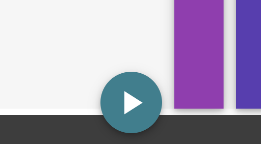
We also need to add the control buttons.
<div class="play-container">
  <span class="material-icons playAction">play_arrow</span>
  <span class="material-icons pauseAction hide">pause</span>
</div>
Last we will add another div element outside the parent-container element. It will have a CSS class name of overlay. It will look something like this.
<div class="overlay"></div>Below, we include all the code outlining the HTML structure of the visualizer. You see more classes, elements, and text added to the structure in the code below. These are important to include. Follow the code below to finish your HTML structure.
<div class="super-container">
  <div class="container">
    <div class="bar barOne"></div>
    <div class="bar barTwo"></div>
    <div class="bar barThree"></div>
    <div class="bar barFour"></div>
    <div class="bar barFive"></div>
    <div class="play-container">
      <span class="material-icons playAction">play_arrow</span>
      <span class="material-icons pauseAction hide">pause</span>
    </div>
  </div>
</div>
<div class="overlay">Music Vizualizer</div>
Adding CSS
Next, we need to add CSS styles to this HTML music visualizer.
The CSS will add styles to each of the five music visual bars. We will also provide styling to control play and pause buttons.
For the CSS animation to work, we must include CSS keyframes. These keyframes control the height of each of the five bars as the animation runs its loop.
@keyframes equalize {
  /* Animation Code */
}
To have a smooth transition on the bars when they animate, we must add a CSS transition easement property to each of the bars. We can do this easily by adding the transition property to the .bar class. The easement property will look something like this.
transition: 200ms 50ms cubic-bezier(0.4, 0, 0.6, 1);As you may notice, each bar starts at a different time to simulate audio playback. The effect is achieved through a delayed effect on each bar. The delay effect is created by setting an animation-delay property for each bar. We can use the ::nth-child CSS selector and the .bar class name to speed up setting delays. An example of the .bar:nth-child selector is provided below.
.bar:nth-child(1) {
  animation-delay: -1.2s;
}
Below, you can find all the HTML music visualizer CSS code.
html, body {
  font-family: sans-serif;
}

.super-container {
  position: absolute;
  background: #f6f6f6;
  top: 0;
  left: 0;
  right: 0;
  bottom: 60px;
}

.container {
  max-width: 500px;
  position: relative;
  height: 100%;
  margin: 0 auto;
  transition: 500ms 50ms cubic-bezier(0.4, 0, 0.6, 1);
}

.bar {
  box-shadow: 0 4px 8px 0 rgb(0 0 0 / 20%), 0 6px 20px 0 rgb(0 0 0 / 19%);
  transition: 200ms 50ms cubic-bezier(0.4, 0, 0.6, 1);
}

.barAnimate {
  animation: equalize 5s 0s infinite;
}

@keyframes equalize {
  0% {
    height: 60%;
  }
  4% {
    height: 50%;
  }
  8% {
    height: 40%;
  }
  12% {
    height: 30%;
  }
  16% {
    height: 20%;
  }
  20% {
    height: 30%;
  }
  24% {
    height: 40%;
  }
  28% {
    height: 10%;
  }
  32% {
    height: 40%;
  }
  36% {
    height: 60%;
  }
  40% {
    height: 20%;
  }
  44% {
    height: 40%;
  }
  48% {
    height: 70%;
  }
  52% {
    height: 30%;
  }
  56% {
    height: 10%;
  }
  60% {
    height: 30%;
  }
  64% {
    height: 50%;
  }
  68% {
    height: 60%;
  }
  72% {
    height: 30%;
  }
  76% {
    height: 80%;
  }
  80% {
    height: 70%;
  }
  84% {
    height: 40%;
  }
  88% {
    height: 50%;
  }
  92% {
    height: 80%;
  }
  96% {
    height: 70%;
  }
  100% {
    height: 60%;
  }
}

.bar:nth-child(1) {
  animation-delay: -1.2s;
}

.bar:nth-child(2) {
  animation-delay: -1.9s;
}

.bar:nth-child(3) {
  animation-delay: -2.2s;
}

.bar:nth-child(4) {
  animation-delay: -2.6s;
}

.barOne {
  position: absolute;
  bottom: 0;
  right: 0%;
  width: 80px;
  height: 20%;
  background: #33b24f;
}

.barTwo {
  position: absolute;
  bottom: 0;
  right: 20%;
  width: 80px;
  height: 53%;
  background: #0eaeae;
}

.barThree {
  position: absolute;
  bottom: 0;
  right: 40%;
  width: 80px;
  height: 31%;
  background: #1474ac;
}

.barFour {
  position: absolute;
  bottom: 0;
  right: 60%;
  width: 80px;
  height: 83%;
  background: #583cb0;
}

.barFive {
  position: absolute;
  bottom: 0;
  right: 80%;
  width: 80px;
  height: 49%;
  background: #933cb0;
}

.play-container {
    z-index: 1;
    position: absolute;
    left: -100px;
    bottom: -40px;
    height: 100px;
    width: 100px;
    background: #397e8d;
    border-radius: 100px;
    box-shadow: 0 4px 8px 0 rgb(0 0 0 / 20%), 0 6px 20px 0 rgb(0 0 0 / 19%);
}

.play-container:active {
    background: #2b5f6a;
}
.play-container:hover {
    background: #4a9cae;
    cursor: pointer;
}

.overlay {
    position: absolute;
    left: 0;
    right: 0;
    bottom: 0;
    background: #3d3d3d;
    pointer-events: none;
    height: 50px;
    line-height: 50px;
    text-align: center;
    color: #fff;
    font-size: 20px;
}

.playAction {
    font-size: 64px;
    color: #fff;
    margin: 18px;
}

.pauseAction {
    font-size: 64px;
    color: #fff;
    margin: 18px;
}

.hide {
  display: none
}
Giving the Play Button Power
We need to trigger the animation for the play and the pause button to work. The trigger will require us to use jQuery code to accomplish this.
The jQuery .toggleClasss function will do the work we need. The toggle class function removes and adds classes to the .bar, .playAction, and .pauseAction elements
$($className).toggleClass($className);When a user clicks on the play button, a class will be added to the .bar elements called .barAnimate The jQuery code will also hide the play button and change it to a pause button.
$('.play-container').on('click', function() {
  $('.bar').toggleClass('barAnimate');
  $('.playAction').toggleClass('hide');
  $('.pauseAction').toggleClass('hide');
});
HTML Music Visualizer Demo and Code
You can find the complete example and live demo on codepen.io and GitHub.
Recommended Articles
- How To Create a Page Loader Using HTML and CSS
- How To Create an HTML Carousel
- How To Create HTML and CSS Emoji Icons
- How To Create An Icon Bar With CSS
- How To Create a Stacked Card Hover Effect Using CSS
- How To Create a CSS Neon Effect With CSS Shadows