AppCode
This article demonstrates how to create a CSS Neon Effect using CSS Shadows. This example will create glowing text with CSS. Code included.
This article was first seen on and republished from csstutorial.io
Google Fonts
This example uses the Comfortaa font as the neon text. This font can be included from the Google Fonts library. The link element below has an HREF attribute with a URL that loads the font as a stylesheet.
<link href="https://fonts.googleapis.com/css?family=Comfortaa" rel="stylesheet">
To include this font in your project, you must include the HTML link element in the head section of your web page. Directly below is an example of how to include the link in the head. This may not be exactly how your head looks, but you must place the link element somewhere within the head element.
<head>
<!--

This is an HTML comment
Place link element somewhere here
<link href="" rel="stylesheet">

-->
</head>
HTML
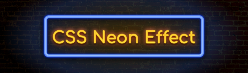
The HTML code below contains three HTML elements. Each DIV element is a direct child of its parent element. The first element is the container that holds the blue and yellow neon lights. This first DIV element has a class name “.container”. The second element is the rectangle blue neon that surrounds the yellow neon text. The last element is the yellow “CSS Neon Effect” text.
<div class="container">
  <div class="blue-neon">
    <div class="yellow-neon">CSS Neon Effect</div>
  </div>
</div>
CSS
The CSS code below contains the styles the create the neon sign effect you see in this example.
The second HTML element uses the class called “.blue-neon”. This class name is the CSS that creates the blue neon light. The blue neon effect is created with the CSS box-shadow property as you see in the example selector name.
.example {
  box-shadow: 0 0 2px 4px rgba(200, 230, 255, 0.5),
    0 -2px 2px 3px rgba(200, 230, 255, 0.5) inset,
    0 0 2px 10px rgba(100, 150, 255, 0.9),
    0 0 2px 7px rgba(100, 150, 255, 1) inset,
    0 0 12px 13px rgba(0, 50, 255, 0.9),
    0 0 12px 11px rgba(0, 50, 255, 0.7) inset,
    0 8px 30px 18px rgba(0, 0, 0, 0.8), 0 8px 25px 12px rgba(0, 0, 0, 0.7) inset;
}
The CSS box-shadow casts drop shadows from the element it is used on. However, in this tutorial, we don’t use one value. Seven values are set with commas separators, to apply multiple shadow effects. As a result of these combined shadow effects, we have the blue rectangular neon box.
Last, we have the yellow text neon. This effect is created by using a CSS text-shadow property which also has multiple values. These values are also separated with commas as seen below.
.example {
  text-shadow: 0 0 5px rgba(255, 245, 0, 1),
    0 0 28px rgba(255, 44, 0, 0.9),
    0 8px 38px black,
    0 8px 10px black,
    0 2px 12px black,
    0 0 50px rgba(255, 120, 0, 0.5),
    0 0 24px rgba(255, 255, 255, 0.8);
}
Below are the entire CSS styles that are needed to render neon effect in this project.
body,
html {
  height: 100%;
  overflow: hidden;
}

body {
  justify-content: center;
  align-items: center;
  background-color: #000;
  background-blend-mode: hard-light;
  background-image: linear-gradient(rgba(6, 6, 6, 0.9), rgba(0, 0, 0, 0.9)),
    url(https://images.pexels.com/photos/1227515/pexels-photo-1227515.jpeg?auto=compress&cs=tinysrgb&dpr=2&h=650&w=940);
  padding: 0;
  font-size: 100px;
  font-weight: bold;
  font-family: "BPneon", "Comfortaa", cursive;
  letter-spacing: 3px;
}

.container {
  min-width: 1000px;
  -webkit-box-align: center !important;
  -ms-flex-align: center !important;
  align-items: center !important;
  -webkit-box-pack: center !important;
  -ms-flex-pack: center !important;
  justify-content: center !important;
  display: -webkit-box !important;
  display: -ms-flexbox !important;
  display: flex !important;
  height: 100%;
  justify-content: center;
  align-items: center;
  background-image: radial-gradient(
    rgb(255 190 0 / 20%) 0%,
    rgba(70, 140, 255, 0.2) 52%,
    transparent 70%
  );
}

.blue-neon {
  display: none;
  width: 970px;
  height: 240px;
  position: relative;
  display: flex;
  justify-content: center;
  align-items: center;
  border-radius: 20px;
  box-shadow: 0 0 2px 4px rgba(200, 230, 255, 0.5),
    0 -2px 2px 3px rgba(200, 230, 255, 0.5) inset,
    0 0 2px 10px rgba(100, 150, 255, 0.9),
    0 0 2px 7px rgba(100, 150, 255, 1) inset,
    0 0 12px 13px rgba(0, 50, 255, 0.9),
    0 0 12px 11px rgba(0, 50, 255, 0.7) inset,
    0 8px 30px 18px rgba(0, 0, 0, 0.8), 0 8px 25px 12px rgba(0, 0, 0, 0.7) inset;
}

.yellow-neon {
  padding-top: 20px;
  text-align: center;
  color: rgba(255, 232, 50, 0.9);
  text-shadow: 0 0 5px rgba(255, 245, 0, 1), 0 0 28px rgba(255, 44, 0, 0.9),
    0 8px 38px black, 0 8px 10px black, 0 2px 12px black,
    0 0 50px rgba(255, 120, 0, 0.5), 0 0 24px rgba(255, 255, 255, 0.8);
  -webkit-text-stroke: 1px rgba(255, 160, 0, 0.45);
}
This example includes a live demo hosted on codepen.io