AppCode
This article demonstrates the power of the CSS clip-path property. Included are syntax examples, code samples, images, and use cases.
CSS clip-path is a property of CSS that allows you to show only a specific region of an element. It gives you the liberty of deciding which part is to be shown and which is to be hidden, all by adding some fun shapes. You can clip away undesired parts to create a shape from an element.
Due to its various values and shapes, understanding clip-path property is still somewhat confusing. However, we will make learning clip-path easy for you. This article will explore more about CSS clip-path and its values through some creative and easy code examples. Now, let’s dive in.
Syntax
clip-path: <clip-source> | [ <basic-shape> || <geometry-box> ] | none<clip-source> values
/* <clip-source> values */
clip-path: url(resources.svg#c1);
<basic-shape> values
/* <basic-shape> values */
clip-path: inset(100px 50px);
clip-path: circle(50px at 0 100px);
clip-path: ellipse(50px 60px at 0 10% 20%);
clip-path: polygon(50% 0%, 100% 50%, 50% 100%, 0% 50%);
clip-path: path(
  "M0.5,1 C0.5,1,0,0.7,0,0.3 A0.25,0.25,1,1,1,0.5,0.3 A0.25,0.25,1,1,1,1,0.3 C1,0.7,0.5,1,0.5,1 Z"
);
<geometry-box> values
/* <geometry-box> values */
clip-path: margin-box;
clip-path: border-box;
clip-path: padding-box;
clip-path: content-box;
clip-path: fill-box;
clip-path: stroke-box;
clip-path: view-box;
<geometry-box> and <basic-shape> values combined
/* Box and shape values combined */
clip-path: padding-box circle(50px at 0 100px);
Keyword values
/* Keyword values */
clip-path: none;
Global values
/* Global values */
clip-path: inherit;
clip-path: initial;
clip-path: revert;
clip-path: revert-layer;
clip-path: unset;
Usage
You can apply the clip-path property to any element by using CSS selectors.
#element-id {
  clip-path: center;
}

.element-class {
  clip-path: start;
}
What Is the Use of CSS Clip-Path?
You can use the CSS clip-path property to set a clipping region. The content within the region will be visible, but the content outside the region will be invisible. In simple words, CSS clip-path allows you to clip a portion on an area of an element and display the rest.
It is a great way to add fun to your websites and create different shapes. Here is an example code for a circle.
Code:
.clipping {
  background-color: blue;
  clip-path: circle(50px at 50% 50%);
  height: 100px;
  width: 100px;
  margin: 0 auto;
}
No matter how large your div or element is, it will only display a circle of 50 pixels. However, it will show the circle at the center because of the set coordinates. So how do the coordinates work? Let’s have a look at them.
The Coordinate System in CSS Clip-Path
Since our screens use a two-dimensional display in most cases, there is an x-axis and a y-axis. The origin of this coordinate system is the top left corner of your screen or div. Moreover, the first coordinate element, the x-axis, controls the left to right movement, and the second axis, the y-axis, controls the top to the bottom movement of your clipped region.
clip-path: circle(50px at 50% 50%);
                          |   |
                          |   |--- y-axis coordinate
                          |
                          |--- x-axis coordinate One
For example, if you change the coordinates of the above example to 0 0, the graph’s origin will now become the center of your circle. Thus, only one-quarter of the circle will be visible because the rest of the circle is not within the region.

Now let’s move forward and learn some properties of the CSS clip-path.
Common Values Of CSS Clip-path
Like every other CSS property, clip-path has some values available that you can use to create shapes. The possible values of CSS Clip-path properties are:
Circle
The code below will generate a circle, and it will move 40% away from the left and 30% from the top.
clip-path: circle(20px at 40% 30%);
Remember: You cannot give multiple radius values for a circle.
Ellipse
There is an option of generating an ellipse with a clip-path as well. Also, unlike a circle, you can give two values for an ellipse because it has two foci.
clip-path: ellipse(30px 40px at 30% 40%);
Polygon
Polygon is the most versatile shape in the clip-path as you can create different shapes with it. By defining multiple pairs of x and y-axis, you get the power to make any shape you want. For example, you can create a star using the following code:
clip-path: polygon(
  50px 0px,
  61px 37px,
  98px 39px,
  68px 59px,
  79px 95px,
  50px 74px,
  21px 95px,
  32px 57px,
  2px 35px,
  39px 38px
);
Inset
Using an inset, you can create an inset rectangle and control its borders just like padding your element.
clip-path: inset(20px 20px 50px 20px);
Note: If you enter only one value as the parameter you can get a square.
Path()
You can also use Path() with the clip-path property; the function accepts an SVG path allowing you to draw a shape.
clip-path: path(evenodd,"M 10 80 C 40 10, 65 10, 95 80 S 150 150, 180 80");
URL
The url() can be used to refer to a clipPath SVG element; once the element is defined, it can be used with the url() property.
clip-path: url(#svgPath1);In the code above, clip-path refers to an SVG element defined in the HTML. You can refer to the complete code below.
HTML
<div>
  <svg width="200" height="200" viewBox="0 0 244 244">
    <clipPath id="svgPath1">
      <path fill="#7db43c" d="M100,50 A100,100 0 1,100 100,80 0,100 0 1,1 50,0 50" />
    </clipPath>
  </svg>
</div>
CSS
div {
  width: 250px;
  height: 250px;
  display: inline-block;
  background-color: #d04646;
  clip-path: url(#svgPath1);
  padding: 10px;
  margin: 20px;
}
Geometry Box
The geometry box is used in combination with basic shapes like a circle, ellipse, etc. the value of the geometry box becomes the reference box for the basic shape. If you use it without a basic shape, it will act as the clipping path for a specified box. You can use any of the following as your geometry box.
clip-path: margin-box;
clip-path: border-box;
clip-path: padding-box;
clip-path: content-box;
clip-path: fill-box;
clip-path: stroke-box;
clip-path: view-box;
None
This value will not change anything in your HTML file. You can use this value if you are arranging CSS elements first.
none;Using Clip-Path With An SVG Element
You can see below the clip-path can be used within SVG elements, but don’t mistake the SVG version for the CSS version. To use the clip-path within the element, you need to define the clip path and the path inside. Check out the example below.
HTML
<svg viewBox="0 0 100 100">
  <clipPath id="myClip">
    <path id="heart" d="M10,30 A20,20,0,0,1,50,30 A20,20,0,0,1,90,30 Q90,60,50,90 Q10,60,10,30 Z" />
  </clipPath>
  <use clip-path="url(#myClip)" href="#heart" fill="pink" />
</svg>
The code above is inspired by an example from MDN docs.
Code Examples of Clip-Path
In this section, we will discuss some code examples of clip-path that you can replicate on your website. Furthermore, you can add your touch to these designs and add a bit of creativity from your side to make some fun shapes.
Close
Starting with the simplest one, you can create a cross shape with the following code:
clip-path: polygon(20% 6%, 5% 21%, 30% 50%, 0% 80%, 20% 96%, 50% 63%, 81% 98%, 97% 81%, 70% 50%, 100% 20%, 80% 0%, 50% 30%);
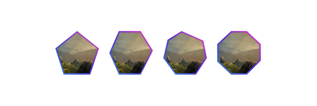
Clip-Path Borders With CSS-Gradient
There are many use cases of clip-path property; it allows you to play around with different shapes. For example, in this code, you can see that we used borders around the image and framed it into multiple shapes. You can use this code to create some fun portraits of your team members on your websites.
The image used in this code is courtesy of Keagan Henman on Unsplash.
HTML
<div class="shape-outer pentagon">
  <div class="shape-inner pentagon"></div>
</div>
<div class="shape-outer hexagon">
  <div class="shape-inner hexagon"></div>
</div>
<div class="shape-outer heptagon">
  <div class="shape-inner heptagon"></div>
</div>
<div class="shape-outer octagon">
  <div class="shape-inner octagon"></div>
</div>
CSS
.shape-outer {
  display: flex;
  flex-shrink: 0;
  height: calc(150px + 4vw);
  width: calc(150px + 4vw);
  margin: 25px;
  background-image: linear-gradient(to bottom right, #ff3ccc, #562b7c, #2b86c5);
}

.shape-outer {
  display: flex;
  flex-shrink: 0;
  height: calc(150px + 4vw);
  width: calc(150px + 4vw);
  margin: 25px;
  background-image: linear-gradient(to bottom left, #ff3ccc, #562bcc, #2b86cc);
}

.shape-inner {
  height: calc(120px + 5vw);
  width: calc(120px + 5vw);
  background: url(https://images.unsplash.com/photo-1523380744952-b7e00e6e2ffa?ixlib=rb-1.2.1&ixid=MnwxMjA3fDB8MHxwaG90by1wYWdlfHx8fGVufDB8fHx8&auto=format&fit=crop&w=870&q=80)
    no-repeat center;
  background-size: cover;
  margin: auto;
}

.pentagon {
  -webkit-clip-path: polygon(50% 0%, 100% 40%, 80% 100%, 19% 100%, 0% 40%);
  clip-path: polygon(50% 0%, 100% 40%, 80% 100%, 19% 100%, 0% 40%);
}

.hexagon {
  -webkit-clip-path: polygon(
    22% 0%,
    72% 0%,
    100% 45%,
    72% 100%,
    22% 100%,
    0% 50%
  );
  clip-path: polygon(22% 0%, 72% 0%, 100% 45%, 72% 100%, 22% 100%, 0% 50%);
}

.heptagon {
  -webkit-clip-path: polygon(
    42% 0%,
    92% 22%,
    100% 62%,
    75% 100%,
    28% 100%,
    0% 62%,
    10% 20%
  );
  clip-path: polygon(
    42% 0%,
    92% 22%,
    100% 62%,
    75% 100%,
    28% 100%,
    0% 62%,
    10% 20%
  );
}
.octagon {
  -webkit-clip-path: polygon(
    32% 0%,
    68% 0%,
    100% 30%,
    100% 68%,
    68% 100%,
    32% 100%,
    0% 70%,
    0% 30%
  );
  clip-path: polygon(
    32% 0%,
    68% 0%,
    100% 30%,
    100% 68%,
    68% 100%,
    32% 100%,
    0% 70%,
    0% 30%
  );
}
Find the code on Codepen here: https://codepen.io/GeorgePark/pen/ZoaRrV
Comment Text Box
Here is another example of the comment text box that you can play around with. You can add different stylings to this shape and even add your client’s testimonials in this comic text box.
The image used in this code is courtesy of Sebastian Svenson on Unsplash.
HTML
<div class="box"></div>CSS
.box {
  width: 230px;
  height: 230px;
  background: black
    url(https://images.unsplash.com/photo-1622547748225-3fc4abd2cca0?ixlib=rb-1.2.1&ixid=MnwxMjA3fDB8MHxwaG90by1wYWdlfHx8fGVufDB8fHx8&auto=format&fit=crop&w=1032&q=80);
  background-size: cover;
  -webkit-clip-path: polygon(
    0% 0%,
    100% 0%,
    100% 76%,
    76% 76%,
    76% 100%,
    50% 76%,
    0% 76%
  );
  clip-path: polygon(
    0% 0%,
    100% 0%,
    100% 76%,
    76% 76%,
    76% 100%,
    50% 76%,
    0% 76%
  );
}
Find the code on Codepen here: https://codepen.io/drewminns/pen/WbXzbb
Wrapping Up
In this article, we have explored the clip-path in detail. We have also explored some code examples and some basic shapes that you can try with clip-path. While this is from us, you can still explore more about this CSS property by experimenting with the mentioned examples. Keep practicing and creating fun shapes!
Specifications
W3C CSS Masking Module Level 1
#the-clip-path
W3C CSS Shapes Module Level 1
#supported-basic-shapes
Next→
Recommended Articles
- The Awesome CSS mask-image Property
- The CSS justify-self Property
- The Awesome CSS Transform Property and Scale Function
- Explaining the Scale Property in CSS
Other Articles
- How To Build Web Layouts for Dual-Screen
- How To Create Video Overlays With CSS
- How To Create a Full-Width Video Background With CSS
- How To Create a Timeline Using HTML and CSS
- How To Create a Page Loader Using HTML and CSS
- How To Create Alert Buttons With CSS
- How To Create a Stacked Card Hover Effect Using CSS