AppCode
This article demonstrates how to create a CSS gradient generator by walking through the steps and code, including an editable example.
This article will require basic CSS, HTML, and JavaScript knowledge to build a working example. Understanding these languages will allow you to update and make a version for another website or application, even just for fun! You can find a tutorial on HTML here, an article on CSS, and, last, a tutorial on the basic blocks of JavaScript.
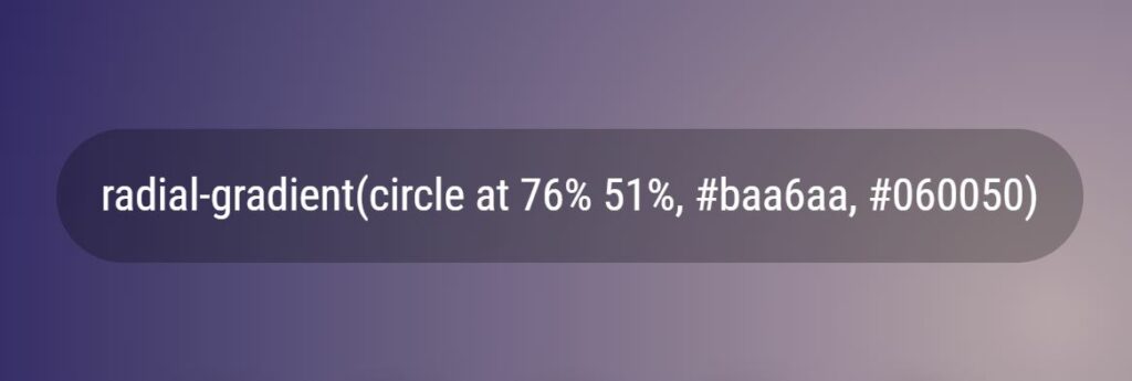
The example we will be working with uses both a CSS linear-gradient() and the radial-gradient() function to create random gradients whenever a user clicks on the background page of the example. If you are interested in learning more about radial gradients, you can check out another published article that reviews and demonstrates how to use a radial-gradient function.
Creating a Gradient Generator
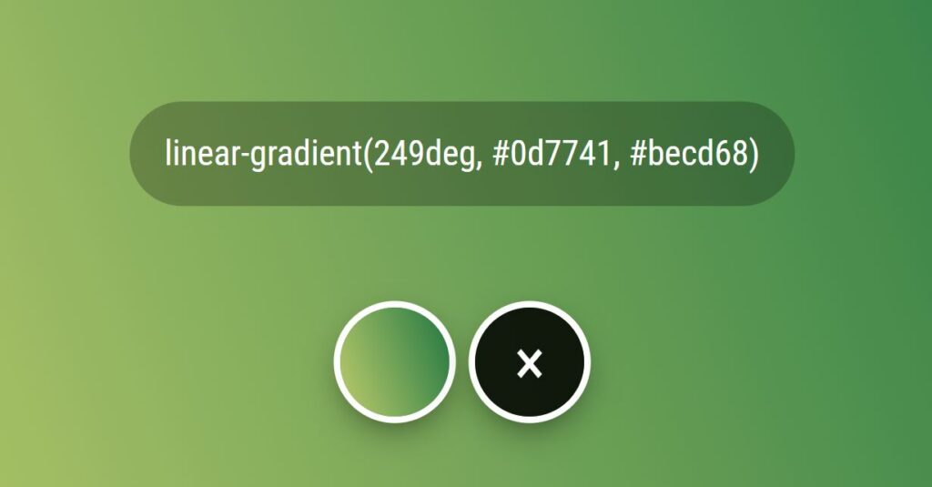
The gradient generator in the image above is the example we will be building. You can copy the style to use on your website. To copy a gradient style to your clipboard, you will need to click the CSS gradient style in the transparent black bubble, the style is automatically selected, and you can use CTRL-C to copy.
In addition to copying a style, you can generate another gradient by clicking or touching the background of the example. On the other hand, to clear the history of generated gradients, you can click the black X button.
Now that we have introduced our project let’s build it. First, we want to create some essential HTML elements. The first element is a background, where we set the gradient. This element will be a <div> element with a class name of .super.
<div class="super"></div>Inside the .super element, we will add two more <div> elements with a class name of .info and .history.
<div class="super">
  <div class="info"></div>
  <div class="history"></div>
</div>
Styling the Generator with CSS
Now that we have all of our HTML for the generator, we can add some CSS styles to give the project design.

With the first element we created, the <div>.super, we must add these styles to center the elements inside a web page.
We utilize a flexbox, set the flex direction as a column, and then align and justify its contents. These properties force the children’s elements to center horizontally and vertically.
.super {
  padding: 50px;
  display: flex;
  flex-direction: column;
  margin: 0;
  color: #fff;
  align-items: center;
  justify-content: center;
  font-size: 3vmax;
  height: 100%;
}
If you are interested in learning more about using CSS flexbox, we have an article on building a flexbox layout for a menu and another on creating a grid.
Now that the background styles are added let’s set the <div> .info element’s styles. This element will contain a CSS style generated for the gradient currently displayed on the web page background. We also use a flex and center the items within it.
.info {
  margin-bottom: 1em;
  flex: 1;
  display: flex;
  align-items: center;
  pointer-events: none;
  font-size: 0.8em;
}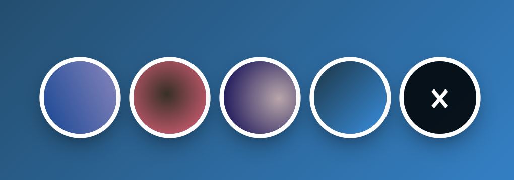
The last major block in our HTML is a <div>.history element. This element contains the history of all the generated gradients since the page was loaded. We set each history item as an inline-block and set the clear button’s background and size using an :after pseudo-element.
.history > span {
  position: relative;
  display: inline-block;
  width: 2.5em;
  height: 2.5em;
  border-radius: 2em;
  box-shadow: 0 0 0 0.15em, 0 0.3em 1em -0.3em #000;
  margin: 0.3em;
}

.history .clear {
  background: rgba(0, 0, 0, 0.85);
  -webkit-user-select: none;
  -moz-user-select: none;
  -ms-user-select: none;
  user-select: none;
}

.history .clear::after {
  content: "×";
  position: absolute;
  top: 50%;
  left: 50%;
  line-height: 0;
  transform: translate(-50%, -50%);
  font-size: 1.5em;
}
Here is the complete code for the above CSS styles and a few we won’t discuss. These other styles address the font and other various items.
@charset "UTF-8";
@import "https://fonts.googleapis.com/css?family=Roboto+Condensed";

.history {
  text-align: center;
}

.history > span {
  position: relative;
  display: inline-block;
  width: 2.5em;
  height: 2.5em;
  border-radius: 2em;
  box-shadow: 0 0 0 0.15em, 0 0.3em 1em -0.3em #000;
  margin: 0.3em;
}

.history .clear {
  background: rgba(0, 0, 0, 0.85);
  -webkit-user-select: none;
  -moz-user-select: none;
  -ms-user-select: none;
  user-select: none;
}

.history .clear::after {
  content: "×";
  position: absolute;
  top: 50%;
  left: 50%;
  line-height: 0;
  transform: translate(-50%, -50%);
  font-size: 1.5em;
}

.info {
  margin-bottom: 1em;
  flex: 1;
  display: flex;
  align-items: center;
  pointer-events: none;
  font-size: 0.8em;
}

.info > div {
  background: rgba(0, 0, 0, 0.25);
  line-height: 1.5;
  padding: 0.75em 1em;
  border-radius: 2em;
  pointer-events: auto;
}

.super {
  padding: 50px;
  display: flex;
  flex-direction: column;
  margin: 0;
  color: #fff;
  align-items: center;
  justify-content: center;
  font-size: 3vmax;
  height: 100%;
}

* {
  box-sizing: border-box;
}

html,
body {
  height: 100%;
  font-family: "Roboto Condensed", Helvetica, Arial, sans-serif;
  padding: 0;
  margin: 0;
}
Giving The CSS Gradient Generator Function
We have successfully added the HTML and CSS to our new webpage, and now we need to use JavaScript to get the example working.
The first task we will do is we need to use a custom function multi-event listener to handle both a click and touch event on the gradient background wall. The click and touch events are JavaScript events triggered when a user performs one of these actions with an element attached to a listener.
addListenerMulti(document, "click touchend", clickHandler);If either of these click events or touchend events is triggered, a listener will run a custom clickHandler function.
  var handled = false;
  var clickHandler = function (e) {
    e.stopImmediatePropagation();
    if (e.type == "touchend") {
      handled = true;
      check(e);
    } else if (e.type == "click" && !handled) {
      check(e);
    } else {
      handled = false;
    }
  };
Once the clickHandler function handles the event, it will pass it to a function called check().
function check(e) {
    if (e.target.className === "super") {
      doIt(e.target);
    } else if (e.target.classList.contains("clear")) {
      history.innerHTML = "";
      history.appendChild(clear);
    } else if (e.target.parentElement.className === "info") {
      selectText(e.target);
    } else if (e.target.tagName === "SPAN") {
      var b = e.target.style.backgroundImage;
      doIt(body, b, true);
    }
  }
Function check will determine whether a user wants to copy the CSS gradient style to a clipboard, clear the history, or generate a new CSS gradient.
If a user clicks on the <div>.super element or the web page background, the doIt() function starts running, which generates a new gradient and adds a new item to the history bar.
if (e.target.className === "super") {
   doIt(e.target);
}
If a user clears the gradient history, the JavaScript sets the innerHTML of the history element to none and appends a new clear button.
if (e.target.classList.contains("clear")) {
   history.innerHTML = "";
   history.appendChild(clear);
}
If a user selects the style info element to copy the CSS styles, then the selectText() function runs, which selects the style text within the element.
if (e.target.parentElement.className === "info") {
  selectText(e.target);
}
Last, if a user clicks on the history span elements. Then the gradient that is stored within that history span element is restored. Restored means that the history gradient clicked is set as the page’s background, and its styles are loaded back into the info element.
Once the check function is complete and a user has clicked the background to generate a new gradient, we perform a few necessary calculations to create a random linear or radial gradient and apply it to the background of the page while also updating the history bar.
You can check out all the JavaScript code for a gradient generator in the code block below.
(function () {
  "use strict";

  var body = document.querySelector(".super");
  var history = document.querySelector(".history");
  var info = document.querySelector(".info");
  var clear = document.createElement("SPAN");
  clear.classList.add("clear");
  history.appendChild(clear);

  var randum = function (max) {
    return Math.round(Math.random() * max);
  };

  var hexify = function (x) {
    return ("0" + parseInt(x).toString(16)).slice(-2);
  };

  var randex = function () {
    return (
      "#" + hexify(randum(255)) + hexify(randum(255)) + hexify(randum(255))
    );
  };

  var blender = function () {
    if (!!Math.round(Math.random())) {
      return (
        "radial-gradient(circle at " +
        randum(100) +
        "% " +
        randum(100) +
        "%, " +
        randex() +
        ", " +
        randex() +
        ")"
      );
    } else {
      return (
        "linear-gradient(" +
        randum(360) +
        "deg, " +
        randex() +
        ", " +
        randex() +
        ")"
      );
    }
  };

  var cleanMe = function (str) {
    if (str) {
      return str.replace(/rgb\(([\d,\s]+)\)/g, function (m) {
        m = m.match(/(\d+)/g);
        return "#" + hexify(m[0]) + hexify(m[1]) + hexify(m[2]);
      });
    }
  };

  var doIt = function (element, b, stop) {
    b = cleanMe(b) || blender();
    element.style.backgroundImage = b;
    info.innerHTML = "<div>" + b + "</div>";
    if (!stop) {
      var output = document.createElement("SPAN");
      history.insertBefore(output, history.childNodes[0]);
      doIt(output, b, true);
    }
  };

  function selectText(element) {
    var range = document.createRange(); // create new range object
    range.selectNodeContents(element); // set range to encompass desired element text
    var selection = window.getSelection(); // get Selection object from current user-selected text
    selection.removeAllRanges(); // unselect any user-selected text (if any)
    selection.addRange(range); // add range to Selection object to select it
  }

  function check(e) {
    if (e.target.className === "super") {
      doIt(e.target);
    } else if (e.target.classList.contains("clear")) {
      history.innerHTML = "";
      history.appendChild(clear);
    } else if (e.target.parentElement.className === "info") {
      selectText(e.target);
    } else if (e.target.tagName === "SPAN") {
      var b = e.target.style.backgroundImage;
      doIt(body, b, true);
    }
  }

  var handled = false;
  var clickHandler = function (e) {
    e.stopImmediatePropagation();
    if (e.type == "touchend") {
      handled = true;
      check(e);
    } else if (e.type == "click" && !handled) {
      check(e);
    } else {
      handled = false;
    }
  };

  doIt(body);

  function addListenerMulti(scope, signatures, fn) {
    var events = signatures.split(" ");
    for (var i = 0, len = events.length; i < len; i++) {
      scope.addEventListener(events[i], fn, false);
    }
  }

  addListenerMulti(document, "click touchend", clickHandler);
})();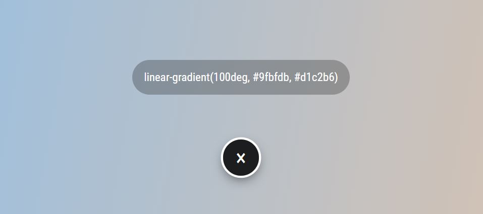
The above image is a rendered example using the code in this project. To edit this project, you can visit codepen.io. The model can be reused on your website or page for commercial or fun.
Frequently Asked Questions
Here are two questions that are frequently asked and related to our project.
What are the three main types of gradients in CSS?
There are three gradients you can choose from conic, which is created using the CSS conic-gradient() function; linear, made with a CSS linear-gradient() function; and third, radial, designed using a CSS radial-gradient() function.
What is a CSS Gradient Generator
A CSS Gradient Generator is a gradient generator that creates a new CSS linear gradient or CSS radial gradient. Typically whenever an author makes a generator website or page, you can save, share, and copy the CSS style to your clipboard for easy pasting.