AppCode
In this article, we demonstrate CSS typography, ways to achieve it, and fluid typography using the CSS clamp function with examples.
A common problem that website developers face is dealing with responsiveness. Especially in the case of typography, the usual approach to deal with responsive typography was by implementing media queries and changing the font size according to different screen sizes. While the approach is still a band-aid, it requires more code and is less efficient than other solutions. Another path is the helpful CSS clamp() function, which deals with this problem more efficiently.
Content
- What is Typography
- What is Typeface
- Typography and User Experience
- Responsive and Fluid Typography
- Different Size Units of Typography
- Using the CSS Clamp() Function
- Conclusion
The concept that governs fluid typography in CSS has been in existence for decades. But before the clamp function, web developers had to add more code and rely heavily on various workarounds to make each text block more responsive on different devices.

Usually, when authors use responsive typography, the text sizes change on specific breakpoints of screen dimentions; this is mainly because screen sizes vary for each device type. Developers would implement these responsive requirements using CSS media queries to target the breakpoints. These typography transformations are typically in the form of CSS font size, line height, and letter spacing properties.
We have a template that consists of media queries for different device sizes, such as large screens, iPads, iPhones, and other smart devices, that you can check out in a separate article. Direct Link →
What is Typography
The definition of typography is the color, size, alignment, font, contrast, and other properties that encase a written language. Typography is also an art that makes written language appealing, legible, and readable to people. Many factors are included in the typography, including boldness and sharpness, in addition to the ones above.
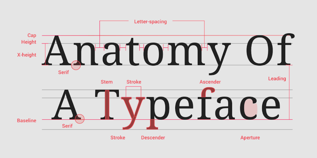
What is Typeface
A typeface is the variations in size, slope(e.g., italic), weight (e.g., bold), width (e.g., condensed), letter-spacing, stroke, and other properties in the design of lettering. Each property variation of typeface is a different font. (e.g., Arial, New Times Roman, Sans-Serif).
New typefaces are constantly developing, and there are thousands in existence. Check out some of the properties of the typeface below.
Typography and User Experience
Typography is a conscious process that needs detailed analysis for the best performance in user experiences.
Quick Note: There is a misconstrued opinionated belief that “If the author can read his or her work, then anyone can”. This opinion should be squashed because if you can read the work, it doesn’t mean the typography is displayed in its best appearance for the target audience.
To develop a fantastic user experience, we need to consider two critical points of typography. These points include font and contrast, which make up the bulk being legible.
Font
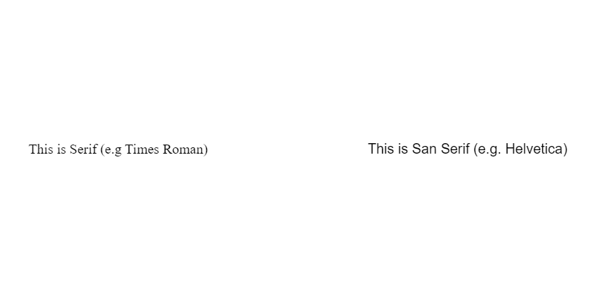
The font in typography has two segments in CSS: the font-size and the font-family properties. An example of different fonts is the Serif and Sans Serif types. While the Serif (e.g., New Times Roman) font has pointed edges, Sans Serif (e.g., Helvetica), on the other hand, has blunt-like edges. So, for instance, if you want a 13-16px font size of Serif and the font’s pointed edges, it will be hard to read compared to Sans Serif, which is the same size.
CSS font-family property
font-family: sans-serif;
font-family: serif;
Contrast
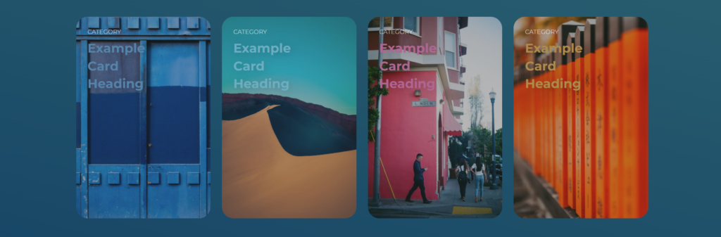
Contrast depends on which font color and background you’ve opted for while designing a website. Imagine if you have an article with a light red background with white text, it won’t be easy to read. The contrast of the text will be pretty low. You can see in the image below the text color is slightly brighter than the background; this causes the distinction to be low and makes reading more difficult.
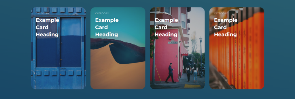
If we adjust the text color to white, the contrast improves marginally and is much easier to read.
CSS Properties that Control the Contrast
opacity: 0.75;
color: black;
background: white;
Responsive and Fluid Typography
The concept of responsive typography has existed for years, and it stemmed from solving the issue of irresponsive fonts that once existed on different screens. So, for example, it will be ideal if you use 58 to 70px in 1920 screen size. for hero banners. But on the flip side, this size range won’t suit a small 480px screen.
Big font sizes on the small screen are inappropriate and often dampen the user experience. So, how do you solve this hassle? Well, this is where responsive typography comes in. Using Px, Em, and Rem values will do the trick.
Different Size Units of Typography
Highlighted below are some of the different sizing units of typography.
Px
The px unit is the most straightforward measurement when designing a web page. However, there’s a catch! If you use 30 to 45px on desktop screens, that’s what you’ll get on mobile screens too. To get it right with px, you need to add media queries to your line of codes. Here’s what working with px units looks like:
P {
  font-size: 20px;
  font-family: Calibri;
  line-height: 120%;
  color: #ffffff;
}
Media Query Example:
// Larger text on screens larger than 480px
P {
  font-size: 20px;
}

// Smaller text on smaller screens
@media (max-width: 480px) {
  P {
    font-size: 16px !important;
  }

}
Em
The em unit is a relative size that depends on the parent’s element. For instance, if we declare a font size of 20px in body, the value 1em will be 20px, and if we use 1.5em, it will be 30px.
body {
  font-size: 20px;
}

/* font-size (1.5em x 20px) = 30px */
h2 {
  font-size: 1.5em;
  font-family: Calibri;
  line-height: 120%;
  color: #ffffff;
}
Rem
Rem, on the other hand, is unique because it’s based on the root element’s font size. When talking about root elements HTML, we refer to the highest parent element with fixed font size. The root em (rem) allows users to access the highest parent of that particular child and create a font size relative to its value. So, for instance, if we assign a 10px font size to the root element, then any elements using the rem font size will automatically be multiplied by the rem’s value.
Addionally, changing the root element’s font size changes all child elements using rem, so the page can be responsive to screen size if the root elements’ font size changes for different screens. Since all the rem values react according to the root size changes, readily adjusting the font of a web page to the different screen sizes is easy.
Here are two examples of headers using the rem for font-size values.
HTML
<html>
  <h2>Heading Level Two</h2>
  <h3>Heading Level Three</h3>
</html>
CSS
/* Root font size */
html {
  font-size: 10px;
}

/* font-size (2rem * 10px) = 20px */
h2 {
  font-size: 2rem;
}

/* font-size (3rem * 10px) = 30px */
h3 {
  font-family: Cambria;
  font-size: 3rem;
  line-height: 120%;
  color: #ffffff;
}
Viewport Units
We can also use minimum and maximum browser screen dimensions in typography, which helps us achieve typography fluidness. These browser screen dimension units are called viewport units. There are four viewport units, vw, vh, vmin, and vmax.
The viewport units have values that refer to the percentage of the web browser’s viewport width or height. For instance, 2vw refers to 2% of the viewport’s total width. And here, the percentage is relative to the parent’s container width, so it changes when the resolution changes.
Using viewport units makes it easier to implement fluid typography because the units make the entire text in a web page responsive as the user moves to a smaller screen or from a small to a big screen.
You can read about the different viewports units (we have an article about this – you can check it out to learn more about them). Direct Link →
Using the CSS Clamp() Function
While the previous methods work just fine, too, the process of transitioning between font sizes from one breakpoint to another is somewhat abrupt and not very efficient. Moreover, implementing multiple media queries makes the code tedious and complex by adding more lines. Reducing complexity is where the clamp() function works magic.
The CSS clamp function clamps a median value within the range of an upper and lower bound. Addionally, the clamp() function takes three arguments, a minimum value, a preferred value, and a maximum value, in their respective orders. If the preferred value is less than the minimum value, the minimum value will be used. Likewise, if the preferred value will be greater than the maximum value in some cases, the max value will be used.
clamp(MIN, VAL, MAX)Fun Fact: In this article, we will use the clamp() function with the CSS font-size property; in other CSS projects, it can be used with any numeric property like padding, margins, width, height, etc.
These arguments can be math expressions, functions like calc(), or literal expressions. Moreover, the arguments can also take nested min() and max() values. The syntax of a basic clamp example looks like this using actual values.
font-size: clamp(1.4rem, 4vw, 3rem);In this example, you may see that we have used “4vw” as a preferred value. If you evaluate that, it makes perfect sense to use the VW unit with the clamp function. As with every resize of the viewport, the preferred value will be calculated accordingly and used as long as it lies between the range of defined min and max values.
Note: One VW refers to the exact 1% width of the current viewport. Consequently, if we are defining 4vw, that translates to 4% of the current viewport width. Direct Link →
Hence, often while calculating the preferred value, some additional mathematical functions are combined with VW to have the desired output. Here is an example of adding vw and rem units together using the calc function.
font-size: clamp(1rem, calc(0.4vw + 0.9rem), 1.19rem)
Conclusion
Fluid and responsive typography can be used on different web pages, including blogs, web pages, or even simple animations. But it can also be a disaster if it isn’t applied well. On the bright side, it is screen responsive using methods such as the CSS clamp function and can help you create a unique project and user experience.
Recommended Articles
- Diving Into the CSS Semi-Transparent World
- 32 CSS Carousel Examples and Code
- How To Use CSS (Cascading Style Sheets) To Style HTML
- CSS Semi-Transparency With Buttons