AppCode
This article will assist you in creating a timeline using HTML and CSS. The tutorial is for everyone, whether a newbie to CSS, someone who wants to explore the CSS and its capabilities, or simply to add a general timeline to their page.
What is a timeline and why are they used?
CSS timelines may be used to display your city’s history, a project schedule, or a corporate strategy, and they can graphically convey essential dates and events.
A timeline can be considered a handy tool for displaying a variety of facts and data to a user. Corporations use them to illustrate their history and what they’ve accomplished throughout time, and individuals may use them to present their portfolio to show their work overtime.
Today, I will show you how to create a vertical timeline with events appearing on the left and right sides using CSS.
CSS timelines might be difficult to imagine or develop, but we will make it simple. Without any further delay let’s come to the main part.
A timeline can be created vertically or horizontally depending on your needs! Whenever you implement horizontal timelines, you can use JavaScript to listen to the scroll event and move your timeline right or left.
Basic structure of the timeline using HTML
Create a div element with a class called .main. Inside our .main class, create a div with a class called .text-wrapper. Inside the div with the class .text-wrapper include another div with class .content and one h3 and p tag.
Something like this.
<!DOCTYPE html>
<html>
  <body>
    <div class="main">
      <div class="text-wrapper left">
        <div class="content">
          <h3>Year 2018</h3>
          <p>About this year..</p>
        </div>
      </div>
    </div>
  </body>
</html>
Showing information about one year won’t make it look like a timeline so I will add three more div with .text-wrapper and inside them, I will add a div with class .content, one h3, and p tag within it.
<!DOCTYPE html>
<html>
  <body>
    <div class="main">
      <div class="text-wrapper left">
        <div class="content">
          <h3>Year 2018</h3>
          <p>About this year..</p>
        </div>
      </div>
      <div class="text-wrapper right">
        <div class="content">
          <h3>Year 2019</h3>
          <p>About this year..</p>
        </div>
      </div>
      <div class="text-wrapper left">
        <div class="content">
          <h3>Year 2020</h3>
          <p>About this year..</p>
        </div>
      </div>
      <div class="text-wrapper right">
        <div class="content">
          <h3>Year 2021</h3>
          <p>About this year..</p>
        </div>
      </div>
    </div>
  </body>
</html>
Your code will look something like this. Here the div .main will contain our timeline. You should have four events. The .left and .right classes with the .text-wrapper are used for the timeline’s left and right sides event.
Design the timeline using CSS
Now we will transform our HTML into a vertical timeline with events on the left and right sides. First, let’s create a vertical line for our timeline using the ::after pseudo-element in the div main.
If you are unfamiliar with CSS you can check out our CSS – Cascading Style Sheets tutorial and reference.
.main::after {
  /* Styles */
}
Something like this.
html {
  font-family: Arial;
  background: rgb(230, 230, 230);
  color: rgb(50, 50, 50);
}

.main {
  position: relative;
  width: 600px;
  margin: 0 auto;
}

.main::after {
  content: "";
  position: absolute;
  width: 5px;
  background: linear-gradient(
    to bottom,
    rgba(80, 80, 80, 0) 0%,
    rgb(80, 80, 80) 8%,
    rgb(80, 80, 80) 92%,
    rgba(80, 80, 80, 0) 100%
  );
  top: 0;
  bottom: 0;
  left: 50.3%;
  margin-left: -3px;
}
The ::after pseudo-element is used to add new content after the content of any other specified element.
Now, a basic vertical line for our timeline has been created. The next thing we are going to do is to adjust the box of all contents that will be displayed on the left and right sides of the timeline using the div .text-wrapper.
Again, we will use the ::after pseudo-element to add a new content box after the previous one.
Here is a practical representation of what I mean.
.text-wrapper {
padding: 10px 40px;
position: relative;
width: 51%;
box-sizing: border-box;
}
.text-wrapper::after {
content: "";
position: absolute;
width: 26px;
height: 26px;
right: -9px;
top: 15px;
border-radius: 50%;
z-index: 1;
box-shadow: 0 0 0 4px #59bf6a, inset 0 2px 0 rgb(0 0 0 / 8%),
0 3px 0 4px rgb(0 0 0 / 5%);
background: #ffffff;
}
.left {
left: 0;
}
.right {
left: 50%;
}
.right::after {
left: -11px;
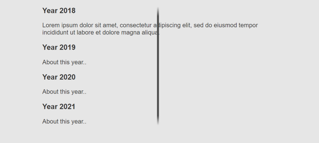
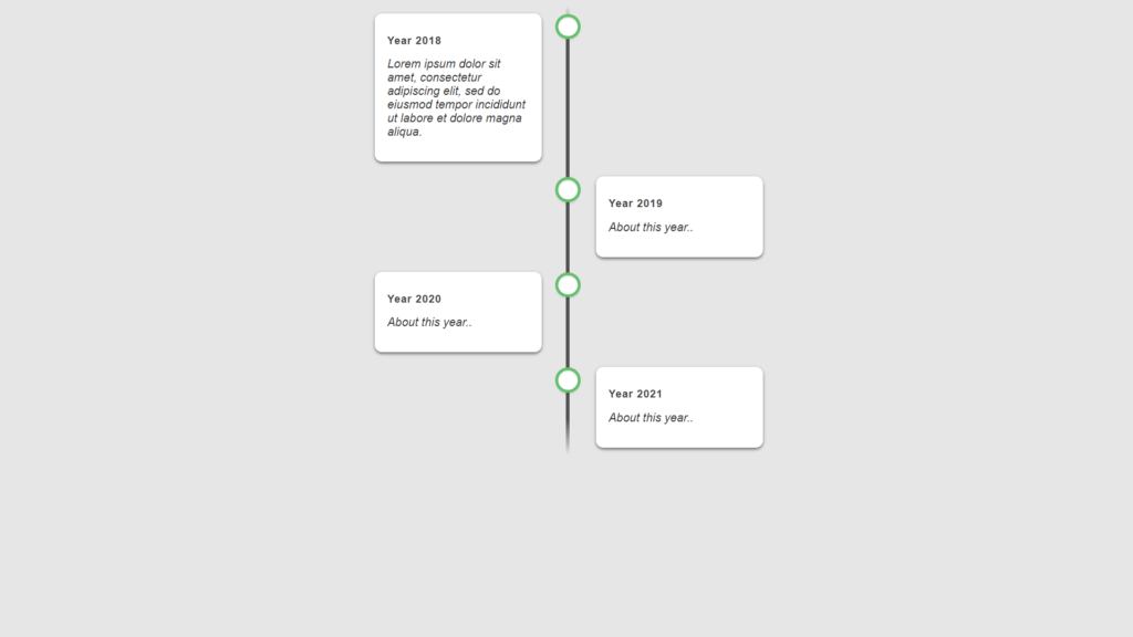
}Using the .text-wrapper class, we created the box with our desired measurements and position. Let’s check out what we have created up to now.
As you can see, the vertical line for our timeline has been created with round dots to show events. Even the information or content is visible on the left and right sides of our timeline, but it’s still incomplete as we can’t see the box background of the event contents.
Now, let’s modify the box containing the content of our timeline. Here’s how to modify the box of the content for each event.
.content {
padding: 15px 15px 15px 17px;
background: white;
border-radius: 10px;
box-shadow: 0 2px 4px rgb(0 0 0 / 50%);
}
.content h3 {
font-size: 14px;
color: #404040;
letter-spacing: 1px;
}
.content p {
font-weight: 300;
margin-top: 2px;
font-style: italic;
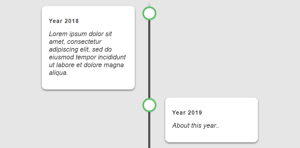
}We have defined padding for content box color padding, border-radius for circular corners, and background color inside the content class.
Next, we have defined the content of h3 to set the text property of the event heading to a dark color. You can also see, the font-style property is used to change the text to italic to make it look more like a description inside the <p> tag
Rendering the timeline
Now, after editing the structure we initially created with HTML, it’s time to compile our code. We will merge the CSS and HTML together into a single webpage.
A complete compilation of what we have done is shown below.
<!DOCTYPE html>
<html>
  <head>
    <style>
        html {
          font-family: Arial;
          background: rgb(230, 230, 230);
          color: rgb(50, 50, 50);
        }

        .main {
          position: relative;
          width: 600px;
          margin: 0 auto;
        }

        .main::after {
          content: "";
          position: absolute;
          width: 5px;
          background: linear-gradient(
            to bottom,
            rgba(80, 80, 80, 0) 0%,
            rgb(80, 80, 80) 8%,
            rgb(80, 80, 80) 92%,
            rgba(80, 80, 80, 0) 100%
          );
          top: 0;
          bottom: 0;
          left: 50.3%;
          margin-left: -3px;
        }

        .text-wrapper {
          padding: 10px 40px;
          position: relative;
          width: 51%;
          box-sizing: border-box;
        }

        .text-wrapper::after {
          content: "";
          position: absolute;
          width: 26px;
          height: 26px;
          right: -9px;
          top: 15px;
          border-radius: 50%;
          z-index: 1;
          box-shadow: 0 0 0 4px #59bf6a, inset 0 2px 0 rgb(0 0 0 / 8%),
            0 3px 0 4px rgb(0 0 0 / 5%);
          background: #ffffff;
        }

        .left {
          left: 0;
        }

        .right {
          left: 50%;
        }

        .right::after {
          left: -11px;
        }

        .content {
          padding: 15px 15px 15px 17px;
          background: white;
          border-radius: 10px;
          box-shadow: 0 2px 4px rgb(0 0 0 / 50%);
        }

        .content h3 {
          font-size: 14px;
          color: #404040;
          letter-spacing: 1px;
        }

        .content p {
          font-weight: 300;
          margin-top: 2px;
          font-style: italic;
        }
    </style>
  </head>

  <body>
    <div class="main">
      <div class="text-wrapper left">
        <div class="content">
          <h3>Year 2018</h3>
          <p>Lorem ipsum dolor sit amet, consectetur adipiscing elit, sed do eiusmod tempor incididunt ut labore et dolore magna aliqua.</p>
        </div>
      </div>
      <div class="text-wrapper right">
        <div class="content">
          <h3>Year 2019</h3>
          <p>About this year..</p>
        </div>
      </div>
      <div class="text-wrapper left">
        <div class="content">
          <h3>Year 2020</h3>
          <p>About this year..</p>
        </div>
      </div>
      <div class="text-wrapper right">
        <div class="content">
          <h3>Year 2021</h3>
          <p>About this year..</p>
        </div>
      </div>
    </div>
  </body>
</html>
Let’s take a look at the result.
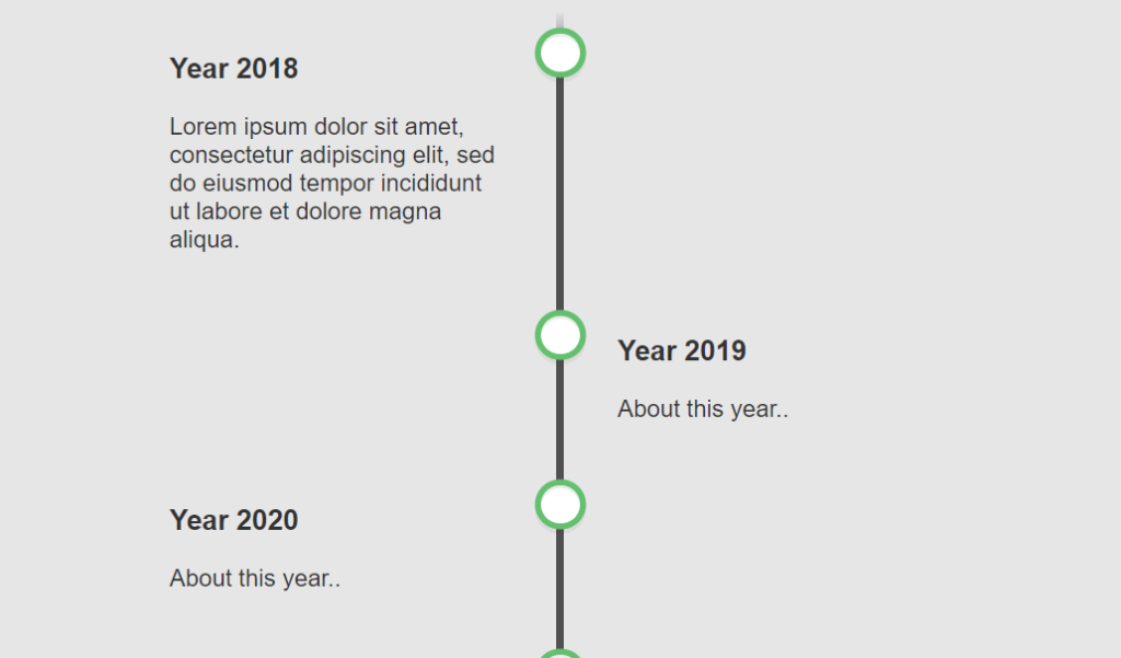
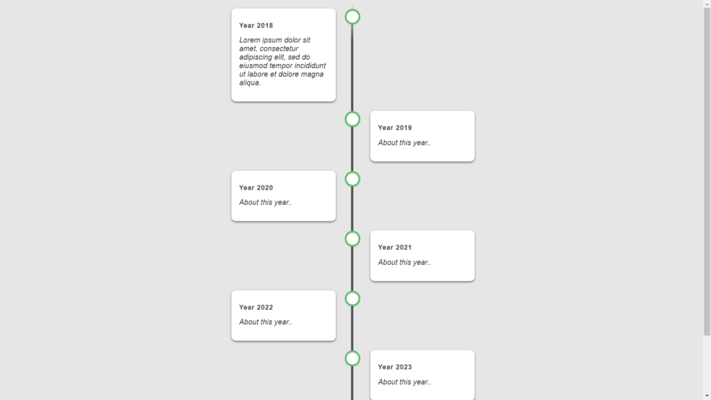
Adding more Events
You may wonder how to add more events to this timeline. It’s actually pretty easy. Each event is contained within a .text-wrapper div unit. You only need to copy this element group and set the .left and .right classes according to the order of the events. Here is the code block below.
<div class="text-wrapper left">
  <div class="content">
    <h3>Year number</h3>
    <p>Text Content</p>
  </div>
</div>
Now that we’ve added more events to the timeline, let’s check out what it looks like.
Spicing up the timeline with Color
It’s also easy to add different colors to the timeline. First, you must set the CSS font-colors to white in the .content h3 and the html classes.
html {
/* Styles */
color: rgb(255 255 255);
}
.content h3 {
/* Styles */
color: #ffffff;
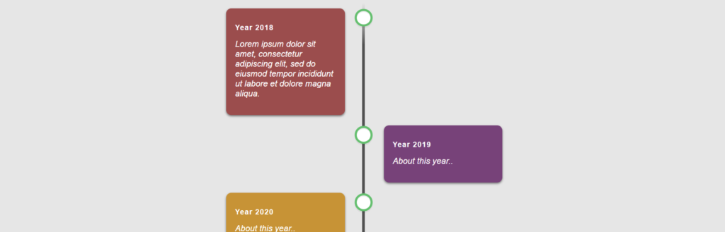
}You can use the inline style attribute to give the .content boxes different colors.
<div class="content" style="background: #9f4d4d;">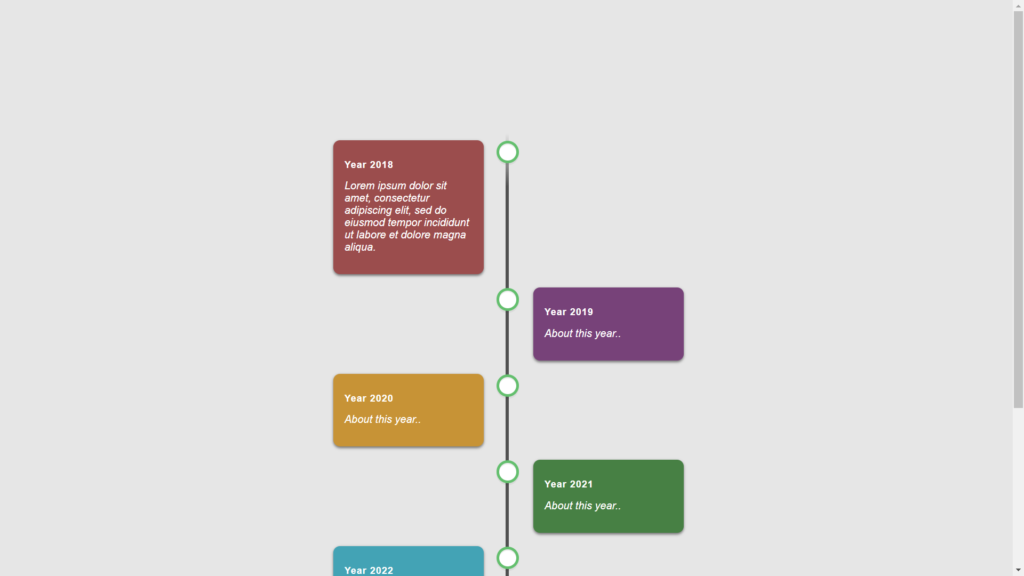
Conclusion
I hope the above steps, including codes and reference images in this article, will assist you in creating your timeline. A timeline can help display many data in one place or specific order. When you add aspects of an event to a CSS timeline, it might assist people in navigating the information they’re seeing.
You can also check out this scrollable and draggable timeline with GSAP. Michelle Barker has created a fancy timeline demo combining these two features. As you scroll down through the timeline, the years fly by, literally. Direct Link
Recommended Articles
- How To Build a JavaScript Retro Galactic Snake Game
- How To Create a Dynamic Select Box With the Select2 Library
- How To Create a Page Loader Using HTML and CSS
- How To Create Alert Buttons With CSS