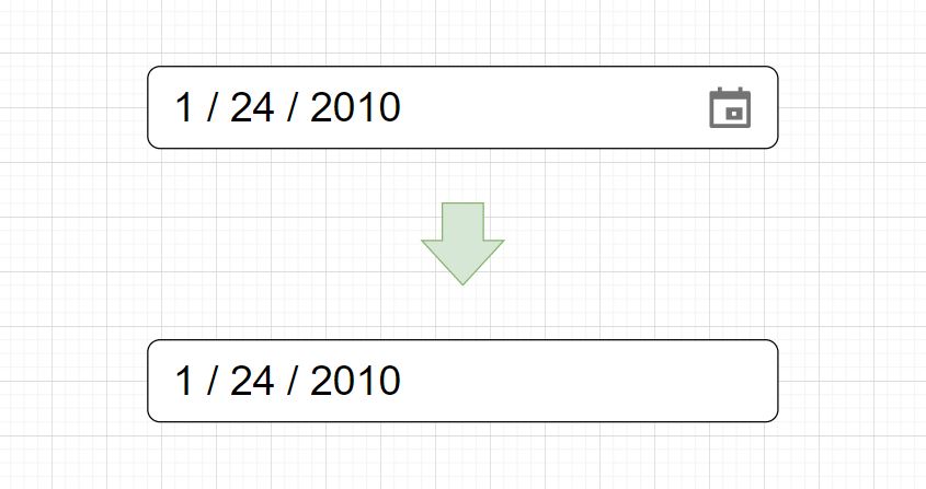
This tutorial demonstrates how to remove the calendar on the HTML input type date. Included is a walkthrough example, code, and a live demo.

- How To Remove the Icon From a Date Input?
- Creating an Input Type Date
- Removing the Calendar Icon
- Project Code
- See Also
A calendar icon on an HTML input type date (input[type=”date”]) can be removed using CSS selectors and properties that target the input element calendar-picker-indicator. When removing a calendar icon, we need to use a ::-webkit-calendar-picker-indicator pseudo-element, as the calendar icon cannot be selected using standard CSS selectors.

This section creates a styled date picker before we move on to removing the icon. This helps to spice up the example to be more visually helpful, so adding the extra HTML and CSS isn’t necessary, but it helps with the demonstration.
To begin creating a webpage with an input type date, we need to create two div elements to move the input element to the center of a web page. First, we will create a div element and a second div as a child. Once we have both div elements, we can create an HTML input element with a type attribute set to date. Something like this: DIV > DIV > INPUT. The first DIV element will have a class named .super-container, and the second will be .container. As you see below, the HTML code fits on a few lines.
<div class="super-container">
  <div class="container">
    <input type="date">
  </div>
<div>
Rendering this HTML will create a generic HTML date picker element like the one below but without any CSS styling.

Suppose we made the date selector a bit more interesting before we removed the calendar icon. In that case, we could render an input element with custom styling, as in the image below.

Here is the CSS for a styled date input before we move on to removing the calendar icon.
html,
body {
  height: 100%;
  overflow: hidden;
  margin: 0;
}

.super-container {
  background: linear-gradient(60deg, rgb(39 28 86) 0%, rgb(0 85 96) 100%);
  height: 100%;
  width: 100%;
}

input[type="date"]::-webkit-inner-spin-button,
input[type="date"]::-webkit-calendar-picker-indicator {
  filter: invert(1);
}

input {
  background: linear-gradient(
    60deg,
    rgba(84, 58, 183, 1) 0%,
    rgba(0, 172, 193, 1) 100%
  );
  border-radius: 10px;
  border: none;
  line-height: 80px;
  width: 400px;
  padding: 0 20px;
  box-shadow: 0 4px 8px rgb(0 0 0 / 50%);
  outline: none;
  color: white;
  font-size: 22px;
}

input::placeholder {
  color: white;
}

.container {
  -webkit-box-align: center !important;
  -ms-flex-align: center !important;
  align-items: center !important;
  -webkit-box-pack: center !important;
  -ms-flex-pack: center !important;
  justify-content: center !important;
  display: -webkit-box !important;
  display: -ms-flexbox !important;
  display: flex !important;
  height: 100%;
}
This section will remove a calendar icon using CSS styles and properties.

We need to remove the calendar icon from the input element above. Below is an image of the input element with the calendar icon removed. To make the icon disappear, we need to utilize a few CSS properties and a unique selector, which is required to achieve this effect.

Removing an icon is simple; we will use two WebKit pseudo-element keywords with the CSS display and WebKit Appearance properties. The CSS pseudo-elements we are using are -webkit-inner-spin-button and -webkit-calender-picker-indicator. We combine these keywords with the CSS input[type="date"] selector, targeting the date picker element.
Included within the braces, we use the CSS properties display and -webkit-appearance. Both of these properties will have a value set to none.
Below are the full CSS selector and properties to remove a date picker calendar icon.
input[type="date"]::-webkit-inner-spin-button,
input[type="date"]::-webkit-calendar-picker-indicator {
    display: none;
    -webkit-appearance: none;
}
Here are the entire CSS stylesheet and HTML used in this project.
<div class="super-container">
  <div class="container">
    <input type="date">
  </div>
<div>
html,
body {
  height: 100%;
  overflow: hidden;
  margin: 0;
}

.super-container {
  background: linear-gradient(60deg, rgb(39 28 86) 0%, rgb(0 85 96) 100%);
  height: 100%;
  width: 100%;
}

input[type="date"]::-webkit-inner-spin-button,
input[type="date"]::-webkit-calendar-picker-indicator {
  display: none;
  -webkit-appearance: none;
}

input {
  background: linear-gradient(
    60deg,
    rgba(84, 58, 183, 1) 0%,
    rgba(0, 172, 193, 1) 100%
  );
  border-radius: 10px;
  border: none;
  line-height: 80px;
  width: 400px;
  padding: 0 20px;
  box-shadow: 0 4px 8px rgb(0 0 0 / 50%);
  outline: none;
  color: white;
  font-size: 22px;
}

input::placeholder {
  color: white;
}

.container {
  -webkit-box-align: center !important;
  -ms-flex-align: center !important;
  align-items: center !important;
  -webkit-box-pack: center !important;
  -ms-flex-pack: center !important;
  justify-content: center !important;
  display: -webkit-box !important;
  display: -ms-flexbox !important;
  display: flex !important;
  height: 100%;
}
Here is a live demo of this example hosted on codepen.io
- How to Create CSS Color Palettes
- How To Remove the Arrows on HTML Input Type Number
- How To Create HTML and CSS Emoji Icons
- How To Create CSS Gradient Buttons
- How To Create a Black and White Image Using CSS Grayscale