AppCode
This tutorial demonstrates how to create HTML animated buttons using CSS animations. Included are CSS keyframes and properties to recreate. (Updated February 22, 2022)
Using a CSS button adds a layer of interaction to your website and increases user engagement. We use CSS animations to make these buttons more appealing to the user, and the animation positively affects the engagement levels.
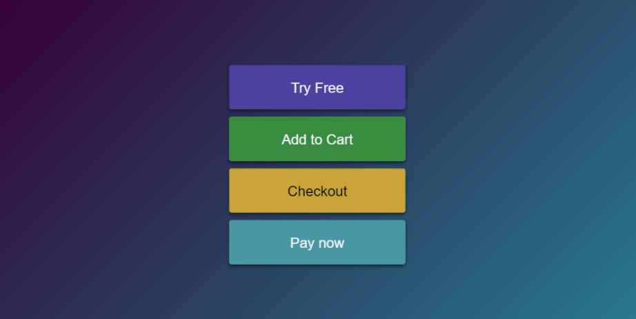
CSS Buttons Example
Why use a CSS Button?
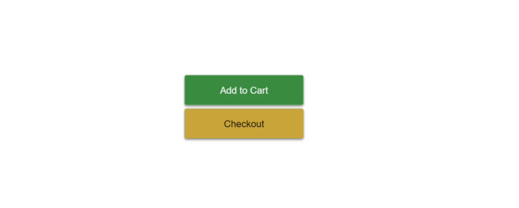
Engagement is significant for websites that generate revenue. For example, e-commerce sites engage customers with add-to-cart or checkout buttons.
On the other hand, Blogs want users to click recommendation buttons to serve readers more content. With either model, buttons and CSS are a fun part of the process.
Suppose you are starting or are building products for customers. A solution is to add a few buttons with animations to engage users with content. Without them, users will arrive on a less attractive webpage.
Getting Started
In this tutorial, we use CSS animations. The buttons include a CSS animation to scale in and out. Let’s make this button by using the example below. To start, we need to make a div container wrapping a button element to display the button.
<div class="container">
  <div class="parent">
    <button class="try-free">Try Free</button>
    <button class="add-cart">Add to Cart</button>
    <button class="checkout">Checkout</button>
    <button class="paynow">Pay now</button>
  </div>
</div>
Second, we define the style of the parent container below to center the buttons vertically on the page. This is done using the .container class and an HTML div element.
.container {
  width: 100%;
  background: transparent;
  text-align: center;
  -webkit-box-align: center !important;
  -ms-flex-align: center !important;
  align-items: center !important;
  -webkit-box-pack: center !important;
  -ms-flex-pack: center !important;
  justify-content: center !important;
  display: -webkit-box !important;
  display: -ms-flexbox !important;
  display: flex !important;
  height: 100%;
}
The CSS styles below name an animation called “float”. The CSS style executes “float” when the page is loaded, triggering the animation. The button now animates a scaling effect with a duration of 2 seconds and an infinite time. This CSS animation will stop when the page is closed by the user.
Now we have our primary container and HTML written. It’s time to give the button its CSS style.
.parent button:hover {
  background: #6f5de0;
  border-color: #6f5de0;
}

button {
  margin: 0 auto;
  width: 200px;
  height: 50px;
  animation-name: float;
  animation-timing-function: ease-in-out;
  animation-duration: 2s;
  animation-direction: alternate;
  animation-iteration-count: infinite;
  text-align: center;
  line-height: 50px;
  font-size: 16px;
  font-weight: 500;
  border-radius: 3px;
  display: block;
  cursor: pointer;
  padding: 0 16px;
  transition: all 250ms;
  box-shadow: 0 2px 4px rgb(0 0 0 / 50%);
  margin: 10px auto;
}

.try-free {
  color: #f4f5f7;
  background: #4d3fa3;
  border: 1px solid #4d3fa3;
}

.paynow {
  color: #f4f5f7;
  background: #3f97a3;
  border: 1px solid #3fa3a0;
}

.add-cart {
  color: #f4f5f7;
  background: #2d8b3b;
  border: 1px solid #3fa33f;
}

.checkout {
  color: #000000;
  background: #cba631;
  border: 1px solid #b5a732;
}
Last, we will finally add the animation style. This style is actually called a CSS keyframe. This keyframe animation uses the transform scale property and changes the scale of the buttons by 0.1.
@keyframes float {
  from {
    transform: scale(1, 1);
  }
  to {
    transform: scale(1.1, 1.1);
  }
}
The Full CSS and HTML Snippet
Full HTML Code to build the structure of buttons:
<div class="container">
  <div class="parent">
    <button class="try-free">Try Free</button>
    <button class="add-cart">Add to Cart</button>
    <button class="checkout">Checkout</button>
    <button class="paynow">Pay now</button>
  </div>
</div>
Full CSS code to renders the CSS buttons with styles:
html,
body {
  height: 100%;
  font-family: "Roboto", arial, sans-serif;
  background-color: #0cbaba;
  background-image: linear-gradient(315deg, #0cbaba 0%, #380036 74%);
  margin: 0;
}

.parent button:hover {
  background: #6f5de0;
  border-color: #6f5de0;
}

button {
  margin: 0 auto;
  width: 200px;
  height: 50px;
  animation-name: float;
  animation-timing-function: ease-in-out;
  animation-duration: 2s;
  animation-direction: alternate;
  animation-iteration-count: infinite;
  text-align: center;
  line-height: 50px;
  font-size: 16px;
  font-weight: 500;
  border-radius: 3px;
  display: block;
  cursor: pointer;
  padding: 0 16px;
  transition: all 250ms;
  box-shadow: 0 2px 4px rgb(0 0 0 / 50%);
  margin: 10px auto;
}

.try-free {
  color: #f4f5f7;
  background: #4d3fa3;
  border: 1px solid #4d3fa3;
}

.paynow {
  color: #f4f5f7;
  background: #3f97a3;
  border: 1px solid #3fa3a0;
}

.add-cart {
  color: #f4f5f7;
  background: #2d8b3b;
  border: 1px solid #3fa33f;
}

.checkout {
  color: #000000;
  background: #cba631;
  border: 1px solid #b5a732;
}

@keyframes float {
  from {
    transform: scale(1, 1);
  }
  to {
    transform: scale(1.1, 1.1);
  }
}

.container {
  width: 100%;
  background: transparent;
  text-align: center;
  -webkit-box-align: center !important;
  -ms-flex-align: center !important;
  align-items: center !important;
  -webkit-box-pack: center !important;
  -ms-flex-pack: center !important;
  justify-content: center !important;
  display: -webkit-box !important;
  display: -ms-flexbox !important;
  display: flex !important;
  height: 100%;
}
To fork or edit this animation. Just click the link below to visit the code on codepen.io https://codepen.io/anon/pen/aXVKNy You can find the complete example of the tutorial below.
Recommended Articles
- How To Create Alert Buttons With CSS
- How To Create CSS Gradient Buttons
- How To Create CSS Inset Shadow Buttons
- 20 Animated CSS Buttons With Examples and Code