AppCode
This article demonstrates the different functions of the CSS filter property and how to use its effects, with examples and documentation.
The CSS filter property applies different effects to HTML elements, such as contrast, blur, drop-shadow, hue, etc. These effects often adjust the look of backgrounds and other elements. There are several functions available in the property to achieve predefined effects. You can also use an SVG filter similar to the mask property, and they can be created using a URL associated with an SVG element.
Filters in web development are commonly used to adjust a rendering and view of an element, image, background, or border. In this article, we will review the syntax, and a few different function values, using global values, animating with the property, walking through several examples, and looking at facts and questions related to this topic.
Syntax
When using a filter property, the syntax can either be a single function, multiple function values, or a URL for an SVG element.
filter: <filter-function> | <url>CSS SVG Filter
The filter property’s url() function takes an XML file’s location using a string that specifies an SVG filter. This string may include an anchor to a specific filter element within an SVG. Example: filter: url(svg-url#element-id).
For reference to an SVG <filter> element, use the following:
/* Using a SVG URL as a value to the property */
filter: url("filter.svg#element-id");
CSS Filter Functions
To use a CSS filter property, specify a value to pass to the following function in the bracket: <property>: { function() }. For example, filter: blur(2px).
If a value for a function is invalid, the function returns “none.” Except where noted, the filter functions that accept a value as a percent sign can also receive a value expressed as a decimal, such as 30% would equal 0.30.
There are many functions to use for the value of a filter property. Below is a list of the available functions, short definitions, and examples.
<filter-function> = <blur()> | <brightness()> | <contrast()> | <drop-shadow()> | <grayscale()> | <hue-rotate()> | <invert()> | <opacity()> | <saturate()> | <sepia()>
/* <filter-function> values */

blur(5px)
brightness(0.4)
contrast(200%)
drop-shadow(16px 16px 20px blue)
grayscale(50%)
hue-rotate(90deg)
invert(75%)
opacity(25%)
saturate(30%)
sepia(60%)

/* Example */
filter: opacity(25%);
Let’s review the available functions, their syntax, and links to a more detailed definition of the property values.
blur()
The CSS blur() function applies a Gaussian blur to a target element or image.
filter: blur(5px) | blur(5px) | blur(1rem);brightness()
The CSS brightness() function applies a linear multiplier to a target element or image, making it appear more or less bright.
filter: brightness(2);

/* both values same... */
filter: brightness(0.5) | brightness(50%)
contrast()
The CSS contrast() function adjusts the contrast of a target element or image.
filter: contrast(200%);

/* both values same... */
filter: contrast(4) | contrast(400%);
drop-shadow()
The CSS drop-shadow() function applies a drop-shadow effect to a target element or image.
filter: drop-shadow(16px 16px 10px black);

filter: drop-shadow(2px 2px 5px rgb(0 0 0 / 0.5));
filter: drop-shadow(4px 4px red); /* no blur */
grayscale()
The CSS grayscale() function converts an element or image to a grayscale.
filter: grayscale(100%);

/* both values same... */
filter: grayscale(20%) | grayscale(0.2);
hue-rotate()
The CSS hue-rotate() function applies a hue rotation on a target element or image.
filter: hue-rotate(90deg);

/* both values same... */
filter: hue-rotate(180deg) | hue-rotate(0.5turn);
invert()
The CSS invert() function inverts the samples in a target element or image.
filter: invert(100%)opacity()
The CSS opacity() function applies transparency to a target element or image.
filter: opacity(50%)saturate()
The CSS saturate() function saturates a target element or image.
filter: saturate(200%)

/* both values same... */
filter: saturate(2) | saturate(200%);
sepia()
The CSS sepia() function converts a target element or image to sepia.
filter: sepia(100%);

/* both values same... */
filter: sepia(0.8) | sepia(80%);
url()
The CSS url() function for filter takes a location string of an XML file that specifies an SVG filter and may consist of an anchor to a specific filter element. The SVG may be embedded in an externally included XML file. Example:
filter: url(svg-url#element-id)
Here’s a tutorial demonstrating a nice intro to SVG filters with a fun demo and another article using SVG gradient maps.
filter: url(resources.svg#c1)CSS Multiple Filters
You may combine functions to manipulate a rendering of a target element or image. However, the order still matters (i.e., using opacity(0) after brightness(100%) will still create in completely transparent effect). Multiple functions can be used by using spaces to separate the function names. In the example below, we use three functions, opacity, brightness, and grayscale. You can see these three functions used below.
/* Combining multiple values */
filter: grayscale(25%) brightness(10%) opacity(60%);
The following example provided below enhances the contrast and brightness of an element or image:
/* Using two values */
filter: contrast(125%) brightness(105%)
CSS Filter None
The filter: none; property sets the value of the filter to none. No effects are applied to a target element or image when the value is none. The none value is also practical when using animations in CSS because you can transition from a filter function to a value of none to remove an effect. In summary, this value helps remove an existing filter.
/* Use none as a value for no effect */
filter: none;
CSS Filter Global Values
A few global values are allowed for the filter property, such as inherit, revert, unset, etc. You can see all the global values below.
/* Global values */
filter: inherit;
<property>: initial;
<property>: revert;
<property>: revert-layer;
<property>: unset;
Usage
You can apply a filter property to any element or image by using CSS selectors. The filter property can be applied to most elements, and SVG applies to container elements but excludes the <defs> element and all graphic elements.
The selectors below use an ID select, element name, and class name to apply the properties to the target elements.
#element-id {
  filter: sepia(87%);
}

img {
  filter: grayscale(50%);
}

.element-class {
  filter: hue-rotate(90);
}
Animating With Filters
Since filters are animatable, they can open a few doors for a lot of fun. In the animation below, we animate a sepia and a saturation rendering using keyframes. The sepia starts at 0, transitions to 1 at 50%, and then back to 0. On the other hand, the saturation changes from 2 to 8, then back to 2.
@keyframes filter-animation {
  0% {
    filter: sepia(0) saturate(2);
  }

  50% {
    filter: sepia(1) saturate(8);
  }

  100% {
    filter: sepia(0) saturate(2);
  }
}
Interpolation
A quick definition of interpolation is to insert something different into something else. In CSS, a filter property uses interpolation in animating with the property function values. For example, if keyframe filters have a function list of the same length minus a url() value, each property is interpolated according to its rules. If they have different sizes, the missing equivalent functions from a longer list are added to the end of a shorter list using their initial values.
Examples Using the Property
Let’s review a few examples of using a few functions with their rendering effects against images and a filter with an SVG.
Applying Functions to Images
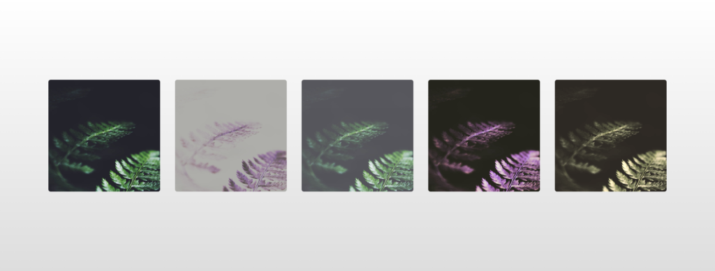
The example above uses a filter to apply five different effects to the same images. Effects are listed in this order, sepia, invert, opacity, hue-rotate, and sepia. We utilized the :nth-child() pseudo-class select to select each image using a number between 1 and 5 and then apply an effect using a filter property.
HTML
<div class="wrapper">
  <img src="https://s3-us-west-2.amazonaws.com/s.cdpn.io/46992/noah-silliman-141979.jpg" alt="" />
  <img src="https://s3-us-west-2.amazonaws.com/s.cdpn.io/46992/noah-silliman-141979.jpg" alt="" />
  <img src="https://s3-us-west-2.amazonaws.com/s.cdpn.io/46992/noah-silliman-141979.jpg" alt="" />
  <img src="https://s3-us-west-2.amazonaws.com/s.cdpn.io/46992/noah-silliman-141979.jpg" alt="" />
  <img src="https://s3-us-west-2.amazonaws.com/s.cdpn.io/46992/noah-silliman-141979.jpg" alt="" />
</div>
CSS
.wrapper img {
  width: 300px;
  height: 300px;
  object-fit: cover;
  border-radius: 6px;
  margin: 0 20px;
  vertical-align: middle;
}

.wrapper img:nth-child(1) {
  filter: sepia(0%);
}

.wrapper img:nth-child(2) {
  filter: invert(75%);
}

.wrapper img:nth-child(3) {
  filter: opacity(75%);
}

.wrapper img:nth-child(4) {
  filter: hue-rotate(180deg);
}

.wrapper img:nth-child(5) {
  filter: sepia(75%);
}

html {
  text-align: center;
  min-height: 100%;
  background: linear-gradient(white, #ddd);
}

.wrapper {
  width: 100%;
  background: transparent;
  text-align: center;
  -webkit-box-align: center !important;
  -ms-flex-align: center !important;
  align-items: center !important;
  -webkit-box-pack: center !important;
  -ms-flex-pack: center !important;
  justify-content: center !important;
  display: -webkit-box !important;
  display: -ms-flexbox !important;
  display: flex !important;
  height: 100%;
}

html,
body {
  height: 100%;
  margin: 0;
}
Applying SVG Functions and Effects
Here are two examples of using a URL function value with an SVG filter resource as followed:
.target {
  filter: url(#c1);
}

.mydiv {
  filter: url(commoneffects.xml#large-blur);
}
Specifications
W3C CSS Filter Effects Module Level 1
#definitions
Frequently Asked Questions
Here is a list of frequently asked questions related to the CSS filter property, such as how to apply it, what it is, what a URL value is, and how to use SVGs with the effects and functions.
How to apply CSS filters?
- Create elements or images and add them to a website or page…
- Add an ID or class attribute to an element or <img> image element…
- Make a CSS stylesheet or use an inline <style> element…
- Write a CSS style and select an <img> or element with the appropriate selector…
- Give a style a filter property with a value for the effect you want…
What is the filter property in CSS?
When using a CSS filter property, you can apply graphical effects like blur, opacity, color shift, sepia, and grayscale to an element or image on a website or page. The filters are commonly used to adjust the rendering of images, backgrounds, elements, and borders. The CSS standard includes several functions that achieve predefined effects with parameters to change the desired effect amount.
How to use an SVG filter in CSS?
To use an SVG filter in CSS, use the url() keyword, define a URI that defines an SVG file, and reference a filter with an id. That’s it!
Here is a tool that uses presets for SVG filters and demonstrates the power they can achieve when rendering elements or images.
What is a filter URL value in CSS?
The url() function refers to an SVG element that will be applied to the element via the CSS filter property. The reference to an effect is an XML file location that specifies an SVG filter, and this string location may include an anchor to an SVG filter element.