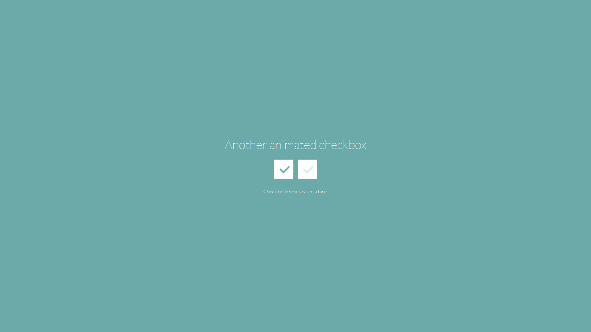
By default, the checkbox is an HTML form element shown as a small square-shaped box. They are used to collect user input. When a user selects a checkbox, it becomes ticked; thus, the name checkbox. CSS Checkbox styling can be used to improve the appearance of the element.
They will have a default appearance if no CSS checkbox style is applied. Unfortunately, your website will seem the same as other websites that use default checkboxes, making it appear not very interesting. As a result, styling the element is critical to making your website stand out.
It would help if you hid the default checkbox before you could style it. You can then use your imagination to style and make the element appealing.
Users can use a checkbox to choose one or more options from a list. As a result, it is a crucial HTML form element if you wish to provide several alternatives to your users and allow them to select one or more possibilities. On the other hand, a radio button is better if you want to prevent users from setting only one choice.
Note:
⦁ “~” is the sibling combinator, which picks all items preceding the previous selection.
⦁ When the user hovers over the checkbox, “: hover” is used to style it (the checkbox). The color turns yellow when you move the mouse pointer over the checkbox.
⦁ When the checkbox is active, “: active” is used to style it. When you click the checkbox, you will see a red color followed by a green hue.
Meanwhile, radio buttons are similar to checkboxes. However, checkboxes represent single values, whereas radio buttons are combined to form a single set. As a result, radio buttons only enable you to pick a single deal, but checkboxes allow you to select many alternatives.
It is also important to note that browsers have their UI design by default, but you can use CSS to style the checkbox and give your website or app a distinctive appearance.
You may have noticed that there are a lot of checkbox styles with all of the varied platforms, devices, and UI styles; this post is about: showing off some fantastic CSS checkbox styles.
In pure CSS, we’ll design fatigue, cross-browser, theme-able, scalable checkboxes with the following features:
⦁ Theme-ability em that it is for relative sizing
⦁ currentColor and CSS custom properties
⦁ The use of pseudo items in the “: checked” indicator
⦁ CSS grid layout for input and label alignment
Examples of Checkboxes Designed with CSS
A checkbox might be difficult to style. This is why reading through some simple examples is the easiest way to learn how to style a CSS checkbox. For this example, we will create a custom checkbox by combining different pseudo-classes such as checked, before, and after. Anytime a checkbox is chosen, a ripple effect appears across the checkbox, making it more appealing.
Setting Checkbox CSS Size using Transform Property
Google Chrome and Microsoft Edge operate fine using the height and width properties. However, the height and width properties do not function properly on Mozilla Firefox or Safari.
Despite the clickable size being as specified in the code in these browsers, the checkbox’s default size will not change. The converted property can be utilized to get around this. In all browsers, the transform property enables setting the appropriate height and width for the checkbox.
<input type="checkbox" class="Size" name="Box2" checked>
Here’s the CSS
Other Examples
This high-quality and hand-picked collection shows CSS checkboxes from across the web. Included are links with examples and code for use on your website.
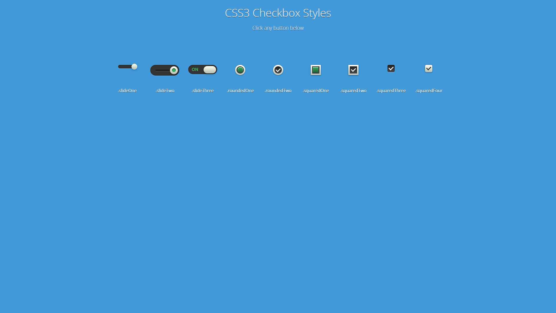
Multiple Gray CSS Checkbox Styles
About Project
Links
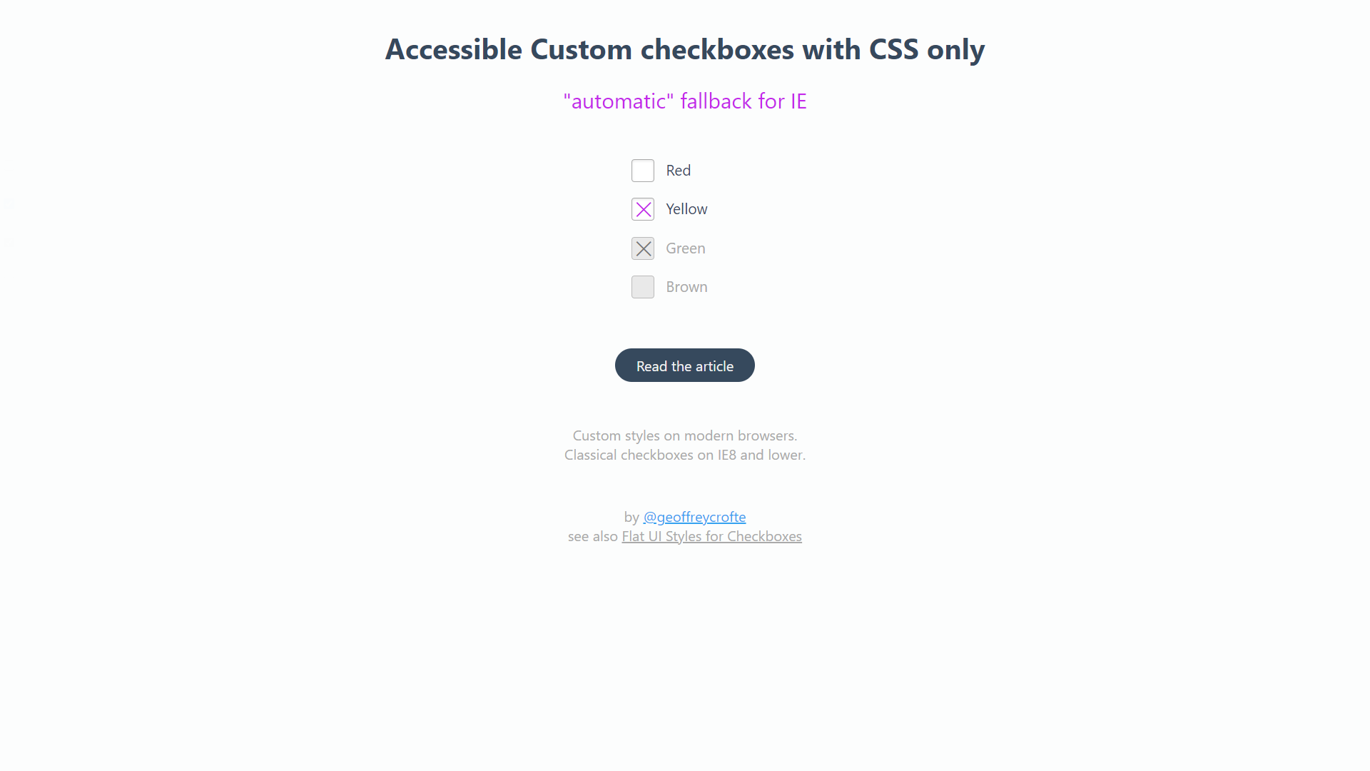
Accessible Custom CSS Checkboxes With Only CSS
About Project
Links
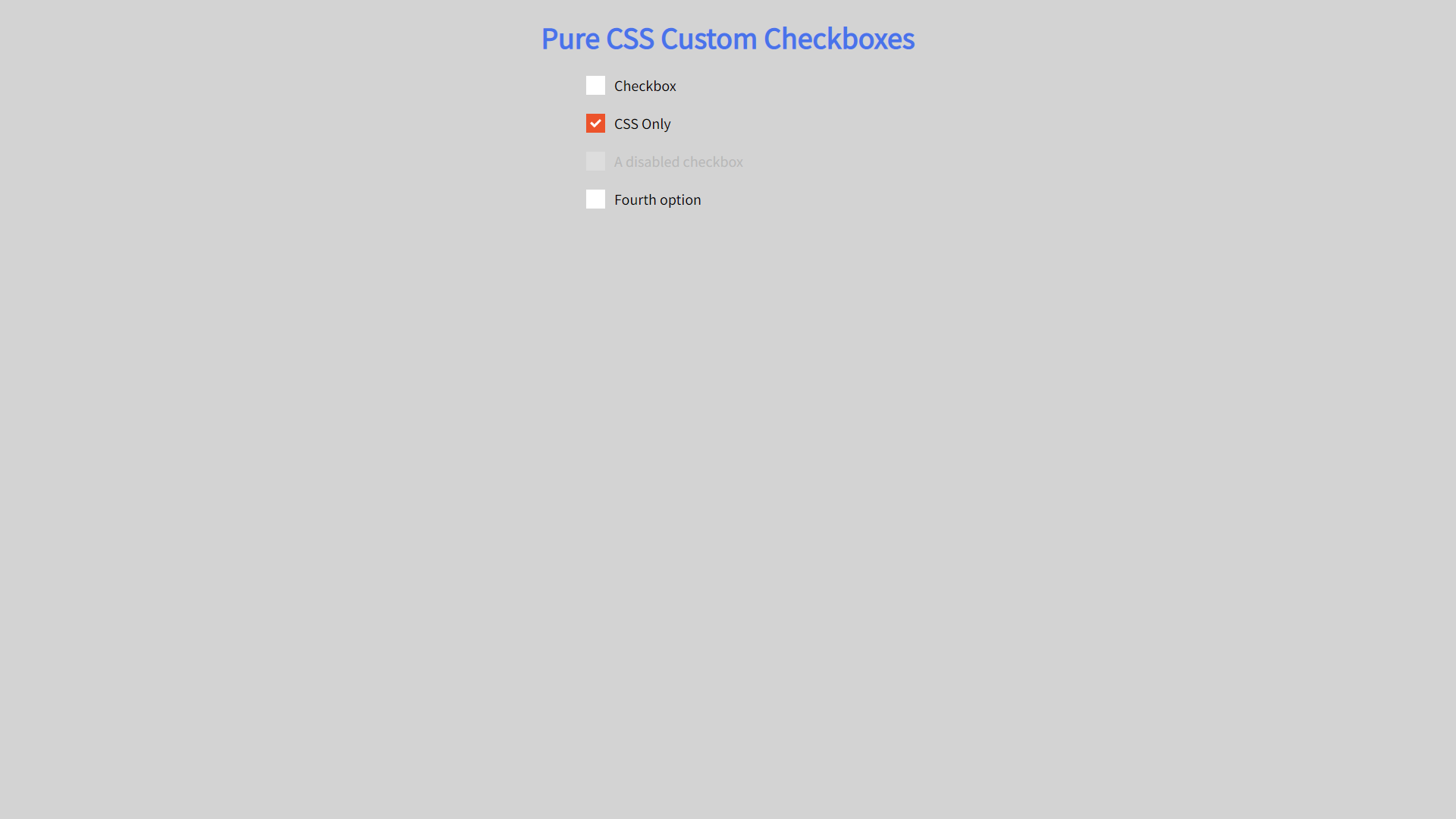
Pure Custom CSS Checkboxes
About Project
Links
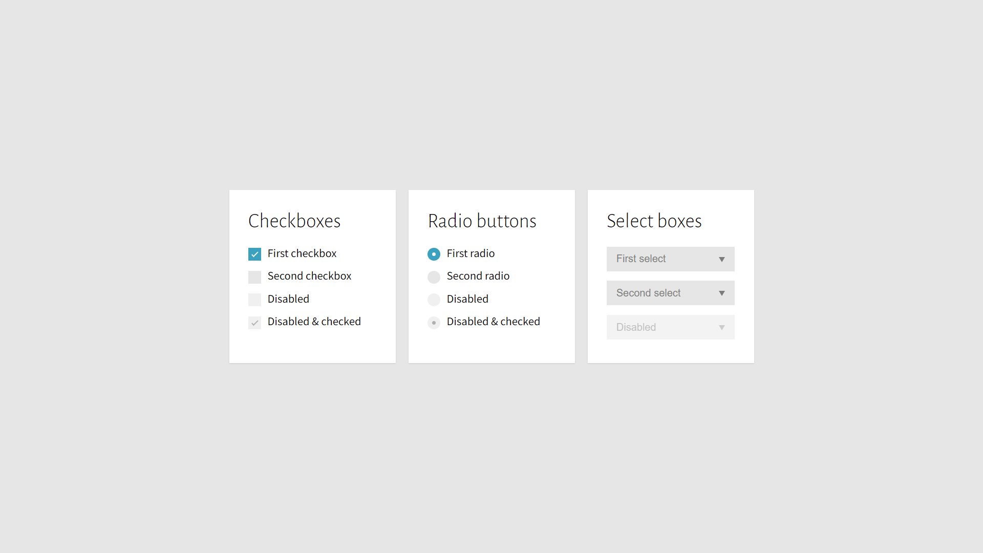
Completely Custom CSS Checkboxes
About Project
Links
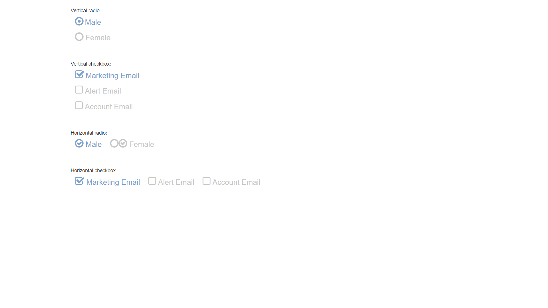
Touch Friendly Bootstrap Radio Buttons and Checkboxes
About Project
Links
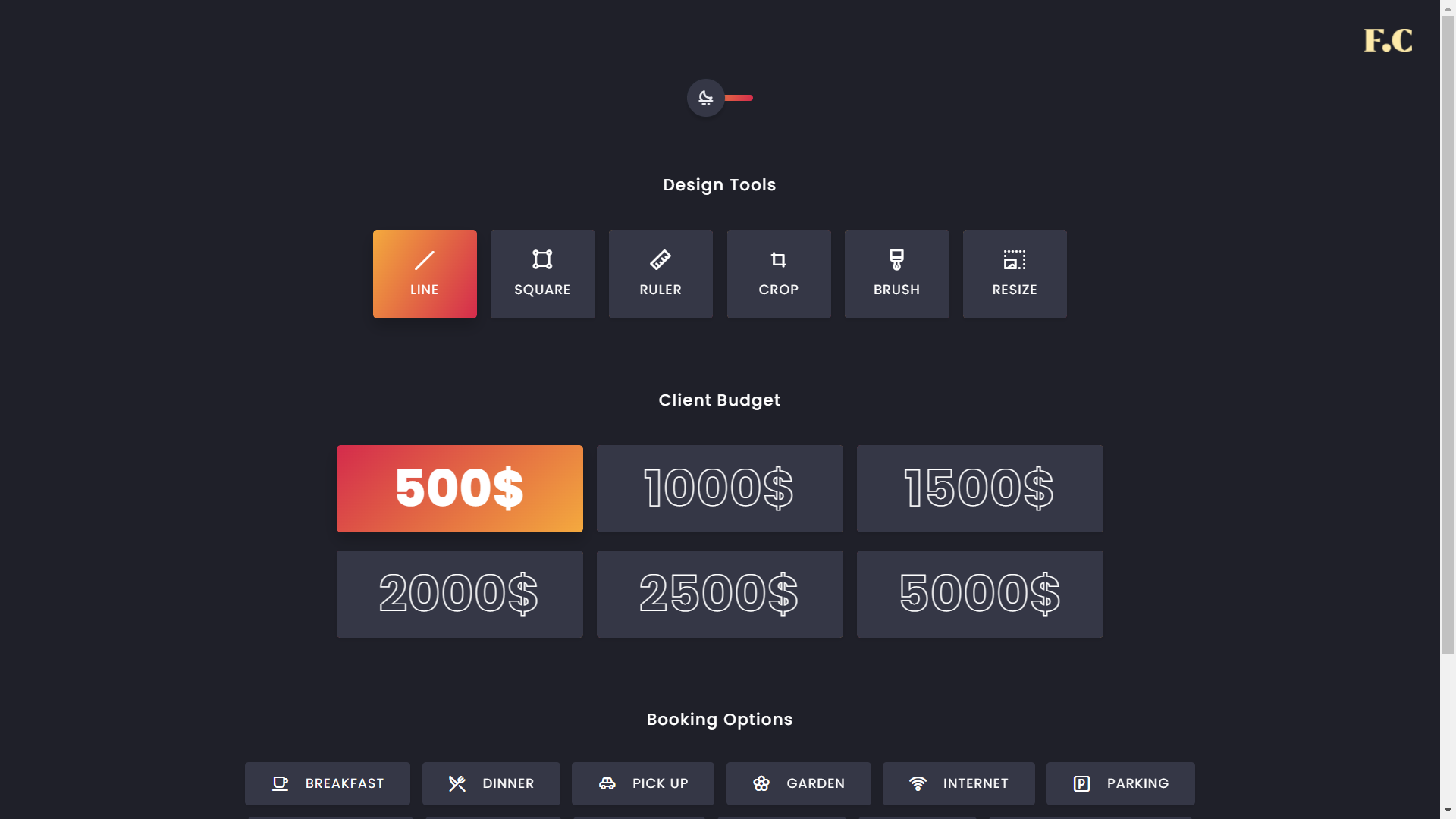
Dark Theme Pure CSS Checkboxes
About Project
Links
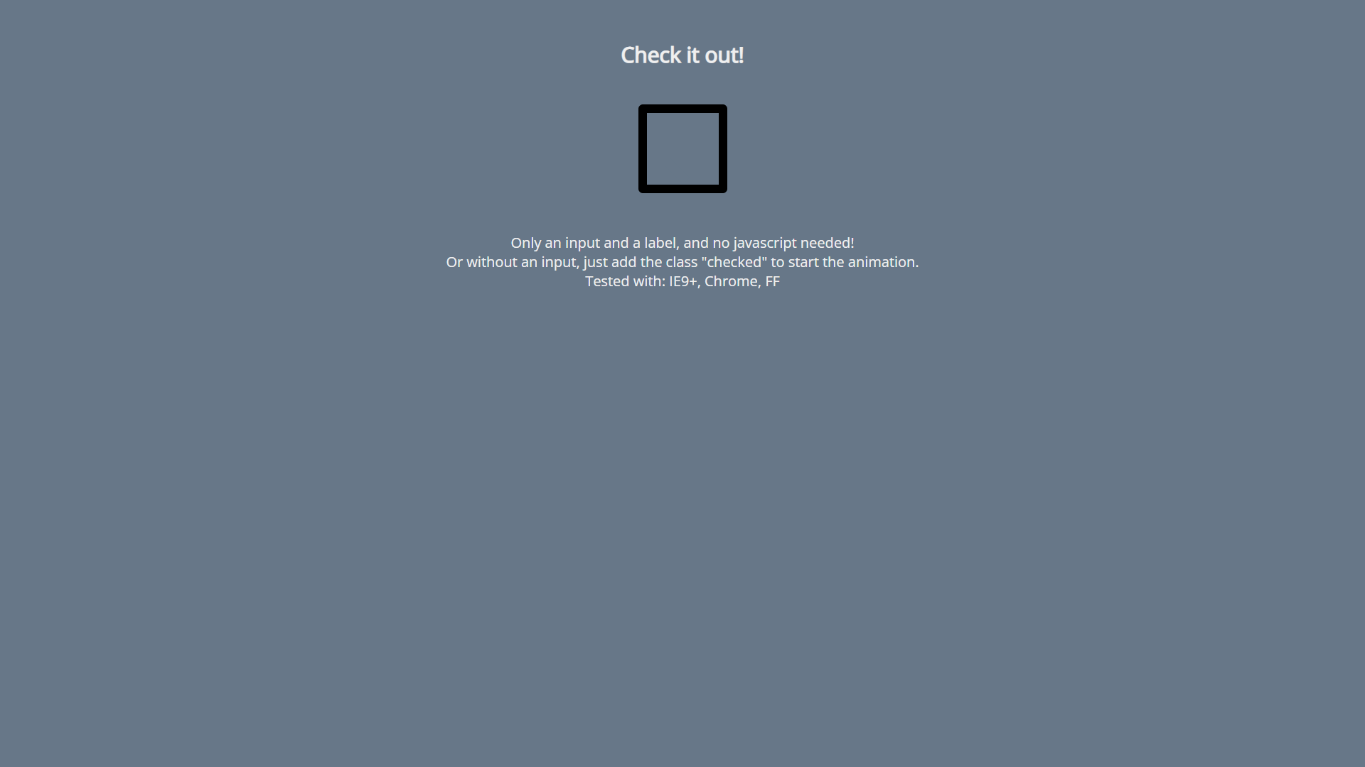
Green Animated CSS Checkbox
About Project
Links
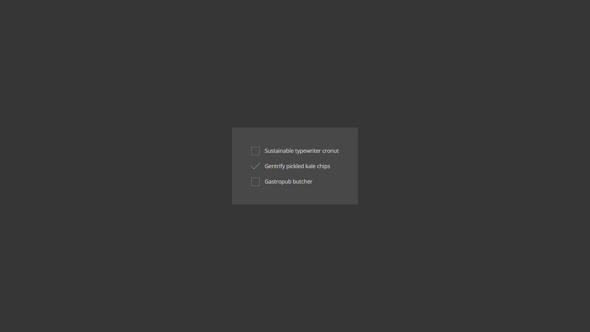
Dark Custom CSS Checkboxes
About Project
Links
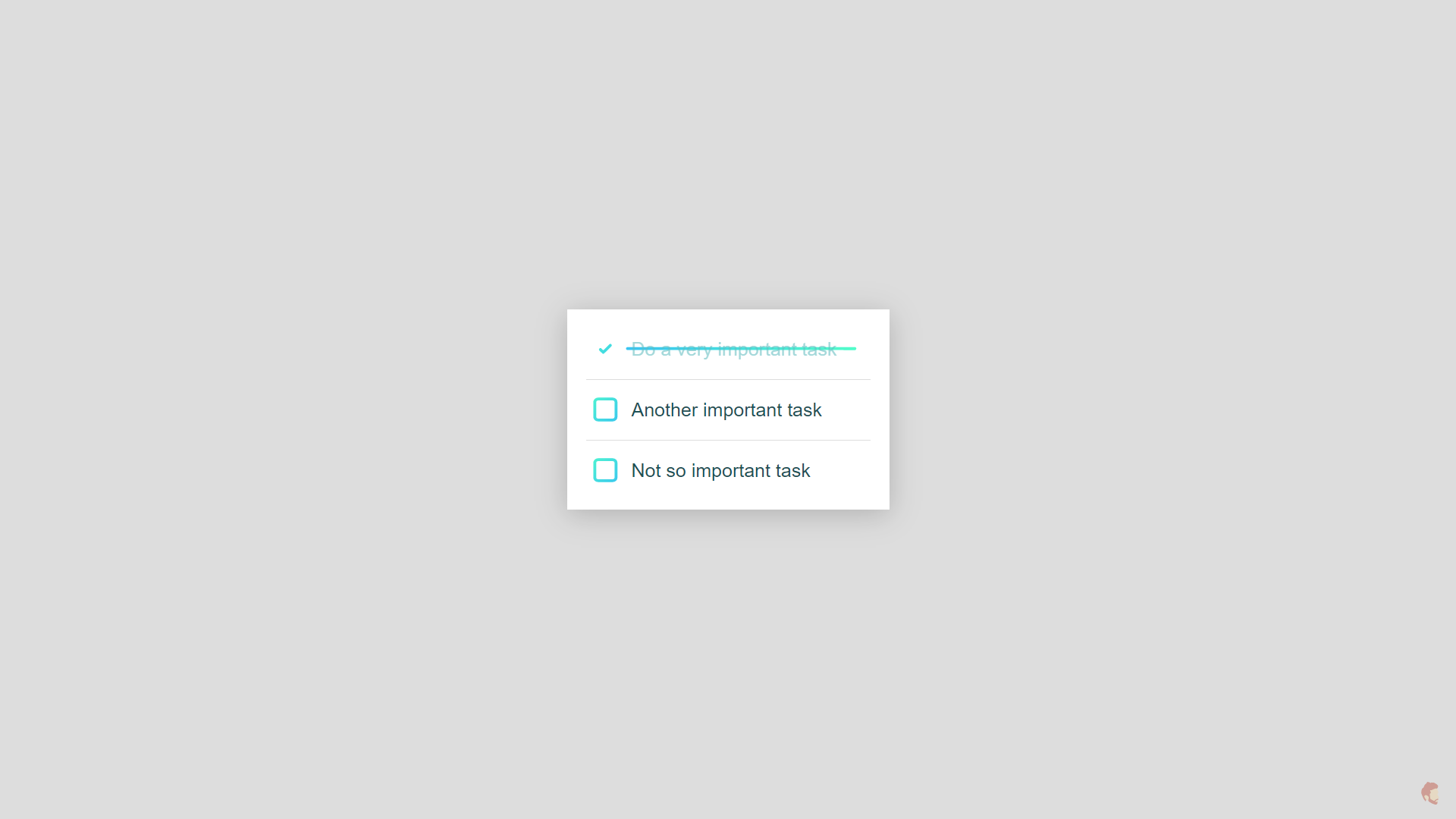
CSS Only Todo List Checkbox Animation
About Project
Links
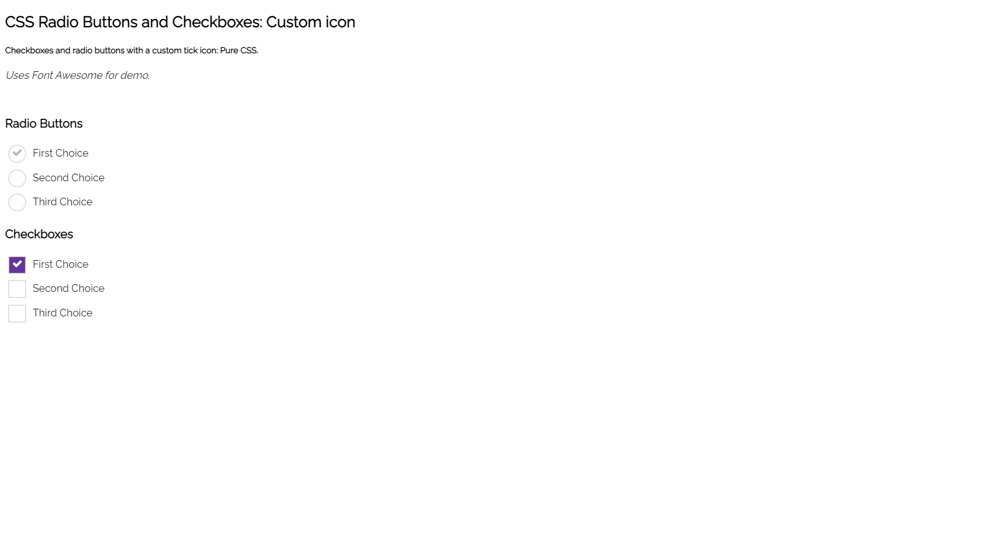
Purple CSS Checkboxes and Radio Buttons
About Project
Links
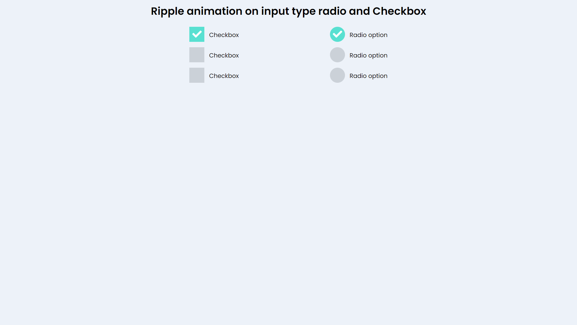
Ripple Animation CSS Checkbox and Radio Buttons
About Project
Links

Simple CSS Checkbox Styling
About Project
Links
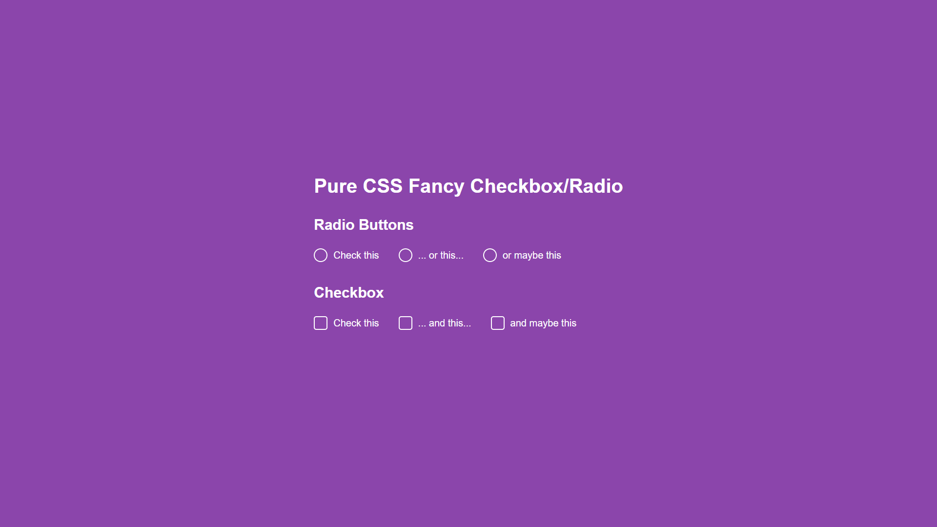
Pure Fancy CSS Checkbox and Radio Buttons
About Project
Links
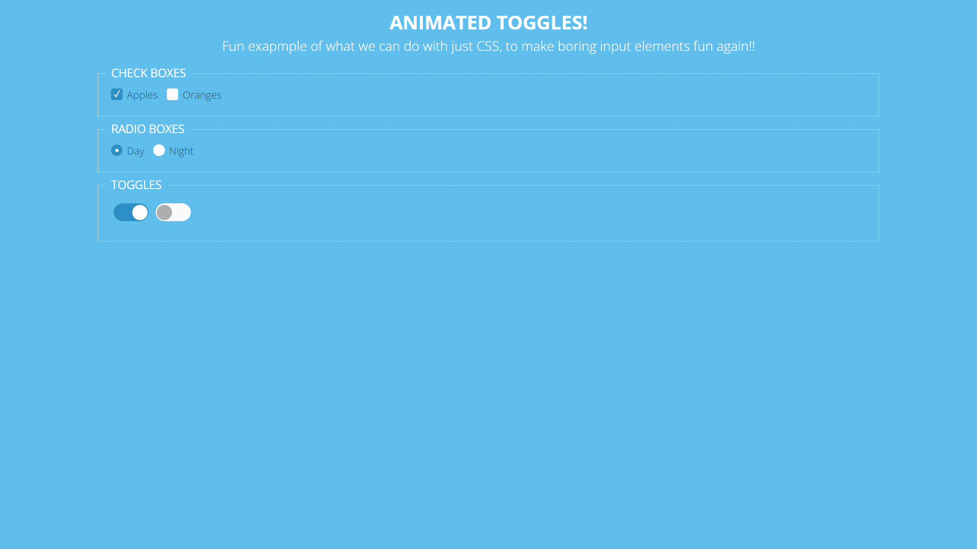
Blue Pure CSS Animated Checkboxes
About Project
Links
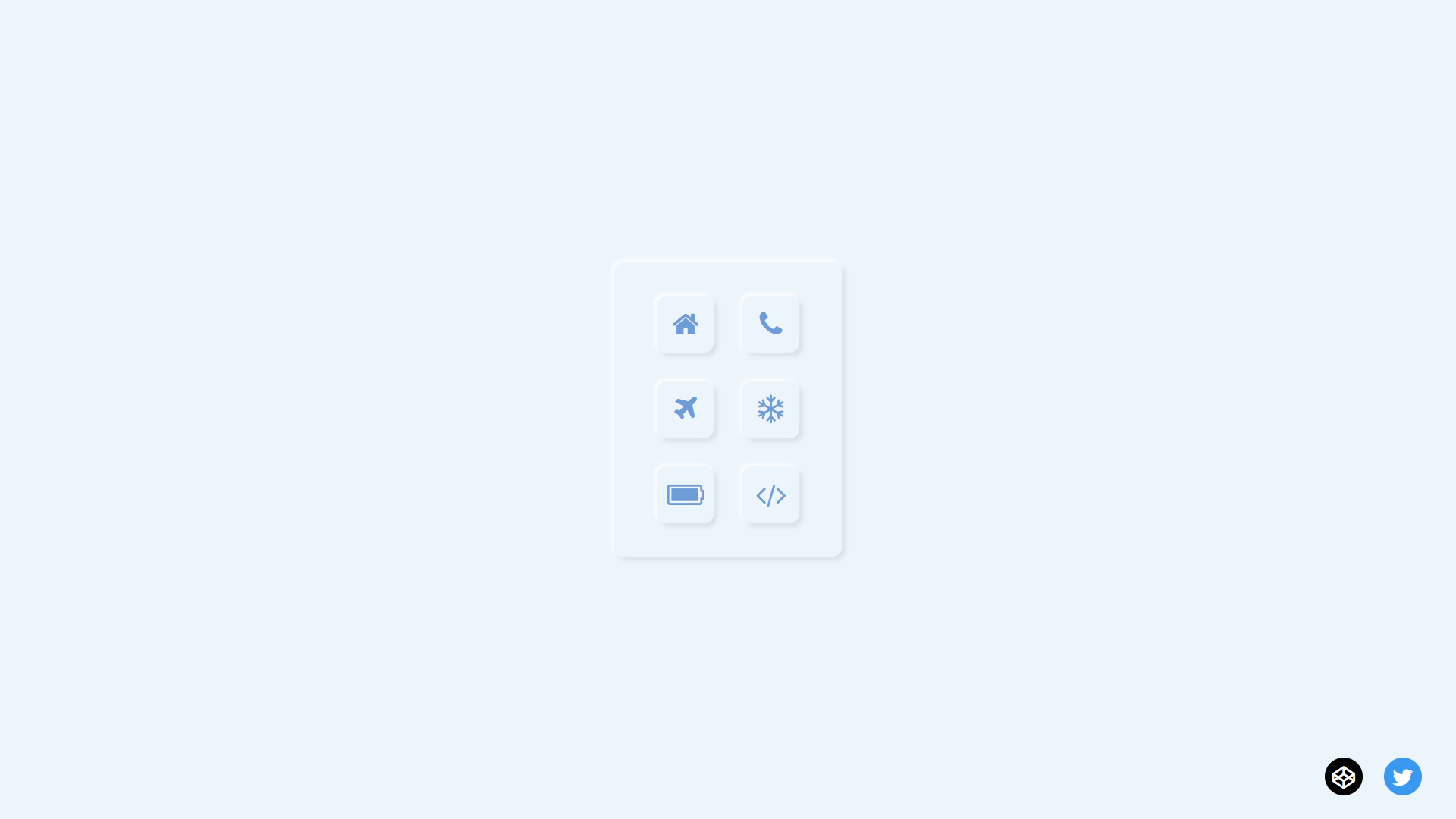
Neuromorphic Checkboxes
About Project
Links
