AppCode
Contribute and help us stay up-to-date. Edit this page on GitHub.
This article demonstrates how to align an HTML list side by side with several methods and walk-throughs to create a horizontal row with CSS.
Before we go walk-through setting up an example project for demonstrating methods of creating a horizontal list, we should review a frequently asked question that developers may ask when developing a website with list items:
How do I make a list horizontally in HTML?
In HTML, <ul> and <ol> elements are usually rendered vertically, with each list item stacked on top of another. This stacking creates a column, and each list item typically uses the entire width of its container. When you need to create an HTML list that expands horizontally or side-by-side, several methods, such as grid, flex, inline, and float, can achieve this effect.
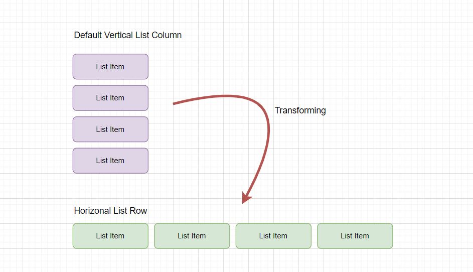
An HTML unordered list will naturally display its list item elements vertically, like in both images. The above image contains a vertical purple section, while the bottom photo has a vertical native HTML list.

If we want to change an HTML list direction from vertical (above) to horizontal, we need to understand and learn the various methods to change the layout to flat, as seen in the image below.

Let’s create an example project to demonstrate the different methods of changing the direction of an ordered or unordered list.
We need to create an HTML code snippet that contains an unordered list element <ul> and list item elements<li> as the children. Once the list is created, we will wrap the unordered list within a <div> element that contains a class called .container. A <div> element centers the list on a web page for easy demonstration when iterating over each method.
Here is the HTML code to create our list structure.
<div class="container">
  <ul>
    <li>List Item One</li>
    <li>List Item Two</li>
    <li>List Item Three</li>
  </ul>
</div>
Now that we have added an HTML structure to a page, we must explain how we target the list elements using CSS selectors and how to remove the list item bullets with properties.
To change a direction of a list, we can target the unordered list element using a ulCSS selector.
ul {
  /* CSS Properties Here */
}
Or we can target a child list elements of the unordered list with the ul li selector, which selects list elements that are only children of a parent ul element. Which selector we use depends on the method implemented.
ul li {
  /* CSS Properties Here */
}
We add the CSS list-style property for visual aid in the demonstration and set the value to none. This effectily removes the bullet circles on the list items. Now we can move on to the various methods to create a horizontal list.
ul {
  list-style: none;
}
There are several methods to consider if you want to transform a direction of an unordered or ordered list in HTML. In the following four sections, we will review the different methods using a float, grid, flexbox, and inline.
We can use a CSS float property to force li elements to be horizontal. The float property is a positioning and formatting rule for content layout. We can set a value of left for the float property, which floats all the li elements left, next to each other. Optionally, a float value can be set to right, and all the elements will float to the right.
ul li {
  float: left; //or right
}
The grid method also achieves making a list horizontal. We can use a CSS display with a grid value to turn an unordered list into a grid where its list element children are placed into three columns.
ul {
  display: grid;
  grid-template-columns: auto auto auto;
  /* Other CSS Properties Here */
}
Let’s explain how grid achieves a side-by-side list. A grid-template-columns property defines a template column layout of grid. So by giving grid-template-columns three auto values since there are three list items, it instructs grid to create three columns that automatically set their width to the width of the contents in each column.
Note: In another article, we expand upon using CSS grid property to create different layouts on a web page. This might be helpful because other properties related to the grid can be applied to HTML lists, such as changing column width, defining gap spacing, sizing rows, and more. You can check out the grid article here. Direct Link →
Another method to align an unordered or ordered list horizontally would be to use a display: flex property on a list container element, <ol> or <ul>. Flex converts a container into a flexbox, each child element becoming a flex item. These flex item act like a grid which is similar to using CSS grid.
ul {
  display: flex;
}
Note: Two other articles can expand information on using the display flexbox property. The first article demonstrates creating a responsive flexbox grid, which can be implemented into your own horizontal list. In a second article, we turn an unordered list into a horizontal menu, with each list element containing a link anchor to navigate. This could be useful if you create a menu using HTML lists. Direct Link →
A frequently used method to make a horizontal list is to use a display: inline property on the children list elements of a <ul> or <ol> (unordered or ordered list). By default, a list element is a block element and expands to the entire width of a parent element. When a list element is changed to inline, they no longer act like full-width blocks; instead, they take the smallest height and width possible if not declared, and they float to the left like text.
ul li {
  display: inline;
}
Each of the inline-block, inline-flex, inline-grid, inline-table, -webkit-inline-box values also produce the same horizontal effect when set as the value of display.
Note: a unique feature of this project is the background gradient. We used a CSS background radial gradient for the body and a container that wraps the unordered list. The position of a circular gradient is set by using the value circle at 17% 98%. We have an article that dives into conic and radial gradients here. Direct Link →
All the CSS styles used in this example to create the whole project are here. You can switch out the CSS properties and use the different methods above.
html,
body {
  height: 100%;
  overflow: hidden;
  margin: 0;
  background: radial-gradient(circle at 17% 98%, #29061f, #4b2020);
  color: white;
  font-family: Roboto, arial, sans-serif;
}

ul {
  list-style: none;
  background: #fff;
  padding: 20px 40px;
  border-radius: 10px;
  box-shadow: 0 4px 8px rgb(0 0 0 / 50%);
  background: radial-gradient(circle at 17% 98%, #90166c, #ec6969);
  font-size: 20px;
}

ul li {
  float: left;
  margin: 10px;
}

.container {
  -webkit-box-align: center !important;
  -ms-flex-align: center !important;
  align-items: center !important;
  -webkit-box-pack: center !important;
  -ms-flex-pack: center !important;
  justify-content: center !important;
  display: -webkit-box !important;
  display: -ms-flexbox !important;
  display: flex !important;
  height: 100%;
}
To tinker with this example, here is a link to the live demo hosted on codepen.io.
- How To Create a Black and White Image Using CSS Grayscale
- Quickly Search and Filter a List With JavaScript
- Create a Three Column Layout Using Pure CSS and Background Image
- How To Build Web Layouts for Dual-Screen