AppCode
The Shadow DOM API can be used like an iFrame to isolate CSS and JavaScript. This article will provide an example of encapsulating CSS (isolating CSS) using JavaScript and Shadow DOM.
Content
- Encapsulation
- Overview
- Shadow DOM
- Encapsulating CSS
- Creating the Custom Element and Button
- Attaching a Shadow DOM to an Element
- Browser Support
- Frequently Asked Questions
Encapsulation
Encapsulation is an important aspect when working with web components. It allows you to keep markup, scripts, and styles separate from the main document. This encapsulation allows you to develop different app components isolated from each other within a single web page.
Overview
This article requires you to be familiar with web development’s DOM (Document Object Model) concept. The DOM is a tree-like structure of connected nodes representing different combinations of HTML elements and text within a markup document. This markup document is typically an HTML document in web development. As an example, here is an HTML fragment that creates a simple DOM:
<!DOCTYPE html>
<html lang="en-US">

<head>
  <meta charset="utf-8" />
  <title>Simple DOM example</title>
</head>

<body>
  <section>
    <img src="velociraptor.png" />
    <p><a href="https://en.wikipedia.org/wiki/Velociraptor">Velociraptor</a> is a genus of small dromaeosaurid dinosaur that lived in Asia during the Late Cretaceous epoch, about 75 million to 71 million years ago. Two species are currently recognized, although others have been assigned in the past.</p>
    <p>
      Here we add a link element to the
      <a href="https://appcode.app">AppCode homepage</a>
    </p>
  </section>
</body>

</html>
This HTML fragment produces the following DOM structure rendered in a browser:
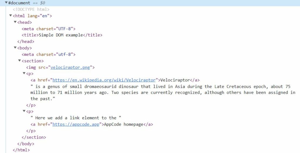
Here is an example of a simple web page dom structure hosted on copepen.io.
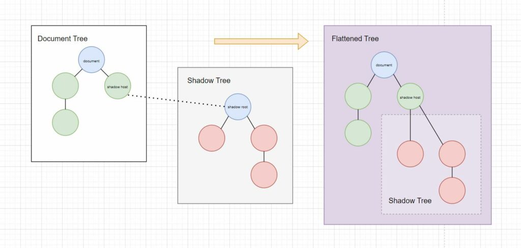
Now that we understand a high-level overview of a DOM let’s give an example of a Shadow DOM. A Shadow DOM allows hidden DOM trees attached to shadow host elements, and these elements can be almost any HTML element in the regular DOM tree. In addition to the similarity of a standard DOM, a shadow DOM typically starts with a shadow root under the host, where you can attach any element.
Shadow DOM
Shadow DOM is essential for web components because it is still rendered within a document and is a separate dom attached to an element.
To summarize, Shadow DOM can be used as self-contained web components. Web components are a mix of shadow DOM, custom elements, and HTML templates initiated by JavaScript.
Encapsulating CSS
Now that we understand why it’s helpful to encapsulate in web development and how we can use the shadow DOM API to achieve this.
With Shadow DOM, CSS styles don’t leak in or out, except with a few exceptions that can be inherited. The styles that can be inherited from Shadow DOMs come from the styles set on the HTML and BODY elements. So, for example, if a font family is placed on an HTML element, then a Shadow DOM will inherit the style. These styles can be overwritten.
Let’s explore a project where we encapsulate CSS custom styles within a web page as a web component that is isolated from the rest of the page’s styles.
This example demonstrates encapsulating CSS by attaching a shadow dom using JavaScript. The new dom includes styles and elements loaded into the innerHTML of a Shadow DOM. The dom is attached to a shadow host <modal-box> element. All the CSS styles are isolated except for one exception: the font-family property used in the HTML CSS selector on the main document.
Creating the Custom Element and Button
To recreate this project, we need to create the custom element <modal-box> and then add an HTML element which, when pressed, will execute JavaScript to attach the new dom to the custom element.
Below are the two elements we will add to our web page.
HTML
<modal-box></modal-box>
<button id="open-modal">Open Modal</button>
The following code set is the CSS style for the web page and a button, not the shadow dom pop-up modal.
CSS
html {
  font-family: Roboto, arial, sans-serif;
}

#open-modal {
  margin: 5% auto 0;
  width: 200px;
  height: 50px;
  animation-name: float;
  animation-timing-function: ease-in-out;
  animation-duration: 2s;
  animation-direction: alternate;
  animation-iteration-count: infinite;
  text-align: center;
  line-height: 50px;
  font-size: 16px;
  background: #4d3fa3;
  border: 1px solid #4d3fa3;
  color: #f4f5f7;
  font-weight: 500;
  border-radius: 3px;
  display: block;
  cursor: pointer;
  padding: 0 16px;
  transition: all 250ms;
  box-shadow: 0 2px 4px rgb(0 0 0 / 50%);
  outline: none !important;
}
Attaching a Shadow DOM to an Element
Now that we have included the HTML and CSS, let’s review how JavaScript creates and attaches the shadow DOM with the encapsulated CSS to the shadow host element.
First, we have created a class Modal that defines a set of actions for an <modal-box> element. This class is attached to a <modal-box> by using a define() method.
Whenever that element is used, the class attaches an open shadow DOM to the element and fires a connectedCallback() method. The connectedCallback() function adds the encapsulated CSS styles and a few HTML elements to a shadow dom on the <modal-box> element to create a hidden modal popup.
customElements.define("modal-box", Modal);Now you may wonder how a modal with isolated CSS styles are shown. To illustrate, when a user clicks on a button, JavaScript is executed. The JavaScript is executed because an event listener is attached to the button, which listens for a click.
const button = document.getElementById("open-modal");
button.addEventListener("click", () => {
  document.querySelector("modal-box").open = true;
});
Once the event listener is triggered, it queries and executes the open() method found within the Modal class attached to the <modal-box> element.
document.querySelector("modal-box").open = true;This open method decides whether to add or remove the open attribute to the element. If the method adds an open attribute, it also toggles the .wrapper element within the shadow dom to be visible. This causes the modal to display to the user.
If the open attribute is already set, then the modal is closed, and the open attribute is removed.
The entire code for encapsulating CSS using web components and the Shadow DOM API is below.
JavaScript
"use strict";
class Modal extends HTMLElement {
static get observedAttributes() {
return ["open"];
}
constructor() {
super();
this.attachShadow({ mode: "open" });
this.close = this.close.bind(this);
}
attributeChangedCallback(attrName, oldValue, newValue) {
if (oldValue !== newValue) {
this[attrName] = this.hasAttribute(attrName);
}
}
connectedCallback() {
const { shadowRoot } = this;
shadowRoot.innerHTML = `<style>
svg {
width: 24px;
fill: #fff;
pointer-events: none;
vertical-align: top;
}
.close {
position: absolute;
top: 0;
right: 0;
margin: 1.2rem;
padding: 0.6rem;
background: rgba(0,0,0,0.3);
border-radius: 50%;
}
.close:focus {outline:0;}
.close:hover {
background: rgba(0,0,0,0.6);
}
.wrapper {
opacity: 0;
transition: visibility 0s, opacity 0.25s ease-in;
}
.wrapper:not(.open) {
visibility: hidden;
}
.wrapper.open {
align-items: center;
display: flex;
justify-content: center;
height: 100vh;
position: fixed;
top: 0;
left: 0;
right: 0;
bottom: 0;
opacity: 1;
visibility: visible;
}
.overlay {
background: rgba(0, 0, 0, 0.8);
height: 100%;
position: fixed;
top: 0;
right: 0;
bottom: 0;
left: 0;
width: 100%;
}
.dialog {
background: #ffffff;
max-width: 600px;
padding: 3rem;
position: fixed;
box-shadow: 0 12px 15px 0 rgb(0 0 0 / 25%);
}
button {
all: unset;
cursor: pointer;
font-size: 1.25rem;
position: absolute;
top: 1rem;
right: 1rem;
}
</style>
<div class="wrapper">
<div class="overlay"></div>
<div class="dialog" role="dialog" aria-labelledby="title" aria-describedby="content">
<button class="close">
<svg class="" viewBox="0 0 24 24"><path d="M19 6.41l-1.41-1.41-5.59 5.59-5.59-5.59-1.41 1.41 5.59 5.59-5.59 5.59 1.41 1.41 5.59-5.59 5.59 5.59 1.41-1.41-5.59-5.59z"></path><path d="M0 0h24v24h-24z" fill="none"></path></svg>
</button>
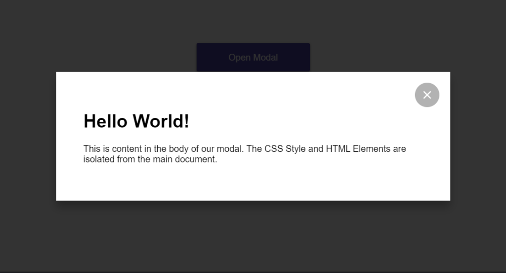
<h1 id="title">Hello World!</h1>
<div id="content" class="content">
<p>This is content in the body of our modal. The CSS Style and HTML Elements are isolated from the main document.</p>
</div>
</div>
</div>`;
shadowRoot.querySelector("button").addEventListener("click", this.close);
shadowRoot.querySelector(".overlay").addEventListener("click", this.close);
this.open = this.open;
}
disconnectedCallback() {
this.shadowRoot
.querySelector("button")
.removeEventListener("click", this.close);
this.shadowRoot
.querySelector(".overlay")
.removeEventListener("click", this.close);
}
get open() {
return this.hasAttribute("open");
}
set open(isOpen) {
const { shadowRoot } = this;
shadowRoot.querySelector(".wrapper").classList.toggle("open", isOpen);
shadowRoot.querySelector(".wrapper").setAttribute("aria-hidden", !isOpen);
if (isOpen) {
this._wasFocused = document.activeElement;
this.setAttribute("open", "");
document.addEventListener("keydown", this._watchEscape);
this.focus();
shadowRoot.querySelector("button").focus();
} else {
this._wasFocused && this._wasFocused.focus && this._wasFocused.focus();
this.removeAttribute("open");
document.removeEventListener("keydown", this._watchEscape);
this.close();
}
}
close() {
if (this.open !== false) {
this.open = false;
}
const closeEvent = new CustomEvent("dialog-closed");
this.dispatchEvent(closeEvent);
}
_watchEscape(event) {
if (event.key === "Escape") {
this.close();
}
}
}
customElements.define("modal-box", Modal);
const button = document.getElementById("open-modal");
button.addEventListener("click", () => {
document.querySelector("modal-box").open = true;
});You can edit a live example of this encapsulated modal popup codepen.io.
Browser Support
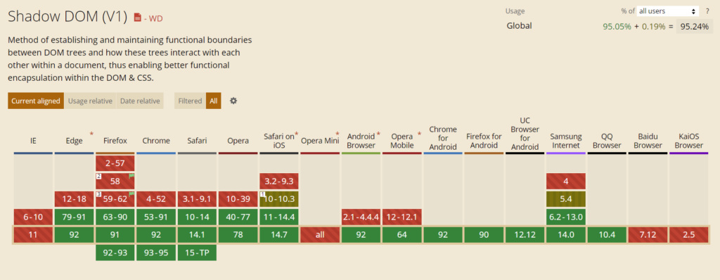
As you can see in the provided image, 95% of all browsers currently support the Shadow DOM API. Most major browsers support a version of the API except Internet Explorer, Opera Mini, Baidu Browser, and the KaiOS Browser. Feel free to use this API since most internet users can use the Shadow DOM technology within their browsers.
Wrapping Up
In summary, encapsulating CSS is easy when using a Shadow DOM API against an element, whether a custom or a native element. Not only can you encapsulate CSS, but you can also isolate HTML to make containerized web applications using web components.
Frequently Asked Questions
What is encapsulation in web development?
Encapsulation is stuffing HTML, JavaScript, and Styles into a web component or element, for example, a class, and then controlling access to that component by isolating the container from the rest of the web page. A great example is using the Shadow DOM API with Web Components.
What are Web Components examples?
Web Components are custom HTML elements created using a name and a dash, for example, <custom-element></custom-element>. The custom element name must contain a dash, so it doesn’t clash with officially supported elements in the HTML specification. Each custom element must have an ES2015 JavaScript class defined to control it.