AppCode
This article demonstrates CSS spinner animations, what they are, how to make one, adding different effects, other spinner examples, and FAQs.
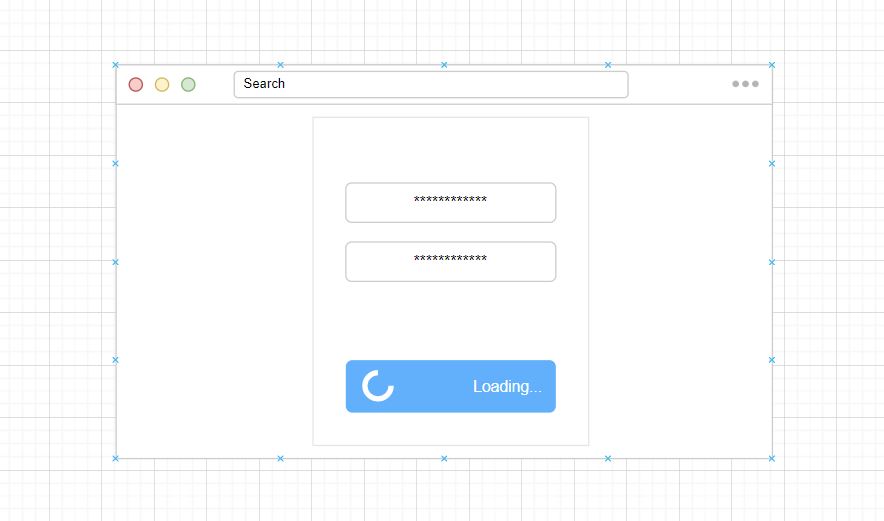
Adding and using CSS spinner animations can increase the engagement levels of users on a website or app. Whenever a CSS spinner is used, they indicate to the user that more content will be loaded soon. As a result, users typically dwell a little longer, waiting for the content to load.
What are Spinner Animations?
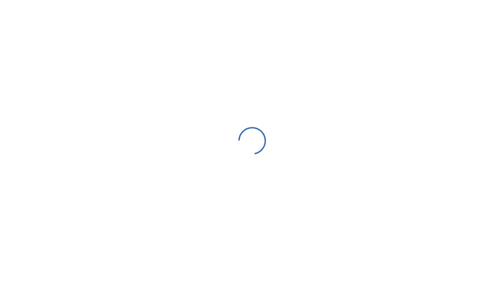
Spinner animations are one type of loader within the CSS loading animation definition. These animations depict that a user should wait for the given app or website to perform its task or function. It communicates to the user if they stay, then a goal or action will complete, or more content will be accessible. Spinner animations consist of HTML or SVG elements animated with CSS keyframes to rotate around one or more x, y, and z-axis and are shown for the duration of the executed resource.
Building a Spinning Animation
Building spinner animations to load content can seem like a big task. It might be easier for you to check out an article on loading animations since spinning animations are a subcategory. The loading animation article explains how to create and shows loading examples for loading purposes.
If you want to get a feel of building a rotating animation, we’ve included a walk-through demonstrating how to create an example. This example can be edited and improved beyond what we have provided; we show this example to explain the process so you can add one to your website or online application. Let’s begin!
The HTML below has a <div> element that wraps around an SVG element containing an SVG <circle> element. The <circle> element within the SVG is the component we will be animating using CSS.
<div class="loader">
  <svg class="circular" viewBox="25 25 50 50">
    <circle class="path" cx="50" cy="50" r="20" fill="none" stroke-width="2" stroke-miterlimit="10" />
  </svg>
</div>
Next, we have the CSS styles, which contain the properties to style the SVG loader and animate it using a keyframe at-rule. The keyframe at-rule will include properties to change the stroke-dasharray, stroke-dashoffset, and transform property values.
.loader {
  position: relative;
  margin: 0 auto;
  width: 100px;
}

.circular {
  -webkit-animation: rotate 3s linear infinite;
  animation: rotate 3s linear infinite;
  height: 100%;
  transform-origin: center center;
  width: 100%;
}

.path {
  stroke-dasharray: 1, 200;
  stroke-dashoffset: 0;
  -webkit-animation: dash 1.5s ease-in-out infinite;
  animation: dash 1.5s ease-in-out infinite;
  stroke-linecap: round;
  stroke: #285bb0;
}

@-webkit-keyframes rotate {
  100% {
    transform: rotate(360deg);
  }
}

@keyframes rotate {
  100% {
    transform: rotate(360deg);
  }
}

@-webkit-keyframes dash {
  0% {
    stroke-dasharray: 1, 200;
    stroke-dashoffset: 0;
  }
  50% {
    stroke-dasharray: 89, 200;
    stroke-dashoffset: -35px;
  }
  100% {
    stroke-dasharray: 89, 200;
    stroke-dashoffset: -124px;
  }
}

@keyframes dash {
  0% {
    stroke-dasharray: 1, 200;
    stroke-dashoffset: 0;
  }
  50% {
    stroke-dasharray: 89, 200;
    stroke-dashoffset: -35px;
  }
  100% {
    stroke-dasharray: 89, 200;
    stroke-dashoffset: -124px;
  }
}
After building the example above, you should learn more about using @keyframes. In fact, we have two other articles you can check out that will help further your understanding of working with animations.
The first article is about making a spinner displayed when in use and then making it invisible. This article lets you understand how to use a few jQuery methods to fadeIn() and fadeOut() elements.
While in the second article teaches you about creating a page loader for an HTML web page using CSS styling and keyframes.
Types of Spinning Animation Properties
Spinning animation has several properties, such as the direction of a rotation and the axis on which it rotates. Let’s review the movement direction and the axis a rotating animation can have.
Direction
The movement direction is how an HTML or SVG element turns, which can be either clockwise or counterclockwise.
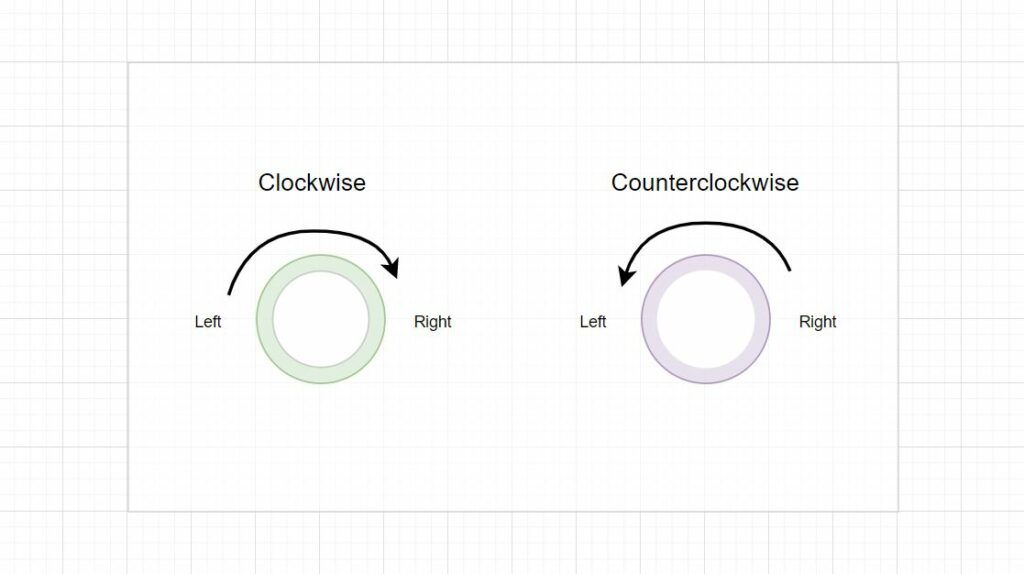
- Clockwise
Clockwise rotation is turning an animation or object from left to right.
- Counterclockwise
Counterclockwise is the opposite of clockwise, which means the object or animation rotates from right to left.
Axis
The axis is the imaginary line that an object rotates on.
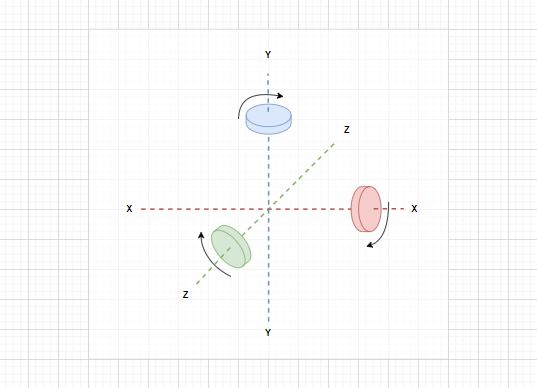
- X-Axis
The x-axis is a line that runs from west to east. The object that usually points in either of those directions, horizontally left or right, rotating around the line. In the image above, the x-axis is the imaginary red line with a red cylinder.
- Y-Axis
The y-axis is a line that runs from north to south, and the object usually rotates on this line vertically, facing up or down. In the image above, the y-axis is a blue cylinder and an imaginary dotted line.
- Z-Axis
The z-axis is an imaginary line that moves away from the center point of perspective. The farther it travels down the line, the farther away it is, and vice-versa. An object rotating on that line would be facing you or away and rotating clockwise or counterclockwise. We placed the z-axis on a downward angle with a green imaginary line and cylinder for demonstration purposes.
Creating CSS Keyframes for Rotation
Now that we understand the different properties of an animation, such as the spin direction and the axis. We can provide examples of implementing the rotation behavior with CSS animation. This section will show a few CSS code snippets using keyframes to get an object to rotate on a webpage.
<div class="rotate"></div>The CSS below includes a @keyframe rotate name; within the keyframe is a set of CSS properties using a transform rotate. Some transform values are commented out, such as the rotate, rotateX, rotateY, etc. These values could also spin a spinner on another axis you want. The most important note is that for an animation to work, you need to call the animation property in a CSS style applied to an element; for example, .rotate. While looking at the animation property of the rotate style, you can see a keyframe name is called along with the amount of time to rotate, infinite, and linear values. Each of these values together instructs the keyframe to run endlessly.
.rotate {
  animation: rotate 1.5s infinite linear;
  height: 100px;
  width: 100px;
  background-color: #3d3d98;
  border-radius: 10px;
}

@keyframes rotate {
  from {
    transform: rotate(0deg);
    /*  transform: rotate3d(3, 2, 1, 5deg); */
    /*  transform: rotateX(360deg);  */
    /*  transform: rotateY(360deg); */
    /*  transform: rotateZ(0deg); */
  }
  to {
    transform: rotate(360deg);
  }
}
One last thing to mention is that for an object to rotate 360 degrees, we must ensure a To and From keyframe is included within the keyframe rule. The keyframes must have 0deg to 360deg as defined in the keyframe above.
An excellent article found on the web by Stephan Wagner provides a great example of creating a few CSS-only loading spinners.
Other Examples
Below you can find a list of different spinning animations authors have created around the web. These examples come from codepen.io, which allows you to quickly edit and deploy your custom version. Feel free to use these examples in your projects or apps.

About Project
Super Simple CSS Spinner Animation
Links

About Project
Slotted CSS3 Spinner
Links

About Project
Groovy CSS Spinner
Links

About Project
Square CSS Spinner Loader
Links

About Project
Multi Stripe Spiral CSS Spinner
Links

About Project
Advanced Multi Line CSS Spinner
Links

About Project
iOS CSS Spinner
Links

About Project
Calming Gradient CSS Spinner
Links

About Project
Folding Square CSS Spinner
Links

About Project
Dead Simple CSS Spinner Animation
Links

About Project
Four Squares CSS Spinner Animation
Links

About Project
Single Div Element CSS Spinner
Links

About Project
Gradient Clock CSS Spinner
Links

About Project
Three Line Swirl CSS Spinner
Links

About Project
CSS Loading Dot Animation
Links
Frequently Asked Questions
Sometimes it’s easier to understand the topic discussed in an article by reading questions users have frequently asked. Here is a short list of questions and answers related to CSS spinning animations.
What is spinning in animation?
Spin animations contain an object that rotates with yaw, pitch, and roll, giving the object the appearance of spinning and showing different faces. The animation is designed primarily to showcase things, such as furniture or machine parts, or in web development, loading forms/sections, and other user interactable features.
What are the 3 types of rotation?
These rotations are called precession, nutation, and intrinsic rotation.
What is the use of animation in CSS?
Animations in CSS let you gradually change an element from one set of properties to another. To use animation in CSS, you must specify some keyframes. These keyframes hold what properties the element will have at specific times. CSS allows you to change as many properties as often as you wish with the keyframe at-rule.
How do you make a rotating animation in CSS?
To create a rotating animation in CSS, use the animation property and set the value of animations like duration, direction, and speed. Moreover, the rotate() CSS function rotates an element circularly with the transform property.
How do I rotate a div in degrees?
To rotate an element using degrees, you can achieve this by using the degree(deg) data type in transform property functions. The transform property includes function values that move, rotate, scale, and perform various HTML element transformations. For rotating in degrees, the rotate() function can be used as a transform value to turn an element. The function will need a deg from 0 - 360deg as its value to set the desired amount.