This article demonstrates what a CSS loader animation is, how to create a loader, and where it should be included, with multiple examples. The examples near the end of the article will consist of other loaders authors have built on the web. In addition to the walk-through and examples, we explain what components make up a loader and provide several frequently asked questions at the bottom of this article.
What are Loader Animations?
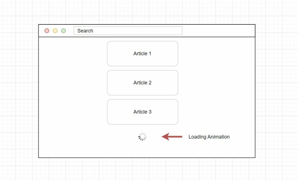
Loading animations are a fundamental part of any app or website. These animations usually indicate when a part of the page or application is loading, or an event is happening. In simple terms, they represent a transitioning state of the application or a new area of content being made available.
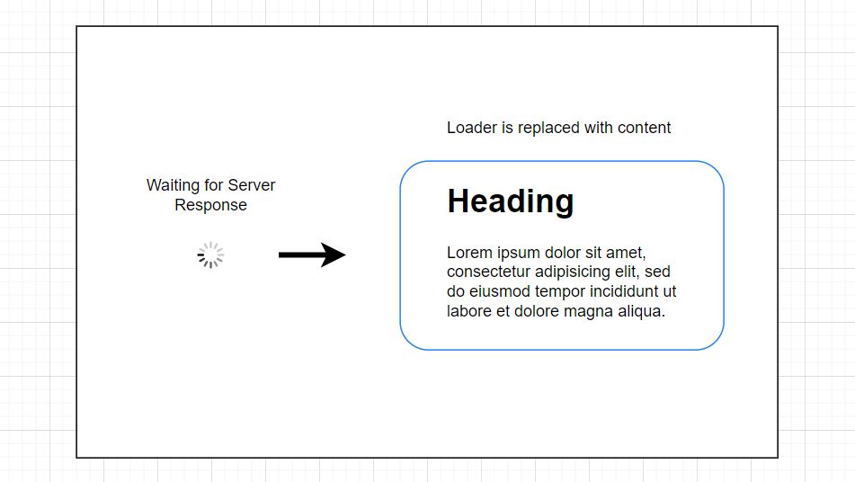
Adding a loader to a website and using the animations successfully can increase the engagement levels of users on a website or app. The increased engagement is because the user is shown an indicator that tells the user to wait for a moment. Waiting for a moment is better than a user moving on to another page. When used accurately and predictably, the CSS loaders will tell the user that more content will be loaded soon. As a result, users typically dwell a little longer, waiting for the animation to complete or the content to load and continue interacting with your webpage. This more extended interaction or visit time on a page, after the loader, not during, contributes to the overall engagement.
Using a lot of loaders can cause the user to become frustrated waiting to perform a task or look up information. It’s ideal only to use the animation when there is a slow connection, more fetched content, and significant actions.
This means avoiding setting a specific time for each loader and only running it for the necessary amount. Further engagement levels can be reached by optimizing the application for lower connection and processor speeds than by making a user wait.
Parts of a Loading Animation
Typically a loader animation can be broken down into three pieces. These pieces include the object to be animated, such as a square, triangle, circle, or some advanced structure, creating CSS keyframes and then directing these keyframes to animate the object’s movement using properties. Let’s go over the three parts of a loading animation.
Object to be animated
The first part of a loader includes the object that is animated. This can be any simple or complicated design of HTML elements, even including SVG elements.
Keyframes
The keyframes are CSS keyframes that create the steps an animation will perform. These keyframes contain the properties that control the animation movement.
Animation movement
The animation movement is what brings an animation loader to life. Animations such as moving, flipping, scaling, and others can be applied to the object and its individual parts.
Building a Simple Loader Animation
Building a loading animation can seem daunting, and it takes work to bring your idea to life. We have two articles that can help you develop your idealistic picture. The first article teaches you how to make an animation invisible and reappear. The second article demonstrates how to create a page loader for your website using HTML and CSS. These two tutorials are great starting points for beginners and even more advanced web developers.

If these two articles don’t interest you, we can demonstrate how to create a simple loader for your site. It’s easy to build a very simple loader using some HTML CSS. The loader we present in the image above, which you may recognize, is the slack loader from the Slack Messaging Service. The HTML below has a single <div> element that provides the base for the animation. The <div> element will be animated using CSS keyframes.
<div class="loader"></div>Next, we have the CSS, which contains the properties to style the loader. You can see this example relies heavily on the :before and :after pseudo-elements to create the four different colored bars. Once the bars receive their styles, they are animated using keyframes that utilize the CSS box-shadow property. The box-shadow value in the keyframes is the Slack icon’s colored bars, and the bars visually change shape and color during the keyframe steps.
.loader {
  position: relative;
  width: 2.5em;
  height: 2.5em;
  transform: rotate(165deg);
}

.loader:before, .loader:after {
  content: "";
  position: absolute;
  top: 50%;
  left: 50%;
  display: block;
  width: 0.5em;
  height: 0.5em;
  border-radius: 0.25em;
  transform: translate(-50%, -50%);
}

.loader:before {
  animation: before 2s infinite;
}

.loader:after {
  animation: after 2s infinite;
}

@keyframes before {
  0% {
    width: 0.5em;
    box-shadow: 1em -0.5em rgba(225, 20, 98, 0.75), -1em 0.5em rgba(111, 202, 220, 0.75);
  }
  35% {
    width: 2.5em;
    box-shadow: 0 -0.5em rgba(225, 20, 98, 0.75), 0 0.5em rgba(111, 202, 220, 0.75);
  }
  70% {
    width: 0.5em;
    box-shadow: -1em -0.5em rgba(225, 20, 98, 0.75), 1em 0.5em rgba(111, 202, 220, 0.75);
  }
  100% {
    box-shadow: 1em -0.5em rgba(225, 20, 98, 0.75), -1em 0.5em rgba(111, 202, 220, 0.75);
  }
}
@keyframes after {
  0% {
    height: 0.5em;
    box-shadow: 0.5em 1em rgba(61, 184, 143, 0.75), -0.5em -1em rgba(233, 169, 32, 0.75);
  }
  35% {
    height: 2.5em;
    box-shadow: 0.5em 0 rgba(61, 184, 143, 0.75), -0.5em 0 rgba(233, 169, 32, 0.75);
  }
  70% {
    height: 0.5em;
    box-shadow: 0.5em -1em rgba(61, 184, 143, 0.75), -0.5em 1em rgba(233, 169, 32, 0.75);
  }
  100% {
    box-shadow: 0.5em 1em rgba(61, 184, 143, 0.75), -0.5em -1em rgba(233, 169, 32, 0.75);
  }
}

/**
 * Attempt to center the whole thing!
 */
html,
body {
  height: 100%;
}

.loader {
  position: absolute;
  top: calc(50% - 1.25em);
  left: calc(50% - 1.25em);
}
Placing Loaders With Purpose
It’s essential to place loaders precisely to communicate to the user what event they are waiting on. These placements give the web page a cleaner design and deliver a more impactful meaning to the user’s interactions. Let’s go over several types of necessary placements.
Types of Placements
The first location a loader may be found is in different sections of a webpage. These sections can include a video loading in, a new sidebar, or images. Typically this placement is a direct response to a user’s actions, like updating settings or changing a profile image.
The second significant placement of loader animations is during a web page’s scrolling process. Whenever a user scrolls to the bottom of a page, sometimes websites are built with a feed structure, where content continuously loads, for example, Pinterest and Imgur. Facebook and Twitter are also good examples of where loading animation is used to load additional content.
The third placement type is when loading a full-page website, waiting for the entire page to load, or connecting to the server. An example could be entering a chat room or staying in a queue to receive support. Another example could be an extensive webpage downloading like a “build your own car” on a major car manufacturer’s website.
Other Examples
Here is a collection of CSS loaders from codepen.io and around the web. In addition, feel free to use these examples in your projects or apps.

Circle Gradient CSS Loader
About Project
Links

Loading Image Hex CSS Loader
About Project
Links
Pure CSS Loader
About Project
Links
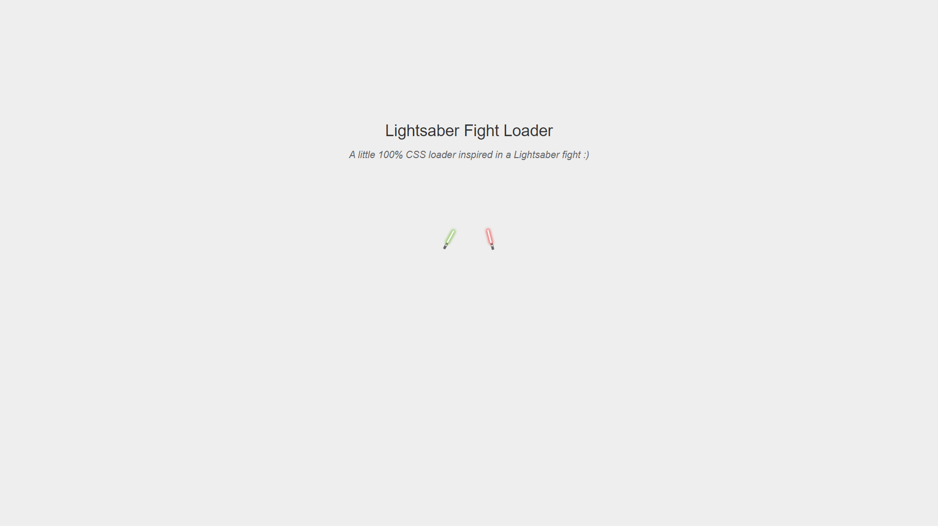
Pure CSS Lightsaber Fight Loader
About Project
Links
Square Grid CSS Loader
About Project
Links

Helix CSS Loader Animation
About Project
Links

Stacking Square Pure CSS Loader
About Project
Links

About Project
Links
Wizard Only CSS Loader Animation
About Project
Links
CSS Color Map Dot Loader
About Project
Links
Fancy CSS Loaders and CSS Spinners
About Project
Links
Three Line CSS Loader
About Project
Links
Pure CSS 3D Grid Column Loader
About Project
Links
Morphing Circle CSS Loader Animation
About Project
Links
Simple Warframe Styled CSS Loader
About Project
Links
Frequently Asked Questions
Here is a list of frequently asked questions related to loading animations.
What is loader animation?
Loading animations can be notifications that assure users a system is still handling their requests. The animation is typically displayed until the server request is complete. Some animations have progress bars or even stacking bars that indicate how long it will take for data or content to load.
What is a loader in web development?
A page loader in web development is a display visible to a website user while the web page loads in a web browser. If there is no animation loader and the page takes longer than the average website, the site users will be left with no results or a blank page.
How long should a loading animation be?
10 seconds is the maximum limit for keeping the user focused on the dialogue. For longer delays, users should be allowed to perform other tasks while waiting for the application to process or load data. This can be given as feedback by displaying the expected completion time.