Image galleries offer a helpful method for displaying a selection of excellent pictures. To make it simpler for visitors to view website photographs, developers use image galleries to show images in a grid-like style.
Including high-quality images on your website is a terrific method to convey information and provide visitors with a beautiful visual experience. That link is even simpler to build when creating an image gallery with CSS.
Websites like Pexel, Unsplash, and other related image-displaying websites create picture galleries using CSS techniques like translating and positioning. With CSS and a bit of JavaScript, you can rapidly create the same functionality.
Note: Check out our CSS translate article to understand better what we will discuss in this article.
Facts about Image Galleries
A common element on many websites is that image galleries present a selection of photos or images visually pleasingly. They may be made using a mix of HTML and CSS, which define the gallery’s framework and layout together.
- One of the fascinating aspects of image galleries is the vast range of patterns that may be made. The options range from easy thumbnail grids to intricate interactive displays.
- JavaScript is sometimes used in picture galleries to offer dynamic features like image zooming, lightbox effects, and slide shows. Users may find the gallery to be more exciting and engaged as a result.
- Responsive image galleries that adapt to the device’s size or viewing screen can be made using HTML and CSS. This guarantees that the gallery will display well on all gadgets, including desktop computers, tablets, and smartphones.
- Flexible, responsive picture galleries may be made using CSS Grid and Flexbox, two powerful layout techniques. These capabilities provide users with tremendous flexibility over the gallery’s layout, making it simple to construct something that looks fantastic on every screen size.
- Many well-known libraries and frameworks, like Bootstrap, Foundation, and Bulma, come with pre-built picture gallery components that may be used to build a gallery with a rapidly polished appearance.
- Image galleries may benefit from fascinating transitions and effects like fading or sliding photos in and out, thanks to CSS animations. This can increase user engagement and give the gallery a more professional appearance.
- By including alternate language for images and employing correct semantic HTML markup, image galleries may be made accessible. This is crucial for ensuring that people with impairments can view the gallery, and it’s also advantageous for SEO.
- Lazy loading is a technique used by specific picture galleries to increase speed by only loading photos when required. This can contribute to speeding up the gallery’s loading time and improving usability.
- The website’s efficiency has received much attention in contemporary web development. One approach is using CSS Grid, Flexbox, and CSS Grid templates to create a responsive design. The website looks fantastic on all devices because of this strategy’s current and adaptable design.
- The availability of several open-source picture gallery scripts and plugins makes it simple to incorporate an image gallery without starting from scratch. This may help you save time and work and make it simple to customize the gallery.
Examples of Image Galleries Using HTML and CSS
At the end of these different examples, you should be able to design responsive image galleries of all kinds. The gallery itself is relatively simple to set up. To host your gallery photographs, you may first construct div containers. You may see divs inserted with class names like “container” connected in the sample scripts below. Alright, my comrades, let’s get right to it:
Ecommerce-type product image gallery
This image gallery will show one full-size product image and all the smaller photos. Any little picture you click on enlarges to its full size to display that specific product image. JavaScript will be used to build this capability into the Image Gallery. Check out the complete source code on Codepen.
The HTML:
<h1>Welcome to Appcode's CSS Image Gallery Tutorial</h1>
    <h6>A responsive ecommerce-type image gallery</h6>

    <div class="myProducts">
        <div class="myProducts-gallery">
            <img src=
"https://images.unsplash.com/photo-1608248543803-ba4f8c70ae0b?ixlib=rb-4.0.3&ixid=MnwxMjA3fDB8MHxwaG90by1wYWdlfHx8fGVufDB8fHx8&auto=format&fit=crop&w=753&q=80"
                alt="click here."
                onclick="myImageFunction(this)">
            <img src=
"https://images.unsplash.com/photo-1522336284037-91f7da073525?ixlib=rb-4.0.3&ixid=MnwxMjA3fDB8MHxwaG90by1wYWdlfHx8fGVufDB8fHx8&auto=format&fit=crop&w=869&q=80"
                alt="click here."
                onclick="myImageFunction(this)">
            <img src=
"https://images.unsplash.com/photo-1535585209827-a15fcdbc4c2d?ixlib=rb-4.0.3&ixid=MnwxMjA3fDB8MHxwaG90by1wYWdlfHx8fGVufDB8fHx8&auto=format&fit=crop&w=870&q=80"
                alt="click here."
                onclick="myImageFunction(this)">
            <img src=
"https://images.unsplash.com/photo-1601070846156-c0a176aac8c9?ixlib=rb-4.0.3&ixid=MnwxMjA3fDB8MHxwaG90by1wYWdlfHx8fGVufDB8fHx8&auto=format&fit=crop&w=751&q=80"
                alt="click here."
                onclick="myImageFunction(this)">
        </div>

        <div class="image-container">
            <img id="img-Box" src=
"https://images.unsplash.com/photo-1515377905703-c4788e51af15?ixlib=rb-4.0.3&ixid=MnwxMjA3fDB8MHxwaG90by1wYWdlfHx8fGVufDB8fHx8&auto=format&fit=crop&w=870&q=80"
                alt="click here">
        </div>
    </div>
The CSS:
@import URL(
'https://fonts.googleapis.com/css2?family=Yaldevi:wght@200;300;400;500;600;700&display=swap');

* {
    margin: 0;
    padding: 0;
    font-family: 'Yaldevi,' sans-serif;
}

h1 {
    color: #34aeeb;
    font-weight: bold;
    text-align: center;
    padding-top: 52px;

}

h6 {
    color: #34aeeb;
    font-size: 20px;
    font-weight: bold;
    text-align: center;
    padding-top: 10px;

    }

.myProducts {
  margin-top:-100px;
}
.myProducts-gallery img{
    height: 92px;
    margin: 10px 0;
    cursor: pointer;
    display: block;
    opacity: .5;
}

.myProducts-gallery img: hover {
    opacity: 1;
}

.myProducts-gallery {
    float: left;
}

.myProducts {
    top: 50%;
    left: 50%;
    transform: translate(-50% , -50%);
    position: absolute;
}

.image-container img {
    height: 400px;
    transition: transform 1s;
}

.image-container img: hover{
    transform: scale(1.5);
    cursor: zoom-in;
}

.image-container {
    float: right;
    padding: 10px;
}
A bit of JavaScript:
function myImageFunction(productSmallImg) {
            var productFullImg = document.getElementById("img-Box");
            productFullImg.src = productSmallImg.src;
        }
Outlook:
A Photo Gallery
In this example, we’ll create a gorgeous image gallery. This photo collection will include a range of pictures similar to those seen in a conventional gallery environment – just like you have in photography portfolios. We will create a responsive layout that exhibits these high-quality photos in a dynamic and captivating way using HTML and CSS.
All photographs will initially be presented in a compact format in this image gallery. However, by simply clicking on any image, the full version will be revealed for closer examination. In addition, users can seamlessly zoom in and out of any picture using the mouse wheel.
We’ll create a full-width picture gallery that can hold images with various aspect ratios. Additionally, it will automatically adjust to smaller devices, guaranteeing a fluid viewing experience on mobile.
The HTML:
<div id="gallery">

   <img src="https://images.unsplash.com/photo-1472396961693-142e6e269027?ixlib=rb-4.0.3&ixid=MnwxMjA3fDB8MHxzZWFyY2h8MTIyfHxuYXR1cmV8ZW58MHx8MHx8&auto=format&fit=crop&w=500&q=60">
   <img src="https://images.unsplash.com/photo-1567647753830-de3fe7ce9f28?ixlib=rb-4.0.3&ixid=MnwxMjA3fDB8MHxzZWFyY2h8MTEyfHxuYXR1cmV8ZW58MHx8MHx8&auto=format&fit=crop&w=500&q=60">
   <img src="https://images.unsplash.com/photo-1507041957456-9c397ce39c97?ixlib=rb-4.0.3&ixid=MnwxMjA3fDB8MHxzZWFyY2h8OTR8fG5hdHVyZXxlbnwwfHwwfHw%3D&auto=format&fit=crop&w=500&q=60">
   <img src="https://images.unsplash.com/photo-1580133318324-f2f76d987dd8?ixlib=rb-4.0.3&ixid=MnwxMjA3fDB8MHxzZWFyY2h8MTE0fHxuYXR1cmV8ZW58MHx8MHx8&auto=format&fit=crop&w=500&q=60">
   <img src="https://images.unsplash.com/photo-1485201543483-f06c8d2a8fb4?ixlib=rb-4.0.3&ixid=MnwxMjA3fDB8MHxzZWFyY2h8ODd8fG5hdHVyZXxlbnwwfHwwfHw%3D&auto=format&fit=crop&w=500&q=60">
   <img src="https://images.unsplash.com/photo-1615729947596-a598e5de0ab3?ixlib=rb-4.0.3&ixid=MnwxMjA3fDB8MHxzZWFyY2h8OTF8fG5hdHVyZXxlbnwwfHwwfHw%3D&auto=format&fit=crop&w=500&q=60">
   <img src="https://images.unsplash.com/photo-1541675154750-0444c7d51e8e?ixlib=rb-4.0.3&ixid=MnwxMjA3fDB8MHxzZWFyY2h8ODZ8fG5hdHVyZXxlbnwwfHwwfHw%3D&auto=format&fit=crop&w=500&q=60">
   <img src="https://images.unsplash.com/photo-1621849400072-f554417f7051?ixlib=rb-4.0.3&ixid=MnwxMjA3fDB8MHxzZWFyY2h8ODh8fG5hdHVyZXxlbnwwfHwwfHw%3D&auto=format&fit=crop&w=500&q=60">
   <img src="https://images.unsplash.com/photo-1508669232496-137b159c1cdb?ixlib=rb-4.0.3&ixid=MnwxMjA3fDB8MHxzZWFyY2h8ODF8fG5hdHVyZXxlbnwwfHwwfHw%3D&auto=format&fit=crop&w=500&q=60">
   <img src="https://images.unsplash.com/photo-1533387520709-752d83de3630?ixlib=rb-4.0.3&ixid=MnwxMjA3fDB8MHxzZWFyY2h8Nzl8fG5hdHVyZXxlbnwwfHwwfHw%3D&auto=format&fit=crop&w=500&q=60">
   <img src="https://images.unsplash.com/photo-1507692812060-98338d07aca3?ixlib=rb-4.0.3&ixid=MnwxMjA3fDB8MHxzZWFyY2h8NzV8fG5hdHVyZXxlbnwwfHwwfHw%3D&auto=format&fit=crop&w=500&q=60">
   <img src="https://images.unsplash.com/photo-1508459855340-fb63ac591728?ixlib=rb-4.0.3&ixid=MnwxMjA3fDB8MHxzZWFyY2h8NzN8fG5hdHVyZXxlbnwwfHwwfHw%3D&auto=format&fit=crop&w=500&q=60">
   <img src="https://images.unsplash.com/photo-1536431311719-398b6704d4cc?ixlib=rb-4.0.3&ixid=MnwxMjA3fDB8MHxzZWFyY2h8NjF8fG5hdHVyZXxlbnwwfHwwfHw%3D&auto=format&fit=crop&w=500&q=60">
   <img src="https://images.unsplash.com/photo-1445262102387-5fbb30a5e59d?ixlib=rb-4.0.3&ixid=MnwxMjA3fDB8MHxzZWFyY2h8NTd8fG5hdHVyZXxlbnwwfHwwfHw%3D&auto=format&fit=crop&w=500&q=60">
   <img src="https://images.unsplash.com/photo-1510797215324-95aa89f43c33?ixlib=rb-4.0.3&ixid=MnwxMjA3fDB8MHxzZWFyY2h8NTF8fG5hdHVyZXxlbnwwfHwwfHw%3D&auto=format&fit=crop&w=500&q=60">
   <img src="https://images.unsplash.com/photo-1518495973542-4542c06a5843?ixlib=rb-4.0.3&ixid=MnwxMjA3fDB8MHxzZWFyY2h8NTJ8fG5hdHVyZXxlbnwwfHwwfHw%3D&auto=format&fit=crop&w=500&q=60">
   <img src="https://images.unsplash.com/photo-1547036967-23d11aacaee0?ixlib=rb-4.0.3&ixid=MnwxMjA3fDB8MHxzZWFyY2h8NTV8fG5hdHVyZXxlbnwwfHwwfHw%3D&auto=format&fit=crop&w=500&q=60">
   <img src="https://images.unsplash.com/photo-1513836279014-a89f7a76ae86?ixlib=rb-4.0.3&ixid=MnwxMjA3fDB8MHxzZWFyY2h8NDN8fG5hdHVyZXxlbnwwfHwwfHw%3D&auto=format&fit=crop&w=500&q=60">
   <img src="https://images.unsplash.com/photo-1433086966358-54859d0ed716?ixlib=rb-4.0.3&ixid=MnwxMjA3fDB8MHxwaG90by1wYWdlfHx8fGVufDB8fHx8&auto=format&fit=crop&w=387&q=80">
   <img src="https://images.unsplash.com/photo-1455218873509-8097305ee378?ixlib=rb-4.0.3&ixid=MnwxMjA3fDB8MHxzZWFyY2h8Mjl8fG5hdHVyZXxlbnwwfHwwfHw%3D&auto=format&fit=crop&w=500&q=60">
   <img src="https://images.unsplash.com/photo-1586314510183-78d11a24e1dd?ixlib=rb-4.0.3&ixid=MnwxMjA3fDB8MHxwaG90by1yZWxhdGVkfDIwfHx8ZW58MHx8fHw%3D&auto=format&fit=crop&w=500&q=60">
   <img src="https://images.unsplash.com/photo-1507908708918-778587c9e563?ixlib=rb-4.0.3&ixid=MnwxMjA3fDB8MHxwaG90by1yZWxhdGVkfDE3fHx8ZW58MHx8fHw%3D&auto=format&fit=crop&w=500&q=60">
   <img src="https://images.unsplash.com/photo-1583082547260-19883a529b7e?ixlib=rb-4.0.3&ixid=MnwxMjA3fDB8MHxwaG90by1yZWxhdGVkfDE4fHx8ZW58MHx8fHw%3D&auto=format&fit=crop&w=500&q=60">
   <img src="https://images.unsplash.com/photo-1586348943529-beaae6c28db9?ixlib=rb-4.0.3&ixid=MnwxMjA3fDB8MHxwaG90by1wYWdlfHx8fGVufDB8fHx8&auto=format&fit=crop&w=415&q=80">

  </div>
As you can observe, we have established a fundamental HTML structure consisting of a div, cleverly labeled as a ‘gallery.’ This container houses 24 images, which I have utilized as a demonstration for this tutorial. (It is worth noting that these images were sourced from Unsplash specifically for this tutorial).
Now, incorporate some aesthetic enhancements to attain the desired look.
For simplicity, I have included the styling within the same document in the provided HTML code. However, in a real-world scenario, it would be best to keep the CSS in a separate file and reference it via a link tag for better organization and maintainability.
#gallery {
   line-height:0;
   -WebKit-column-count:5; /* split it into 5 columns */
   -WebKit-column-gap:5px; /* give it a 5px gap between columns */
   -Moz-column-count:5;
   -Moz-column-gap:5px;
   column-count:5;
   column-gap:5px;
}


#gallery img {
   width: 100% !important;
   height: auto! important;
   margin-bottom:5px; /* to match column gap */
}
For thoroughness, I have included WebKit and Moz references in the code, even though they may be optional for modern web browsers. Nevertheless, it is worth taking this precautionary measure to ensure that the page is rendered correctly on older browsers. We’ve also applied styling to the images displayed in the gallery.
As you can see, a 5px bottom margin has been added to each image. This aligns with the column gap, resulting in a neat appearance. You should have a visually pleasing image gallery
if you are currently viewing this on a computer.
However, the display on mobile devices is worth considering, as five columns may appear overwhelming on a smaller screen. Fortunately, this is easily resolved by incorporating media queries for different screen sizes.
@media (max-width: 1200px) {
   #gallery {
    -Moz-column-count:    4;
    -WebKit-column-count: 4;
    column-count:         4;
   }
}


@media (max-width: 1000px) {
   #gallery {
    -Moz-column-count:    3;
    -WebKit-column-count: 3;
    column-count:         3;
   }
}


@media (max-width: 800px) {
   #gallery {
    -Moz-column-count:    2;
    -WebKit-column-count: 2;
    column-count:         2;
   }
}
That concludes our guide. By now, you should be able to observe that as you adjust the width of your browser window, the images will automatically rearrange into the designated number of columns.
This ensures that the gallery will display optimally on smaller devices, such as phones, rather than displaying small images across multiple columns.
There you have it, a responsive and mobile-friendly image gallery ready to be utilized as-is or customized to your preference. Additionally, it is worth noting that the gallery element can be given a specific width and aligned accordingly, making it easy to center or align it within a webpage. Here’s the complete source code.
Conclusion
You can enhance its interactivity and engagement using JavaScript, and you can make it appear fantastic on any device by utilizing CSS Grid, Flexbox, and responsive design. The development process may be significantly streamlined and more effective by employing libraries, frameworks, and open-source scripts. With this in mind, you can design a lovely and valuable image gallery, giving your website visitors an outstanding user experience.
- https://www.udacity.com/blog/2021/06/the-easy-guide-to-building-a-css-image-gallery.html
- https://developer.mozilla.org/en-US/docs/Learn/JavaScript/Building_blocks/Image_gallery
- https://blog.logrocket.com/responsive-image-gallery-css-flexbox/
- https://www.freecodecamp.org/news/how-to-create-an-image-gallery-with-css-grid-e0f0fd666a5c/
Other Examples
A CSS image gallery is an essential aspect of the web. It allows you to display a grid of images to the user in a condensed format. Furthermore, using an image gallery increases the amount of content a user is shown, increasing the potential to activate the user’s interest. Here is a collection of different CSS galleries from codpen.io and around the web.

About Project
CSS Image Hexagon Grid
Links
About Project
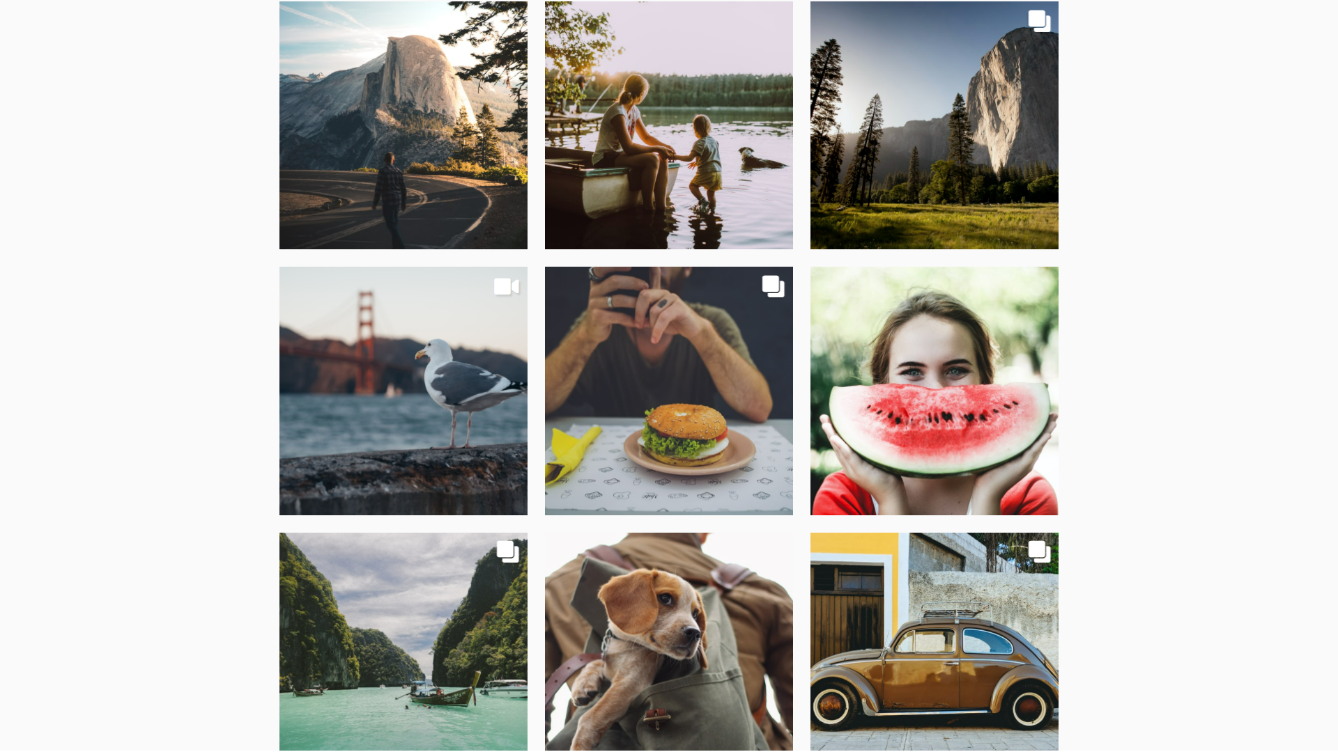
Instagram CSS Gallery With CSS Grid
Links
About Project
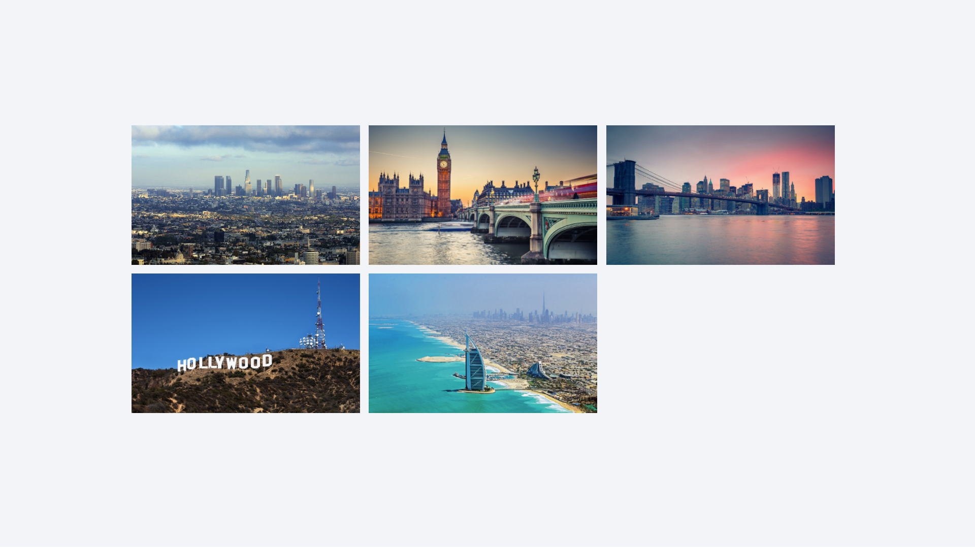
CSS Gallery With Image Hover Effect
Links
About Project
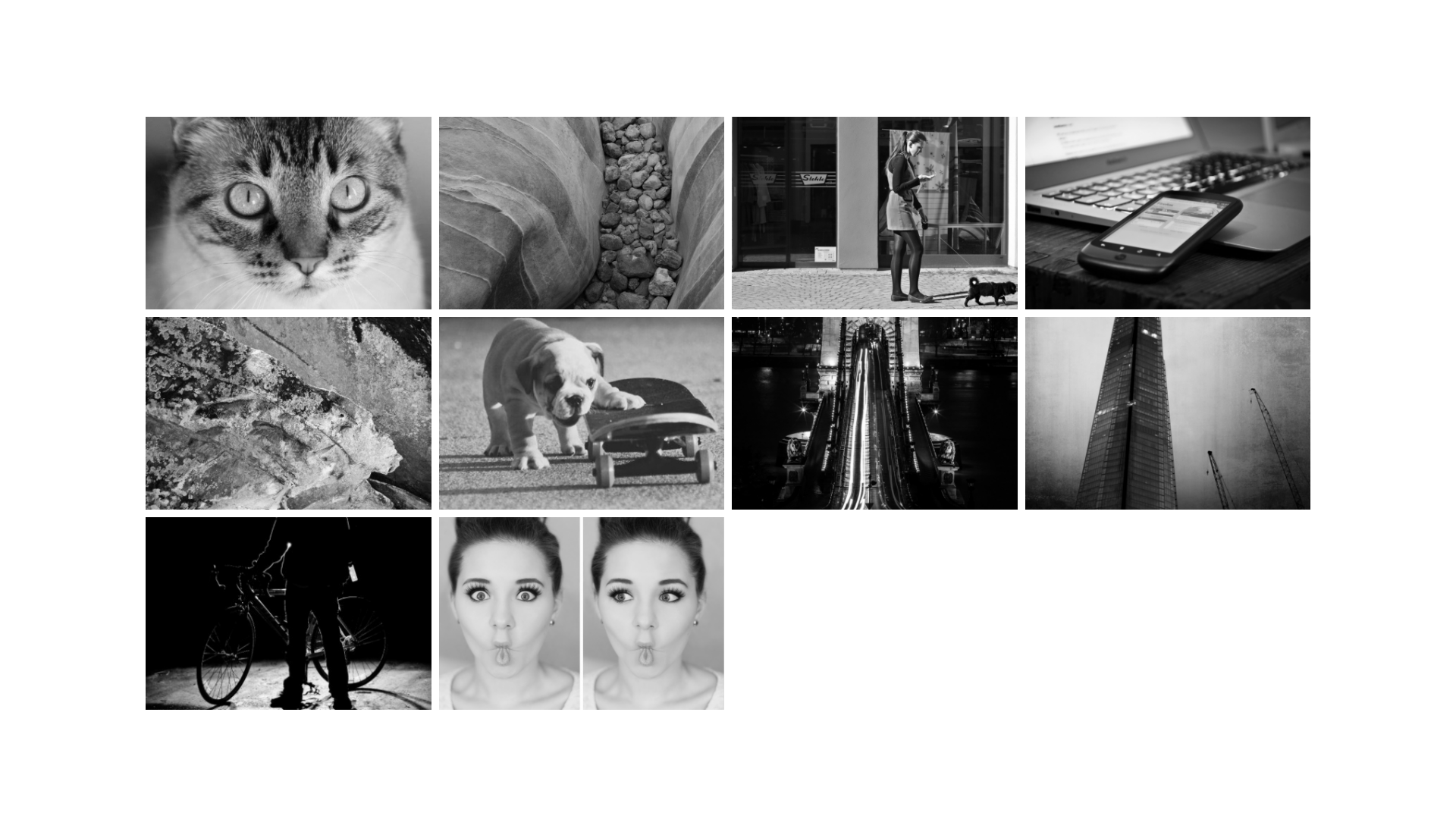
Responsive Grid Using Display Inline-Block
Links

About Project
CSS3 Responsive Image Grid With Hover Effect
Links

About Project
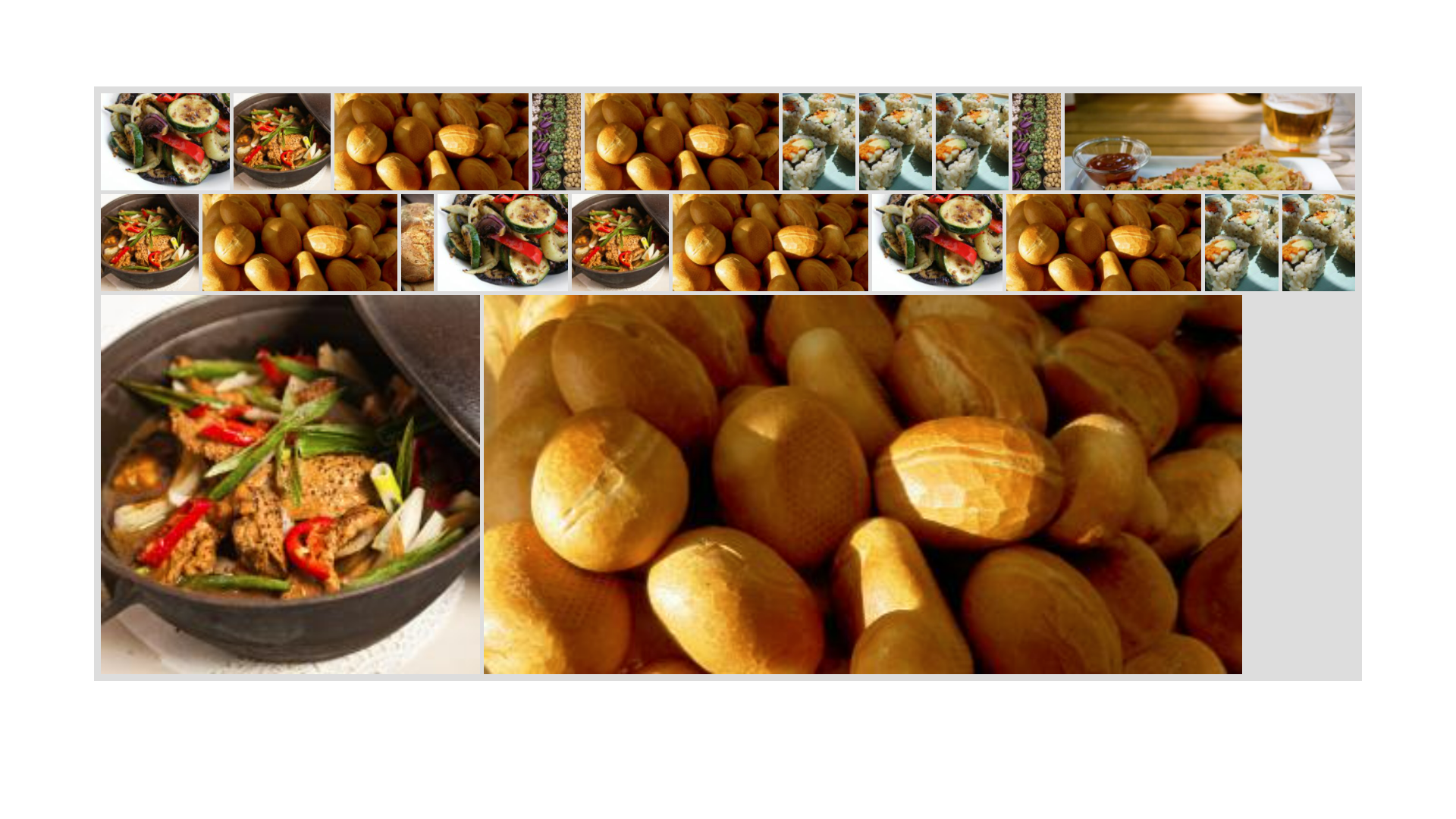
3D CSS Grid Image Gallery With Hover Effect
Links
About Project
Flex Justified Image Grid
Links

About Project
CSS Flexbox Image Grid Project
Links

About Project
Responsive CSS Image Grid
Links
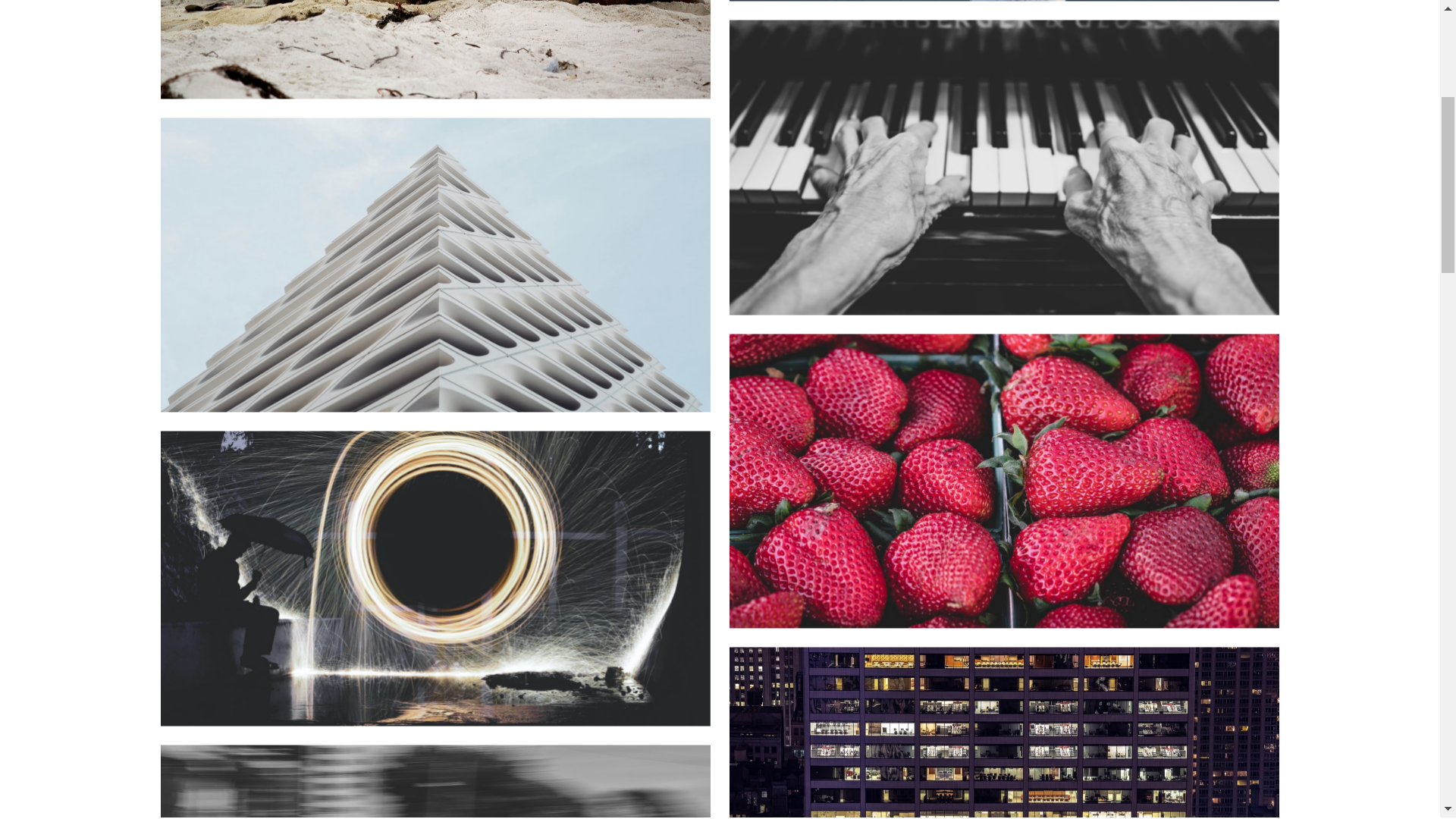
About Project
Simple Image Gallery With JavaScript
Links
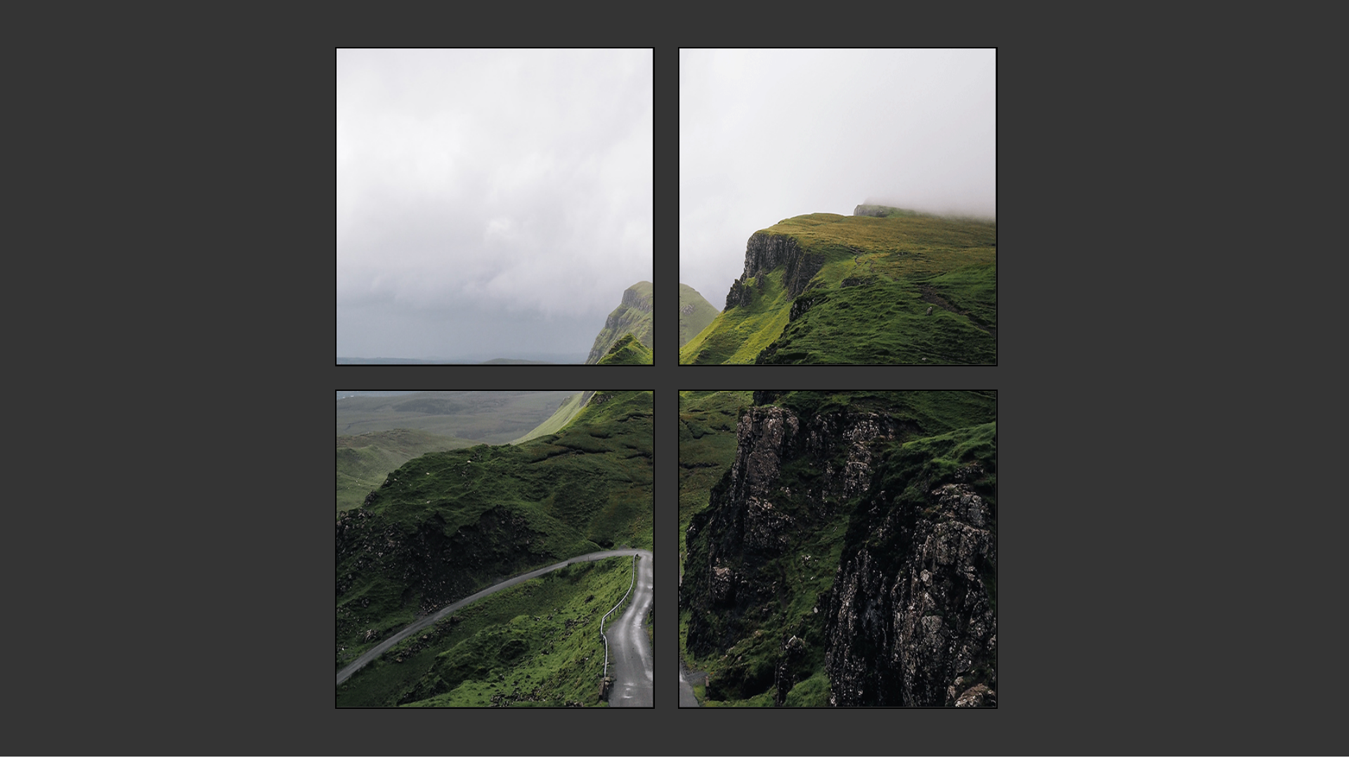
About Project
2×2 CSS Image Grid
Links

About Project
Mosiac Responsive CSS Image Gallery
Links
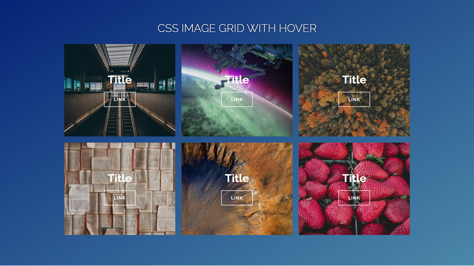
About Project
CSS Image Grid With Hover
Links
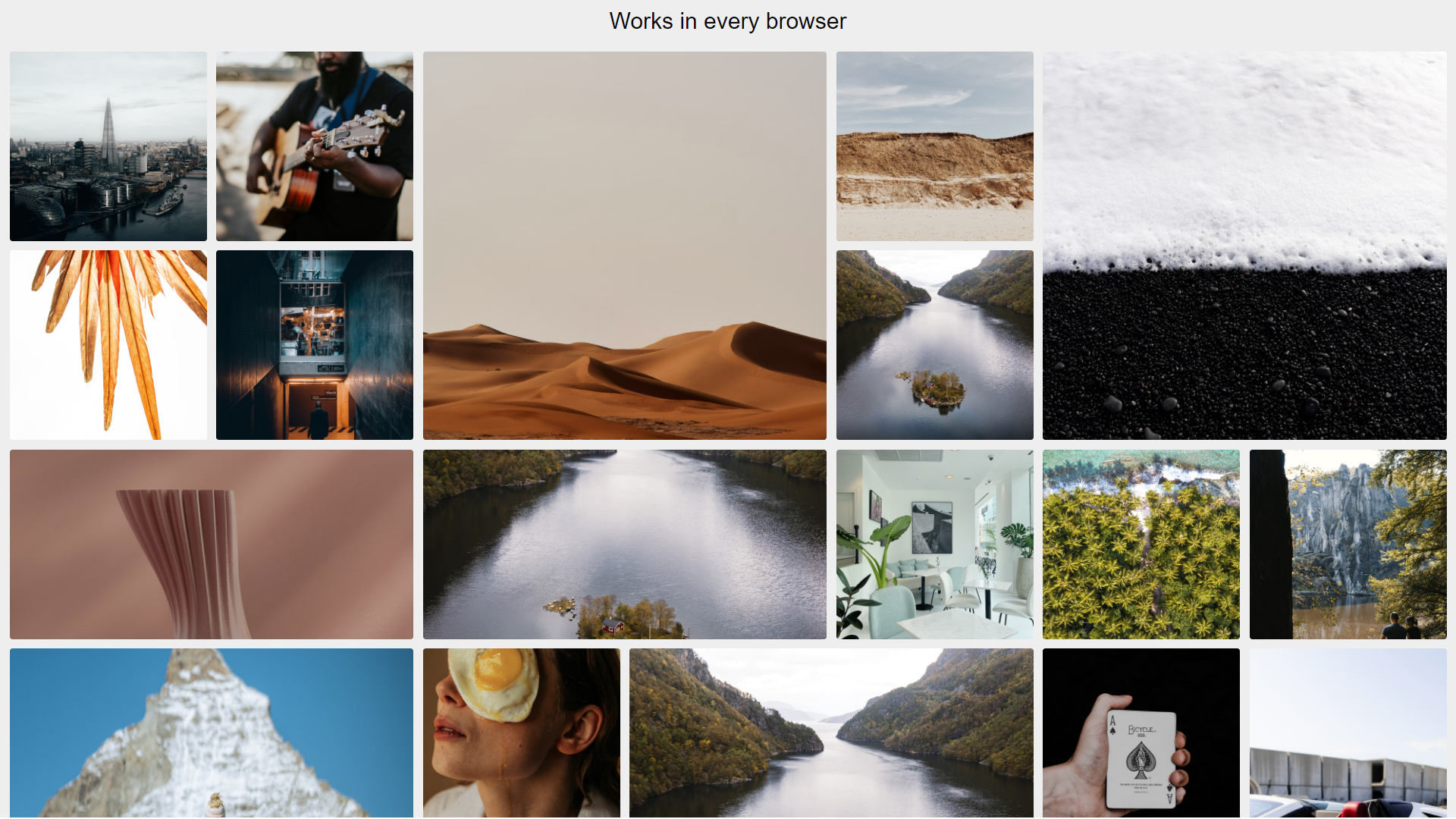
About Project
Responsive Lazy Loading Image Gallery
Links
About Project
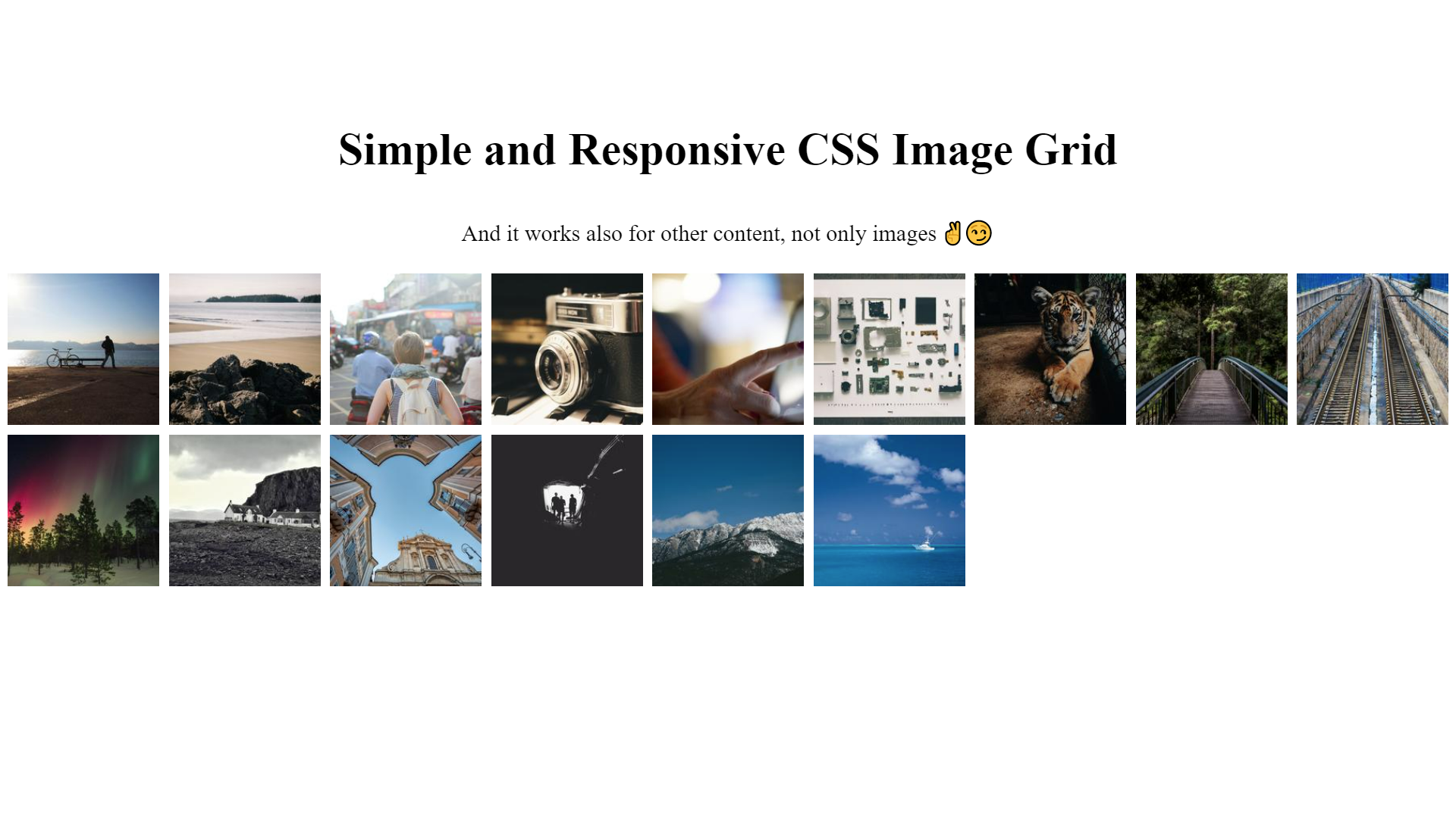
Simple and Responsive CSS Image Grid
Links
About Project