AppCode
This article demonstrates how to create several CSS carousels for your webpage. Included are code walkthroughs and other carousel examples.
Carousels are essential to websites that rely on diagrams, products, text, and images because they can condense the content into smaller view areas. The smaller view areas reduce the need for a list of similar or relative items down a page. Additionally, a carousel can enhance the user experience of websites by making the site more interactive.
What Is a Carousel in CSS?
A CSS carousel is a container of HTML elements that allow users to navigate through different visual content, such as text, images, and videos. Usually, the active slide item is centered in the container, while previews of the previous and next items are shown on the sides. The navigation of the container is typically made up of buttons or arrows that control the direction of the next item (either backward or forward).
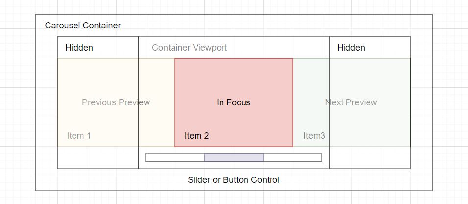
The diagram above outlines the components that make up a simple carousel. These components are made of HTML elements, and let’s review each.
- Carousel Container – The container is the HTML element that holds all the other elements within the carousel. This can also be called the root element of the container.
- Hidden – The hidden sections are items such as images, text, or videos that are not in the container viewport or are previewed on each side. These items will slide into focus whenever the controls are used to navigate.
- Container Viewport – The container viewport shows the selected item in the carousel and most likely takes up the most room within this area.
- Focused Item – The focused item is the active item in the container viewport.
- Previous Preview – The previous preview on the left-hand side, in the viewport, is the item that will come into complete view when the carousel back controls are used.
- Next Preview – The next preview on the right-hand side, in the viewport, is the item that is next in sequence. This item will be the next focused item when the controls are used to move forward.
- Item – An item is each slide within the carousel, and they usually contain videos, images, text, captions, etc.
- Slider or Button Control – The slider or buttons control the various actions, such as back or forward, skipping to a slide, scrolling to the next, or any other actions that have been added.
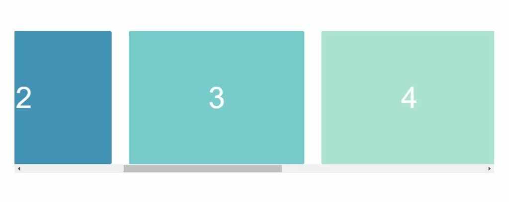
Creating a Carousel With Arrows
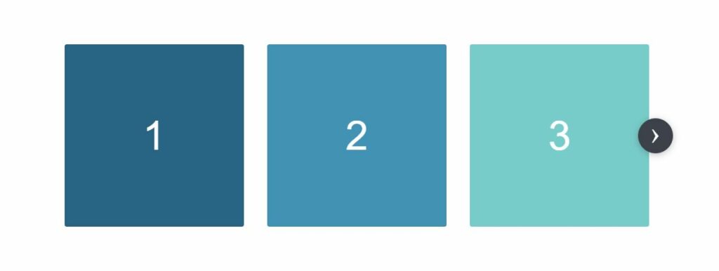
This carousel is made up of three parts.
- Radio Buttons – The radio buttons are hidden inputs that control which item in the track is shown to the user. By using radio buttons, we can pair it with a CSS general sibling combinator ~ to select the child element containing the slide. When the input is
:checkedit applies styles to the corresponding item.
- Arrows – The arrows are label elements programmatically attached to the radio buttons. Whenever a user clicks on an arrow, the corresponding input will be changed to a checked state, and the rest will be unchecked. Using the
:checkedpseudo-class selector, we can check the state of each radio.
- Container – The container is the track of the carousel. It contains all of the items. In the track container, the items are made into a horizontal row using the display: inline-flex and width: 33.33% properties. We can combine radio buttons, arrows, and the check state, to move an item along the track with a
transform: translateX(value). Once the transform is applied, it moves the specific slide into view.
In this example, we have created a feature to adapt to the device’s screen size. In the track, will we will create seven items. One item will be shown on mobile devices, two items on tablets, and three items on larger screens, such as desktops.
Now let’s create the needed HTML.
HTML
<div class='demo-container'>
<div class='carousel'>
<input checked='checked' class='activator' id='carousel-slide-activator-1' name='carousel' type='radio'>
<input class='activator' id='carousel-slide-activator-2' name='carousel' type='radio'>
<input class='activator' id='carousel-slide-activator-3' name='carousel' type='radio'>
<div class='controls'>
<label class='control control--forward' for='carousel-slide-activator-2'>›</label>
</div>
<div class='controls'>
<label class='control control--backward' for='carousel-slide-activator-1'>‹</label>
<label class='control control--forward' for='carousel-slide-activator-3'>›</label>
</div>
<div class='controls'>
<label class='control control--backward' for='carousel-slide-activator-2'>‹</label>
</div>
<div class='screen'>
<div class='track'>
<div class='item item--mobile-in-1 item--tablet-in-2 item--desktop-in-3'>
<div class='demo-content'>1</div>
</div>
<div class='item item--mobile-in-1 item--tablet-in-2 item--desktop-in-3'>
<div class='demo-content'>2</div>
</div>
<div class='item item--mobile-in-1 item--tablet-in-2 item--desktop-in-3'>
<div class='demo-content'>3</div>
</div>
<div class='item item--mobile-in-1 item--tablet-in-2 item--desktop-in-3'>
<div class='demo-content'>4</div>
</div>
<div class='item item--mobile-in-1 item--tablet-in-2 item--desktop-in-3'>
<div class='demo-content'>5</div>
</div>
<div class='item item--mobile-in-1 item--tablet-in-2 item--desktop-in-3'>
<div class='demo-content'>6</div>
</div>
<div class='item item--mobile-in-1 item--tablet-in-2 item--desktop-in-3'>
<div class='demo-content'>7</div>
</div>
</div>
</div>
</div>
</div>Next, we need to add the styles for the radio buttons, control arrows, items, and containers.
CSS
html {
  box-sizing: border-box;
}

*,
*:before,
*:after {
  box-sizing: inherit;
}

.carousel {
  min-width: 900px;
  max-width: 1236px;
  margin-left: auto;
  margin-right: auto;
  padding-left: 48px;
  padding-right: 48px;
  position: relative;
}

.activator {
  display: none;
}

.controls {
  display: none;
  align-items: center;
  justify-content: space-between;
  position: absolute;
  top: 0;
  right: 16px;
  left: 16px;
  bottom: 0;
}

.controls:first-of-type {
  justify-content: flex-end;
}

.controls:last-of-type {
  justify-content: flex-start;
}

.control {
  cursor: pointer;
  background-color: #3d414a;
  color: #fff;
  border-radius: 100%;
  box-shadow: 0 2px 10px 0 rgb(33 34 36 / 30%);
  font-size: 40px;
  height: 48px;
  justify-content: center;
  transition: 0.3s all;
  width: 48px;
  z-index: 1;
  text-align: center;
  line-height: 40px;
}

.control:hover {
  transform: scale(1.05);
}

.activator:nth-of-type(1):checked ~ .controls:nth-of-type(1) {
  display: flex;
}

.activator:nth-of-type(1):checked ~ .screen .track {
  transform: translateX(0%);
}

.activator:nth-of-type(2):checked ~ .controls:nth-of-type(2) {
  display: flex;
}

.activator:nth-of-type(2):checked ~ .screen .track {
  transform: translateX(-100%);
}

.activator:nth-of-type(3):checked ~ .controls:nth-of-type(3) {
  display: flex;
}

.activator:nth-of-type(3):checked ~ .screen .track {
  transform: translateX(-200%);
}

.activator:nth-of-type(4):checked ~ .controls:nth-of-type(4) {
  display: flex;
}

.activator:nth-of-type(4):checked ~ .screen .track {
  transform: translateX(-300%);
}

.activator:nth-of-type(5):checked ~ .controls:nth-of-type(5) {
  display: flex;
}

.activator:nth-of-type(5):checked ~ .screen .track {
  transform: translateX(-400%);
}

.activator:nth-of-type(6):checked ~ .controls:nth-of-type(6) {
  display: flex;
}

.activator:nth-of-type(6):checked ~ .screen .track {
  transform: translateX(-500%);
}

.activator:nth-of-type(7):checked ~ .controls:nth-of-type(7) {
  display: flex;
}

.activator:nth-of-type(7):checked ~ .screen .track {
  transform: translateX(-600%);
}

.activator:nth-of-type(8):checked ~ .controls:nth-of-type(8) {
  display: flex;
}

.activator:nth-of-type(8):checked ~ .screen .track {
  transform: translateX(-700%);
}

.activator:nth-of-type(9):checked ~ .controls:nth-of-type(9) {
  display: flex;
}

.activator:nth-of-type(9):checked ~ .screen .track {
  transform: translateX(-800%);
}

.activator:nth-of-type(10):checked ~ .controls:nth-of-type(10) {
  display: flex;
}

.activator:nth-of-type(10):checked ~ .screen .track {
  transform: translateX(-900%);
}

.screen {
  overflow: hidden;
  margin-left: -16px;
  margin-right: -16px;
}

.track {
  font-size: 0;
  transition: all 0.3s ease 0s;
  white-space: nowrap;
  -webkit-overflow-scrolling: touch;
}

.item {
  display: inline-flex;
  padding-left: 16px;
  padding-right: 16px;
  vertical-align: top;
  white-space: normal;
}

.item--desktop-in-1 {
  width: 100%;
}

.item--desktop-in-2 {
  width: 50%;
}

.item--desktop-in-3 {
  width: 33.3333333333%;
}

.item--desktop-in-4 {
  width: 25%;
}

.item--desktop-in-5 {
  width: 20%;
}

.demo-container {
  display: flex;
  position: absolute;
  top: 0;
  align-items: center;
  bottom: 0;
  left: 0;
  right: 0;
}

.demo-content {
  color: #fff;
  display: flex;
  font-family: Helvetica;
  font-weight: 100;
  align-items: center;
  justify-content: center;
  text-transform: uppercase;
  border-radius: 3px;
  font-size: 56px;
  height: 250px;
  width: 100%;
}

.item:nth-child(1) .demo-content {
  background-color: #216485;
}

.item:nth-child(2) .demo-content {
  background-color: #3692b6;
}

.item:nth-child(3) .demo-content {
  background-color: #6fccc9;
}

.item:nth-child(4) .demo-content {
  background-color: #a6e3cf;
}

.item:nth-child(5) .demo-content {
  background-color: #aff0be;
}

.item:nth-child(6) .demo-content {
  background-color: #527059;
}

.item:nth-child(7) .demo-content {
  background-color: #243127;
}

@media screen and (max-width: 1023px) {
  .carousel {
    padding-left: 0;
    padding-right: 0;
  }

  .activator:nth-of-type(n):checked ~ .controls:nth-of-type(n) {
    display: none;
  }

  .activator:nth-of-type(n):checked ~ .screen .track {
    transform: none;
  }

  .screen {
    margin-left: 0;
    margin-right: 0;
  }

  .track {
    overflow-x: auto;
    width: auto;
    padding-left: 48px;
    padding-right: 48px;
  }

  .item--tablet-in-1 {
    width: 90%;
  }

  .item--tablet-in-2 {
    width: 45%;
  }

  .item--tablet-in-3 {
    width: 30%;
  }
}

@media screen and (max-width: 650px) {
  .track {
    padding-left: 0;
    padding-right: 0;
  }

  .item--mobile-in-1 {
    width: 90%;
  }

  .item--mobile-in-2 {
    width: 45%;
  }

  .item--mobile-in-3 {
    width: 30%;
  }
}
Some classes you may notice are the .item--mobile-in-1.item--tablet-in-2.item--desktop-in-3 on each slide item. As we talked about before, the layout for the items will be different depending on the device. These classes detect the screen size using a @media query. When the screen size matches the correct query size, the styles contained inside the query will be applied to the items in the track. The styles result in the responsive nature of the carousel. In addition to being responsive, the carousel also becomes swipeable, left or right, on smaller devices.
Creating a Carousel for Movie Titles
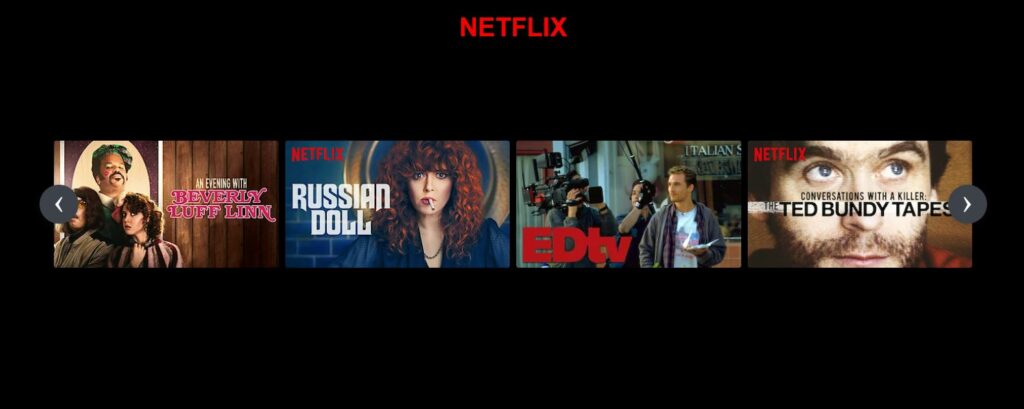
The following example will demonstrate creating a carousel for movie titles using a Netflix theme. As we build the example, we use a couple of features to create a realistic effect for the movie title viewer. Let’s go over these features.
- Wrapper – The .carousel
<div>element wrapper contains all the necessary elements to give the carousel its structure. It has a width with a value ofcalc(80% - 60px)and a left-right padding of 30px.
- Anchor Link – The
<a>anchor link elements are the controls. They allow navigation to the different sets of movie titles. Each link has an id attribute corresponding to a section containing the same id. Since we set the value of the anchor link to an id, the carousel moves to that section whenever the forward or backward link control is clicked.
- Item – Each item in the carousel is the image of the movie title. The width of the items is set to 25% of the parent container width, which creates four titles in each section.
- Item Hover – On hovering a movie title, an animation is applied that adds a margin and a transform scale effect. The effect uses a transition property to ease the animation.
- Smooth Scrolling – When the titles change positions, we could call this scrolling, but it isn’t actual scrolling. The scrolling effect is a
transform: translateX(n)property combined with a 0.75s transition ease. To get the correct translation length, we set each transform to multiples of 100 (100%, 200%, 300%). The transform tells the browser to shift the section 100% depending on if the value is right (positive) or left (negative).
Let’s begin creating the example.
HTML
<h1>NETFLIX</h1>
<div class='demo-container'>
<div class='carousel'>
<input checked='checked' class='activator' id='carousel-slide-activator-1' name='carousel' type='radio'>
<input class='activator' id='carousel-slide-activator-2' name='carousel' type='radio'>
<input class='activator' id='carousel-slide-activator-3' name='carousel' type='radio'>
<input class='activator' id='carousel-slide-activator-4' name='carousel' type='radio'>
<div class='controls'>
<label class='control control--backward' for='carousel-slide-activator-4'>‹</label>
<label class='control control--forward' for='carousel-slide-activator-2'>›</label>
</div>
<div class='controls'>
<label class='control control--backward' for='carousel-slide-activator-1'>‹</label>
<label class='control control--forward' for='carousel-slide-activator-3'>›</label>
</div>
<div class='controls'>
<label class='control control--backward' for='carousel-slide-activator-2'>‹</label>
<label class='control control--forward' for='carousel-slide-activator-4'>›</label>
</div>
<div class='controls'>
<label class='control control--backward' for='carousel-slide-activator-3'>‹</label>
<label class='control control--forward' for='carousel-slide-activator-1'>›</label>
</div>
<div class='screen'>
<div class='track'>
<div class='item item--desktop-in-3'>
<img class='demo-content' src="https://occ-0-1567-1123.1.nflxso.net/dnm/api/v5/rendition/412e4119fb212e3ca9f1add558e2e7fed42f8fb4/AAAABRvngexxF8H1-OzRWFSj6ddD-aB93tTBP9kMNz3cIVfuIfLEP1E_0saiNAwOtrM6xSOXvoiSCMsihWSkW0dq808-R7_lBnr6WHbjkKBX6I3sD0uCcS8kSPbRjEDdG8CeeVXEAEV6spQ.webp" alt="Describe Image">
</div>
<div class='item item--desktop-in-3'>
<img class='demo-content' src="https://occ-0-243-299.1.nflxso.net/dnm/api/v5/rendition/412e4119fb212e3ca9f1add558e2e7fed42f8fb4/AAAABZEK-7pZ1H5FD4cTyUb9qB_KeyJGz5p-kfPhCFv4GU_3mbdm8Xfsy4IBchlG9PFNdGff8cBNPaeMra72VFnot41nt0y3e8RLgaVwwh3UvyM2H2_MkmadWbQUeGuf811K7-cxJJh7gA.jpg" alt="Describe Image">
</div>
<div class='item item--desktop-in-3'>
<img class='demo-content' src="https://occ-0-243-299.1.nflxso.net/dnm/api/v5/rendition/412e4119fb212e3ca9f1add558e2e7fed42f8fb4/AAAABQCoK53qihwVPLRxPEDX98nyYpGbxgi5cc0ZOM4iHQu7KQvtgNyaNM5PsgI0vy5g3rLPZdjGCFr1EggrCPXpL77p2H08jV0tNEmIfs_e8KUfvBJ6Ay5nM4UM1dl-58xA6t1swmautOM.webp" alt="Describe Image">
</div>
<div class='item item--desktop-in-3'>
<img class='demo-content' src="https://occ-0-243-299.1.nflxso.net/dnm/api/v5/rendition/412e4119fb212e3ca9f1add558e2e7fed42f8fb4/AAAABdYtAqj8CyaJTWq5taD8Ro_UgwH3nne9QpFGVps-2J3IG-leqrfqXFii4jzZn48nPYTkrlwKQEV0R7_cEKlYBPRzdKqNODc-Oz26IL3LlLgFboXibIWXwxzeYxzuqn0I9TpARjeByw.jpg" alt="Describe Image">
</div>
<div class='item item--desktop-in-3'>
<img class='demo-content' src="https://occ-0-243-299.1.nflxso.net/dnm/api/v5/rendition/412e4119fb212e3ca9f1add558e2e7fed42f8fb4/AAAABbcCX42tsqGbBvO2y9CQv5-7QvYbCfoHtXsuc6NPCtZaKa4l4fBX3XWvUwG9F2A3CTsNpHVmulxBbdXKwK8Q6xGjejd9FoadGkZ7CnGrSl601TOQjzSHJ23NuIPC8j0QMGORL4uRIA.jpg" alt="Describe Image">
</div>
<div class='item item--desktop-in-3'>
<img class='demo-content' src="https://occ-0-243-299.1.nflxso.net/dnm/api/v5/rendition/412e4119fb212e3ca9f1add558e2e7fed42f8fb4/AAAABVopDZ5Fy9_fk_HO5WxHTXKKjKhtWFupbSjuvPwfLK_vytzon4EwRUdGgYJ34JwPxOTK_NkV3aXfkULMB0Dcct-FyfqzH-X44VXuRMp4QeBHlvKwWeZFpZlGdItPzmmg4scmwhG7SQ.jpg" alt="Describe Image">
</div>
<div class='item item--desktop-in-3'>
<img class='demo-content' src="https://occ-0-243-299.1.nflxso.net/dnm/api/v5/rendition/412e4119fb212e3ca9f1add558e2e7fed42f8fb4/AAAABTOj1-116yVcgKWMU2dI3GFR4x0fSkiGsqtLLeLUxRR7STaksjAqBTrYlTfrB8nIGnGvXksi0ewXAhVGg6-pLxpFOIfcpjK-pf8D5xehFZo5a6vJbo4L0AGbrzglbyUoq255QBJgRQ.jpg" alt="Describe Image">
</div>
<div class='item item--desktop-in-3'>
<img class='demo-content' src="https://occ-0-243-299.1.nflxso.net/dnm/api/v5/rendition/a76057bcfd003711a76fb3985b1f2cf74beee3b8/AAAABd3IBDpxbRcHXvRMFCZeKa2aHLU1P4SJtrACMS9om3yhLjqPlvNlmR_fypPxjtbsbnKaC4JZhPSpDG4r_kdxSHHAltWguMcCB-1Y1OShr2zWfUv7Whf_39fNH5ZJ3_0gxQrs0akmQjQz44_LT7jXH5LMZ7iMBAzac5IEj4m7Fn_5OWEGYnVsDsKG-QTommDooULMDF9bEw.jpg" alt="Describe Image">
</div>
<div class='item item--desktop-in-3'>
<img class='demo-content' src="https://occ-0-243-299.1.nflxso.net/dnm/api/v5/rendition/a76057bcfd003711a76fb3985b1f2cf74beee3b8/AAAABXSd7bhDddcwkq9XpksoQFCHVx29Sxl_h4hb2n3F2GIt32a4XWcOnctQfgnT5qdolv8UML6_xNB5CJ89h56wueb13mYmEBr0sx5e9iLPdtVcOQAOmKXKWHHXwFvJuCUwuNnL3s8eAQwqLXPVMHMEsujM684rUGrZNF2btN2GRy5-RyEslsxZO93V2Q_H2bWs8A8oayt1h5M.webp" alt="Describe Image">
</div>
<div class='item item--desktop-in-3'>
<img class='demo-content' src="https://occ-0-243-299.1.nflxso.net/dnm/api/v5/rendition/a76057bcfd003711a76fb3985b1f2cf74beee3b8/AAAABbXWODpAWqVXcmmjMA7K-2mPkQpvwCLfSdeyhVXzR8A3MSpdSEnnjf4HEJJTYC-TnktU6njTUGAxmzWEYCaJbk4v_ZeL-7QGzmkvYBjg_N-evr2XmcX-Fanoyvu_nimFP4iigPe4O3Vr_WcgplhwkDrJwPUJa84wRLrNAx3TufN5V7cWRP4indqu5HQahvgFEqfL9zjp4g.jpg" alt="Describe Image">
</div>
<div class='item item--desktop-in-3'>
<img class='demo-content' src="https://occ-0-243-299.1.nflxso.net/dnm/api/v5/rendition/412e4119fb212e3ca9f1add558e2e7fed42f8fb4/AAAABRr4YxdaABuAuH_3FmSQZn7BCvLp-UUPsXE9MiYpvFP3CSUHV2zOew5oVqKqqdaOd3tbFVS0Uf67uIs7_eZydlCghg4nK0nMatRpPImABwTOhnNzCLCxdKrua7pPIcPCZqBYTeAO5g.jpg" alt="Describe Image">
</div>
<div class='item item--desktop-in-3'>
<img class='demo-content' src="https://occ-0-243-299.1.nflxso.net/dnm/api/v5/rendition/412e4119fb212e3ca9f1add558e2e7fed42f8fb4/AAAABTyWK1MKaw8GcObtz47R2Tj7wkLJ7qQu9tk6TVpcoyxpzD4B-zZ569bQ5vGrREBL-MWFkGilXUwy7tCDaj2XOGkUB4RsbbFAmp9NgSr6lygMpUGNHSlyfrFbUORsRkrxSIoh_ggOvg.jpg" alt="Describe Image">
</div>
<div class='item item--desktop-in-3'>
<img class='demo-content' src="https://occ-0-243-299.1.nflxso.net/dnm/api/v5/rendition/a76057bcfd003711a76fb3985b1f2cf74beee3b8/AAAABY7NwkWEJIfXsn6t3Li4bGSCQ1nEErPisI5ZZtXlC-_VRBZOUrhWK5X3vt3t6SR_cpgVhCwxgQqFFDJhk62Kk8hawOnYGZMr0LKeLczMFV2zalCFjkcdLksvT4HB2LEi6LFyruyk3Uu0LmNGsHfC2A8Bly60smr_3sDbz4RruXcklPOG1qYq9wUVu3zfaiwNvqmG4b8aFA.jpg" alt="Describe Image">
</div>
<div class='item item--desktop-in-3'>
<img class='demo-content' src="https://occ-0-243-299.1.nflxso.net/dnm/api/v5/rendition/a76057bcfd003711a76fb3985b1f2cf74beee3b8/AAAABemXHOga9feFnOux6I2YyACBD94wvM7N3vcTGIfMpQ_BcaXeoeM9XyzdVdamKtxt0SHXZfvsl6czcp3E48tXMLtHBxuQsh1BjHtPGgJDZ81je_FjItINiqzLtir0A30s_e4KR8G3d7AYAPDjZVOY97bNpzNqtkcHcGp7fGnJByVCps1uLfG9U9tK3Ma1A_3JbRt0NiT2_Q.jpg" alt="Describe Image">
</div>
<div class='item item--desktop-in-3'>
<img class='demo-content' src="https://occ-0-243-299.1.nflxso.net/dnm/api/v5/rendition/a76057bcfd003711a76fb3985b1f2cf74beee3b8/AAAABVxuRB932hvre-XP0gh6ar5ztoR3Oe3QjKHkyvcDnRak2MKXOrx5H7mFQSvggefMFOppwEs7ZCCpiqrJ_CYGvtvYB9NpU4SWUtNO6uV2u-DTID267AcHjHcGvGBQJ1ufddDkxcGOZyi5MlOQ5QUmBun4652FbYUnib3zMYQDgcna_Pvz8y_HO5fbokxezrRR1JZAAiqFSQ.jpg" alt="Describe Image">
</div>
</div>
</div>
</div>
</div>Next, we need to add the styles.
CSS
html {
  box-sizing: border-box;
  background-color: #000;
  margin: 0;
}

body {
  margin: 0;
}

*,
*:before,
*:after {
  box-sizing: inherit;
}

h1 {
  font-family: Arial;
  color: red;
  text-align: center;
}

.carousel {
  min-width: 900px;
  margin: 0 auto;
  padding-left: 0 30px;
  position: relative;
  width: calc(80% - 60px);
}

.activator {
  display: none;
}

.controls {
  display: none;
  align-items: center;
  justify-content: space-between;
  position: absolute;
  top: 0;
  right: 0;
  left: 0;
  bottom: 0;
}

.controls:last-of-type {
  justify-content: flex-start;
}

.control {
  cursor: pointer;
  background-color: #3d414a;
  color: #fff;
  border-radius: 100%;
  box-shadow: 0 2px 10px 0 rgb(33 34 36 / 30%);
  font-size: 40px;
  height: 48px;
  justify-content: center;
  transition: 0.3s all;
  width: 48px;
  z-index: 1;
  text-align: center;
  line-height: 40px;
}

.control:hover {
  transform: scale(1.05);
}

.activator:nth-of-type(1):checked ~ .controls:nth-of-type(1) {
  display: flex;
}

.activator:nth-of-type(1):checked ~ .screen .track {
  transform: translateX(0%);
}

.activator:nth-of-type(2):checked ~ .controls:nth-of-type(2) {
  display: flex;
}

.activator:nth-of-type(2):checked ~ .screen .track {
  transform: translateX(-100%);
}

.activator:nth-of-type(3):checked ~ .controls:nth-of-type(3) {
  display: flex;
}

.activator:nth-of-type(3):checked ~ .screen .track {
  transform: translateX(-200%);
}

.activator:nth-of-type(4):checked ~ .controls:nth-of-type(4) {
  display: flex;
}

.activator:nth-of-type(4):checked ~ .screen .track {
  transform: translateX(-300%);
}

.screen {
  overflow: hidden;
  margin-left: -16px;
  margin-right: -16px;
  padding: 40px 0;
}

.track {
  font-size: 0;
  transition: all 0.75s ease 0s;
  white-space: nowrap;
  -webkit-overflow-scrolling: touch;
}

.item {
  display: inline-flex;
  vertical-align: top;
  white-space: normal;
  transition: 250ms all;
  padding: 0 4px;
}

.item:hover {
  margin: 0 30px;
  transform: scale(1.2);
}

.item--desktop-in-1 {
  width: 100%;
}

.item--desktop-in-2 {
  width: 50%;
}

.item--desktop-in-3 {
  width: 25%;
}

.item--desktop-in-4 {
  width: 25%;
}

.item--desktop-in-5 {
  width: 20%;
}

.demo-container {
  display: flex;
  position: absolute;
  top: 0;
  align-items: center;
  bottom: 0;
  left: 0;
  right: 0;
}

.demo-content {
  color: #fff;
  display: flex;
  font-family: Helvetica;
  font-weight: 100;
  align-items: center;
  justify-content: center;
  text-transform: uppercase;
  border-radius: 3px;
  font-size: 56px;
  width: 100%;
}
Other Examples
Here is a collection of CSS carousel examples from across the web. Included are examples and code for reuse.

Full CSS Carousel
About Project
Links
![Pure CSS Carousel [Dissolving Images]](https://appcode.app/wp-content/uploads/2022/04/Pure-CSS-Carousel-Dissolving-Images.png "Pure CSS Carousel [Dissolving Images]")
Pure CSS Carousel [Dissolving Images]
About Project
Links

3D Spinning Carousel
About Project
Links

Pure CSS Carousel
About Project
Links

CSS Carousel With Keyboard Controls
About Project
Links

Playlist Carousel – CSS Only
About Project
Links

A CSS-Only Carousel Slider
About Project
Links

Gallery Type CSS Carousel
About Project
Links

Pure CSS Carousel With Thumbnails
About Project
Links
")
Responsive Sliding Carousel (CSS Animation Journey Collection)
About Project
Links

CSS-Tricks Card Carousel
About Project
Links

Multidirectional Email Carousel
About Project
Links

3D Carousel Rotating
About Project
Links

Infinite Autoplay CSS Carousel
About Project
Links
arousel – Pure CSS Carousels")
C(ss)arousel – Pure CSS Carousels
About Project
Links

Very Simple Pure CSS Carousel – Can The Code Be Any Smaller
About Project
Links

CSS Vertical Carousel Animation
About Project
Links

Fruity Pure CSS carousel
About Project
Links
")
CSS Variables 3D Carousel (No JS)
About Project
Links
")
Pure CSS Carousel ( Cube )
About Project
Links

Testimonial Pure CSS Carousel
About Project
Links
")
CSS Carousel (Perspective + 3D)
About Project
Links

Looping Images CSS Carousel
About Project
Links

Html+CSS Carousel
About Project
Links

Testimonial Pure CSS Carousel 2
About Project
Links

CSS CAROUSEL BASED SLIDER
About Project
Links

Basic CSS Carousel
About Project
Links

CSS Carousel Marquee
About Project
Links

Classic CSS Carousel
About Project
Links

CSS Carousel Using @keyframes
About Project
Links

Profile Carousel
About Project
Links

Jorge’s Portfolio Carousel
About Project
Links
Recommended Articles
Other Articles
- 15 Text Outline CSS Examples and Code
- 15 Flexbox CSS Examples and Code
- 32 CSS Page Transition Examples and Code
- 32 CSS Text Animation Examples and Code
- 32 CSS Timeline Examples and Code
- 32 CSS Form Examples and Code
- 32 CSS Tab Examples and Code
- 33 CSS Button Examples and Code
- 32 CSS Hover Effect Examples and Code