- Overview
- What is a Card?
- Parts of a Card
- How are Cards Used?
- CSS Recap – CSS Application in HTML
- Creating a Read More Card
- Creating a Shoutout Card
- Other Examples
- Conclusion
- Frequently Asked Questions
- See Also
This article demonstrates CSS card designs, definitions, walk-throughs, code examples, FAQs, and other card-related developer information.
You must be familiar with CSS to make your website look appealing. CSS (also referred to as Cascading Style Sheets) is a style sheet language for styling web content. Cards are often used in modern web design.
The cards appear sleek and similar to the Android Material design. Using the box-shadow property, we can generate both Text and Picture cards.
These cards can display article excerpts, with an image on top and the article title at the bottom, user profiles, or anything else. Picture cards can be used for several different things. This lesson will teach CSS fundamentals by creating card components from scratch. Let’s get started if you’re ready.
First, let’s look at three approaches to adding CSS to HTML. These approaches are:
External stylesheets
The most popular and useful method is to use an external stylesheet. CSS is contained in a separate file with the extension.css.
Create a new file, style.css, in the same folder as index.html to add an external stylesheet. You may also import the stylesheet within the element by doing this:
<link rel="stylesheet" href="style.css">
Internal stylesheets
You can include an internal stylesheet by putting CSS in the
<!DOCTYPE html>
<html lang="en">
<head>
  <meta charset="UTF-8">
  <meta name="viewport" content="width=device-width, initial-scale=1.0">
  <title>Creating Cards using CSS</title>

  <style>
    /* your style */
  </style>

</head>
<body>

</body>
</html>
Inline styles (Not recommended)
You should avoid this style as much as you can. However, the style attribute can also add style directly to an element.
This method is frequently used when working with lines of code that do not allow you to alter the external or internal stylesheets.
Adding inline styling to your page is not a good practice. Why? That’s because it makes it tough to read and understand; therefore, avoid it wherever possible.
<div style="color:red;">paragraph</div>
We need some content to work with before we begin working with CSS. In this step, we will start by creating the HTML markups. If you are unfamiliar with HTML, you can start with some of our HTML tutorials.
<!-- A div with container id to hold the card -->
<div id="container">
  <!-- A div with card class for the card  -->
  <div class="card">
    <img src="https://images.unsplash.com/photo-1672357867403-0b36f4334de7?ixlib=rb-4.0.3&ixid=MnwxMjA3fDB8MHxwaG90by1wYWdlfHx8fGVufDB8fHx8&auto=format&fit=crop&w=870&q=80">
    <!-- A div with card__details class to hold the details in the card  -->
    <div class="card__details">
      <!-- Span with tag class for the tag -->
      <span class="tag">When nature calls</span>
      <span class="tag">By Unsplash</span>
      <!-- A div with name class for the name of the card -->
      <div class="name">Jim Carrey</div>
      <p>
        Pride is an abomination. One must forego the self to obtain total spiritual creaminess and avoid the chewy chunks of degradation.
      </p>
      <button>Read more</button>
    </div>
  </div>
</div>
If you are coding externally, you must wrap these lines of code in the basic HTML markups. This means you ought to start by creating something like this:
<!DOCTYPE html>
<html lang="en">
    <head>
      <meta charset="UTF-8">
      <meta name="viewport" content="width=device-width, initial-scale=1.0">
      <title>Creating Cards using CSS</title>
    </head>
    <body>
    <!-- Website Content Here -->
    </body>
</html>
Alright, with the HMTL elements out of the way, let’s see what we’ve achieved so far with the lines of codes we’ve created thus far:
Image Placeholder
It doesn’t look like much, but that’s because we are yet to style it. However, what we’ve done here with HTML is to create the “skeleton” or “frame” for our design. With this, styling can exist. But it’s like trying to place a fleshy one in thin air – nothing will hold it!
Remember, our task is to create a card component with an image, tags, a name, a description, and a button.
The component must then be styled. This is the tutorial’s central point. This section will explain several concepts as I create the card component.
Styling the HTML elements
With this out of the way, let’s go back to our tutorial and style it using CSS.
body {
  background-color: #eaeff1;
  font-family: sans-serif;
}

#container {
  max-width: 300px;

  /* This will center the container in the middle on the horizontal axis */
  margin: 0 auto;

  /* Add space above the container (20% of the view height) */
  margin-top: 20vh;
}

img {
  width: 100%;
  border-radius: 12px;
  height: 214px;
  object-fit: cover;
}

.card {
  /* Change background color */
  background-color: white;

  /* Add border */
  border: 1px solid #bacdd8;

  /* Add space between the border and the content */
  padding: 8px;
  border-radius: 12px;
}
Now you should have a responsive image with a height of 214px. So let’s move on. We’ve also fixed the distorted image by adding the object-fit: cover;
But we still need to finish.
.tag {
  padding: 4px 8px;
  border: 1px solid #e5eaed;
  border-radius: 50px;
  font-size: 12px;
  font-weight: 600;
  color: #788697;
}

.name {
  font-size: 24px;
  font-weight: 600;
  margin-top: 16px;
}

p {
  font-size: 14px;
  color: #7f8c9b;
  line height: 150%;
}

button {
  border: none;
  padding: 12px 24px;
  border-radius: 50px;
  font-weight: 600;
  color: #0077ff;
  background-color: #e0efff;
  margin: 0 auto;
  display: block;
  cursor: pointer;
  padding: 16px 8px 8px 8px;
}

button: focus,
button: hover {
  background-color: red;
  color: #e0efff;
}
Here’s the final result:
Image Placeholder
Caption: News-like card using CSS
n this example, we will use CSS to design a simple card. We will not use any frameworks or libraries because there will be occasions when you want to make things as basic as possible, which is exactly what this example is intended for. Let’s begin:
<div class="tutorial">
  <div class="theheader">
    <p>Paragraph</p>
  </div>
  <div class="container">
    <p>Let me just place this here</p>
    <p>Yep, we’ve got another text here!</p>
    <p>Placeholder Texts</p>
    <p>How about a dumb text? That should work. </p>
  </div>
</div>
We’ll start by making a div called “tutorial.” Then we will build another div called header and wrap it around the text “theheader .”It will be the content’s header, as the name suggests.
Styling With CSS
We’ll set the card width to 30% in the “tutorial” class and utilize the percentage ‘%’ to make the card mobile responsive. Then, we’ll use the flexbox to rearrange the header and the container so that the title fits appropriately on the card.
To utilize flexbox, set the display to flex, which will stack the header and container into a row by default, and we’ll remedy that by changing the flex-direction to a column.
.tutorial {
    width: 30%;
    display: flex;
    flex-direction: column;
    border: 1px red solid;
}

.theheader {
    height: 35%;
    background: red;
    color: white;
    text-align: center;
}

.container {
    padding: 3px 18px;
}
The header has also been styled. We’ll make the header 35% taller, alter the background color to red, and change the text color to white.
Finally, we’ll add the padding 3px 18px shorthand (similar to padding-top: 3 and padding-right: 18) to the container class to create some gap between the contents and the card, making the card look more professional.
Image Placeholder
Here is a collection of cards that show CSS cards from across the web. Included are links with examples and code for use on your website. These cards can be used on your website’s sidebars, blog entries, etc.

Three Black Product CSS Cards
About Project
Links
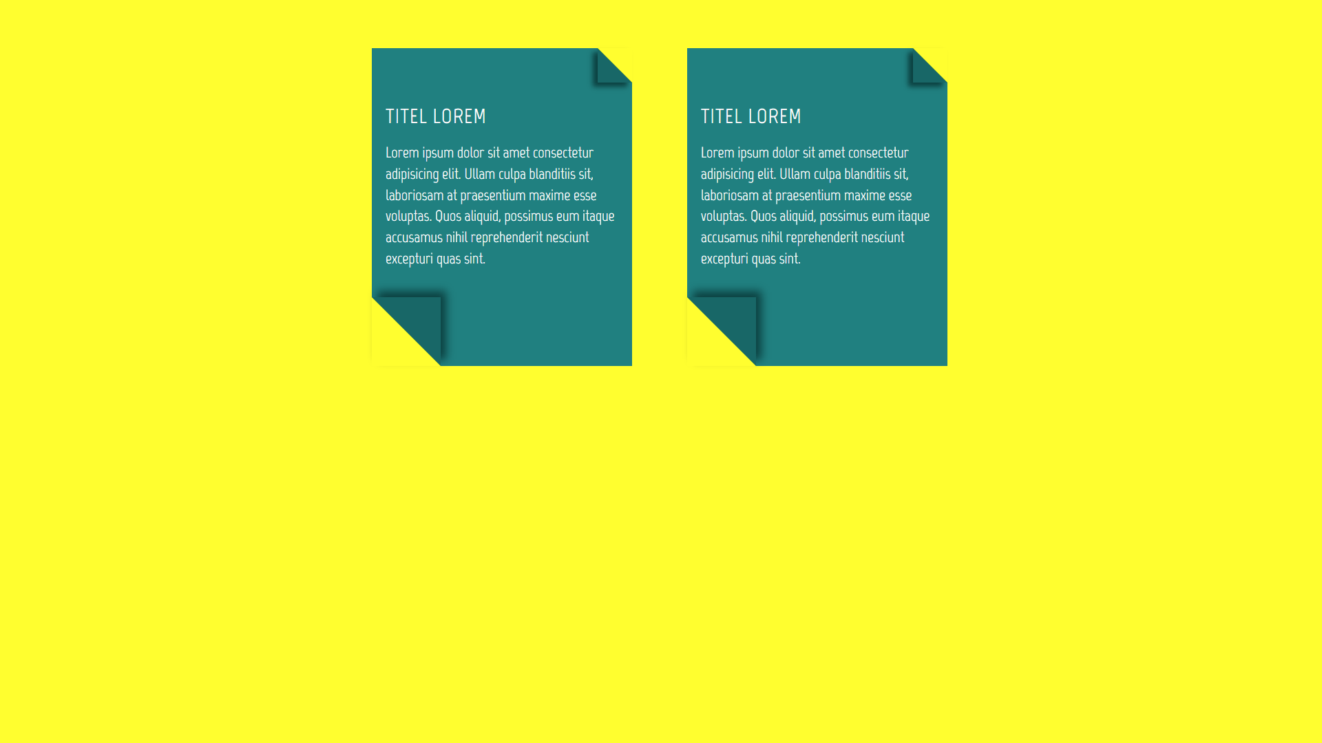
CSS Cards With Drop-Shadow Effect
About Project
Links
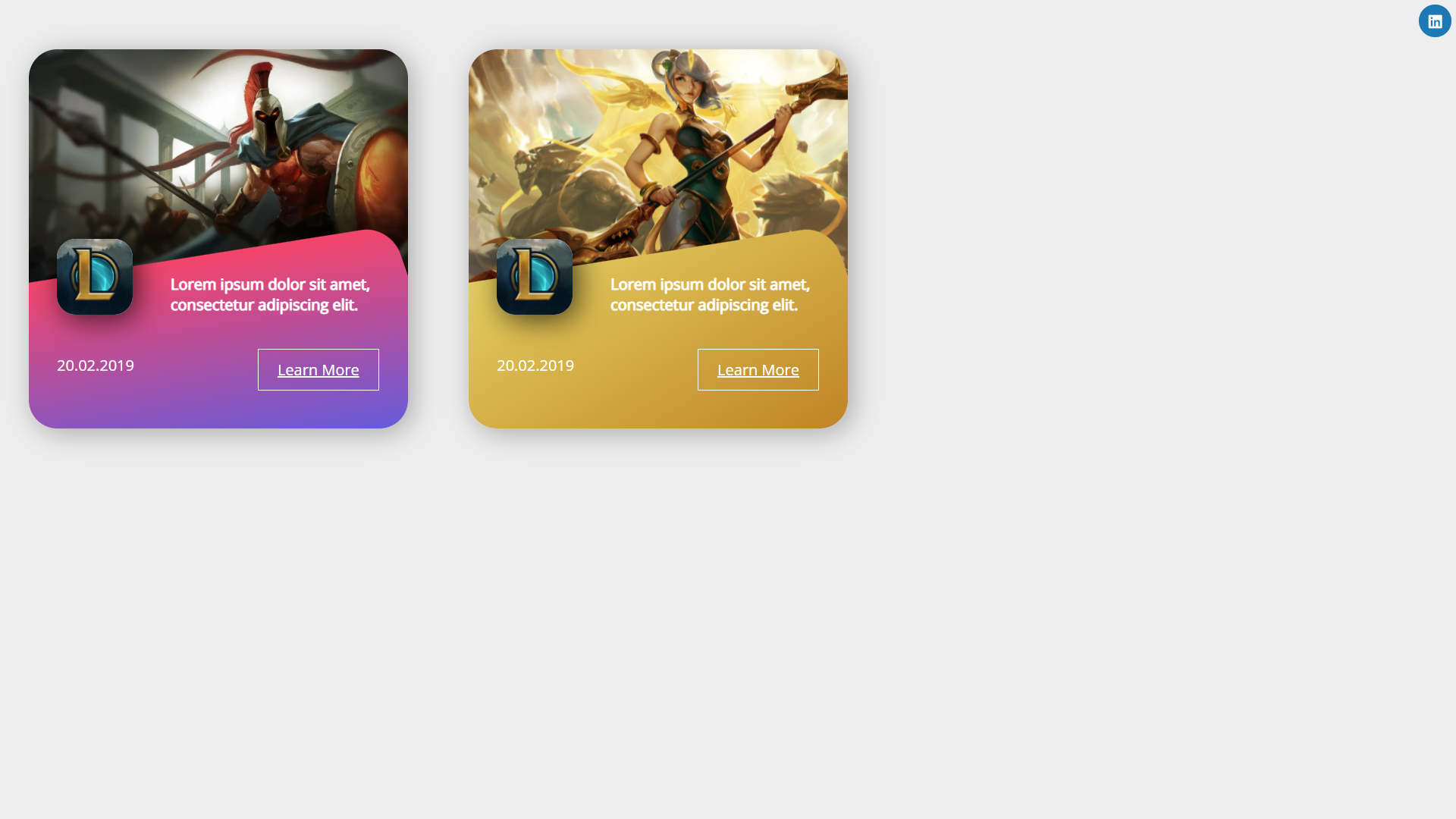
Modern CSS Cards Design
About Project
Links
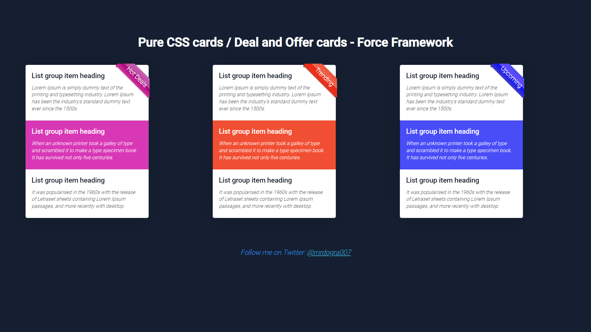
Pure CSS Cards and Deal Offer Cards
About Project
Links
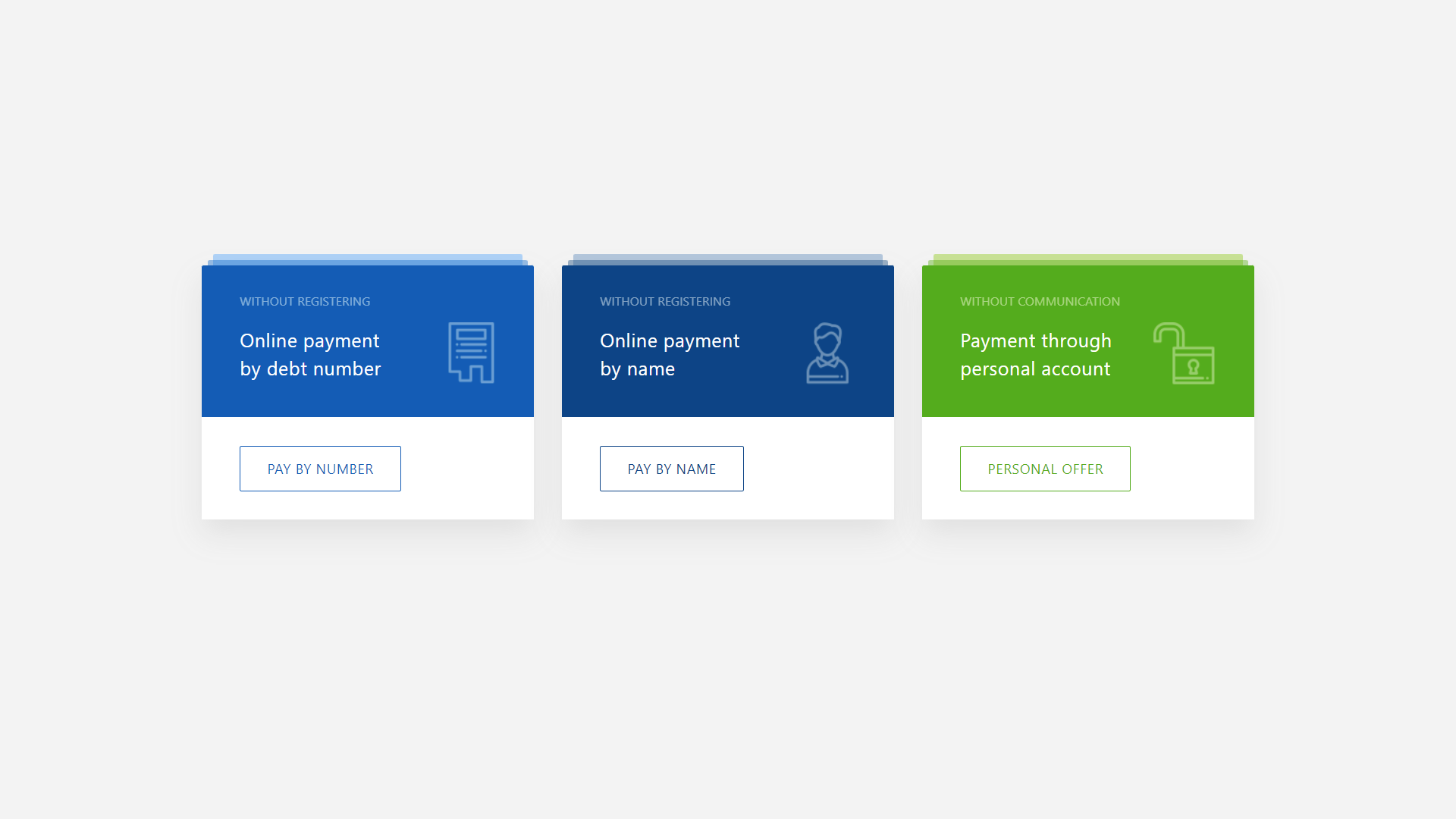
Multi-Colored CSS Cards With Buttons
About Project
Links
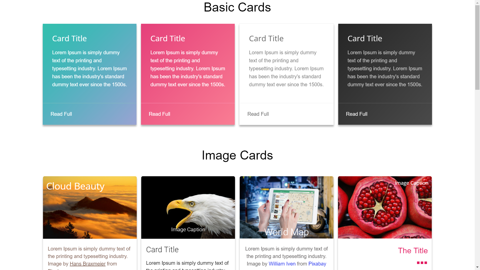
Beautiful Collection of CSS Cards
About Project
Links
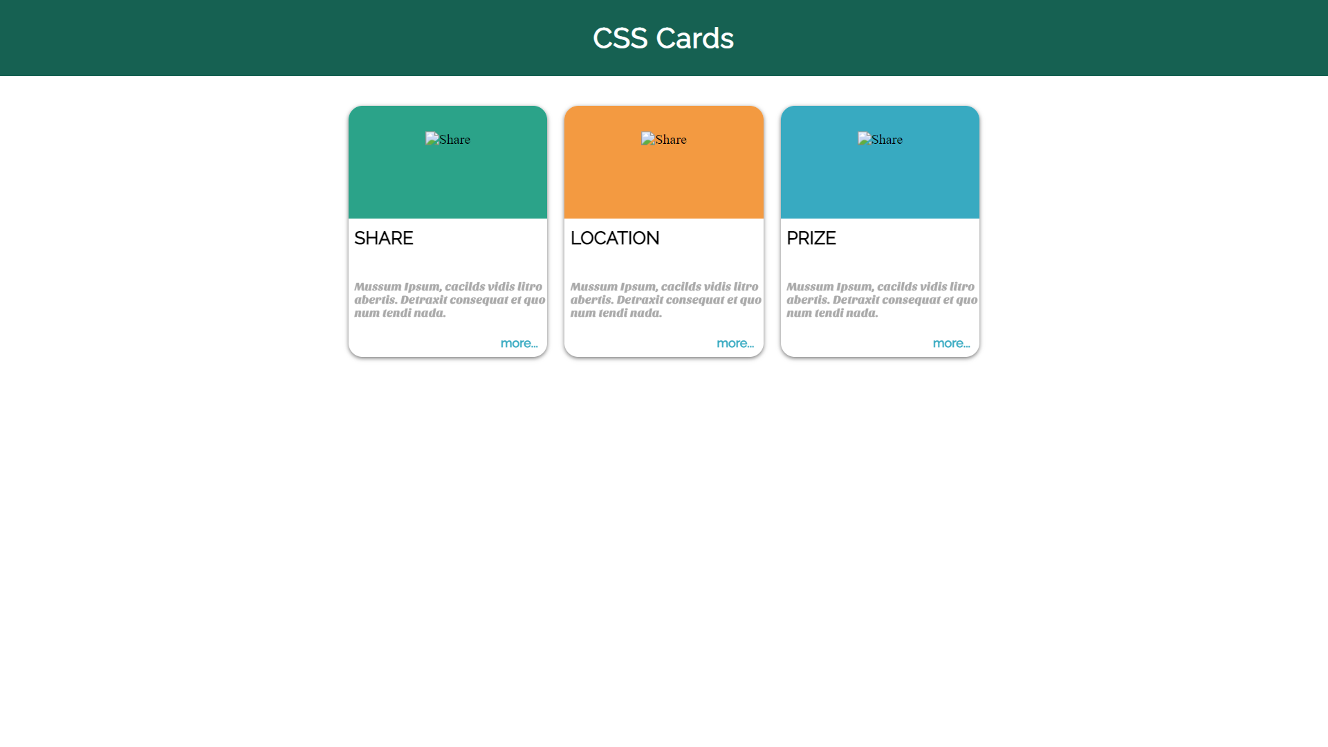
Three Small CSS Cards
About Project
Links
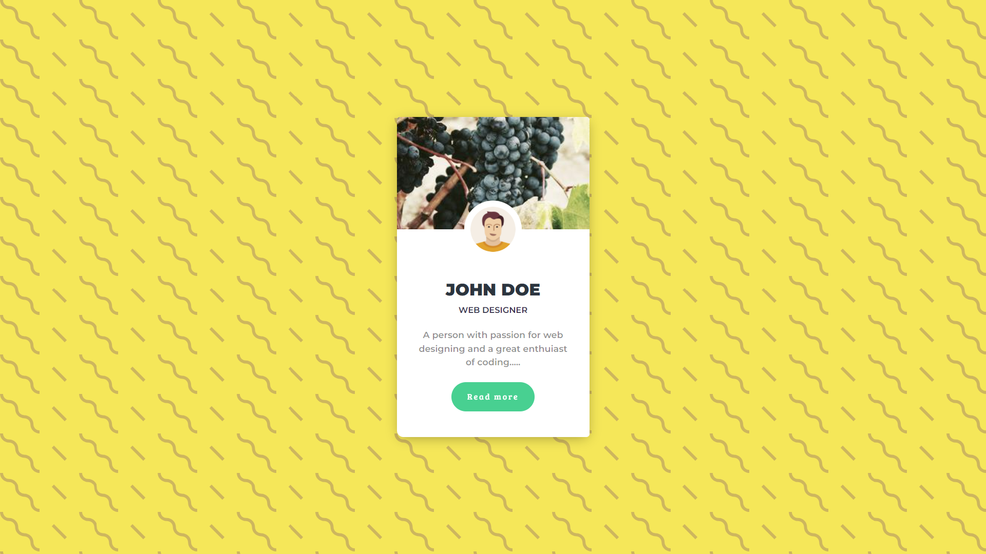
UI Profile CSS Card
About Project
Links
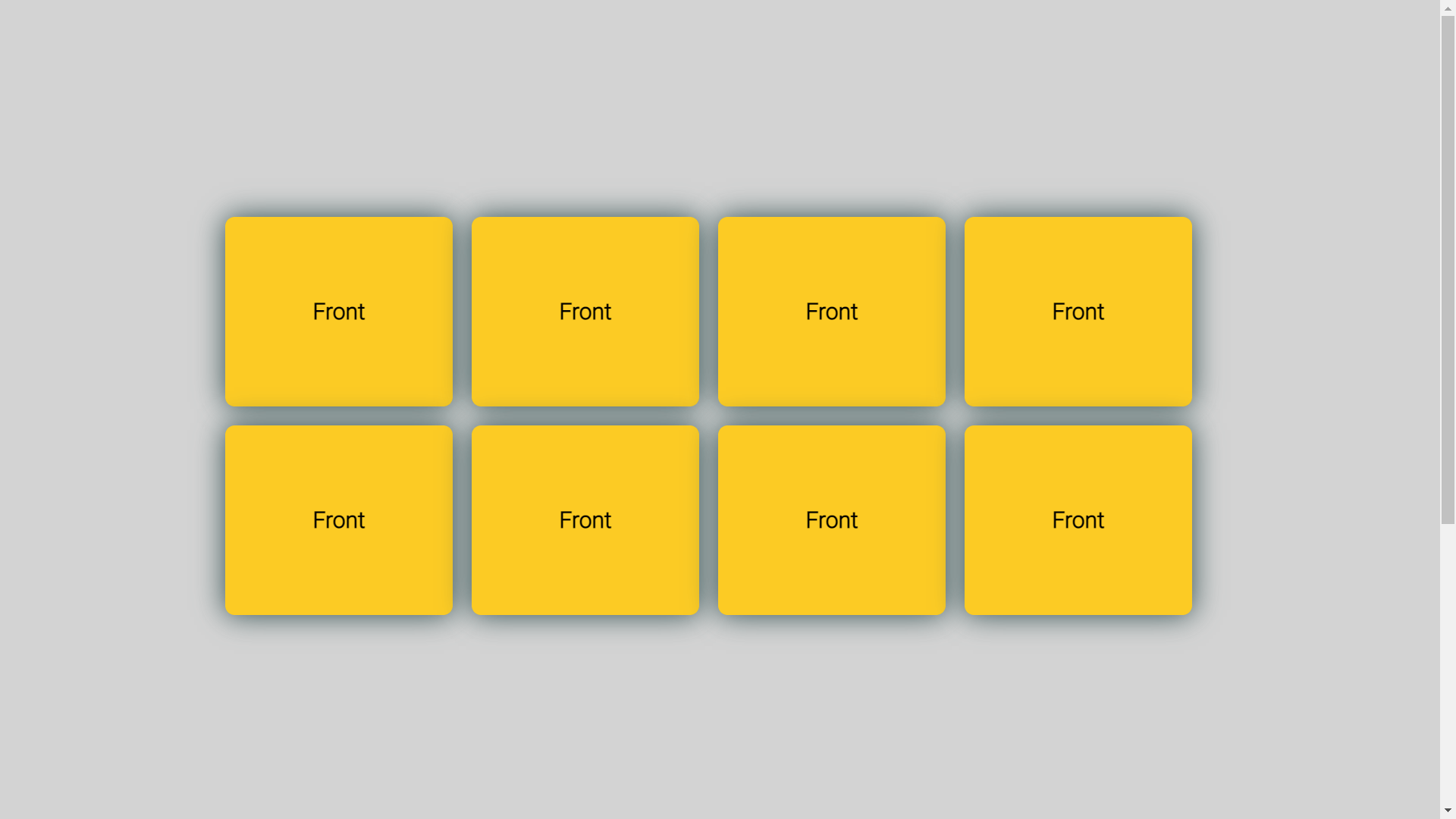
Flipping CSS Cards
About Project
Links
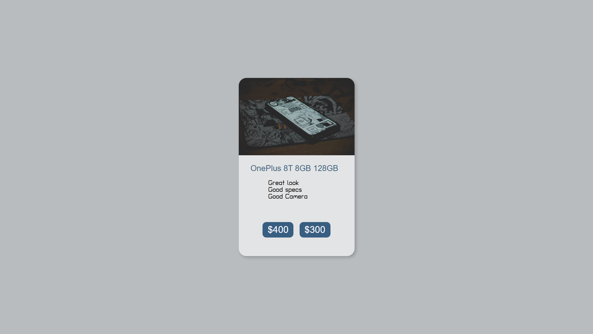
CSS Cards Animation and Product Card
About Project
Links
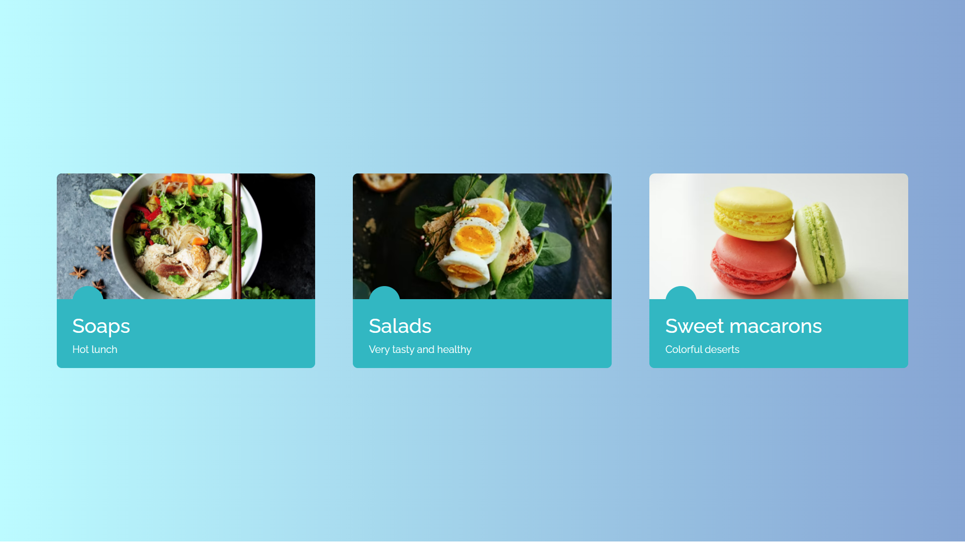
Blue Flat CSS Cards
About Project
Links
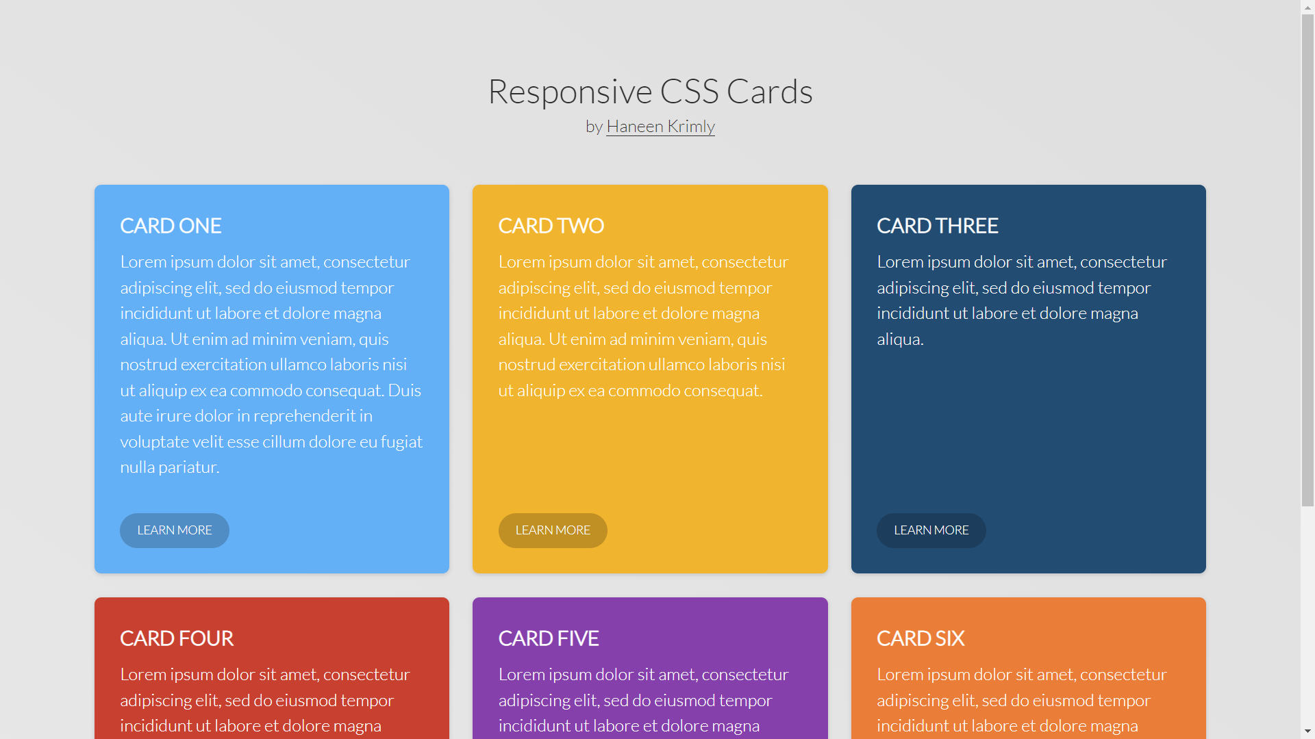
Responsive Column CSS Cards
About Project
Links
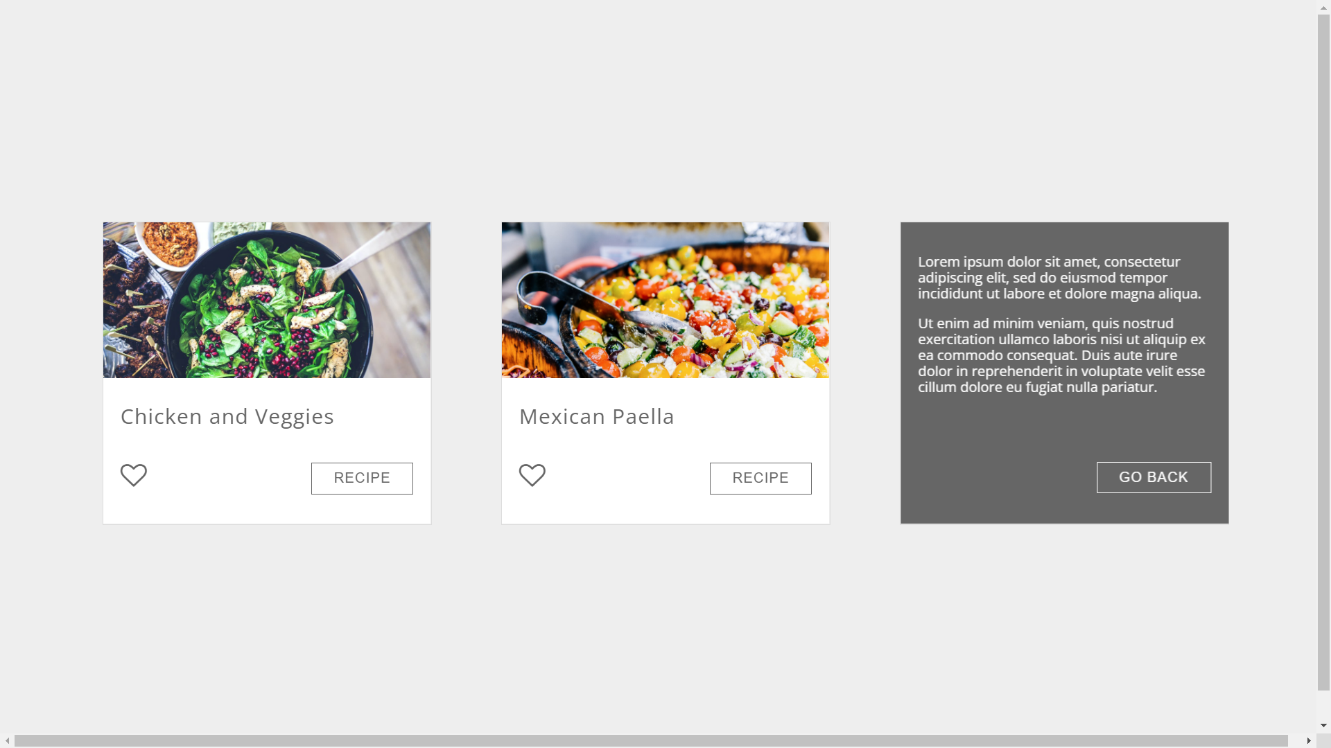
Recipe Flipping CSS Cards
About Project
Links
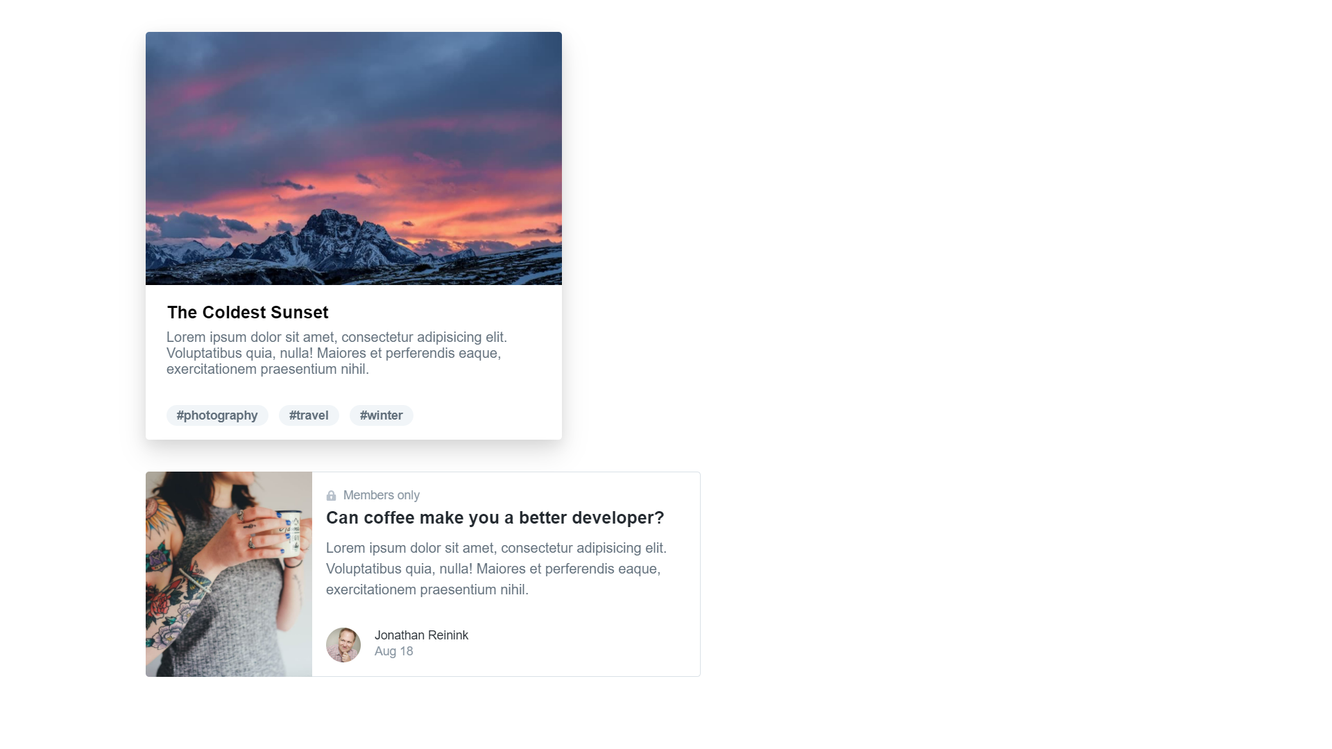
Tailwind CSS Cards
About Project
Links
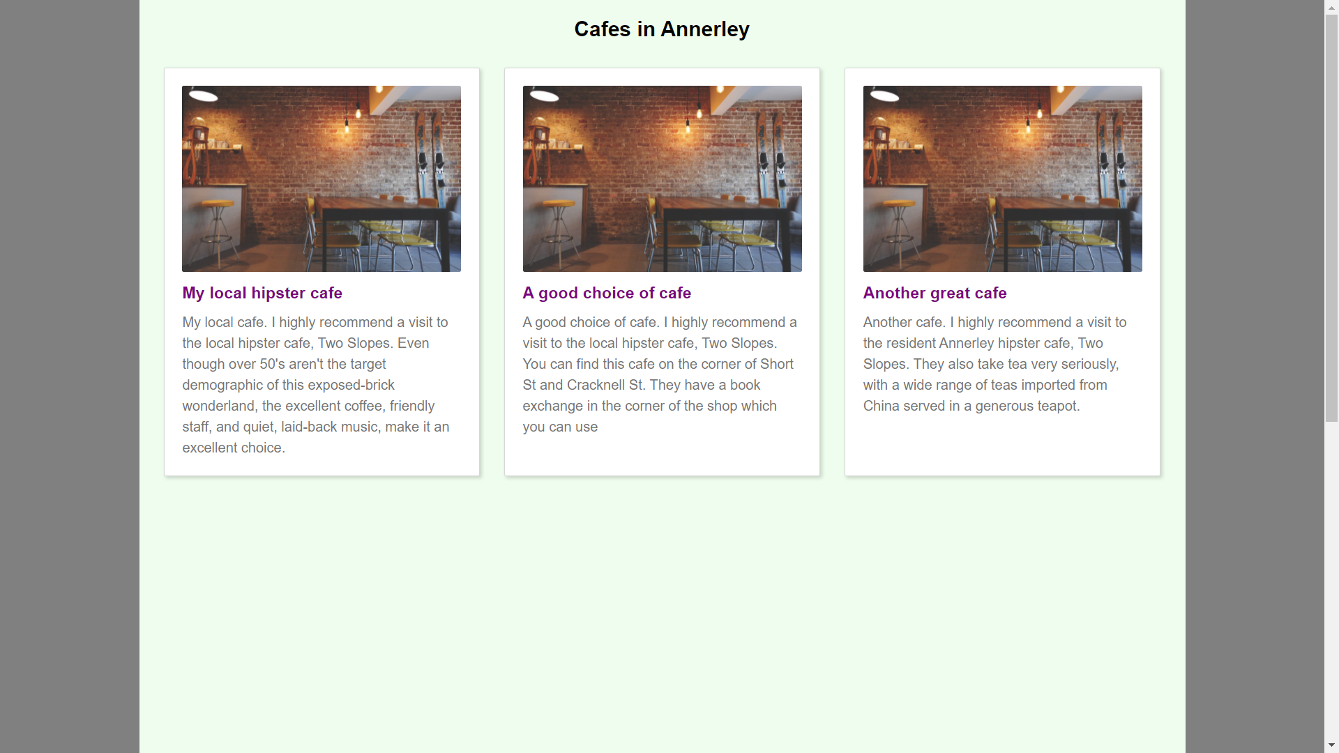
Generic Responsive CSS Cards
About Project
Links
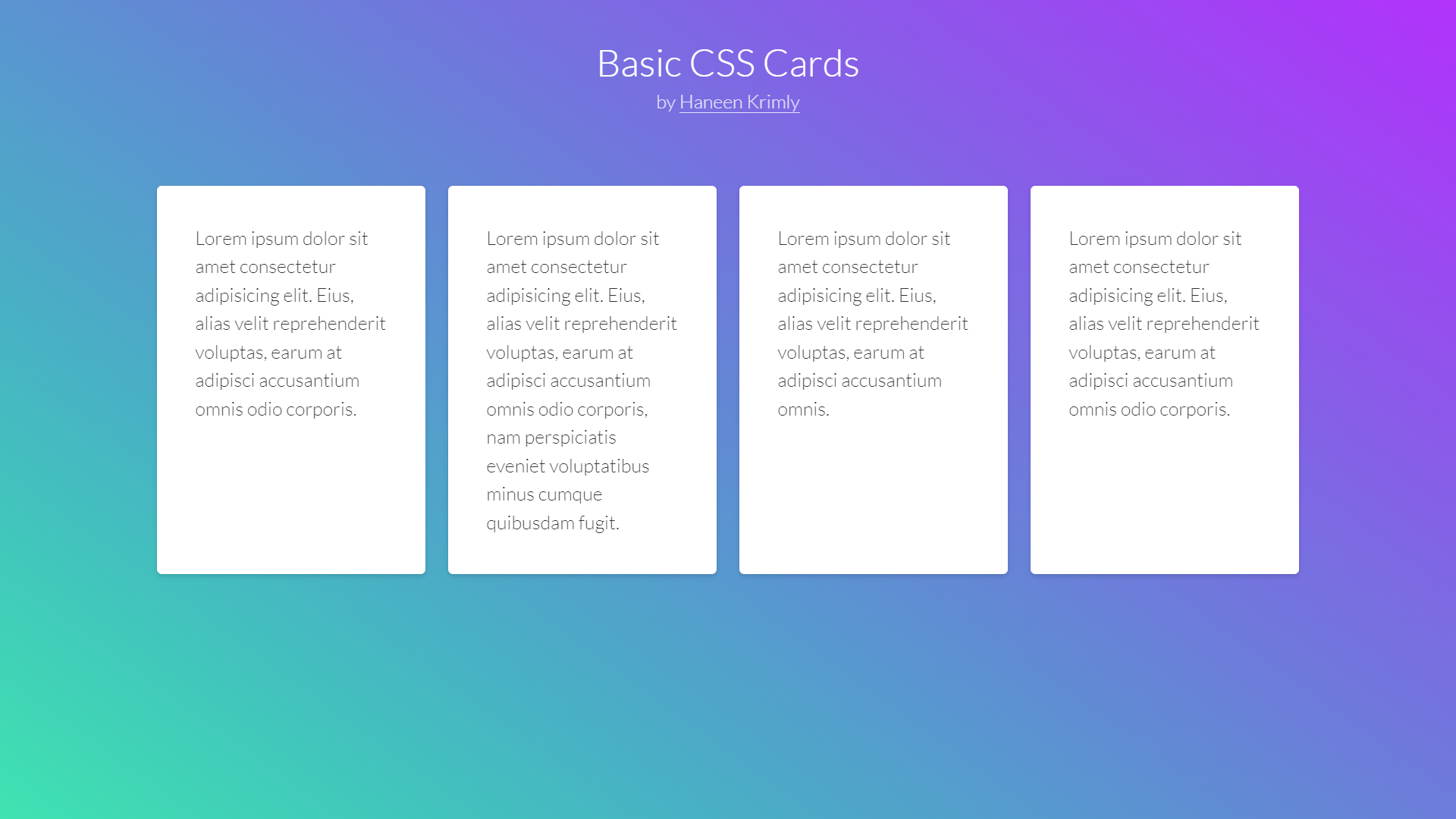
Basic CSS Cards
About Project
Links
There are plenty of additional crucial CSS concepts to understand. However, using this guide, you should be able to use cards to structure your website with the help of CSS.
Mising Text