Adding and using CSS keyframe animation can increase user engagement levels on the web. Whenever keyframes are used, they cause the users to engage more often than a page without animations. This has been tested and the results are more than 50% true across the entire web industry. However, this depends on the type of animation. For instance, annoying keyframe animations will get your users to bounce more often. Nevertheless, a great example of a fun engaging animation is the iconic hamburger menu that when clicked usually opens a menu.
Before we jump into keyframe examples, we need to explain what they are. To demonstrate, keyframes are like flipbooks, as the book starts flipping, the pages or aka frames, start producing moving parts. You can have as many frames as you want, manipulating objects on the web page, to produce the effect or effects you want to achieve.
Down below you will find examples and code of cascading style sheets keyframe at-rules across the web and from codepen.io. Feel free to use these keyframe examples and code in your web pages and projects.
CSS Animation Floating Factory
About Project
CSS Animation Floating Factory
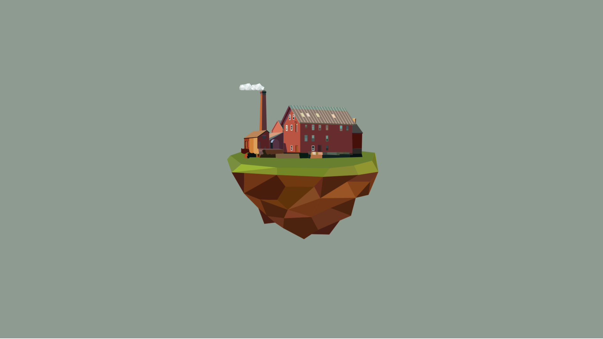
The CSS Animation Floating Factory is a project on codepen.io which utilizes CSS keyframes to animate a factory island floating in the sky. For example, this factory uses two different animations to achieve the effect you see. To demonstrate, the first effect is the smokestack cloud puff. The cloud puff uses a keyframe that moves the clouds by transitioning the CSS opacity property to 0 and moves the cloud away from the smokestack by using the CSS transform translateX property. As a result, the cloud puff fades out as it moves away from the smokestack. Secondly, the other keyframe involves the entire island. That is, it involves moving the entire island up and down. This is because, whenever the keyframe runs it uses a CSS transition translateY to move the island up and down on the Y-axis.
Pure CSS Watch Keyframe Animation
About Project
Pure CSS Watch Keyframe Animation
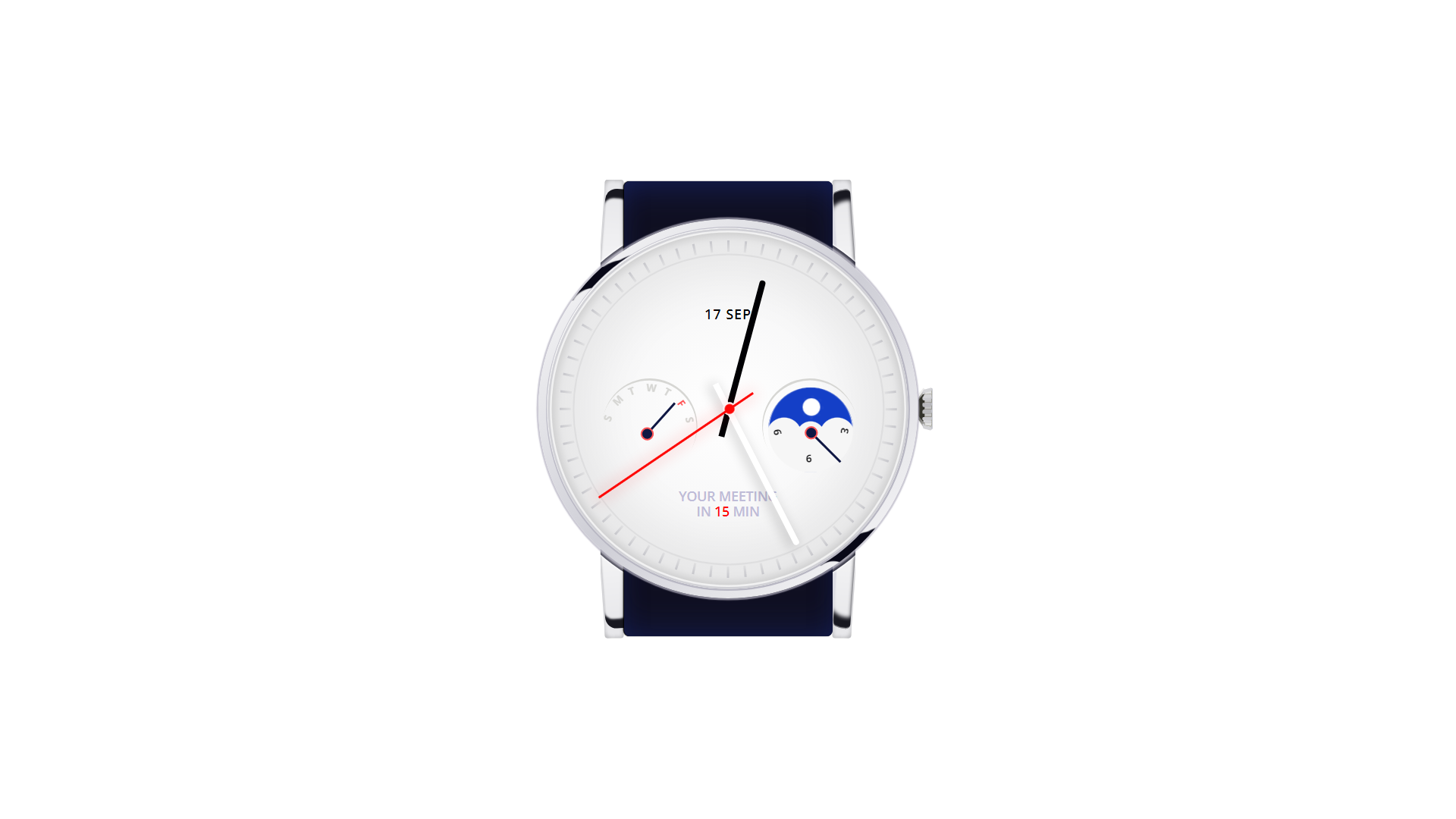
The Pure CSS Watch Keyframe Animation is a project on codepen.io which uses pure CSS Keyframe animations to create a working ticking watch. To illustrate, this example animates two different parts of the watch, the second hand, and the moon phase. Firstly, the second-hand animation uses the CSS transform rotate property to rotate the arm of the second hand in a 360-degree rotation. As a result, at the end of the rotation, the animation comes to a complete loop. This then continues infinitely. Secondly, the moon phase is made up of several animation parts combined into one. For example, these animation parts are the different phases of the moon cycle. This includes the Sun and many of the Moon’s phases. As a result, the moon cycle is very complex. To handle this complexity, the moon phase animation uses the transform translate, opacity property, and the background color to animate the cycle.
CSS Animation Responsive Material Design
About Project
CSS Animation Responsive Material Design
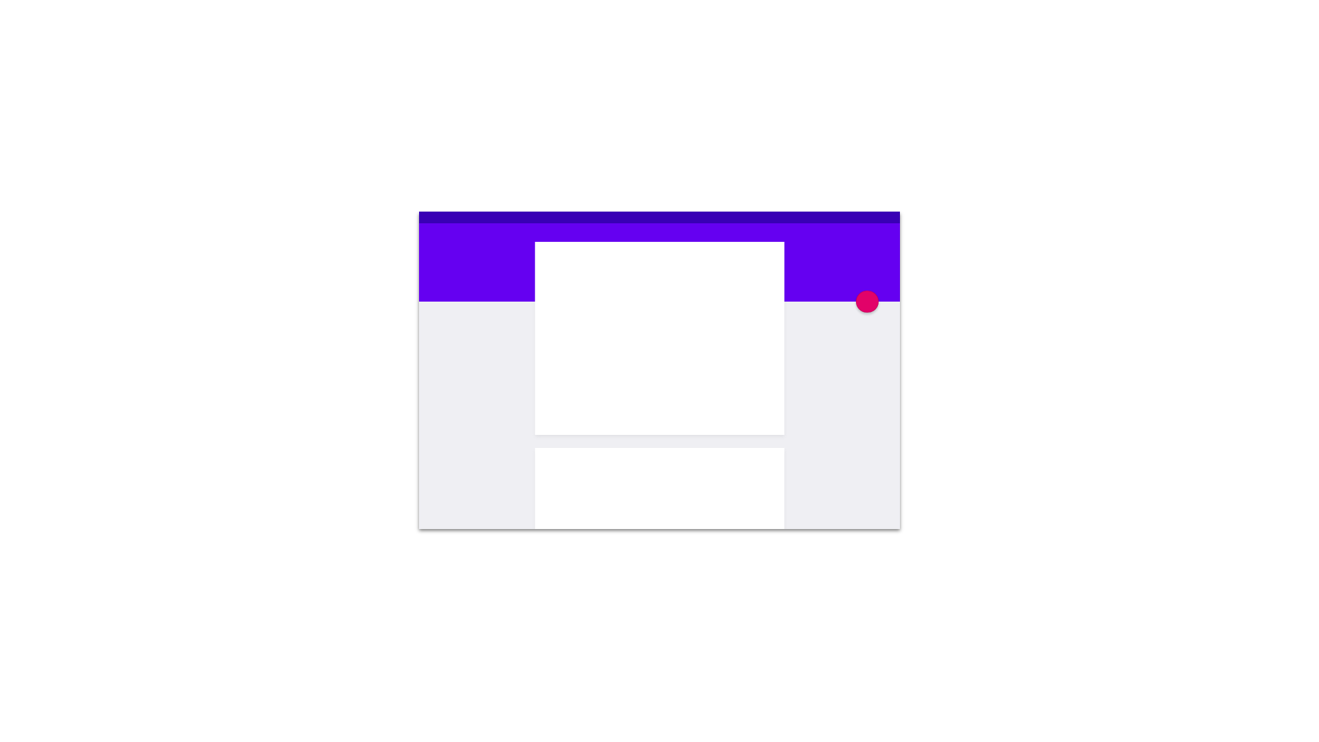
The CSS Animation Responsive Material Design is a project on codepen.io that uses keyframe animations to animate a Google material-designed web page. To demonstrate, this example uses four different keyframe at-rules. The name of these keyframes is button, article, header, and window. First, the button keyframe animates the pink circle button by using the position property. That is, it changes the absolute position of the button as the window resizes. Secondly, the article animation animates the white “piece of paper” inside the window by changing the position, width, and height. Thirdly, during the header animation, the keyframe changes the height and width of the purple header in the document. Last, the window animation changes the width and height of the entire document as the animation executes. In conclusion, all of these @keyframes create a mobile to desktop website view that repeats over and over.
Floating Dust Keyframe CSS

About Project
Floating Dust Keyframe CSS
The Floating Dust Keyframe CSS is a project on codepen.io that animates floating dust that shifts whenever the user places their cursor in the webpage. Since the cursor interacts with the project, the author uses jQuery additionally to create the effect you see. To demonstrate, this example uses several different layers of images to create the dust effect. Each layer of dust is set at a different opacity level and is stacked on each other. The closest image has a higher opacity than the furthest. This allows you to see all the particles. The way these animation works is by moving each image to the right at different speeds. This is accomplished by using the transition translate property. At the end of the animation, 600 seconds, the animation repeats because the CSS animation-iteration-count is set to infinite.
Funny Candle Pure CSS Keyframe Animation

About Project
Funny Candle Pure CSS Keyframe Animation
The Funny Candle Pure CSS Keyframe Animation is a project on codepen.io that displays a short animation of a funny angry candle that gets its flame blown out and reignited. To demonstrate, this example uses several different keyframe CSS animations. First, the animation uses a CSS transition translate and a CSS transition rotateZ to animate the blowing out and relighting of the candle. Right before the candle blows out the flame, a keyframe is triggered to animate the expansion of light. Because the taller candle needs to take a breath before blowing, air travels towards the taller candle. This effect mimics real-life because the flame produces a brighter light as more oxygen is fed to the flame. The light expansion uses transform scales property to scale a ring that expands and then shortly later disappears.
Never Ending Box Keyframe CSS

About Project
Never Ending Box Keyframe CSS
The Never Ending Box Keyframe CSS is a project on codepen.io that displays an animated climbing box. To illustrate, when the box reaches the top, it falls back down. This then starts over once more. This effect is achieved by using a single CSS keyframe at-rule. For instance, the keyframe uses percents as steps in the animation. Each step uses a CSS transform translate and a CSS transform rotate property. At the top of the climb, the transform is reset by using more percents in quick succession.
Double Helix CSS Keyframe Animation
About Project
Double Helix CSS Keyframe Animation
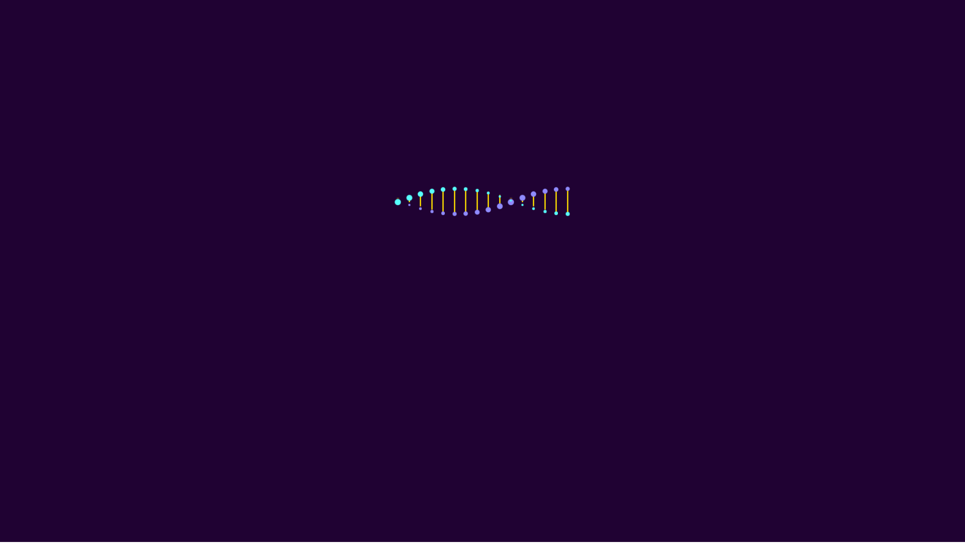
The Double Helix CSS Keyframe Animation is a project on codepen.io that displays an animation of a double helix using jQuery, CSS, and HTML. To demonstrate, this example uses keyframes to rotate spheres attached to lines over the Y-axis. As the spheres move farther away from the user, they scale down. Furthermore, as the spheres move closer to the user they scale up. For that reason, this creates the spinning effect you see with each set of spheres. Additionally, each set of spheres is delayed at the start of the page load. Thus, the delay and the spinning for each set create the double helix you see in the example.
Pure CSS Border Animation

About Project
Pure CSS Border Animation
The Pure CSS Border Animation is a project on codepen.io which shows an animation of lines that border a box. These lines circulate the boxes over and over. To demonstrate, this keyframe is created by using a clip property. As the keyframe runs, the boxes move their borders as if they are moving around the side border of the box.
Pure CSS 404 Error Page Animation
About Project
Pure CSS 404 Error Page Animation
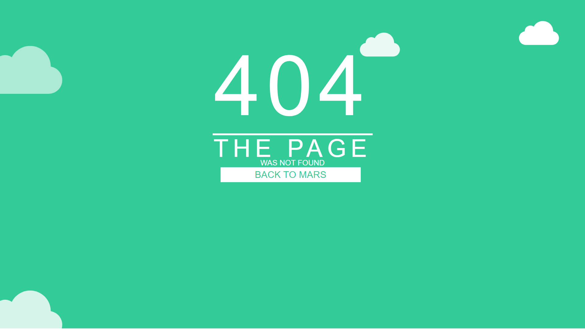
The Pure CSS 404 Error Page Animation is a project on codepen.io which animates clouds on a 404 page. These clouds are animated using keyframe at-rules. To illustrate, the cloud effect is created by changing the margin-left position of each cloud. Furthermore, there are a total of six different clouds, with each being set at a different scale. Additionally, each of the clouds uses the margin-left keyframe with a different duration delay. For that reason, it creates clouds moving across the 404 page at different times.
CSS Animated 3D Solar System
About Project
CSS Animated 3D Solar System
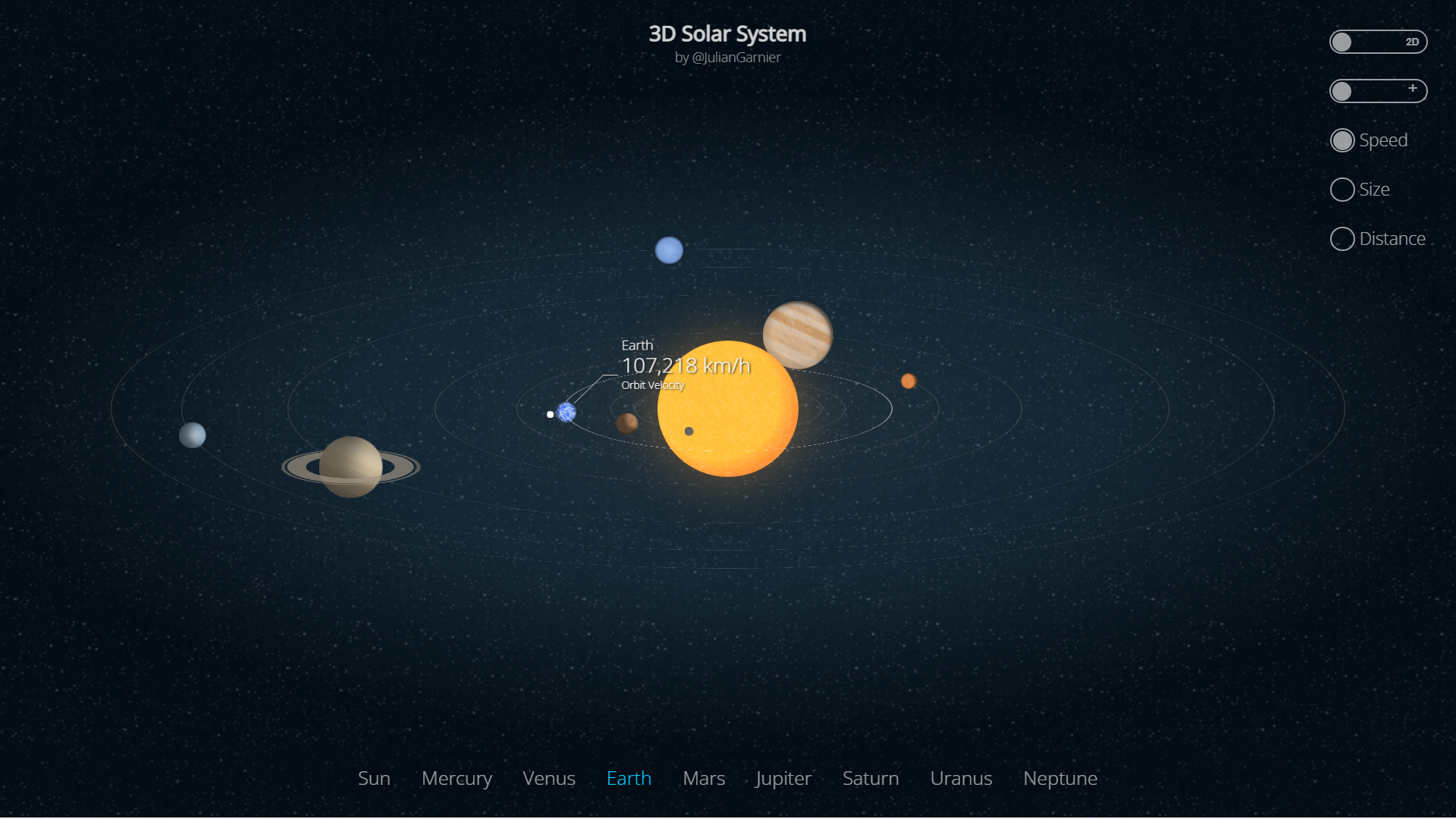
The CSS Animated 3D Solar System is a project on codepen.io. This project display a 3D or 2D representation of the solar system with each planet moving at a representational speed. To demonstrate, whenever the user views the 3D model initially, the model shows a 2D top side view that moves to a wider 3D side view of the solar system. Additionally, a really cool feature about this example is the planets rotate around the Sun which compares to the real-life representation of their actual speed. Moreover, the rotation around the Sun is created using keyframes to rotate the planets around a central axis. This 3D model relies on the transform-style property to maintain the position of elements in the 3D space.
CSS Text Animation
About Project
CSS Text Animation
The CSS Text Animation is a project on codepen.io that displays text that slides up or down into view. To demonstrate, this changing text is powered by keyframes. Firstly, the keyframes use the transform translate3d to change the Y position of the container div element named “content__container__list”. The content container is an HTML list that contains four children elements that contain text. As the keyframe moves the container with the transform property, the text slides into view based on the current keyframe step. In other words, the text changes position during each keyframe step. For that reason, the text updates with a new saying that starts with hello.
CSS Animated Blue Hyperspace
A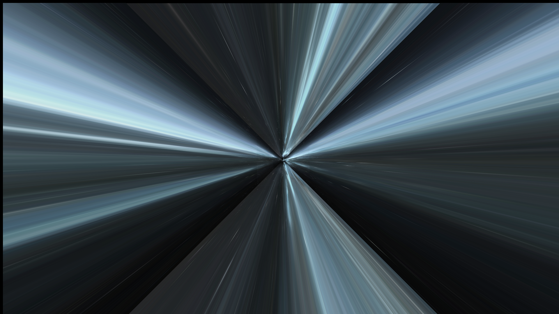
About Project
The CSS Animated Blue Hyperspace
The CSS Animated Blue Hyperspace is a project on codepen.io which throws the user into a hyperjump. Space and time are warped as the user flies through the universe. To demonstrate, the hyperspace effect is created by using a single image loaded externally. First, the image is duplicated to the back and all sides of the tunnel. Secondly, a keyframe called “move” uses the transform translateZ property to move images on the Z-axis towards the user. As a result, this creates the effect that you are moving forward. Thirdly, the animation also uses the transform rotate property to rotate the tunnel 90 degrees as you are moving. Thus, all three keyframes combined create the effect of a hyperspace jump!
Ants on Sugar CSS Animation
A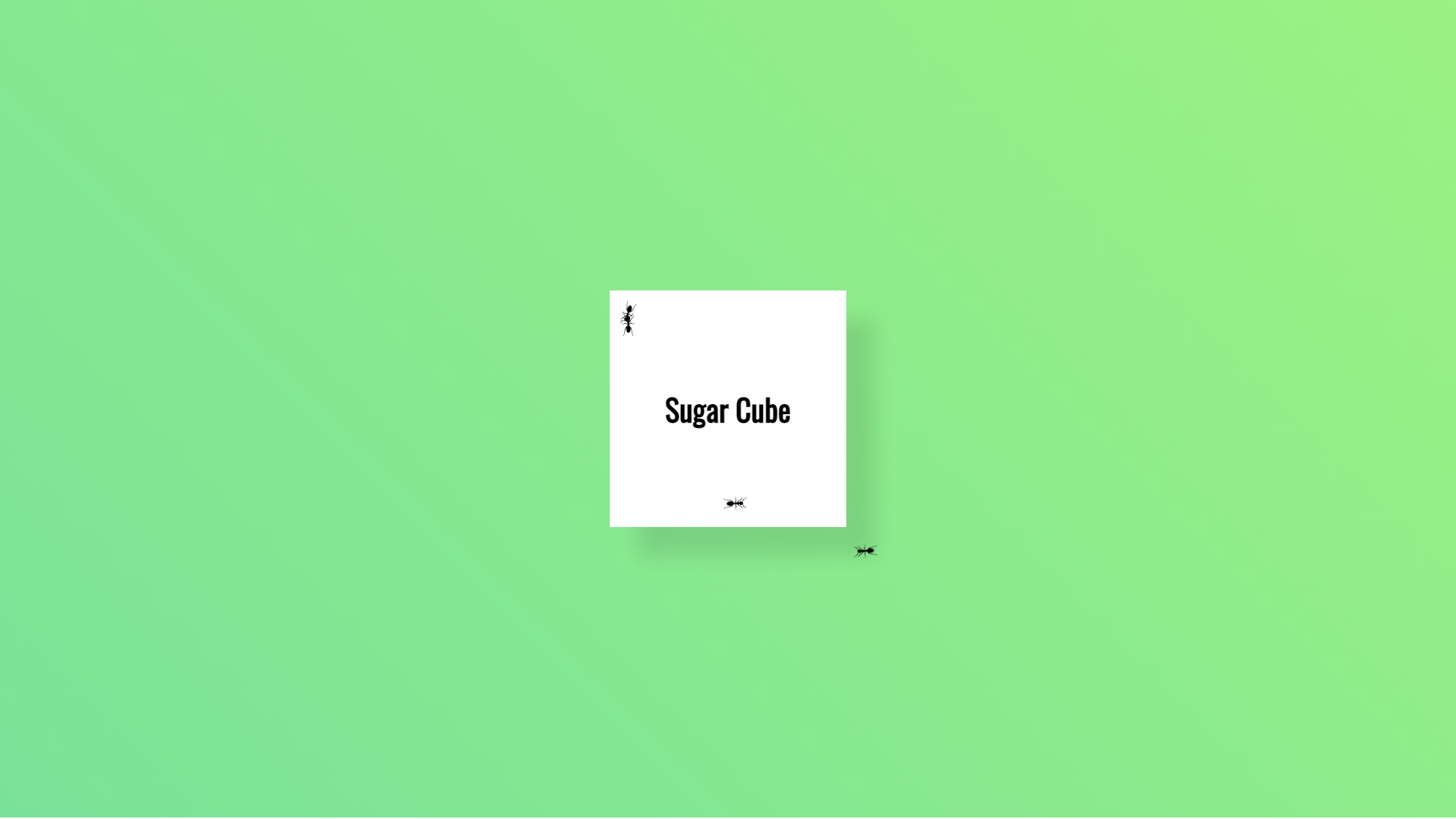
About Project
Ants on Sugar CSS Animation
The Ants on Sugar CSS Animation is a project on codepen.io that demonstrates ants crawling over a sugar cube. To illustrate these hungry ants, the ants are created by using SVG and CSS keyframes. For that reason, each ant is an SVG that is embedded into the HTML code. Additionally, a keyframe is created for each ant with a separate name that moves the ant around using the position and transform rotation properties. For example, the ants are positioned with an absolute value. Moreover, when each ant’s animation runs, the keyframe changes the position and rotation of each ant. Therefore, this creates the hungry ants crawling over the sugar effect you see above.
Noir Shadow CSS Animation
A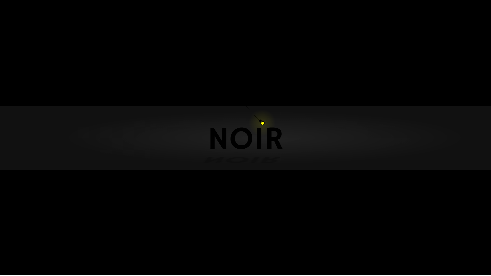
About Project
Noir Shadow CSS Animation
The Noir Shadow CSS Animation is an animation on codepen.io that is created out of CSS and HTML. The animation demonstrates using text shadows to cast a shadow on the text as the light swings. This example uses 3 CSS keyframe animations. The first animation animates the light swinging by using transform rotate. The second animation animates the gradient behind the text. The last animation uses transform scaleY and transform skew on the CSS text-shadow to produce a moving shadow effect.
Underwater Pure CSS Animation
A
About Project
Underwater Pure CSS Animation
The Underwater Pure CSS Animation is a project on codepen.io in which the author has created a moving picture displaying life under the ocean. This example uses a little under 2000 lines of style code to create this effect and is loaded with keyframe at-rules. In fact, there are 3 parts to this animation, the swimming whales, the bubbles, and the light refractions from the sun into the ocean. As a result, this project invests heavily in the CSS transform translate properties to create the moving parts. Additionally, this example uses WebKit keyframe animations to target a wider selection of browser rendering engines.