This article demonstrates how to create several CSS sidebar menus for your webpage. Included are code walkthroughs and other sidebar examples.
What Is a Sidebar Menu in CSS?
The sidebar menu phrase refers to an area in a webpage that provides access to top-level collections of links and enables quick app navigation to the content in your app, game, or article. In most cases, a sidebar is a column or pillar that can include typography and icons that appear at the side of the main content – either on the left or on the right in a side pane of a split view, depending on a website layout and structure. A sidebar in a web application can be a creative, unique, and valuable HTML component of website navigation design.
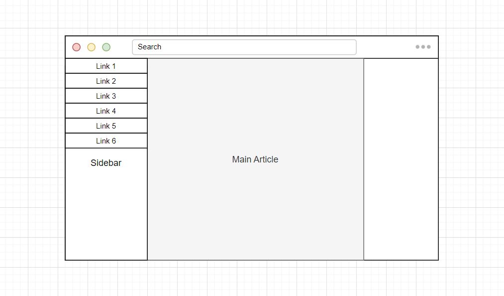
What Is a Sidebar Layout?
With sidebar navigation, you have several options: You can have a navigation pane always displayed to the left of the page content; Use collapsible and responsive side navigation; Have a navigation pane that slides over the left part of the page content; Or even a navigation pane that opens to cover a whole page.
Where Is a Sidebar Menu Located?
A sidebar is a form of an auxiliary menu that appears at the edge of a web page or application. In simple words, a sidebar is usually a vertical column placed on either the left or right of a web page’s primary content.
Creating a Sidebar Menu
To demonstrate several different types of sidebar menus, we need to create a web page with HTML and CSS to create an example we can edit. First, we must generate HTML with links, a toggle button, and a close button. Then we will add some CSS.
Let’s go over how a side navigation menu is created. We won’t use JavaScript to add or remove class names to elements to create a functional menu; instead, we will use label elements mixed with a hidden checkbox input. The input and labels allow us to use a CSS :has() pseudo-class to check if a body element has an input element with a value set to check. Once an input element is in a check state a CSS selector can select any element within the webpage because all the HTML elements are contained within the body.
Down below, we have created an HTML structure for you.
HTML
<!-- Use any element to open the sidenav -->
<nav>
<label for="menu-toggle" class="menu-button">Menu</label>
<input type="checkbox" id="menu-toggle" name="menu" value="">
<div id="mySidenav" class="sidenav">
<label class="closebtn" for="menu-toggle">×</label>
<a href="#">Home</a>
<a href="#">Resources</a>
<a href="#">Guides</a>
<a href="#">Examples</a>
</div>
</nav>
<!-- Add all page content inside this div if you want the side nav to push page content to the right (not used if you only want the sidenav to sit on top of the page -->
<div id="main">
Main Content
</div>Here we provide the CSS code that decorates the webpage and gives the sidebar menu a simple visual look. The following four examples will use this same CSS to demonstrate different ways you can implement a sidebar menu.
CSS
html,
body {
  margin: 0;
  font-family: Arial;
}

html {
  margin-top: 50px;
}

.sidebar {
  transition: 0.5s; /* 0.5 second transition effect to slide in the sidenav */
}

/* The side navigation menu */
.sidenav {
  height: 100%; /* 100% Full-height */
  width: 0; /* 0 width - change this with JavaScript */
  position: fixed; /* Stay in place */
  z-index: 1; /* Stay on top */
  top: 50px; /* Stay at the top */
  left: 0;
  background: #634d8d; /* Purple */
  overflow-x: hidden; /* Disable horizontal scroll */
  padding-top: 60px; /* Place content 60px from the top */
}

/* The navigation menu links */
.sidenav a {
  padding: 8px 8px 8px 32px;
  text-decoration: none;
  font-size: 25px;
  color: #fff;
  display: block;
  transition: 0.3s;
}

/* When you mouse over the navigation links, change their color */
.sidenav a:hover {
  color: #f1f1f1;
}

/* Position and style the close button (top right corner) */
.sidenav .closebtn {
  position: absolute;
  top: 0;
  right: 25px;
  font-size: 36px;
  color: white;
  cursor: pointer;
  height: 50px;
  line-height: 55px;
}

/* Style page content - use this if you want to push the page content to the right when you open the side navigation */
#main {
  transition: margin-left 0.5s;
  padding: 20px;
}

/* On smaller screens, where height is less than 450px, change the style of the sidenav (less padding and a smaller font size) */
@media screen and (max-height: 450px) {
  .sidenav a {
    font-size: 18px;
  }
}

nav {
  height: 50px;
  background: #c1c1c1;
}

.menu-button {
  background: #4646cc;
  height: 40px;
  margin: 5px;
  float: left;
  line-height: 40px;
  width: 100px;
  text-align: center;
  color: white;
  border-radius: 4px;
  cursor: pointer;
}

#menu-toggle {
  display: none;
}

/* Move the menu if the button is clicked */
body:has(#menu-toggle:checked) #mySidenav {
  width: 250px !important;
}
Animating The Sidebar Menu
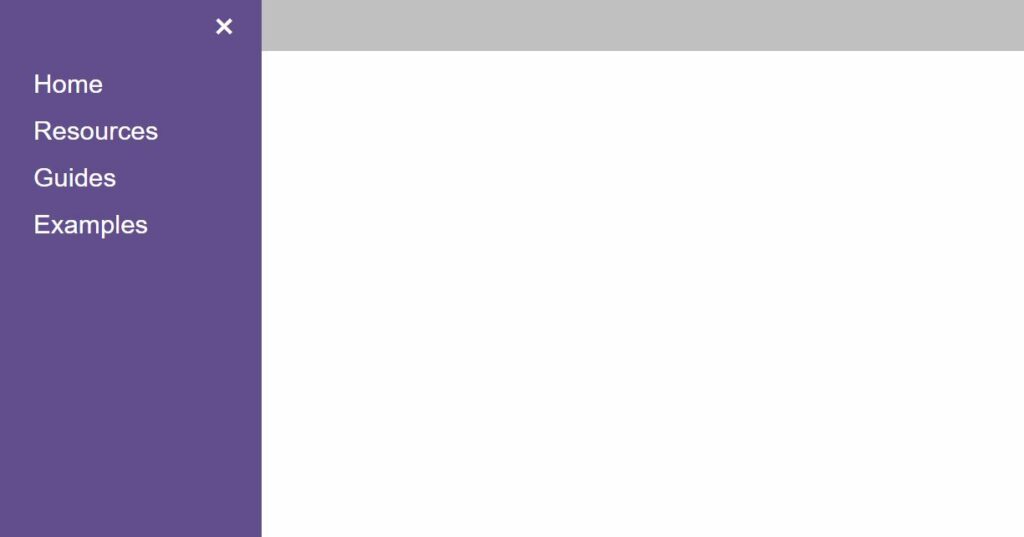
Animated sidebar menus are where a menu is transitioned or moved animatedly. For example, a user can click a menu icon, and a side section of a page containing links fades in from the left side.
Let’s add a property to animate a menu when a user interacts with a page. All that is required is adding a transition property to the element with a .sidebar class.
CSS
.sidenav {
  transition: 0.5s; /* 0.5 second transition effect to slide in the sidenav */
}
Making the Sidebar Fixed

A fixed sidebar menu is helpful whenever you want some links and other buttons in a menu constantly to be accessible to a user. In this case, we need to change the width property from 0 to 250px.
CSS
/* Replace 0 width value with a value of 250px */
*/
.sidenav {
  width: 0;
}
*/

/* The new width value forces the sidebar to be fixed */
.sidenav {
  width: 250px;
}
Make The Sidebar Push Content
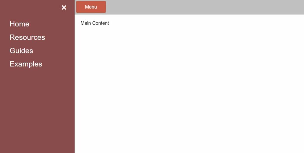
Content pushed or nudged to a side when a side menu is opened is also possible. To achieve this effect, we can add another :has() pseudo-element class that targets the body element and applies a margin equal to the size of the .sidebar class. In addition to adding the second :has() pseudo-element, we must give the .sidebar and body the same transition time, so there is a smooth animation.
CSS
/* Move the body if the button is clicked */
body:has(#menu-toggle:checked) {
  margin-left: 250px;
}

.sidebar, body {
  transition: 0.5s; /* 0.5 second transition effect to slide the side navigation and body */
}
Making the Sidebar Expand to Full-Width
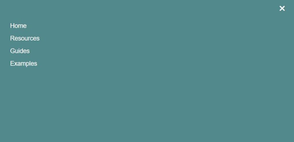
Another sidebar we can create is a menu that expands over an entire page. To do this, we can set a width value to 100% in the .sidebar class instead of an absolute or relative value. The above image shows that the side section expands across a whole page when the menu is opened.
CSS
/* Move the menu if the button is clicked */
body:has(#menu-toggle:checked) #mySidenav {
  width: 100% !important;
}
Other Examples
This collection shows CSS sidebar menus from across the web. Included are links with examples and code for use on your website.
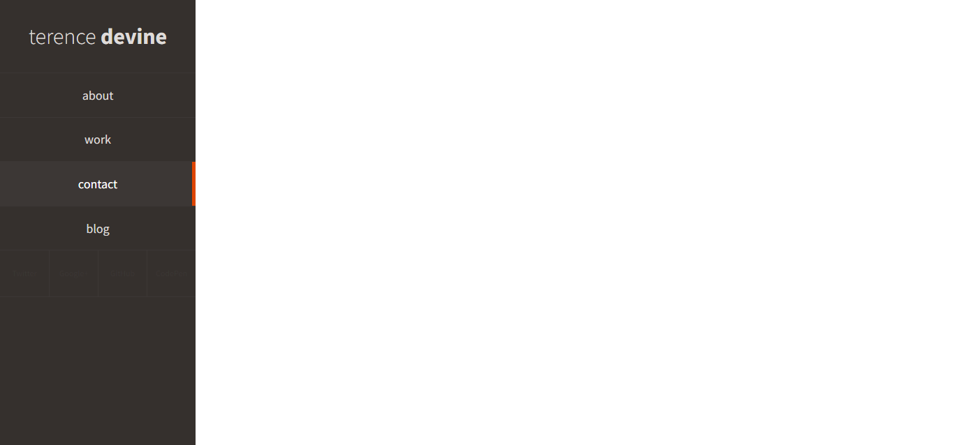
Fixed Nav Hover Effect
About Project
Links
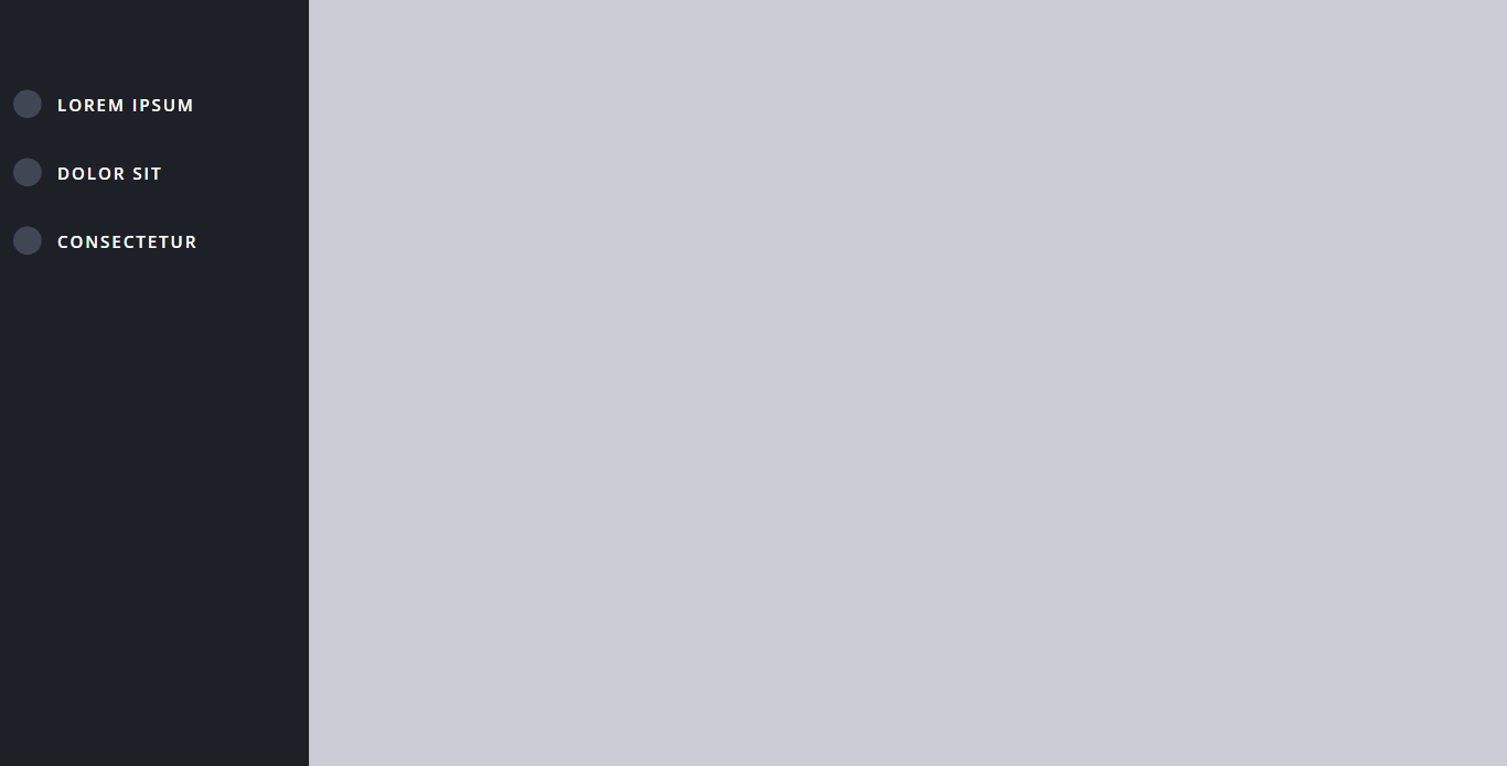
Double Explorer Sidebar Nav
About Project
Links

Sidebar Menu Hover Show Hide CSS
About Project
Links
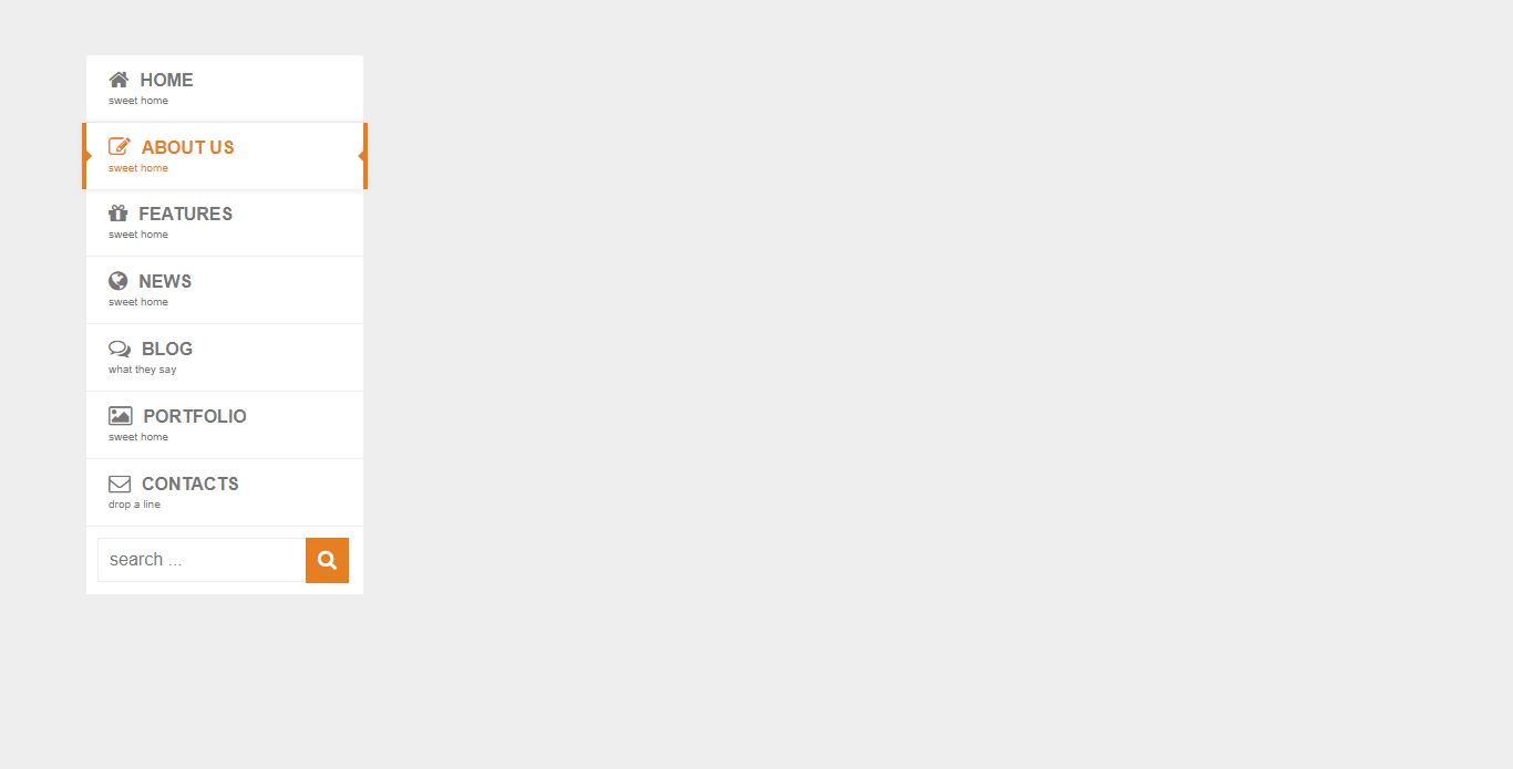
Pure CSS3 Mega Dropdown Menu With Animation (Vertical)
About Project
Links

3D Rotating Navigation
About Project
Links

Side Sliding Menu CSS
About Project
Links
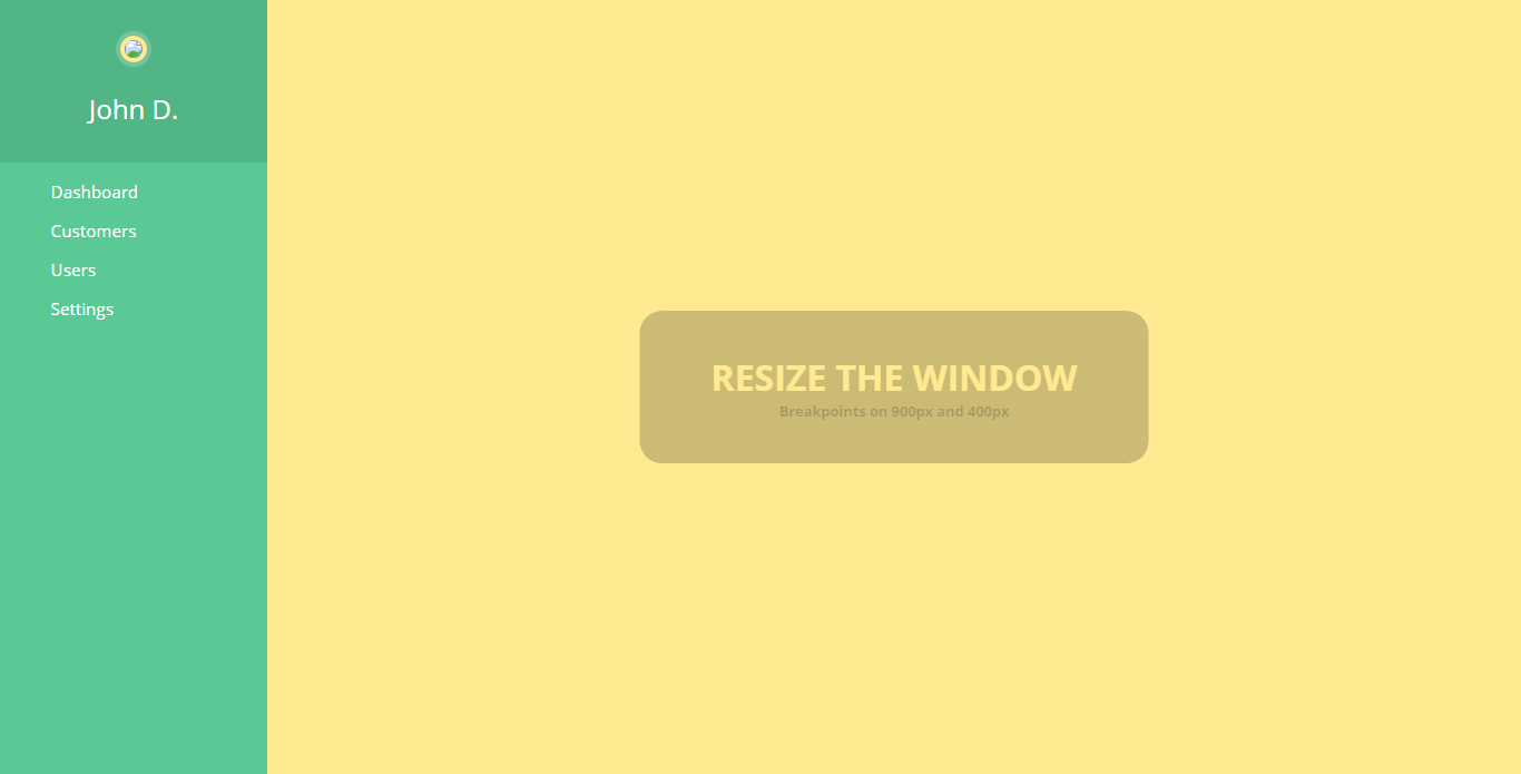
Fully Responsive CSS3 Menu
About Project
Links
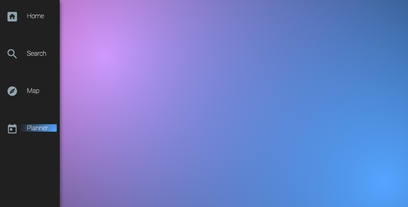
Fixed Hover Navigation
About Project
Links
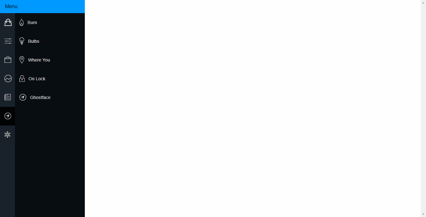
Pure CSS Fly In Sidebar Nav
About Project
Links

Simple Purple Sidebar Menu
About Project
Links
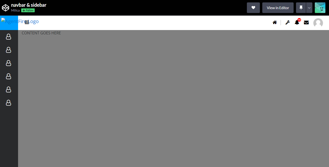
Navbar and Sidebar
About Project
Links
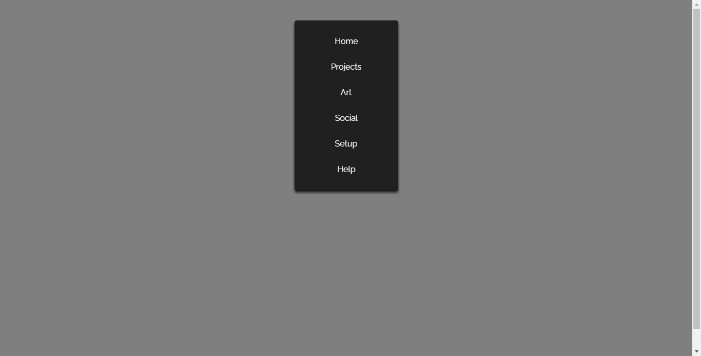
Front End Day 94 CSS Only Mirror Like Nav
About Project
Links
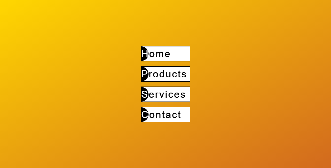
Reverse Text Color Menu Effects
About Project
Links

Pure CSS Single Page Application
About Project
Links
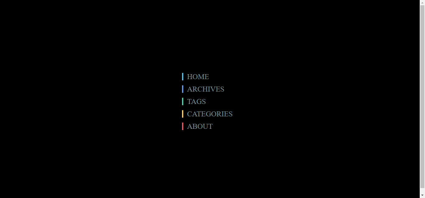
Menu Hover Slide Fill
About Project
Links
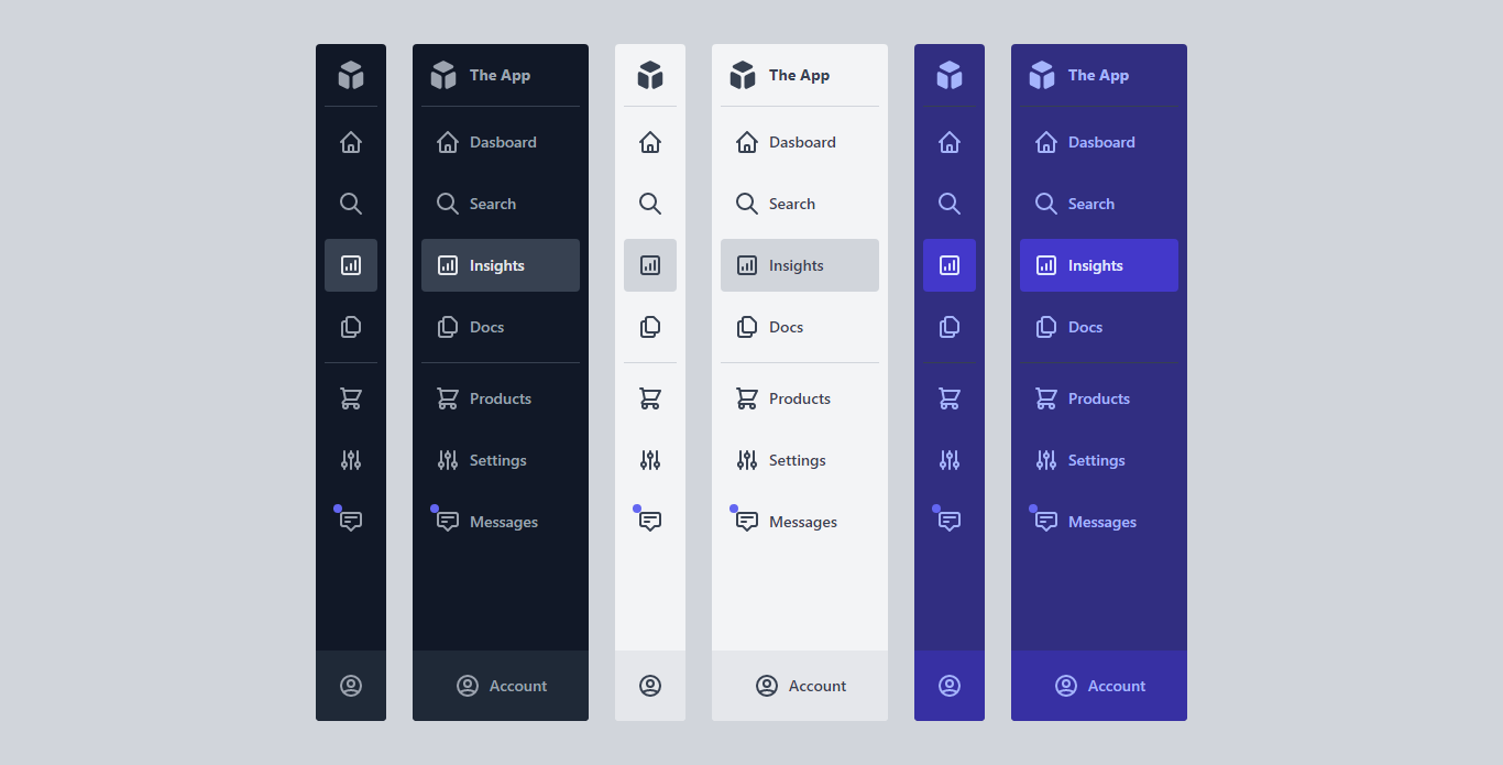
CodePen Home App Admin Menus + Light_Dark Modes – With Tailwind CSSl
About Project
Links
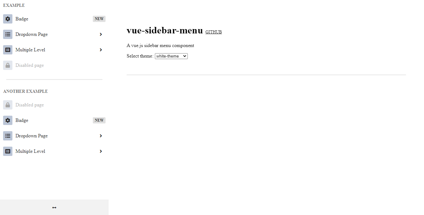
Vue Sidebar Menu
About Project
Links
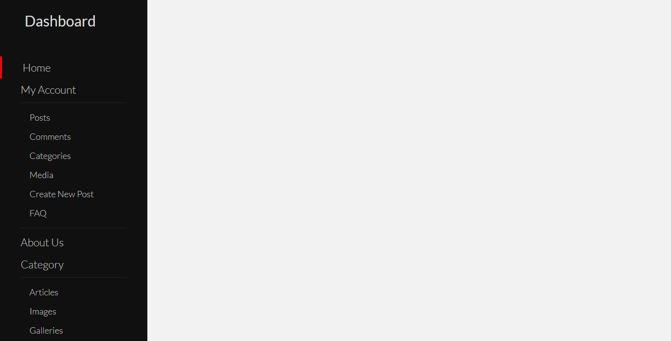
Custom Bootstrap4 Sidebar Menu
About Project
Links
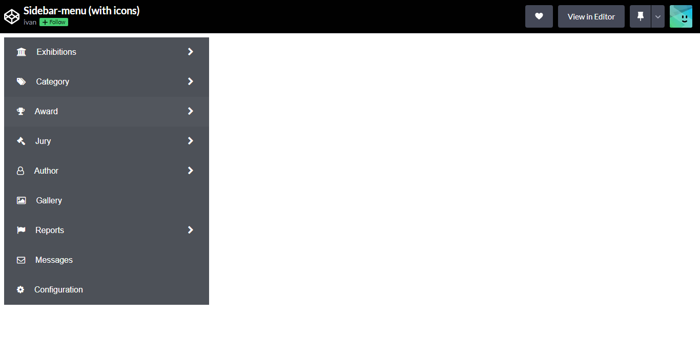
Sidebar Menu With Icons
About Project
Links
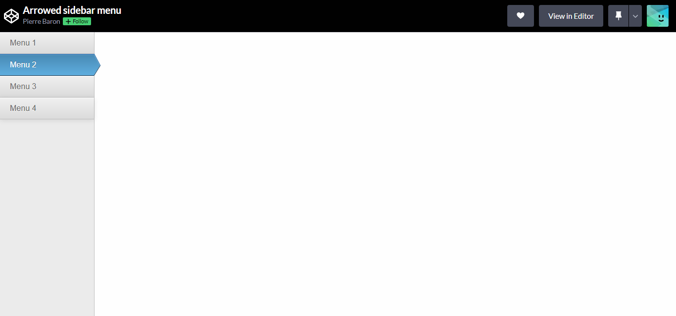
Arrowed Sidebar Menu
About Project
Links
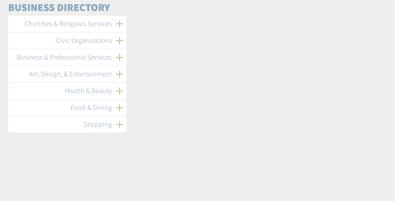
Simple Accordion Menu
About Project
Links
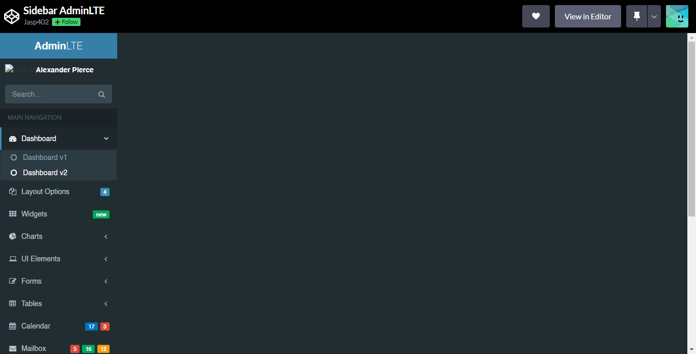
Sidebar AdminLTE
About Project
Links
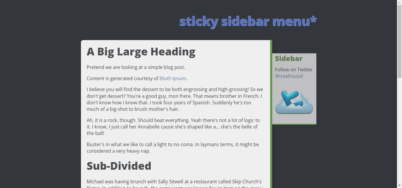
Sticky Sidebar Menu
About Project
Links
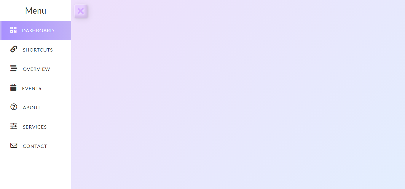
Sidebar Pastel
About Project
Links
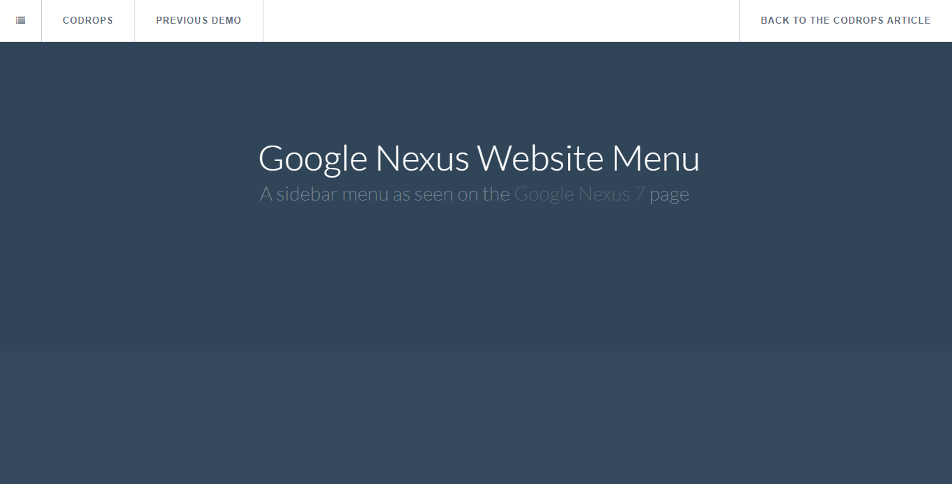
Nexus Sidebar
About Project
Links
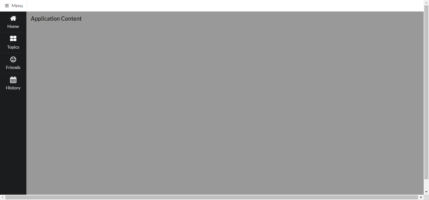
Semantic-UI Sidebar
About Project
Links
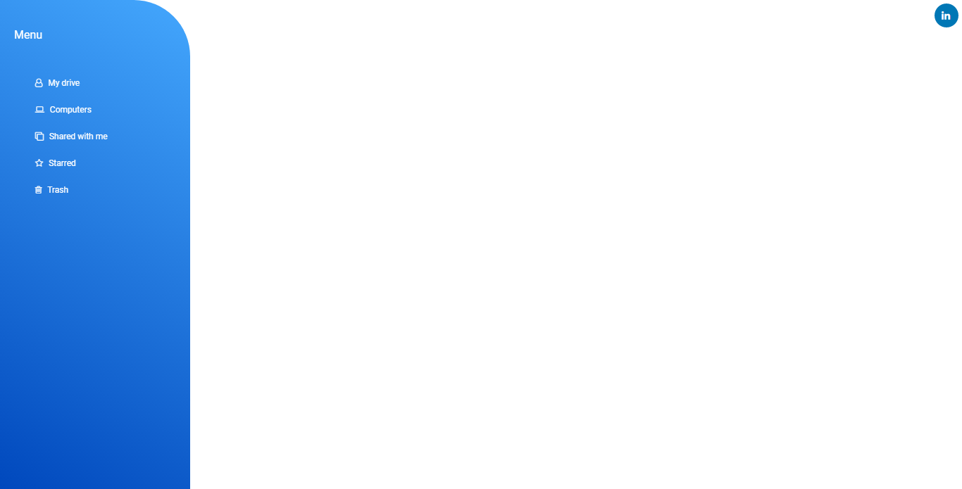
Modern Sidebar Menu
About Project
Links
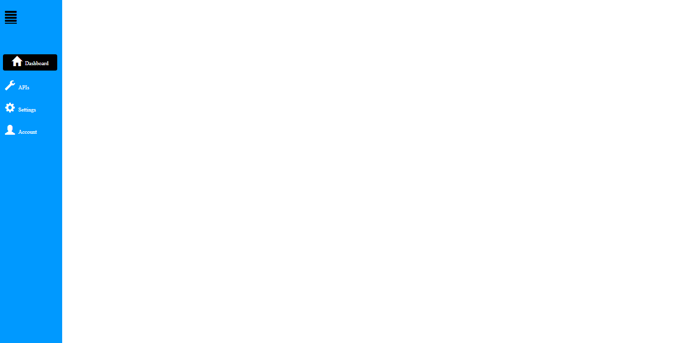
Simple Bootstrap SideBar
About Project
Links
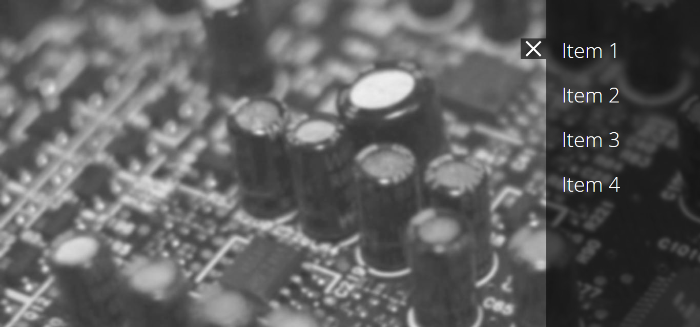
Hidden Sidebar Menu
About Project
Links
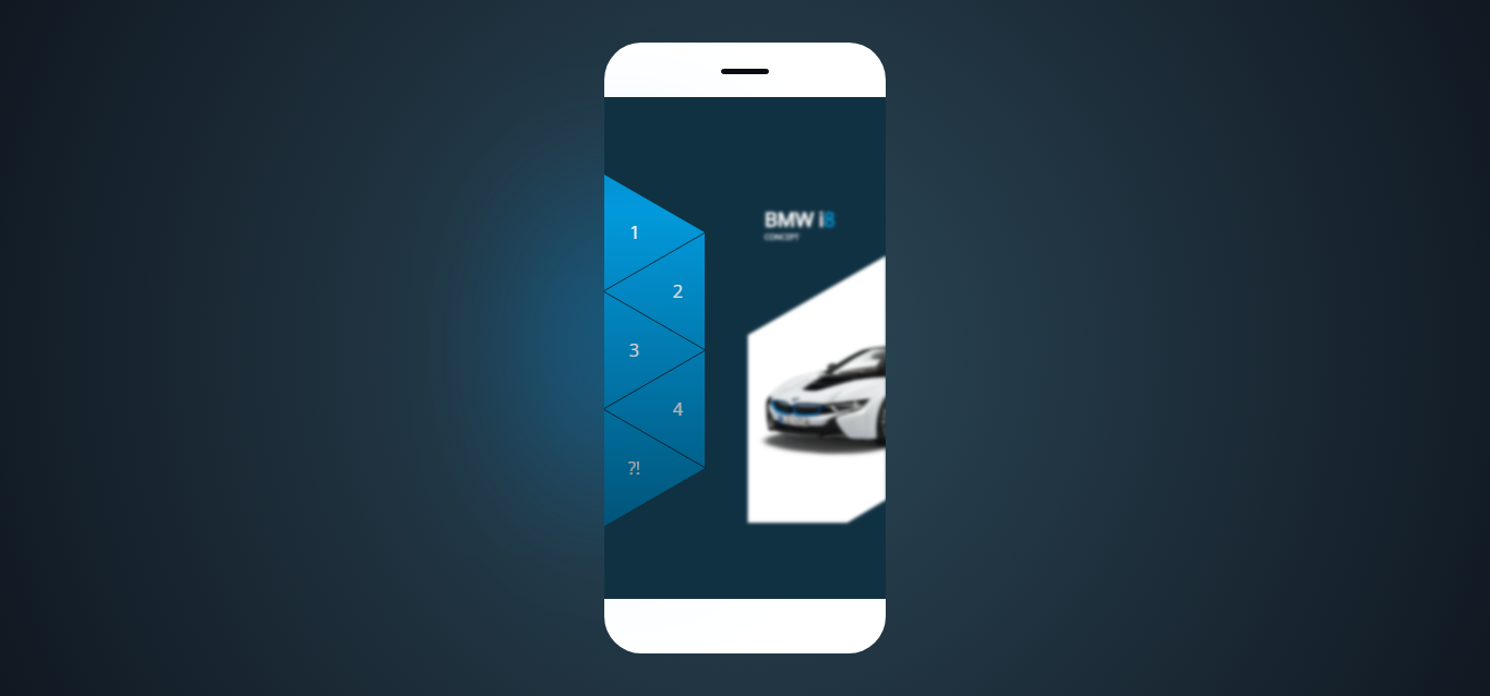
Triangular Sidebar Menu
About Project
Links
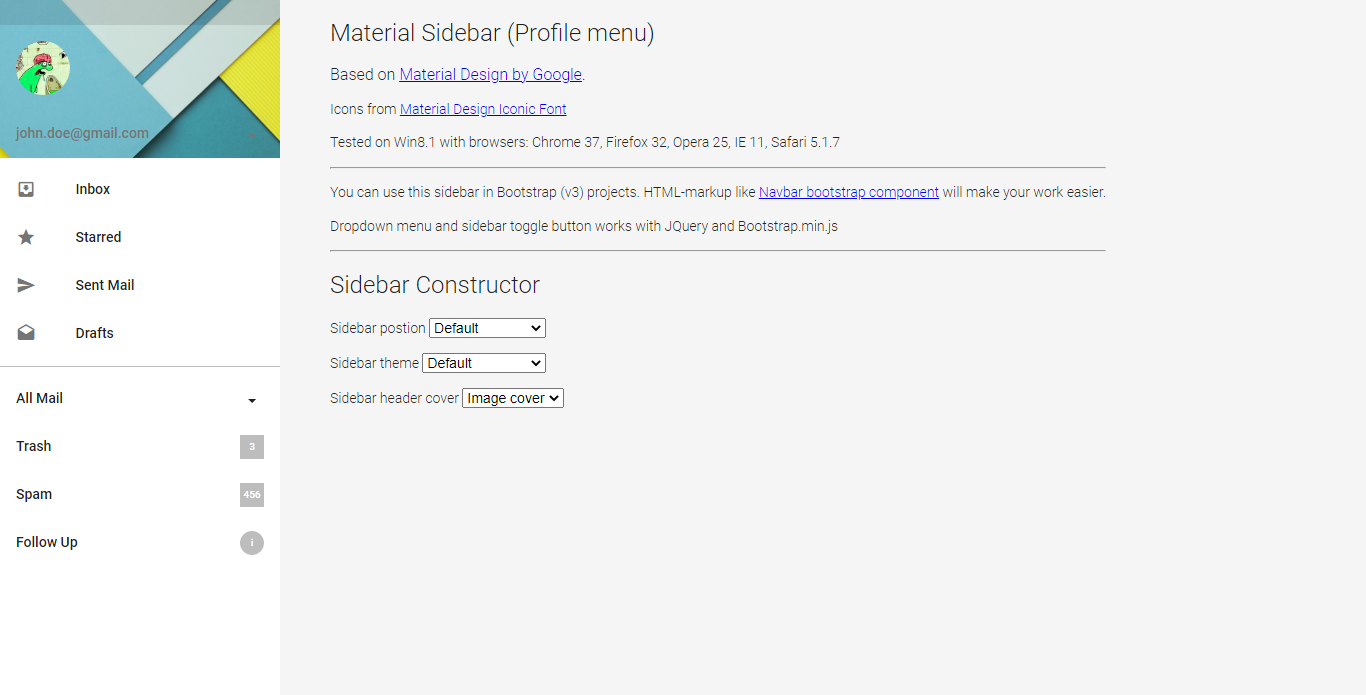
Material Design – Sidebar (Profile Menu)
About Project
Links
Recommended Articles
- CSS Flexbox Navigation Menus Tutorial and Examples
- 32 CSS Menu Examples and Code
- Creating a Responsive Animated Sliding Tab Menu
- 32 CSS Arrow Examples and Code
- How To Create An Icon Bar With CSS
- 15 HTML Search Bar Examples and Code